【Flutter Widget of the Week #18】CustomPaintを使ってみた
はじめに
Flutter Widget of the Week #18 CustomPaint についてまとめましたので、紹介します。
CustomPaint
Flutter で複雑にUIをカスタマイズしたいとき、CustomPaint が選択肢の一つとして使えます。
CustomPaint は canvas を提供していて、グラフや複雑な図形を自由に描画できます。
では、サンプルを動かして使い方を見てみましょう。
CustomPaint サンプルコード
サンプルはボタンをタップすると円が描画されたり、消えたりを繰り返すアニメーションが実行され、もう一度ボタンをタップすると処理が止まる、という動きになってます。
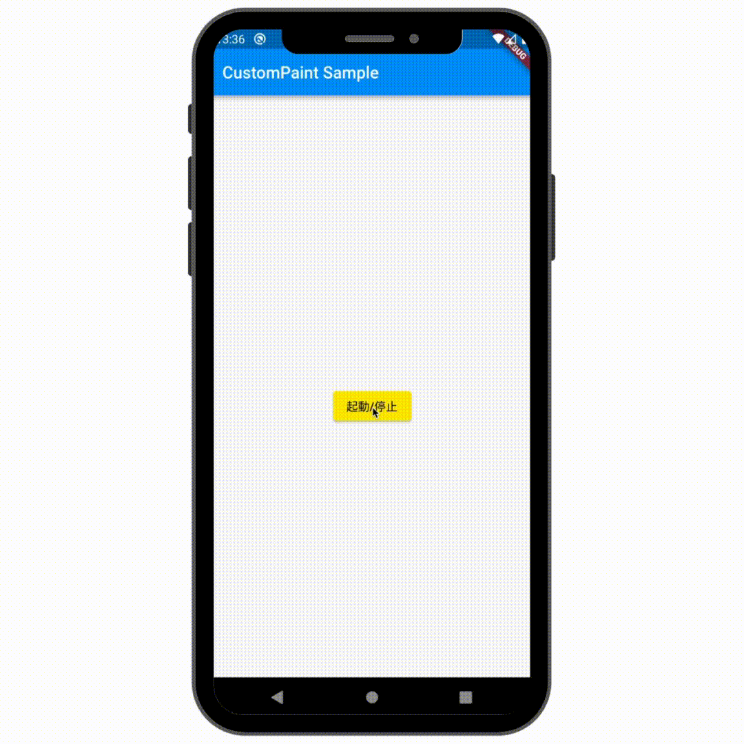
CustomPaint サンプル実行画面
サンプルコード全体
class CustomPaintSample extends StatefulWidget {
const CustomPaintSample({super.key});
State<StatefulWidget> createState() {
return CustomPaintSampleState();
}
}
class CustomPaintSampleState extends State<CustomPaintSample>
with SingleTickerProviderStateMixin {
late Animation<double> _animation;
late AnimationController _animationController;
void initState() {
_animationController =
AnimationController(duration: const Duration(seconds: 2), vsync: this);
_animation = Tween(begin: 10.0, end: 100.0).animate(_animationController)
..addListener(() {
setState(() {});
});
super.initState();
}
void dispose() {
_animationController.dispose();
super.dispose();
}
Widget build(BuildContext context) {
return Scaffold(
appBar: AppBar(
title: const Text('CustomPaint Sample'),
),
body: Center(
child: Column(
children: <Widget>[
Opacity(
opacity: _animationController.isAnimating ? 1.0 : 0.00,
child: CustomPaint(
size: const Size(0, 200),
painter: _CirclePainter(_animation.value),
),
),
Container(
margin: const EdgeInsets.only(top: 150),
child: ElevatedButton(
style: ElevatedButton.styleFrom(
backgroundColor: Colors.yellow, //ボタンの背景色
),
onPressed: () {
if (_animationController.isAnimating) {
_animationController.reset();
} else {
_animationController.repeat();
}
},
child: const Text(
'起動/停止',
style: TextStyle(
color: Colors.black,
),
),
),
),
],
),
),
);
}
}
class _CirclePainter extends CustomPainter {
double radius;
_CirclePainter(this.radius);
void paint(Canvas canvas, Size size) {
var c = const Offset(0, 200.0);
var paint = Paint()
..isAntiAlias = true
..color = Colors.blue
..strokeWidth = 5.0;
canvas.drawCircle(
c,
radius,
paint,
);
}
bool shouldRepaint(CustomPainter oldDelegate) {
return true;
}
}
使い方としては、
まず CustomPaint widget を widget ツリーに追加します。
そして、CustomPaint に size と painter を指定します。
CustomPaint(
  size: const Size(0, 200), //size を指定
  painter: _CirclePainter(_animation.value), //painter を指定
)
次に painter の中身を作成していきます。
CustomPainter を extends したクラスを作り、 paint と shouldRepaint の2つのメソッドを実装します。
class _CirclePainter extends CustomPainter {
void paint(Canvas canvas, Size size){
// ・・・
}
bool shouldRepaint(CustomPainter old){
// ・・・
}
}
paint メソッドは canvas を作るメソッドです。
今回は canvas.drawCircle() で円を描画します。
void paint(Canvas canvas, Size size) {
var c = const Offset(0, 200.0);
var paint = Paint()
..isAntiAlias = true
..color = Colors.blue
..strokeWidth = 5.0;
canvas.drawCircle(
c,
radius,
paint,
);
}
他にも様々な方法で描画できます。
canvas.drawLine()
canvas.drawRect()
canvas.drawCircle()
canvas.drawArc()
canvas.drawPath()
canvas.drawImage()
canvas.drawImageNine()
canvas.drawParagraph()
shouldRepaint メソッドは customPainter が再構築されるときに呼ばれるメソッドです。
古い widget(再構築前の widget)を再利用すべきかを判断し、必要な場合のみ再構築が行われるようになります。
@override
bool shouldRepaint(CustomPainter oldDelegate) {
  return true;
}
CustomPaint のプロパティについて
CustomPaint にはプロパティがいくつかありますので、一部紹介します。
(new) CustomPaint CustomPaint({
  Key? key,
  CustomPainter? painter,
  CustomPainter? foregroundPainter,
  Size size = Size.zero,
  bool isComplex = false,
  bool willChange = false,
  Widget? child,
})
①painter
canvas に描画する内容を設定する
型は CustomPainter 型
②foregroundPainter
canvas に描画する内容を設定する
型は CustomPainter 型
①のpainterとやることは同じだが、描画する順番が異なります。例えば、以下のように CustomPaint を作るとしたら、描画は painter → child → foregroundPainter の順で上に重ねる形で描画されます
CustomPaint(
  child: childWidget(),
  foregroundPainter: DemoForegroundPainter(),
  painter: DemoPainter(),
)
③size
CustomPaint に child がない場合に、レイアウトの制約を考慮して CustomPaint が目指すサイズを指定する
デフォルトは Size.zero
型は Size 型
最後に
今回は CustomPaint を紹介しました。UIをもっと複雑なものにしたいとき、CustomPaint の使い方さえ知っていれば作れると思うと、覚えておきたい widget ですね。
サンプルで作った円だけでなく、三角や四角も作るの難しくないので、是非試しに作って見てください。
次は #19 Tooltip です。またお会いしましょう。
参考記事
Discussion