【Flutter Widget of the Week #8】FloatingActionButtonを使ってみた
はじめに
Flutter Widget of the Week #8 FloatingActionButton についてまとめましたので、紹介します。
FloatingActionButton とは
今回紹介する FloatingActionButton は Flutter を触ったことのある人であれば必ず一度は見たことのある Widgte です。
flutter create を実行すると最初に出てくるカウンターアプリ。
その右下にあるボタンが FloatingActionButton です。

API Document にあるサンプルを参考に動かしてみましょう。
Scaffold で FloatingActionButton を作成
class FabExample extends StatelessWidget {
const FabExample({super.key});
Widget build(BuildContext context) {
return Scaffold(
appBar: AppBar(
title: const Text('FloatingActionButton Sample'),
),
body: const Center(child: Text('Press the button below!')),
floatingActionButton: FloatingActionButton(
onPressed: () {
// Add your onPressed code here!
},
backgroundColor: Colors.green,
child: const Icon(Icons.navigation),
),
);
}
}
Scaffoldで 拡張されたFloatingActionButtonを作成する
class FabExample extends StatelessWidget {
const FabExample({super.key});
Widget build(BuildContext context) {
return Scaffold(
appBar: AppBar(
title: const Text('FloatingActionButton Sample'),
),
body: const Center(
child: Text('Press the button with a label below!'),
),
floatingActionButton: FloatingActionButton.extended(
onPressed: () {
// Add your onPressed code here!
},
label: const Text('Approve'),
icon: const Icon(Icons.thumb_up),
backgroundColor: Colors.pink,
),
);
}
}
Material Design 3 でFloatingActionButtonを作成する
Material Design 3 を使用するには MaterialApp の theme で useMaterial3 :true を追加する必要があります。
MaterialApp(
  theme: ThemeData(
    colorSchemeSeed: const Color(0xff6750a4),
    useMaterial3: true
  ),
  home: const FabExample(),
);
FloatingActionButtonウィジェット のすべてのバリエーション
Material Design 3 を使用するため、上記同様に useMaterial3 を true にする必要があります。
FloatingActionButton small
FloatingActionButton.small(
  onPressed: () {
    // Add your onPressed code here!
  },
  child: const Icon(Icons.add),
),
FloatingActionButton regular
FloatingActionButton(
  onPressed: () {
    // Add your onPressed code here!
  },
  child: const Icon(Icons.add),
),
FloatingActionButton large
FloatingActionButton.large(
  onPressed: () {
    // Add your onPressed code here!
  },
  child: const Icon(Icons.add),
),
FloatingActionButton extended
FloatingActionButton.extended(
  onPressed: () {
    // Add your onPressed code here!
  },
  label: const Text('Add'),
  icon: const Icon(Icons.add),
),
 FloatingActionButtonウィジェット のすべてのバリエーション
FloatingActionButton のプロパティについて
FloatingActionButton にはいくつかプロパティがあります。
主要なプロパティを説明します。
(new) FloatingActionButton FloatingActionButton({
  Key? key,
  Widget? child,
  String? tooltip,
  Color? foregroundColor,
  Color? backgroundColor,
  Color? focusColor,
  Color? hoverColor,
  Color? splashColor,
  Object? heroTag = const _DefaultHeroTag(),
  double? elevation,
  double? focusElevation,
  double? hoverElevation,
  double? highlightElevation,
  double? disabledElevation,
  required void Function()? onPressed,
  MouseCursor? mouseCursor,
  bool mini = false,
  ShapeBorder? shape,
  Clip clipBehavior = Clip.none,
  FocusNode? focusNode,
  bool autofocus = false,
  MaterialTapTargetSize? materialTapTargetSize,
  bool isExtended = false,
  bool? enableFeedback,
})
①backgroundColor
ボタンの背景色を指定する
型は Color 型
②foregroundColor
ボタンのアイコンやテキストの色を指定する
型は Color 型
③hoverColor
ボタンにカーソルを合わせたときの色を指定する
型は Color 型
④tooltip
ボタンの機能を説明するテキストを設定する
型は String 型
⑤shape
ボタンの形状を指定する
型は ShapeBorder 型
⑥onPressed
ボタンを押したときに実行する関数を設定する
型は VoidCallback 型
下部のナビゲーションバーの中に FloatingActionButton を埋め込む
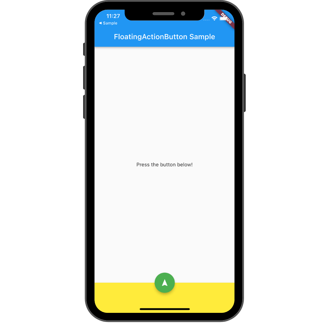 ナビゲーションバーの中に FloatingActionButton を埋め込む
class FabExample extends StatelessWidget {
const FabExample({super.key});
Widget build(BuildContext context) {
return Scaffold(
appBar: AppBar(
title: const Text('FloatingActionButton Sample'),
),
body: const Center(child: Text('Press the button below!')),
// FloatingActionButton の生成
floatingActionButton: FloatingActionButton(
onPressed: () {
// Add your onPressed code here!
},
backgroundColor: Colors.green,
child: const Icon(Icons.navigation),
),
// ボトムナビゲーションの生成
bottomNavigationBar: BottomAppBar(
color: Colors.yellow,
child: Container(height: 50.0),
),
// FloatingActionButton の位置を指定する
floatingActionButtonLocation: FloatingActionButtonLocation.centerDocked, //中央に配置する
);
}
}
最後に
今回は FloatingActionButton を紹介しました。このボタンはスクロールしても位置が変わらないボタンであり、簡単に設置できるのですごく便利な Widget だなと思いました。
次は #9 PageView です。またお会いしましょう。
参考記事
Discussion