UnoCSSでまれによく使うやつ
 eyemono.moe
where/?
preset-miniで定義されているデバッグ用Rule。使用すると以下のように虹色にアニメーションするボーダーが付く。
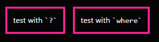
envModeが'dev'になっている場合のみoutputされるため、開発環境で?をつけっぱなしにしたままpushしてしまっても安心。
eyemono.moebracket syntax内でthemeを使う
preset-miniで定義されているVariant。bg-[theme(colors.blue.500)]のような書き方をすることで、直接themeを参照できる。もちろん色以外にspacingなども使用可能。
bg-[theme(colors.blue.500)]は単にbg-blue-500と書けばよいのでtheme()を使う嬉しさは無いが、例えばbg-[color-mix(in_oklch,theme(colors.myRed.950/100),theme(colors.zinc.950/100))]のように、cssの関数内で使用できるのが強みだと思う。(tailwindでもcss変数としてこのような使い方ができる)
eyemono.moe結合子
preset-miniでは、TailwindCSSで使用可能な結合子(combinators)に加え、次兄弟結合子(next-sibling combinator)が使用可能な記法も提供されている。
-
group: 子孫結合子による、特定親要素を持つ要素のスタイリング-
(TailwindCSSにも存在)
-
group-hover:text-white.group:hover .group-hover\:text-white { --un-text-opacity: 1; color: rgb(255 255 255 / var(--un-text-opacity)); }
-
-
parent: 子結合子による、特定親要素を持つ要素のスタイリング-
parent-hover:text-white.parent:hover > .parent-hover\:text-white { --un-text-opacity: 1; color: rgb(255 255 255 / var(--un-text-opacity)); }
-
-
peer: 後続兄弟結合子による、特定兄弟要素を持つ要素のスタイリング-
(TailwindCSSにも存在)
-
peer-invalid:visible:.peer:invalid ~ .peer-invalid\:visible { visibility: visible; }
-
-
previous: 次兄弟結合子による、特定兄弟要素を直前に持つ要素のスタイリング-
previous-invalid:visible.previous:invalid + .previous-invalid\:visible { visibility: visible; }
-
-
all: 子孫結合子による、子孫要素のスタイリング-
all:bg-red.all\:bg-red * { --un-bg-opacity: 1; background-color: rgb(248 113 113 / var(--un-bg-opacity)); } -
all-[a.target:hover]:bg-red.all-\[a\.target\:hover\]\:bg-red a.target:hover { --un-bg-opacity: 1; background-color: rgb(248 113 113 / var(--un-bg-opacity)); }
-
-
*: 子結合子による、子要素のスタイリング-
(TailwindCSSにも存在)
-
*:bg-red.\*\:bg-red > * { --un-bg-opacity: 1; background-color: rgb(248 113 113 / var(--un-bg-opacity)); } -
preset-miniでは次の記法も提供-
children:bg-red(*:bg-redと同じ結果) -
children-[target.a:hover]:bg-red.children-\[a\:hover\]\:bg-red > a:hover { --un-bg-opacity: 1; background-color: rgb(248 113 113 / var(--un-bg-opacity)); }
-
-
-
siblings: 後続兄弟結合子による、後続兄弟要素のスタイリング-
siblings:bg-red.siblings\:bg-red ~ * { --un-bg-opacity: 1; background-color: rgb(248 113 113 / var(--un-bg-opacity)); } -
siblings-[target.a:hover]:bg-red.siblings-\[target\.a\:hover\]\:bg-red ~ target.a:hover { --un-bg-opacity: 1; background-color: rgb(248 113 113 / var(--un-bg-opacity)); }
-
-
next/sibling: 次兄弟結合子による、直後の兄弟要素のスタイリング-
next:bg-red.next\:bg-red + * { --un-bg-opacity: 1; background-color: rgb(248 113 113 / var(--un-bg-opacity)); } -
sibling-[target.a:hover]:bg-red.sibling-\[target\.a\:hover\]\:bg-red + target.a:hover { --un-bg-opacity: 1; background-color: rgb(248 113 113 / var(--un-bg-opacity)); }
-
例えばpreset-miniにおけるprevious-invalid:visibleは、TailwindCSSにおいてはinvalidが切り替わる要素側に[&:invalid+div]:visibleと書く必要があった。
preset-miniでは、各結合子について、これで指定される要素の状態に応じたスタイリング/これで指定される要素自体のスタイリング の記法が提供されている。(preset-miniでも[&:invalid+div]:visible自体は動く)
eyemono.moeInteractive Docs
任意の検索項目について、いい感じにいろいろ教えてくれる。
実際に吐かれるCSS, 対応するRuleの正規表現, 関連するMDNのドキュメントページなど教えてくれて便利。

特にすごいのがCustom Config機能で、ページ上の入力欄にuno.config.jsを入力することで、そのconfigに対応した検索結果を出してくれる。
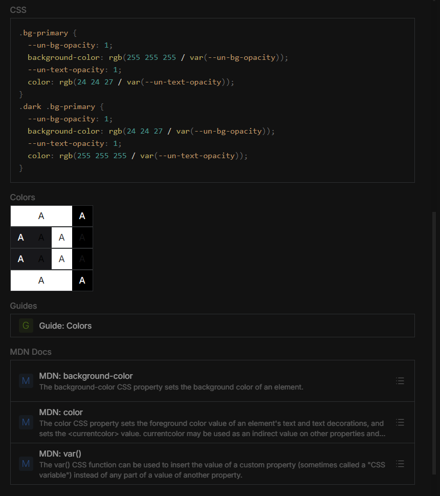
例えば以下のようにshortcutとしてbg-primaryを登録しているconfigを入力すると、

検索結果にこのshortcutが出てくるようになる。

吐き出されるCSSはもちろん、使用されている色のプレビュー, 関連したMDNのドキュメントも自動で表示してくれる。
筆者はブラウザのサイドパネルに置いて、いつでも一瞬で開けるようにしています。
eyemono.moerule自作時に使えるutility
parseColor
↑のJSDocコメントに書いてあるとおりだが、red-100/20や[rgb(100 2 3)]/[var(--op)]といった文字列をパースして、colorやopacityを取得できる。
@unocss/preset-mini/utilsまたは@unocss/rule-utilsからimportして使用可能
handler
@unocss/preset-mini/utilsからimportして使用可能な汎用関数。文字列から"いいかんじに"値を作ってくれる。
例えばhandler.rem("2")は"0.5rem"になる(4=1rem, 1=0.25rem)。
handler.bracket.cssvar.fraction.rem(size)のようにoptionをメソッドチェーンのように記述でき、以下のように様々な入力を一括で処理できるようになる。
-
handler.bracket.cssvar.fraction.rem("[calc(1px+2rem)]")→calc(1px + 2rem)(bracketの効果) -
handler.bracket.cssvar.fraction.rem("[--test]")→var(--test)(bracketの効果) -
handler.bracket.cssvar.fraction.rem("1/4")→25%(fractionの効果)
そのほかの"option"は以下に記述されている。
eyemono.moecolor themeでのアルファ値プレースホルダ
コンフィグファイルのtheme.colorsを記述する際に、rgb(80 50 0 / <alpha-value>)やlch(80 50 120 / %alpha)といった風に、アルファ値を入れる箇所に<alpha-value>/%alphaを記述すると、その色に対してアルファ値を設定できるようになる。
import { defineConfig, presetMini } from 'unocss'

export default defineConfig({
  presets: [presetMini()],
  theme: {
    colors: {
      myRed: 'lch(90 80 0 / <alpha-value>)',
    },
  },
})
<div class="bg-myRed/50">change opacity!</div>
↓
.bg-myRed\/50 {
  background-color: lch(90 80 0 / 0.5);
}