【Flutter Widget】Card
Card基礎
Cardのコンストラクタ
CardがMaterial Designの一員であり、StatelessWidgetを継承しています。コンストラクタを見るとわかりますが、色、影の色、形状、マージンなどカスタマイズできるようになります。
Cardのソースコードに「A Material Design card: a panel with slightly rounded corners and an elevation shadow.」のコメントがあり、Cardが軽い丸角と立体的な影を持つパネルであることもわかります。
class Card extends StatelessWidget {
  const Card({
    super.key,
    this.color,
    this.shadowColor,
    this.surfaceTintColor,
    this.elevation,
    this.shape,
    this.borderOnForeground = true,
    this.margin,
    this.clipBehavior,
    this.child,
    this.semanticContainer = true,
  }) : assert(elevation == null || elevation >= 0.0),
       _variant = _CardVariant.elevated;
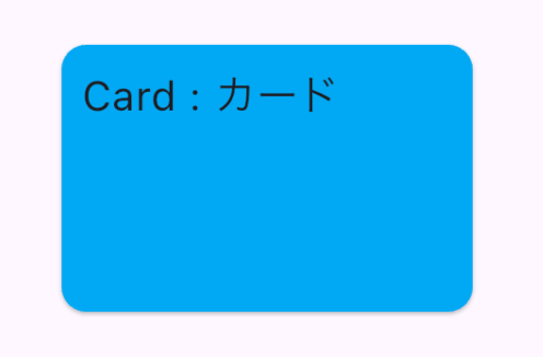
Cardの生成
    //cardのコンテンツを生成する
    Widget buildContent() {
      return Container(
          width: 200,
          height: 130,
          padding: const EdgeInsets.all(10),
          child: const Text("Card : カード", style: TextStyle(fontSize: 20)));
    }

  //cardの利用
   Center(
       child:Card(
          color: Colors.lightBlue,
          child: buildContent(),
       ),
   )
Card属性
shadowColor及びelevation
shadowColor:影の色
elevation:影の深さ
Center(
            child:Card(
              color: Colors.lightBlue,
              shadowColor: Colors.,
              elevation: 20, //効果が見やすいようにわざと大きい値に設定
              child: buildContent(),
            )
          )

margin
margin:ほかのウィジェットとの余白
      Row(
          mainAxisAlignment: MainAxisAlignment.start,
            children:[
              Container(
                height: 40,
                width: 40,
                color: Colors.redAccent,
              ),
              Card(
                color: Colors.lightBlue,
                margin: const EdgeInsets.only(left: 30,right: 30),
                child: buildContent(),
              ),
              Container(
                height: 40,
                width: 40,
                color: Colors.redAccent,
              ),
            ]
          )

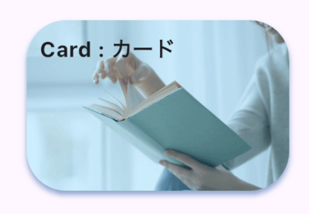
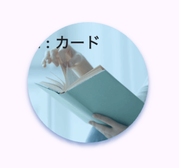
clipBehavior
clipBehavior:描画におけるクリップ動作
四つの設定値がありますが、通常は目視であまり見た目の差分を感じられませんが、背景が画像である場合は、設定値により丸角にならないなどの動作になります。
| clipBehavior設定 | 効果 |
|---|---|
| Clip.none | 何もない(デフォルト設定) |
| Clip.hardEdge | 描画がもっとも高速、視覚的にはやや粗く、エッジが滑らかではない |
| Clip.antiAlias | 描画がhardEdgeより遅い、エッジが滑らかになる |
| Clip.antiAliasWithSaveLayer | 描画がantiAliasより遅い、あまり利用しない |
- 背景が画像になる場合の効果比較
| Clip.none | 見た目 |
|---|---|
| Clip.none | 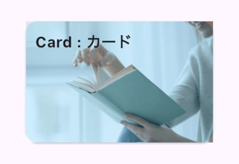 |
| Clip.hardEdge |  |
| Clip.antiAlias |  |
| Clip.antiAliasWithSaveLayer |  |
Clip.noneの場合はCardが丸角にならないことがわかるかと思います。
比較のソースコード:
    Widget buildContent() {
      return Container(
          width: 200,
          height: 130,
          padding: const EdgeInsets.all(10),
          decoration: BoxDecoration(
              image: DecorationImage(
                colorFilter: ColorFilter.mode(
                    Colors.blue.withOpacity(0.2),
                    BlendMode.dstOut),
                  fit: BoxFit.cover,
                  image: const AssetImage('images/read_book.jpg')
              )
          ),

          child: const Text("Card : カード",
              style: TextStyle(
                  fontSize: 16,
                  fontWeight: FontWeight.bold)));
    }

   Card(
            clipBehavior: Clip.antiAliasWithSaveLayer,
            color: Colors.lightBlue,
            margin: const EdgeInsets.only(left: 30,right: 30),
            child: buildContent(),
      ),
sharp
sharp:Cardの形状をカスタマイズする、ShapeBorder型であり、直接利用可能なのは、CircleBorder(円型)、RoundedRectangleBorder(丸角)、ContinuousRectangleBorder(連続角?)、BeveledRectangleBorder(斜角)があります。
- 角をもっと丸くする
Card(
    clipBehavior: Clip.antiAlias,
    shape: const RoundedRectangleBorder(
          side: BorderSide.none,
          borderRadius: BorderRadius.all(Radius.circular(30))
     ),
     elevation: 3,
     shadowColor: Colors.blueAccent,
     color: Colors.lightBlue,
     margin: const EdgeInsets.only(left: 30,right: 30),
     child: buildContent(),
),
- 円型にする
Card(
   clipBehavior: Clip.antiAlias,
   shape: const CircleBorder(),
   shadowColor: Colors.blueAccent,
   color: Colors.lightBlue,
   margin: const EdgeInsets.only(left: 30,right: 30),
   child: buildContent(),
  )
Rippleエフェクト
Cardの背景に画像を設定した場合やCard表示内容のContainerにcolorやdecorationを設定した場合は、タップによるRippleエフェクトができなくなります。解決方法としては、ContainerをInkを置き換えることになります。
- Rippleエフェクトの実装方法
childにInkWellを利用(CardをタップできるようにするにもInkWellの利用が必要になります)
Card(
    clipBehavior: Clip.antiAlias,
    shadowColor: Colors.blueAccent,
    color: Colors.lightBlue,
    margin: const EdgeInsets.only(left: 30,right: 30),
    child: InkWell(
          splashColor: Colors.blue.withAlpha(30),
          onTap: (){
          },
          child:buildContent()),
    )
- Rippleエフェクトができない問題の解決コード例
    Widget buildContent() {
      return Ink(
          width: 200,
          height: 130,
          padding: const EdgeInsets.all(10),
          color: Colors.blue,
          decoration: BoxDecoration(
              image: DecorationImage(
                colorFilter: ColorFilter.mode(
                    Colors.blue.withOpacity(0.2),
                    BlendMode.dstOut),
                  fit: BoxFit.cover,
                  image: const AssetImage('images/read_book.jpg')
              )
          ),
          child: const Text("Card : カード",
              style: TextStyle(
                  fontSize: 16,
                  fontWeight: FontWeight.bold)));
    }
Discussion