凝集度を上げるcompound patternのいろは
はじめに
すでにこちらやこちらの記事でかなり前から言及されていたデザインパターンの一種であり、開発に有効活用されている方も多いかと思いますが、これまで自身は理解が足らず実践で使うことをしてきませんでした。色々なコードを参考にさせて頂く中で理解が深まった為、今後は開発において有効な場面で使っていきたいなということで備忘録も兼ねて説明していきたいと思います。
compound patternとは?
In our application, we often have components that belong to each other.
They’re dependent on each other through the shared state, and share logic
together. You often see this with components like select, dropdown
components, or menu items. The compound component pattern allows you to
create components that all work together to perform a task.
日本語訳
私たちのアプリケーションでは互いに関連するコンポーネントがあり、これらのコンポーネントは共有状態を通じて互いに依存していることが多くまた、共通のロジックを共有しています。これは、主にセレクト・ドロップダウンコンポーネント・またはメニュー項目のようなコンポーネントによく見受けられます。compound patternを使用することで特定のタスクを実行するためにComponent間の凝集度を高めながら機能するコンポーネントを作成することができます。
公式の具体例も良いものなのですが今回はもう少しシンプルなcomponentで説明したいと思います。
結果としてRepositoryも貼っておきます
カードViewのパターンにおいて

このようなカードをViewとして描画しないといけない場合があると仮定した場合
page.tsx
import Card from './components/Card';

const dummyPostData = {
  id: 1,
  title: 'タイトル',
  content: 'サンプルコンテンツ',
  user: {
    id: 10,
    name: 'ユーザー1',
  },
};

export default function Home() {
  return (
    <main className="flex h-screen items-center justify-center bg-sky-200">
      <Card post={dummyPostData} />
    </main>
  );
}
card.tsx
type Post = {
  id: number;
  title: string;
  content: string;
  user: {
    id: number;
    name: string;
  };
};

type CardProps = {
  post: Post;
};

const Card = ({ post }: CardProps) => {
  return (
    <div className="max-w-sm rounded-2xl shadow-2xl bg-white p-6">
      <div className="px-6 py-4 space-y-3">
        <div className="font-bold text-xl mb-2">{post.title}</div>
        <p className="text-gray-700 text-base">{post.content}</p>
        <p className="text-gray-700 text-sm text-center">{post.user.name}</p>
      </div>
      <div className="flex flex-row px-6 pt-4 pb-2 justify-between gap-3">
        <button className="bg-blue-500 hover:bg-blue-700 text-white font-bold py-2 px-4 rounded w-1/2">
          Button
        </button>
        <button className="bg-red-500 hover:bg-red-700 text-white font-bold py-2 px-4 rounded w-1/2">
          Cancel
        </button>
      </div>
    </div>
  );
};

export default Card;
上記のように各componentを用意することをされると思います。
この状態としてのViewのみで利用する場合であれば特に問題ないのですがこのCard Componentが汎用的なものである場合、場面によってはタイトル消した状態で同様のカードを描画したい場合やcancelボタンは今回の場面では不要****ユーザー名とタイトルの位置を上下入れ替えたいなど様々な想定のもとで表示の切り替えを行う必要が発生するかと思います。
その場合、isXXXなどのプロパティをPropsに含めた上で表示の切り分けを行うことをされることが多いと思ます。(私自身は大体の場合、そのように対応していました。)
タイトルの表示を切り替える例
const dummyPostData = {
  id: 1,
  title: 'タイトル',
  content: 'サンプルコンテンツ',
  user: {
    id: 10,
    name: 'ユーザー1',
  },
+ isTitle: true,
};
type Post = {
  id: number;
  title: string;
  content: string;
  user: {
    id: number;
    name: string;
  };
+ isTitle: boolean
};

略・・・
+ { isTitle && <div className="font-bold text-xl mb-2">{post.title}</div> }
- <div className="font-bold text-xl mb-2">{post.title}</div>
この対応自体もよくある対応の一つなのですが表示の切り替えが必要な要素がtitle以外に増えたり、そもそもCard内の要素がより複雑な場合にisXXXのプロパティをその分用意することや&&での表示・非表示、三項演算子を使った切り替えなどにより実際にViewとしてのComponentそのものがどの場合にどの表示になるのかコード上から読み解くことが一見では難しくなり保守性の低下に繋がりうる場合もあると思います。
compound patternを使った解決策
- createContextを使ってComponent自体をwrapしたのちuseCardContextを作成
+ import { createContext, useContext } from 'react';

+ type CardContextType = {
+ post: Post;
+ };

+ const CardContext = createContext<CardContextType | undefined>(undefined);

+ const useCardContext = () => {
+ const context = useContext(CardContext);
+ if (!context) {
+   throw new Error('useCardContext must be used within a Card Component');
+ }
+  return context;
+ };

+ <CardContext.Provider value={{ post }}>
  <div className="max-w-sm rounded-2xl shadow-2xl bg-white p-6">
    <div className="px-6 py-4 space-y-3">
      <div className="font-bold text-xl mb-2">{post.title}</div>
      <p className="text-gray-700 text-base">{post.content}</p>
      <p className="text-gray-700 text-sm text-center">{post.user.name}</p>
    </div>
    <div className="flex flex-row px-6 pt-4 pb-2 justify-between gap-3">
      <button className="bg-blue-500 hover:bg-blue-700 text-white font-bold py-2 px-4 rounded w-1/2">
        Button
      </button>
      <button className="bg-red-500 hover:bg-red-700 text-white font-bold py-2 px-4 rounded w-1/2">
        Cancel
      </button>
    </div>
  </div>
+ </CardContext.Provider>
- 型情報の為にchildrenを追加
+ import { createContext, PropsWithChildren, useContext } from 'react';

+ type CardProps = PropsWithChildren<{
+  post: Post;
+ }>;

+ const Card = ({ post, children }: CardProps) => {
  return (
    <CardContext.Provider value={{ post }}>
    略
  );
};
- 各パーツを細分化
Card.Title = function CardTitle() {
  const { post } = useCardContext();
  return <div className="font-bold text-xl mb-2">{post.title}</div>;
};

Card.Content = function CardContent() {
  const { post } = useCardContext();
  return <p className="text-gray-700 text-base">{post.content}</p>;
};

Card.UserName = function CardUserName() {
  const { post } = useCardContext();
  return <p className="text-gray-700 text-sm text-center">{post.user.name}</p>;
};

Card.Action = function CardAction() {
  return (
    <div className="flex flex-row px-6 pt-4 pb-2 justify-between gap-3">
      <button className="bg-blue-500 hover:bg-blue-700 text-white font-bold py-2 px-4 rounded w-1/2">
        Button
      </button>
      <button className="bg-red-500 hover:bg-red-700 text-white font-bold py-2 px-4 rounded w-1/2">
        Cancel
      </button>
    </div>
  );
};
4. Card Component内の各パーツがchildrenでの表示になるように表示を調整
const Card = ({ post, children }: CardProps) => {
  return (
    <CardContext.Provider value={{ post }}>
      <div className="max-w-sm rounded-2xl shadow-2xl bg-white p-6">
        <div className="px-6 py-4 space-y-3">{children}</div>
        <Card.Action />
      </div>
    </CardContext.Provider>
  );
};
- page.tsx内で各CardのPartsをCardComponent内で呼び出し
import Card from './components/Card';

const dummyPostData = {
  id: 1,
  title: 'タイトル',
  content: 'サンプルコンテンツ',
  user: {
    id: 10,
    name: 'ユーザー1',
  },
};

export default function Home() {
  return (
    <main className="flex h-screen items-center justify-center bg-sky-200">
      <Card post={dummyPostData}>
+       <Card.Title />
+       <Card.UserName />
+       <Card.Content />
      </Card>
    </main>
  );
}
完成形
page.tsx
'use client';
import Card from './components/Card';

const dummyPostData = {
  id: 1,
  title: 'タイトル',
  content: 'サンプルコンテンツ',
  user: {
    id: 10,
    name: 'ユーザー1',
  },
};

export default function Home() {
  return (
    <main className="flex h-screen items-center justify-center bg-sky-200">
      <Card post={dummyPostData}>
        <Card.Title />
        <Card.UserName />
        <Card.Content />
      </Card>
    </main>
  );
}
card.tsx
'use client';

import { createContext, PropsWithChildren, useContext } from 'react';

type CardContextType = {
  post: Post;
};

const CardContext = createContext<CardContextType | undefined>(undefined);

const useCardContext = () => {
  const context = useContext(CardContext);
  if (!context) {
    throw new Error('useCardContext must be used within a Card Component');
  }
  return context;
};

type Post = {
  id: number;
  title: string;
  content: string;
  user: {
    id: number;
    name: string;
  };
};

type CardProps = PropsWithChildren<{
  post: Post;
}>;

const Card = ({ post, children }: CardProps) => {
  return (
    <CardContext.Provider value={{ post }}>
      <div className="max-w-sm rounded-2xl shadow-2xl bg-white p-6">
        <div className="px-6 py-4 space-y-3">{children}</div>
        <Card.Action />
      </div>
    </CardContext.Provider>
  );
};

export default Card;

Card.Title = function CardTitle() {
  const { post } = useCardContext();
  return <div className="font-bold text-xl mb-2">{post.title}</div>;
};

Card.Content = function CardContent() {
  const { post } = useCardContext();
  return <p className="text-gray-700 text-base">{post.content}</p>;
};

Card.UserName = function CardUserName() {
  const { post } = useCardContext();
  return <p className="text-gray-700 text-sm text-center">{post.user.name}</p>;
};

Card.Action = function CardAction() {
  return (
    <div className="flex flex-row px-6 pt-4 pb-2 justify-between gap-3">
      <button className="bg-blue-500 hover:bg-blue-700 text-white font-bold py-2 px-4 rounded w-1/2">
        Button
      </button>
      <button className="bg-red-500 hover:bg-red-700 text-white font-bold py-2 px-4 rounded w-1/2">
        Cancel
      </button>
    </div>
  );
};
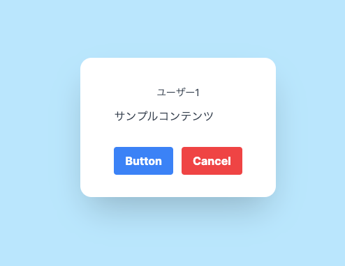
<!-- <Card.Title /> -->
<Card.UserName />
<Card.Content />
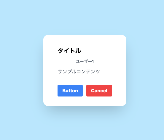
<Card.Title />
<Card.UserName />
<Card.Content />

<Card.UserName />
<Card.Title />
<Card.Content />
まとめ
これにより仮にTitleの表示を非表示にしたい場合、<Card.Title>の領域ごと削除することで表示はされず、またデザイン上、TitleよりもUserNameを上にしたい場面などの想定の場合Component Partの位置を上下にずらすことで簡単にそれらの要望に対応することができるようになります。
デザインやパーツの配置を決めるWrapperのdivによる影響も大きいですがPartsとしての入れ替えや表示・非表示の切り替えが一見で把握できるので上手く使えば使い所は多いと思います。
Discussion