Tailwindでライトセーバーを作ってみた(ネタ)


結論
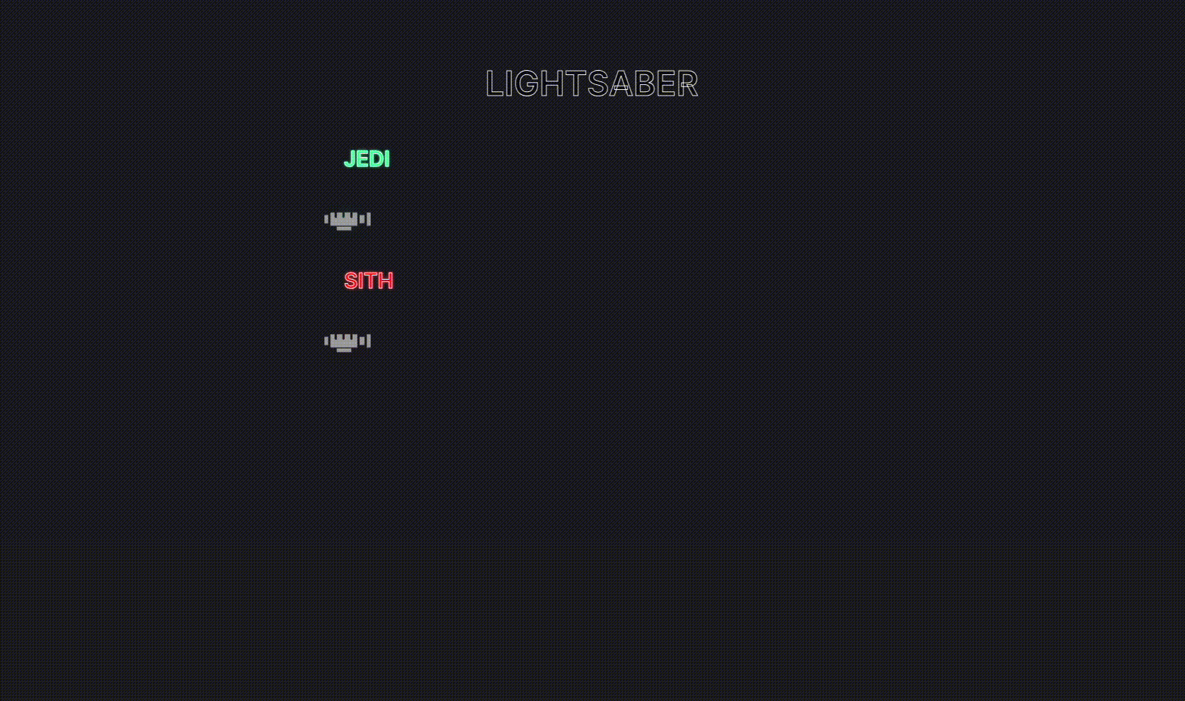
gifなのでもっさりしてますが実際はもう少し伸び縮み早いです
vercelにもあげているので良ければ遊んでください🙇
なぜ作ったか?
現在、自身のポートフォリオを作成している段階でNeonの処理をたくさん入れているので
Neonといえばライトセーバーでしょ!ということでネタとして作りました。
ロゴなどにも拘ろうかなと思いましたが労力が見合わないのでかなりざっくりした作りです
※ただ、それなりっぽく見せる為にライトセーバーの柄の部分の画像は作りました🔥
何をしているのか?
少し前に自分が書いた以下の記事を応用してNeonの処理がいろんな色でできるようにしています。
環境
| 名称 | version |
|---|---|
| Next.js | 14.2.5 |
| Tailwind.css | 3.4.1 |
各ファイルについて
page.tsx
page.tsx(Home)
'use client';

import { LightSaber } from '@/components/Lightsaber';

export default function Home() {
  return (
    <main className="flex min-h-screen flex-col items-center gap-16 p-24">
      <div className="flex flex-col">
        <h1 className="text-outline text-center text-5xl font-semibold uppercase text-black/45">
          Lightsaber
        </h1>
      </div>
      <div className="flex flex-col gap-16">
        <h2 className="text-outline text-3xl font-semibold uppercase text-neon-jedi">
          Jedi
        </h2>
        <LightSaber type="jedi" imageUrl="/assets/Lightsaber.png" />
        <h2 className="text-outline text-3xl font-semibold uppercase text-neon-sith">
          Sith
        </h2>
        <LightSaber type="sith" imageUrl="/assets/Lightsaber.png" />
      </div>
    </main>
  );
}
中身を確認していただければわかると思いますがpage.tsxは簡単にスタイル当ててるだけなので説明は割愛します。
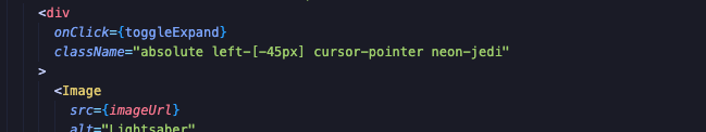
Lightsaber.tsx
Lightsaber.tsx
'use client';

import Image from 'next/image';
import { useEffect, useRef, useState } from 'react';

import { cn } from '@/lib/utils';

type LightSaberProps = {
  type: string;
  imageUrl: string;
};

export const LightSaber = ({ type, imageUrl }: LightSaberProps) => {
  const [expanded, setExpanded] = useState(false);
  const initialRender = useRef(true);

  const neonType = type === 'jedi' ? 'neon-jedi' : 'neon-sith';

  const toggleExpand = () => {
    if (!initialRender.current) {
      setExpanded(!expanded);
    }
  };

  useEffect(() => {
    initialRender.current = false;
  }, []);

  return (
    <div className="relative flex w-[700px] items-center">
      <div
        onClick={toggleExpand}
        className="absolute left-[-45px] cursor-pointer"
      >
        <Image
          src={imageUrl}
          alt="Lightsaber"
          priority
          quality={100}
          className="object-contain"
          width={100}
          height={40}
        />
      </div>
      <div
        className={cn(
          `p-1 rounded-2xl bg-white ${neonType}`,
          !initialRender.current &&
            (expanded ? 'animate-expand' : 'animate-shrink')
        )}
      />
    </div>
  );
};
Lightsaber.tsxもcomponent化しているだけでかなりシンプルです。
後に説明しますが、tailwind.config.tsでのkeyframeの設定でanimate-expandとanimate-shrinkを切り替えて伸び縮みするようになっています。
  <div
    className={cn(
      `p-1 rounded-2xl bg-white ${neonType}`,
      expanded ? `animate-expand` : `animate-shrink`
    )}
  />
tailwind.config.ts
tailwind.config.ts
import type { Config } from 'tailwindcss';

import { customNeonColor, customNeonText } from './lib/customNeonUtilities';

const config = {
  darkMode: ['class'],
  content: [
    './pages/**/*.{ts,tsx}',
    './components/**/*.{ts,tsx}',
    './app/**/*.{ts,tsx}',
    './src/**/*.{ts,tsx}',
  ],
  prefix: '',
  theme: {
    container: {
      center: true,
      padding: '2rem',
      screens: {
        '2xl': '1400px',
      },
    },
    extend: {
      colors: {
        primary: '#1c1c22',
        jedi: {
          DEFAULT: '#00ff99',
          hover: '#00e187',
        },
        sith: {
          DEFAULT: '#F60F0F',
          hover: '#FF3D3D',
        },
      },
      keyframes: {
        'accordion-down': {
          from: { height: '0' },
          to: { height: 'var(--radix-accordion-content-height)' },
        },
        'accordion-up': {
          from: { height: 'var(--radix-accordion-content-height)' },
          to: { height: '0' },
        },
        expand: {
          '0%': { width: '0%' },
          '100%': { width: '100%' },
        },
        shrink: {
          '0%': { width: '100%' },
          '100%': { width: '0%' },
        },
      },
      animation: {
        'accordion-down': 'accordion-down 0.2s ease-out',
        'accordion-up': 'accordion-up 0.2s ease-out',
        expand: 'expand 0.5s ease-in-out forwards',
        shrink: 'shrink 0.5s ease-in-out forwards',
      },
    },
  },
  plugins: [require('tailwindcss-animate'), customNeonColor, customNeonText],
} satisfies Config;

export default config;
extend: {
  colors: {
    primary: '#1c1c22',
    jedi: {
      DEFAULT: '#00ff99',
      hover: '#00e187',
    },
    sith: {
      DEFAULT: '#F60F0F',
      hover: '#FF3D3D',
    },
  },
の部分でジェダイとシスの色を追加しています。これで基本的にはtext-jediなどがcolorとして使えるようになります。
 keyframes: {
  ~略~
    expand: {
      '0%': { width: '0%' },
      '100%': { width: '100%' },
    },
    shrink: {
      '0%': { width: '100%' },
      '100%': { width: '0%' },
    },
  },
  animation: {
    ~略~
    expand: 'expand 0.5s ease-in-out forwards',
    shrink: 'shrink 0.5s ease-in-out forwards',
  },
この部分で伸び縮みするanimation classを設定しています。
import { customNeonColor, customNeonText } from './lib/customNeonUtilities';
~略~
plugins: [require('tailwindcss-animate'), customNeonColor, customNeonText],
pluginsにNeon colorにできるようにする為のCustom Utilityを2つ追加しています。
Custom Utility
customNeonUtilties.ts
import { PluginAPI } from 'tailwindcss/types/config';

export const customNeonColor = (plugins: PluginAPI) => {
  const neonUtilities: Record<string, { boxShadow: string }> = {};
  const { addUtilities, theme } = plugins;
  const colors = theme('colors');
  for (const color in colors) {
    if (typeof colors[color] === 'object') {
      const color1 = colors[color]['hover'] || colors[color]['500'];
      const color2 = colors[color]['DEFAULT'] || colors[color]['700'];
      neonUtilities[`.neon-${color}`] = {
        boxShadow: `0 0 5px ${color1}, 0 0 20px ${color2}`,
      };
    }
  }
  addUtilities(neonUtilities);
};

export const customNeonText = (plugins: PluginAPI) => {
  const neonTextUtilities: Record<
    string,
    { color: string; textShadow: string }
  > = {};
  const { addUtilities, theme } = plugins;
  const colors = theme('colors');

  for (const color in colors) {
    if (typeof colors[color] === 'object') {
      const color1 = colors[color]['500'] || colors[color]['DEFAULT'];
      const color2 = colors[color]['700'] || colors[color]['hover'];
      if (color1 && color2) {
        neonTextUtilities[`.text-neon-${color}`] = {
          color: color1,
          textShadow: `0 0 1px ${color1}, 0 0 1px ${color1}, 0 0 1px ${color1}, 0 0 4px ${color2}, 0 0 1px ${color1}`,
        };
      }
    }
  }
  addUtilities(neonTextUtilities);
};
customNeonColor/customNeonTextと2つ用意していますが作りはほぼ同様です。
今回はcustomNeonColorの方を使って説明します🙇
- まず、新しく設定したいUtilityのobjectを準備します
const neonUtilities: Record<string, { boxShadow: string }> = {};
- 次にpluginsから必要な内容を抜き出します。
const { addUtilities, theme } = plugins;
- themeのcolors(tailwindに内包されているもの)を取り出します。すべての色に対して同一色の2種を設定し、新たに
.neon-${color}という形で設定できるようにして好みのスタイルを(この場合はboxShadow)準備しておいたUtilityのobjectに設定します。
 const colors = theme('colors');
  for (const color in colors) {
    if (typeof colors[color] === 'object') {
      const color1 = colors[color]['hover'] || colors[color]['500'];
      const color2 = colors[color]['DEFAULT'] || colors[color]['700'];
      neonUtilities[`.neon-${color}`] = {
        boxShadow: `0 0 5px ${color1}, 0 0 20px ${color2}`,
      };
    }
  }
- 最後に
addUtilitiesに自身で設定したneonUtilitiesを渡して、pluginとして完成です。
addUtilities(neonTextUtilities);
この設定でneon-red等とすると対応するboxShadowが要素にあたるのでtailwindに設定されているすべての色をNeon化することが可能になります。
※textも同じ要領なので同様にすべての色で使えます。補完もちゃんとでます。

※黄色の波線はerrorではなくtailwindのsort設定により出ているのもです。

選択後はちゃんと綺麗になります🥰

自分で設定したjediもちゃんと補完によりNeon化が可能です
※errorは打っている途中なので怒られているだけです
選択後はこちらもちゃんと綺麗になります🥰
まとめ
本来、業務におけるプロダクトでNeon化することはほぼ無いかと思いますので殆ど役に立たないとおもますが😧w
自分用のポートフォリオをCyberPunkっぽくカッコよくしようという場合などにはおすすめです!
参考
切り替えのところをなんとか動的にしたかったのですが以下で言及して頂いている通り、上手くいかなかったので已む無しという感じで切り替えの処理を書いてます
ライトセーバーの色って色んな意味があるんですね🤔
上記、参考にさせていただきました!!ありがとうございました🙇
Discussion