はじめに
こんにちは。
D2Cのフロントエンドエンジニアをしています、廣瀬です。
今回は以前から個人的に気になっていた、Next.jsを勉強してみたく、手を動かしながらの方が身につくと考えたため、とりあえずTodoリストを作成してみましたので、その内容を記事にしたいと思います。
UIコンポーネントはshadcn/uiを使用したいと思います。
もしよろしければ、ハンズオン形式で当記事をご覧いただければと思います。
Next.jsとは?
Next.jsとはVercel社が開発した、Reactのフルスタックフレームワークです。
Reactでは他ライブラリに頼ったり、設定等が必要だった一部の機能がNext.jsではゼロコンフィグで扱えるようになりました。
環境の準備
実際に以下のような手順でNext.jsの環境を構築していきます。
プロジェクト立ち上げ
$ yarn create next-app
✔ What is your project named? … practice-nextjs14
✔ Would you like to use TypeScript? … Yes
✔ Would you like to use ESLint? … Yes
✔ Would you like to use Tailwind CSS? … Yes
✔ Would you like to use `src/` directory? … No
✔ Would you like to use App Router? (recommended) … Yes
✔ Would you like to customize the default import alias (@/*)? … Yes
✔ What import alias would you like configured? … @/*
必要なモジュールの準備
$ cd practice-nextjs14
$ yarn
$ yarn add shadcn-ui
$ yarn shadcn-ui init
✔ Which style would you like to use? › Default
✔ Which color would you like to use as base color? › Slate
✔ Would you like to use CSS variables for colors? … yes
shadcn/uiについてはこちらでも取り扱っていますので、もしよろしければご参考にしてみてください。
開発
それでは、上の手順で環境は構築できましたので、
早速、開発に入っていきましょう!
下準備
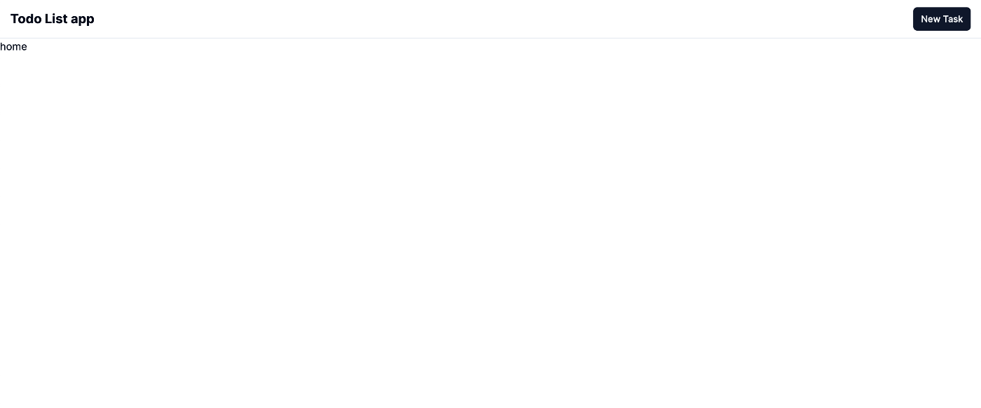
不要なデフォルトの記述を削除しましょう。↓
export default function Home() {
    return <>home</>;
}
結果

UIの実装
Todoリストを作成するに伴い、まずはUIの実装から行っていきたいと思います。
ヘッダーの実装
こちらのセクションでは、ヘッダー部分を実装していきたいと思います。
まず、shadcn/uiの必要なUIコンポーネントをインストールします。
$ yarn shadcn-ui button
それでは、ヘッダーコンポーネントを作成していきましょう。
$ mkdir components/layouts/Header && touch components/layouts/Header/index.tsx
import { Button } from "@/components/ui/button";
import Link from "next/link";

export const Header = () => {
    return (
        <header className="flex fixed w-[100vw] items-center h-[60px] px-4 border-b bg-white">
            <div className="flex-1 min-w-0">
                <h1 className="font-bold text-xl">
                    <Link href="/">Todo List app</Link>
                </h1>
            </div>
            <Button size="sm">New Task</Button>
        </header>

    );
};
結果
新規作成部分の実装
こちらのセクションでは、Todoの新規作成画面を実装していきたいと思います。
まず、shadcn/uiの必要なコンポーネントをインストールします。
$ yarn shadcn-ui add card input label textarea
それでは、新規作成画面を作成していきましょう。
$ mkdir app/create/ && touch app/create/page.tsx
import { Button } from "@/components/ui/button";
import {
    Card,
    CardContent,
    CardDescription,
    CardFooter,
    CardHeader,
    CardTitle,
} from "@/components/ui/card";
import { Input } from "@/components/ui/input";
import { Label } from "@/components/ui/label";
import { Textarea } from "@/components/ui/textarea";

import Link from "next/link";

export default function CreateTodo() {
    return (
        <main className="flex justify-center min-h-[700px] items-center">
            <Card className="w-[700px]">
                <CardHeader>
                    <CardTitle>Create Todo</CardTitle>
                    <CardDescription>Create your new Todo in one-click.</CardDescription>
                </CardHeader>
                <CardContent>
                    <form>
                        <div className="grid w-full items-center gap-4">
                            <div className="flex flex-col space-y-1.5">
                                <Label htmlFor="title">Title</Label>
                                <Input id="title" placeholder="Title of your Todo" />
                            </div>
                            <div className="flex flex-col space-y-1.5">
                                <Label htmlFor="description">Description</Label>
                                <Textarea placeholder="Description of your Todo" />
                            </div>
                        </div>
                    </form>
                </CardContent>
                <CardFooter className="flex justify-between">
                    <Button variant="outline">
                        <Link href="/">Cancel</Link>
                    </Button>
                    <Button>Create</Button>
                </CardFooter>
            </Card>
        </main>
    );
}
これに伴い、Headerコンポーネントの「New Task」ボタンにリンクを付与します。
import { Button } from "@/components/ui/button";
import Link from "next/link";

export const Header = () => {
    return (
        <header className="flex fixed w-[100vw] items-center h-[60px] px-4 border-b">
            <div className="flex-1 min-w-0">
                <h1 className="font-bold text-xl">
                    <Link href="/">Todo List app</Link>
                </h1>
            </div>
            <Button size="sm">
                {/* ↓追加 */}
                <Link href="create/">New Task</Link>
            </Button>
        </header>
    );
};
結果
Next.jsではApp Routerという機能があるため、page.tsxというファイルが所属しているディレクトリ名がそのままURLとして反映される仕様となっています。
なので、今回作成した新規作成画面は http://localhost:3000/create にアクセスすると閲覧することができます。

コンテンツリスト部分の実装
こちらのセクションでは、Todoリストを表示する部分を実装していきたいと思います。
まず、shadcn/uiの必要なUIコンポーネントをインストールします。
$ yarn shadcn-ui add checkbox
また、以下サイトを利用し、削除ボタン用のアイコンファイルを作成します。
$ mkdir components/ui/icons && touch components/ui/icons/TrashIcon.tsx
import { SVGProps } from "react";

export function TrashIcon(props: SVGProps<SVGSVGElement>) {
    return (
        <svg
            xmlns="http://www.w3.org/2000/svg"
            width="1em"
            height="1em"
            viewBox="0 0 24 24"
            {...props}
        >
            <path
                fill="currentColor"
                d="M7.615 20q-.69 0-1.152-.462Q6 19.075 6 18.385V6H5V5h4v-.77h6V5h4v1h-1v12.385q0 .69-.462 1.152q-.463.463-1.153.463zm2.193-3h1V8h-1zm3.384 0h1V8h-1z"
            ></path>
        </svg>
    );
}
また、Todoリストのそれぞれのコンテンツ部分のコンポーネントも準備しておきましょう。
$ mkdir components/layouts/Todo && touch components/layouts/Todo/index.tsx
"use client";

import { FC, useState } from "react";

import { Button } from "@/components/ui/button";
import { Checkbox } from "@/components/ui/checkbox";

import { TrashIcon } from "@/components/ui/icons/TrashIcon";

type Props = {
    title: string;
    description: string;
};

export const Todo: FC<Props> = ({ title, description }) => {
    const [isDone, setIsDone] = useState<boolean>(false);

    const handleDone = () => {
        setIsDone(!isDone);
    };

    return (
        <div className="flex items-center gap-4 p-4">
            <Checkbox className="mx-auto" id="task1" onCheckedChange={handleDone} />
            <div className={`flex-1 min-w-0 ${isDone && "line-through"}`}>
                <h3 className="font-medium leading-none">{title}</h3>
                <p className="text-sm text-gray-500 dark:text-gray-400">{description}</p>
            </div>
            <Button className="rounded-full w-8 h-8" size="icon" variant="destructive">
                <TrashIcon className="w-4 h-4" />
            </Button>
        </div>
    );
};
ここでは1行目でuse clientの記述があると思います。
この記述があるコンポーネントはクライアントサイドコンポーネントとして取り扱われます。
Next.jsではこのような記述がないコンポーネントはデフォルトでサーバーサイドコンポーネントとして取り扱われますので、注意が必要です。
hooks等はクライアントサイドコンポーネントでしか使用できないため、今回はこのように記載しています。
それでは、Todoリスト部分を実装していきます。
import { Todo } from "@/components/layouts/Todo";

export default function Home() {
    return (
        <main className="flex-1 pt-[60px] grid max-w-[700px] min-h-[calc(100vh_-_1rem)] divide-y p-4 text-sm lg:min-h-[calc(100vh_-_1.5rem)]">
            <div className="flex-1 overflow-auto py-4 lg:py-6">
                <Todo title={"buy eggs"} description={"Need to get eggs, milk, and bread"} />
            </div>
        </main>
    );
}
結果

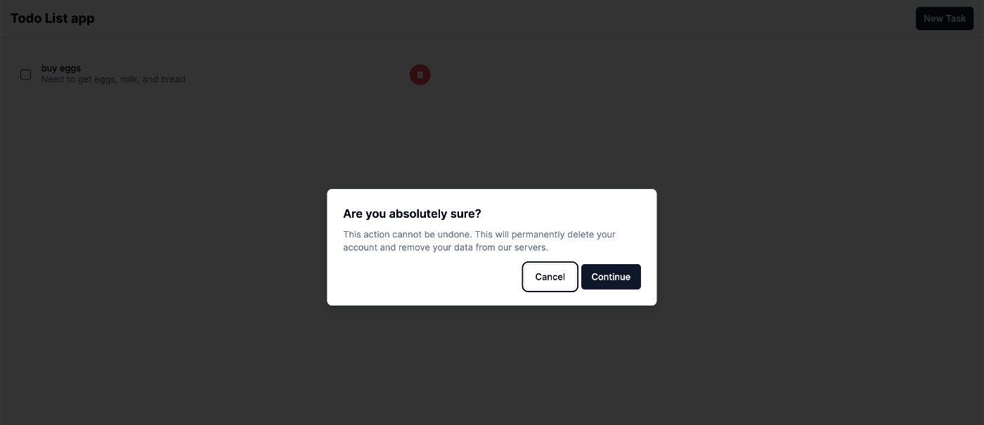
削除確認ダイアログの実装
このセクションでは、Todoコンテンツの削除確認ダイアログを実装していきたいと思います。
まず、shadcn/uiの必要なUIコンポーネントをインストールします。
$ yarn shadcn-ui add alert-dialog
それでは、削除確認ダイアログを作成していきます。
$ mkdir components/layouts/ConfirmDialog && touch components/layouts/ConfirmDialog/index.tsx
import {
    AlertDialogAction,
    AlertDialogCancel,
    AlertDialogContent,
    AlertDialogDescription,
    AlertDialogFooter,
    AlertDialogHeader,
    AlertDialogTitle,
} from "@/components/ui/alert-dialog";

export const ConfirmDialog = () => {
    return (
        <AlertDialogContent>
            <AlertDialogHeader>
                <AlertDialogTitle>Are you absolutely sure?</AlertDialogTitle>
                <AlertDialogDescription>
                    This action cannot be undone. This will permanently delete your account and
                    remove your data from our servers.
                </AlertDialogDescription>
            </AlertDialogHeader>
            <AlertDialogFooter>
                <AlertDialogCancel>Cancel</AlertDialogCancel>
                <AlertDialogAction>Continue</AlertDialogAction>
            </AlertDialogFooter>
        </AlertDialogContent>
    );
}
これに伴い、layouts/Todo/index.tsxとapp/page.tsxを以下のように変更します。
"use client";

import { AlertDialogTrigger } from "@/components/ui/alert-dialog";

import { FC, useState } from "react";

import { Button } from "@/components/ui/button";
import { Checkbox } from "@/components/ui/checkbox";

import { TrashIcon } from "@/components/ui/icons/TrashIcon";
// ↓追記
import { ConfirmDialog } from "@/components/layouts/ConfirmDialog";

type Props = {
    title: string;
    description: string;
};

export const Todo: FC<Props> = ({ title, description }) => {
    const [isDone, setIsDone] = useState<boolean>(false);

    const handleDone = () => {
        setIsDone(!isDone);
    };

    return (
        <div className="flex items-center gap-4 p-4">
            <Checkbox className="mx-auto" id="task1" onCheckedChange={handleDone} />
            <div className={`flex-1 min-w-0 ${isDone && "line-through"}`}>
                <h3 className="font-medium leading-none">{title}</h3>
                <p className="text-sm text-gray-500 dark:text-gray-400">{description}</p>
            </div>
            {/* ↓追記 */}
            <AlertDialogTrigger asChild>
                <Button className="rounded-full w-8 h-8" size="icon" variant="destructive">
                    <TrashIcon className="w-4 h-4" />
                </Button>
            </AlertDialogTrigger>
            <ConfirmDialog />
        </div>
    );
};
import { Todo } from "@/components/layouts/Todo";
// ↓追記
import { AlertDialog } from "@/components/ui/alert-dialog";

export default function Home() {
    return (
        <main className="flex-1 pt-[60px] grid max-w-[700px] min-h-[calc(100vh_-_1rem)] divide-y p-4 text-sm lg:min-h-[calc(100vh_-_1.5rem)]">
            {/* ↓追記 */}
            <AlertDialog>
                <div className="flex-1 overflow-auto py-4 lg:py-6">
                    <Todo title={"buy eggs"} description={"Need to get eggs, milk, and bread"} />
                </div>
            </AlertDialog>
        </main>
    );
}
結果
削除ボタンを押下すると以下のようなダイアログが表示されると思います。
バック側の実装
今回はsupabaseとprismaを使用していきたいと思います。
また、今回はこちらの設定方法は割愛しますが、データ構造は以下のようにしました。
...

model Post {
    id Int @id @default(autoincrement())
    title String
    description String
    createdAt DateTime @default(now())
}
supabaseのポリシーはSELECT・INSERT・DELETEを追加しました。
また、prisma clientですが、以下のように設定しました。
$ touch lib/prismaClient.ts
ちなみに、こちらの内容は公式ページのコードをコピペしたものになります。
import { PrismaClient } from "@prisma/client";

const prismaClientSingleton = () => {
    return new PrismaClient();
};

declare global {
    var prisma: undefined | ReturnType<typeof prismaClientSingleton>;
}

const prisma = globalThis.prisma ?? prismaClientSingleton();

export default prisma;

if (process.env.NODE_ENV !== "production") globalThis.prisma = prisma;
Todoリスト一覧機能(SELECT)
次にsupabaseに事前に登録しておいたTodoデータをフェッチして、ブラウザに表示させていきたいと思います。
以下のファイルを編集します。
$ mkdir app/types && touch app/types/todo.ts
export interface TodoType {
    id: number;
    title: string;
    description: string;
    createdAt: Date;
}
以下のように、api/post/配下にroute.tsを作成することで、APIを/api/postというエンドポイントでリクエストすることができるようになります。
また、このroute.tsというファイル名はNext.js側で決められている名前なので、注意が必要です。
$ mkdir app/api/post && app/api/post/route.ts
import prisma from "../../../lib/prismaClient";
import { NextResponse } from "next/server";

export async function GET(req: Request) {
    const todoPosts = await prisma.post.findMany();
    return NextResponse.json(todoPosts);
}
"use client";

import { AlertDialogTrigger } from "@/components/ui/alert-dialog";

import { FC, useState } from "react";

import { Button } from "@/components/ui/button";
import { Checkbox } from "@/components/ui/checkbox";

import { TrashIcon } from "@/components/ui/icons/TrashIcon";
import { ConfirmDialog } from "@/components/layouts/ConfirmDialog";
// ↓追記
import { TodoType } from "@/app/types/todo.ts";

// 「Props」を削除
//                   ↓追記
export const Todo: FC<TodoType> = ({ title, description }) => {
    const [isDone, setIsDone] = useState<boolean>(false);

    const handleDone = () => {
        setIsDone(!isDone);
    };

    return (
        <div className="flex items-center gap-4 p-4">
            <Checkbox className="mx-auto" id="task1" onCheckedChange={handleDone} />
            <div className={`flex-1 min-w-0 ${isDone && "line-through"}`}>
                <h3 className="font-medium leading-none">{title}</h3>
                <p className="text-sm text-gray-500 dark:text-gray-400">{description}</p>
            </div>
            <AlertDialogTrigger asChild>
                <Button className="rounded-full w-8 h-8" size="icon" variant="destructive">
                    <TrashIcon className="w-4 h-4" />
                </Button>
            </AlertDialogTrigger>
            <ConfirmDialog />
        </div>
    );
};
import { AlertDialog } from "@/components/ui/alert-dialog";

import { Todo } from "@/components/layouts/Todo";
import { TodoType } from "@/app/types/todo";

async function getTodos() {
    const response = await fetch("http://localhost:3000/api/post", {
        cache: "no-store",
    });

    const todos: TodoType[] = await response.json();
    return todos;
}

export default async function Home() {
    const todos = await getTodos();
    return (
        <main className="flex-1 pt-[60px] grid max-w-[700px] min-h-[calc(100vh_-_1rem)] divide-y p-4 text-sm lg:min-h-[calc(100vh_-_1.5rem)]">
            <div className="flex-1 overflow-auto py-4 lg:py-6">
                {todos.map((todo: TodoType) => {
                    return (
                        <AlertDialog key={todo.id}>
                            <Todo title={todo.title} description={todo.description} />
                        </AlertDialog>
                    );
                })}
            </div>
        </main>
    );
}
app/page.tsxでAPIにリクエストしている部分で、cache: "no-store"とあリますが、こちらはSSRに利用されるオプションです。
結果

新規作成機能(INSERT)
次にTodoデータをフォームから入力して新規作成ができるよう、実装していきます。
まず、shadcn/uiの必要なUIコンポーネントをインストールします。
$ yarn shadcn-ui add form
import prisma from "../../../lib/prismaClient";
import { NextResponse } from "next/server";

export async function GET(req: Request) {
    const todoPosts = await prisma.post.findMany();
    return NextResponse.json(todoPosts);
}

// ↓追記
export async function POST(req: Request) {
    const { title, description } = await req.json();
    const post = await prisma.post.create({
        data: {
            title,
            description,
        },
    });
    return NextResponse.json(post);
}
"use client";

import { Button } from "@/components/ui/button";
import {
    Card,
    CardContent,
    CardDescription,
    CardFooter,
    CardHeader,
    CardTitle,
} from "@/components/ui/card";
import { Input } from "@/components/ui/input";
import { Textarea } from "@/components/ui/textarea";
import {
    Form,
    FormField,
    FormLabel,
    FormControl,
    FormDescription,
    FormMessage,
    FormItem,
} from "@/components/ui/form";

import Link from "next/link";
import { useRouter } from "next/navigation";

import * as z from "zod";
import { zodResolver } from "@hookform/resolvers/zod";
import { useForm } from "react-hook-form";

const formSchema = z.object({
    title: z.string().min(1, { message: "Title is a required field." }),
    description: z.string().min(1, { message: "Description is a required field." }),
});

export default function CreateTodo() {
    const router = useRouter();
    const form = useForm({
        resolver: zodResolver(formSchema),
        defaultValues: {
            title: "",
            description: "",
        },
    });

    const onSubmit = async (value: z.infer<typeof formSchema>) => {
        const { title, description } = value;
        try {
            await fetch("http://localhost:3000/api/post", {
                method: "POST",
                headers: {
                    "Content-Type": "application/json",
                },
                body: JSON.stringify({ title, description }),
            });
            router.push("/");
            router.refresh();
        } catch (err) {
            console.log(err);
        }
    };

    return (
        <main className="flex justify-center min-h-[700px] items-center">
            <Form {...form}>
                <form onSubmit={form.handleSubmit(onSubmit)} className="space-y-8">
                    <Card className="w-[700px]">
                        <CardHeader>
                            <CardTitle>Create Todo</CardTitle>
                            <CardDescription>Create your new Todo in one-click.</CardDescription>
                        </CardHeader>
                        <CardContent className="flex flex-col gap-10">
                            <FormField
                                control={form.control}
                                name="title"
                                render={({ field }) => (
                                    <FormItem>
                                        <FormLabel>Title</FormLabel>
                                        <FormControl>
                                            <Input placeholder="workout" {...field} />
                                        </FormControl>
                                        <FormMessage />
                                        <FormDescription>This is your Todo title.</FormDescription>
                                    </FormItem>
                                )}
                            />
                            <FormField
                                control={form.control}
                                name="description"
                                render={({ field }) => (
                                    <FormItem>
                                        <FormLabel>Description</FormLabel>
                                        <FormControl>
                                            <Textarea
                                                placeholder="1 hour workout at 4:00 p.m."
                                                {...field}
                                            />
                                        </FormControl>
                                        <FormMessage />
                                        <FormDescription>
                                            This is your Todo description.
                                        </FormDescription>
                                    </FormItem>
                                )}
                            />
                        </CardContent>
                        <CardFooter className="flex justify-between">
                            <Button variant="outline">
                                <Link href="/">Cancel</Link>
                            </Button>
                            <Button type="submit">Create</Button>
                        </CardFooter>
                    </Card>
                </form>
            </Form>
        </main>
    );
}
結果
↓URL: /create
「Create」ボタンを押下すると、、
↓URL: /
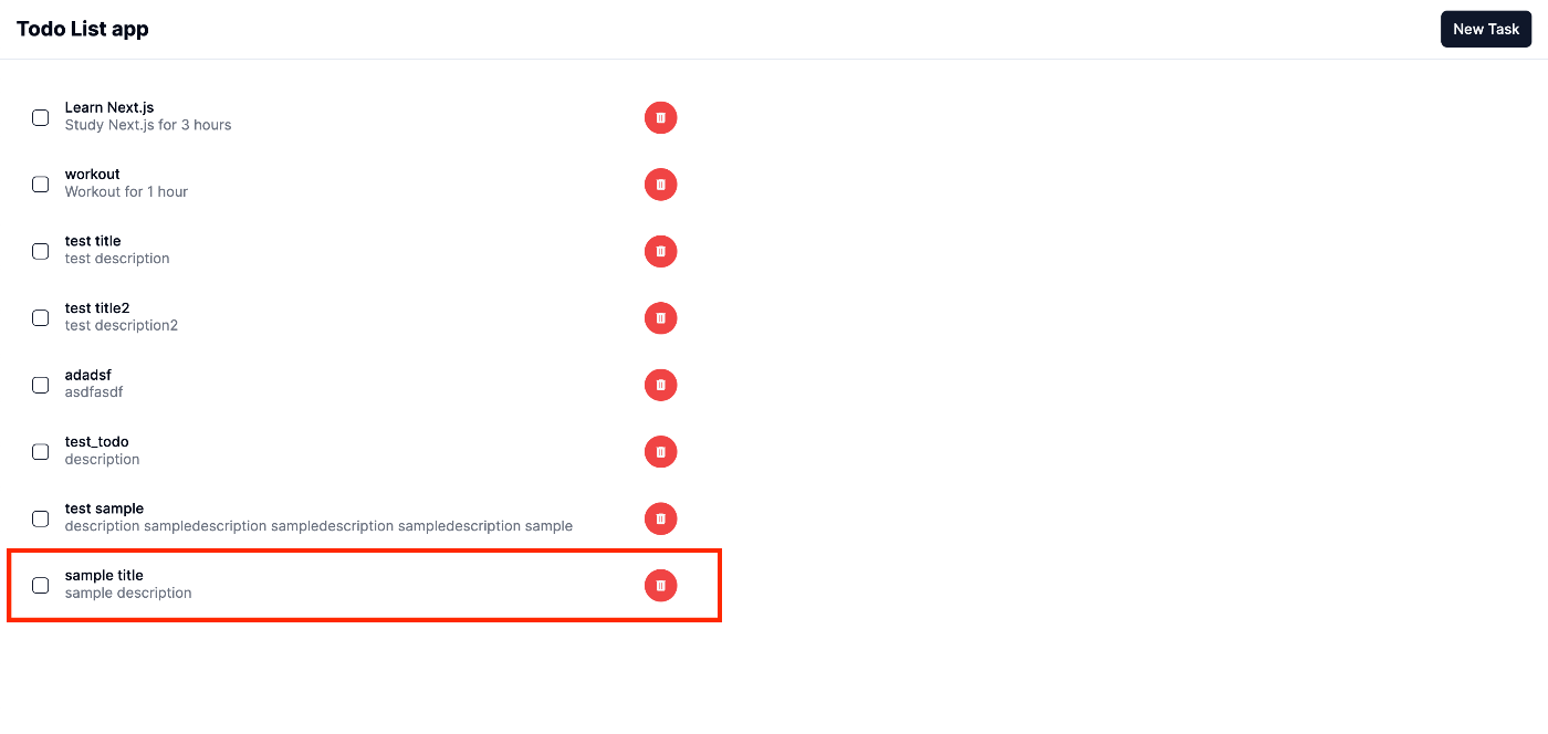
結果が反映されているのを確認できました。
削除機能(DELETE)
こちらのセクションでは作成したTodoを削除する機能を実装していきたいと思います。
以下のようにファイルを編集します。
import prisma from "../../../lib/prismaClient";
import { NextResponse } from "next/server";

...

// ↓追記
export async function DELETE(req: Request) {
    const { id } = await req.json();
    const deleteItem = await prisma.post.delete({
        where: {
            id: id,
        },
    });
    return NextResponse.json(deleteItem);
}
import { AlertDialog } from "@/components/ui/alert-dialog";

import { Todo } from "@/components/layouts/Todo";
import { TodoType } from "@/app/types/todo";

async function getTodos() {
    const response = await fetch("http://localhost:3000/api/post", {
        cache: "no-store",
    });

    const todos: TodoType[] = await response.json();
    return todos;
}

export default async function Home() {
    const todos = await getTodos();

    return (
        <main className="flex-1 pt-[60px] grid max-w-[700px] min-h-[calc(100vh_-_1rem)] divide-y p-4 text-sm lg:min-h-[calc(100vh_-_1.5rem)]">
            <div className="flex-1 overflow-auto py-4 lg:py-6">
                {todos.map((todo: TodoType) => {
                    return (
                        <AlertDialog key={todo.id}>
                            // ↓ 「id」を追加
                            <Todo id={todo.id} title={todo.title} description={todo.description} />
                        </AlertDialog>
                    );
                })}
            </div>
        </main>
    );
}
...
// ↓追記
import { FC } from "react";
//↓追記
type Props = {
    handleDelete: () => void;
};

export const ConfirmDialog: FC<Props> = ({ handleDelete }) => {
    return (
        <AlertDialogContent>
            <AlertDialogHeader>
                <AlertDialogTitle>Are you absolutely sure?</AlertDialogTitle>
                <AlertDialogDescription>
                    This action cannot be undone. This will permanently delete your Todo and remove
                    your data from our servers.
                </AlertDialogDescription>
            </AlertDialogHeader>
            <AlertDialogFooter>
                <AlertDialogCancel>Cancel</AlertDialogCancel>
                // ↓追記
                <AlertDialogAction onClick={handleDelete}>Continue</AlertDialogAction>
            </AlertDialogFooter>
        </AlertDialogContent>
    );
};
"use client";

import { AlertDialogTrigger } from "@/components/ui/alert-dialog";

import { FC, useState } from "react";

import { Button } from "@/components/ui/button";
import { Checkbox } from "@/components/ui/checkbox";

import { TrashIcon } from "@/components/ui/icons/TrashIcon";
import { ConfirmDialog } from "@/components/layouts/ConfirmDialog";
import { TodoType } from "@/app/types/todo.ts";
// ↓追記
import { useRouter } from "next/navigation";

export const Todo: FC<TodoType> = ({ id, title, description }) => {
    const [isDone, setIsDone] = useState<boolean>(false);
    // ↓追記
    const router = useRouter();

    const handleDone = () => {
        setIsDone(!isDone);
    };

    // ↓追記
    const handleDelete = async () => {
        try {
            await fetch("http://localhost:3000/api/post", {
                method: "DELETE",
                headers: {
                    "Content-Type": "application/json",
                },
                body: JSON.stringify({ id }),
            });
            router.refresh();
        } catch (err) {
            console.log(err);
        }
    };

    return (
        <form className="flex items-center gap-4 p-4">
            <Checkbox className="mx-auto" id={`task${id}`} onCheckedChange={handleDone} />
            <div className={`flex-1 min-w-0 ${isDone && "line-through"}`}>
                <h3 className="font-medium leading-none">{title}</h3>
                <p className="text-sm text-gray-500 dark:text-gray-400">{description}</p>
            </div>
            <AlertDialogTrigger asChild>
                <Button className="rounded-full w-8 h-8" size="icon" variant="destructive">
                    <TrashIcon className="w-4 h-4" />
                </Button>
            </AlertDialogTrigger>
            // ↓追記
            <ConfirmDialog handleDelete={handleDelete} />
        </form>
    );
};
結果
今回は「sample3」を削除したいと思います。
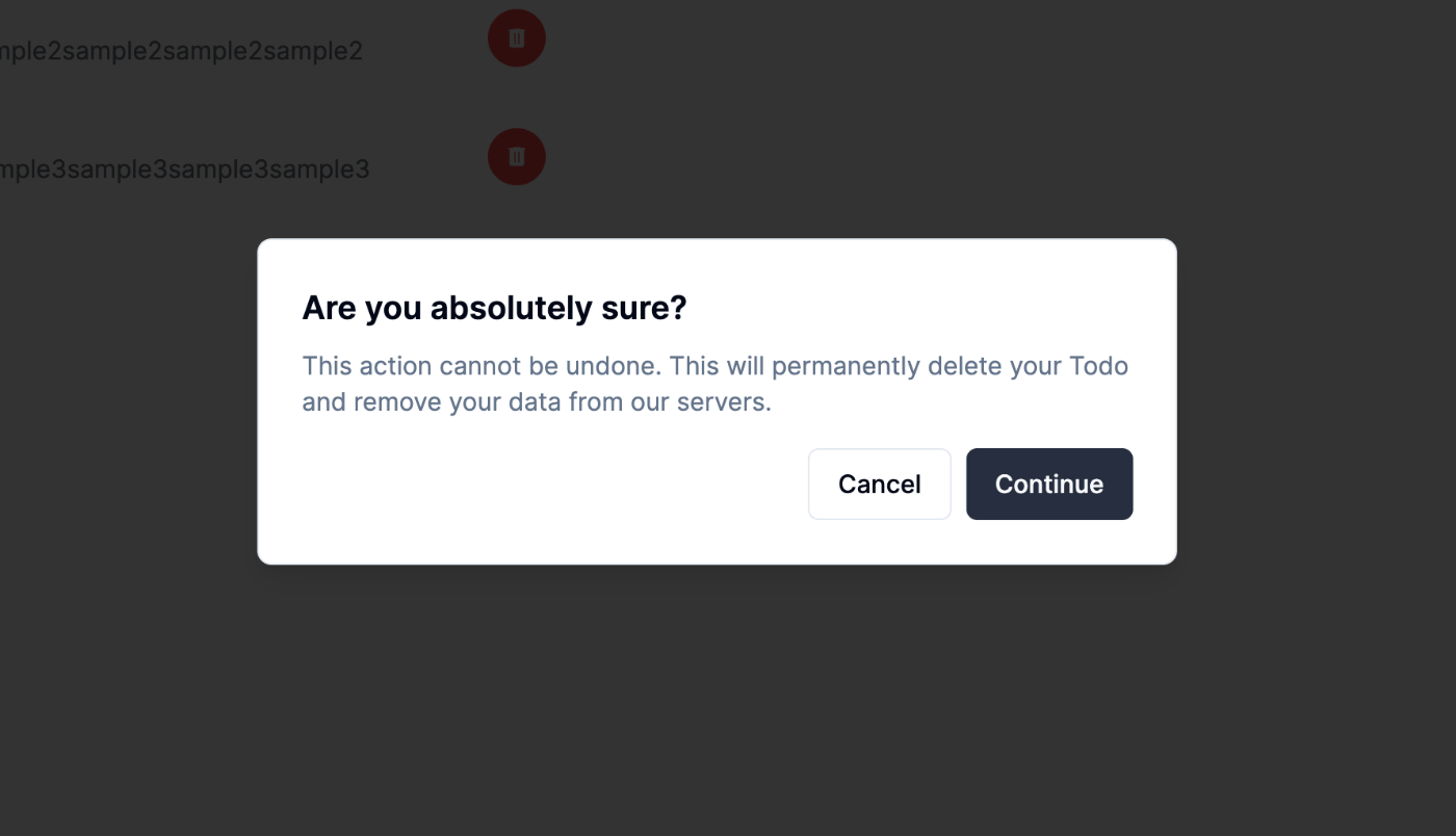

削除されていることが確認できました。
最終的なディレクトリ構造
app/
├── api
│   └── post
│       └── route.ts
├── create
│   └── page.tsx
├── favicon.ico
├── globals.css
├── layout.tsx
├── page.tsx
└── types
    └── todo.ts
lib/
├── prismaClient.ts
└── utils.ts
prisma/
├── migrations
│   ├── 20240303135616_init
│   │   └── migration.sql
│   └── migration_lock.toml
└── schema.prisma
components/
├── layouts
│   ├── ConfirmDialog
│   │   └── index.tsx
│   ├── Header
│   │   └── index.tsx
│   └── Todo
│       └── index.tsx
└── ui
    ├── alert-dialog.tsx
    ├── button.tsx
    ├── card.tsx
    ├── checkbox.tsx
    ├── form.tsx
    ├── icons
    │   └── TrashIcon.tsx
    ├── input.tsx
    ├── label.tsx
    └── textarea.tsx
感想
普段Reactを使っている身からすると、比較的難易度は低いのかなと執筆前は考えていたのですが、
コンポーネントがサーバー側とクライアント側で分かれていることから、思った以上に慣れるのに時間がかかりそうだと思いました。
終わり
いかがでしたでしょうか。
今回はTodoリストという定番のアプリを作成しましたが、これではまだまだNext.jsのポテンシャルは活かせていないのかなと思ったりもしたので、これから個人的に深ぼっていきたいと思います。
また、このようなフロントエンド系の技術を学ぶには、今回登場したsupabaseやprismaを利用すると効率よく学べると思いましたのでうまく活用していきたいと思いました。
この記事が誰かの学びの糧になれば幸いです。
最後までお読みいただきありがとうございました。
参考

株式会社D2C d2c.co.jp のテックブログです。 D2Cは、NTTドコモと電通などの共同出資により設立されたデジタルマーケティング企業です。 ドコモの膨大なデータを活用した最適化を行える広告配信システムの開発をしています。
Discussion