


PandaCSSが使いやすいと感じたので、いくつかボタンのバリアントを作って行きたいと思います。
PandaCSSをはじめて触った時の記事
作るボタン
バリアントとdisabledと色を指定できるようにします。
また、cssのオーバライドをできるようにしておきます。
以下のようなバリエーションを作ることにしました。


実装してみる
src/components/parts/Button/Button.tsx
import { cva } from "@s/css";
import React from "react";

const buttonStyle = cva({
  base: {
    rounded: "4px",
    h: "36px",
    p: "0px 18px",
    fontSize: "14px",
    _focusVisible: {
      outline: "solid 2px",
      outlineColor: "colorPalette.500",
      outlineOffset: "2px",
    },
  },
  variants: {
    variant: {
      filled: {
        bg: "colorPalette.500",
        color: "#fff",
        _hover: {
          bg: "colorPalette.600",
        },
      },
      outline: {
        border: "solid 1px",
        borderColor: "colorPalette.500",
        color: "colorPalette.500",
        _hover: {
          bg: "colorPalette.50",
        },
      },
      light: {
        bg: "colorPalette.50",
        color: "colorPalette.500",
        _hover: {
          bg: "colorPalette.100",
        },
      },
    },
    disabled: {
      true: {
        color: "gray.500",
        bg: "gray.200",
      },
      false: {
        _active: {
          transform: "translateY(1px)",
        },
      },
    },
    color: {
      blue: { colorPalette: "blue" },
      violet: { colorPalette: "violet" },
    },
  },
  compoundVariants: [
    {
      disabled: true,
      css: {
        _hover: {
          color: "gray.500",
          bg: "gray.200",
        },
      },
    },
  ],
  defaultVariants: {
    variant: "filled",
    disabled: false,
    color: "blue",
  },
});

export type ButtonProps = React.ComponentPropsWithRef<"button"> & {
  variant: "filled" | "outline" | "light";
  color: "blue" | "violet";
};

export default function Button({ children, variant, color, ...props }: ButtonProps) {
  return (
    <button
      {...props}
      className={
        buttonStyle({ variant, disabled: props.disabled, color }) + (props.className || "")
      }
    >
      {children}
    </button>
  );
}
Storiesを作成する
tsx
import { action } from "@storybook/addon-actions";
import type { Meta, StoryObj } from "@storybook/react";

import Button from ".";

const meta: Meta<typeof Button> = {
  title: "Button",
  component: Button,
  argTypes: {
    children: {
      control: {
        type: "text",
      },
    },
    onClick: {
      action: "clicked",
    },
    variant: {
      description: "ボタンの種類",
      options: ["filled", "outline", "light"],
      control: { type: "select" },
    },
    color: {
      description: "ボタンの色",
      options: ["blue", "violet"],
      control: { type: "select" },
    },
    disabled: {
      control: {
        type: "boolean",
      },
    },
  },
  args: {
    children: "Button",
    onClick: action("clicked"),
  },
};

export default meta;

export const Default: StoryObj<typeof Button> = {};

export const Disabled: StoryObj<typeof Button> = {
  args: {
    disabled: true,
  },
};

export const Outline: StoryObj<typeof Button> = {
  args: {
    variant: "outline",
  },
};

export const Light: StoryObj<typeof Button> = {
  args: {
    variant: "light",
  },
};

export const Violet: StoryObj<typeof Button> = {
  args: {
    color: "violet",
  },
};
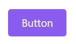
実装出来ました😊
感想
レシピという機能を使うことで、複数のバリアントの設定を簡単に行うことが出来ました✨
今後も他のコンポーネントの実装をしていきたいと思います。🙌

「ワークスタイルの未来を切り拓く」を理念に掲げ、リアルとデジタルの2つの働く場に向けた事業展開に留まらず、自社が率先して新しいワークスタイルに挑戦し、発信を行うことでワークスタイルの未来を切り拓いていきます。
Discussion