🦁
[Flutter]コピペで使える!ボタンのデザイン16種類をまとめました
Flutter開発する中で、「この形のボタンどうやって書いたっけ?」と調べ直すことが何度かありましたので、ここにまとめておきます。
特に、ボタンウィジェットのshapeで定義できるのは、RoundedRectangleBorderやStadiumBorder、BeveledRectangleBorderなどなど色々ありますが、少し覚えにくいんですよね...
修正点等ありましたら、ご指摘お願いします。
[2020年10月24日追記]
Flutter1.22より、ElevatedButtonやTextButton、OutlinedButtonなどのボタンWidgetが追加されたため、そちらも追記しておきます。
いろんなボタンまとめ
1. 色付きボタン

RaisedButton(
  child: const Text('Button'),
  color: Colors.orange,
  textColor: Colors.white,
  onPressed: () {},
),
// Flutter1.22以降のみ
ElevatedButton(
  child: const Text('Button'),
  style: ElevatedButton.styleFrom(
    primary: Colors.orange,
    onPrimary: Colors.white,
  ),
  onPressed: () {},
),
2. 角丸ボタン

RaisedButton(
  child: const Text('Button'),
  color: Colors.blue,
  shape: RoundedRectangleBorder(
    borderRadius: BorderRadius.circular(10),
  ),
  onPressed: () {},
),
// Flutter1.22以降のみ
ElevatedButton(
  child: const Text('Button'),
  style: ElevatedButton.styleFrom(
    primary: Colors.blue,
    onPrimary: Colors.black,
    shape: RoundedRectangleBorder(
      borderRadius: BorderRadius.circular(10),
    ),
  ),
  onPressed: () {},
),
3. 横丸ボタン

RaisedButton(
  child: const Text('Button'),
  color: Colors.red,
  shape: const StadiumBorder(),
  onPressed: () {},
),
// Flutter1.22以降のみ
ElevatedButton(
  child: const Text('Button'),
  style: ElevatedButton.styleFrom(
    primary: Colors.red,
    onPrimary: Colors.black,
    shape: const StadiumBorder(),
  ),
  onPressed: () {},
),
4. 斜角(?)ボタン

RaisedButton(
  child: const Text('Button'),
  color: Colors.yellow,
  shape: BeveledRectangleBorder(
    borderRadius: BorderRadius.circular(10),
  ),
  onPressed: () {},
),
// Flutter1.22以降のみ
ElevatedButton(
  child: const Text('Button'),
  style: ElevatedButton.styleFrom(
    primary: Colors.yellow,
    onPrimary: Colors.black,
    shape: BeveledRectangleBorder(
      borderRadius: BorderRadius.circular(10),
    ),
  ),
  onPressed: () {},
),
5. 下ライン
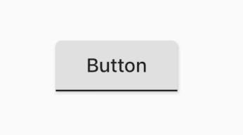
RaisedButton(
  child: const Text('Button'),
  shape: const UnderlineInputBorder(),
  onPressed: () {},
),
6. 角丸 + 外枠線
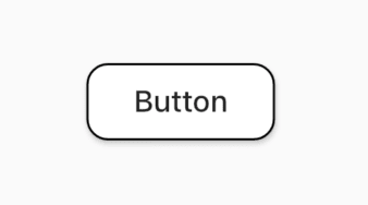
RaisedButton(
  child: const Text('Button'),
  color: Colors.white,
  shape: const OutlineInputBorder(
    borderRadius: BorderRadius.all(Radius.circular(10)),
  ),
  onPressed: () {},
),
// Flutter1.22以降のみ
OutlinedButton(
  child: const Text('Button'),
  style: OutlinedButton.styleFrom(
    primary: Colors.black,
    shape: RoundedRectangleBorder(
      borderRadius: BorderRadius.circular(10),
    ),
    side: const BorderSide(),
  ),
  onPressed: () {},
),
7. 横丸 + 外枠線

RaisedButton(
  child: const Text('Button'),
  color: Colors.white,
  shape: const StadiumBorder(
    side: BorderSide(color: Colors.green),
  ),
  onPressed: () {},
),
// Flutter1.22以降のみ
OutlinedButton(
  child: const Text('Button'),
  style: OutlinedButton.styleFrom(
    primary: Colors.black,
    shape: const StadiumBorder(),
    side: const BorderSide(color: Colors.green),
  ),
  onPressed: () {},
),
8. 外枠線カスタマイズ

RaisedButton(
  child: Text("Button"),
  color: Colors.white,
  shape: Border(
    top: BorderSide(color: Colors.red),
    left: BorderSide(color: Colors.blue),
    right: BorderSide(color: Colors.yellow),
    bottom: BorderSide(color: Colors.green),
  ),
  onPressed: () {},
),
9. 丸型ボタン

RaisedButton(
  child: const Text('Btn'),
  color: Colors.white,
  shape: const CircleBorder(
    side: BorderSide(
      color: Colors.black,
      width: 1,
      style: BorderStyle.solid,
    ),
  ),
  onPressed: () {},
),
// Flutter1.22以降のみ
ElevatedButton(
  child: const Text('Btn'),
  style: ElevatedButton.styleFrom(
    primary: Colors.white,
    onPrimary: Colors.black,
    shape: const CircleBorder(
      side: BorderSide(
        color: Colors.black,
        width: 1,
        style: BorderStyle.solid,
      ),
    ),
  ),
  onPressed: () {},
),
10. 影が深いボタン

RaisedButton(
  elevation: 16,
  child: const Text('Button'),
  onPressed: () {},
  color: Colors.orange,
),
// Flutter1.22以降のみ
ElevatedButton(
  child: const Text('Button'),
  style: ElevatedButton.styleFrom(
    primary: Colors.orange,
    onPrimary: Colors.black,
    elevation: 16,
  ),
  onPressed: () {},
),
11. タップ時に色が変わるボタン
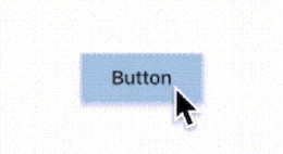
RaisedButton(
  child: const Text('Button'),
  onPressed: () {},
  highlightElevation: 16,
  highlightColor: Colors.blue,
  onHighlightChanged: (value) {},
),
12. rippleエフェクトのみ色が変わるボタン
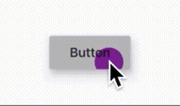
RaisedButton(
  child: const Text('Button'),
  onPressed: () {},
  splashColor: Colors.purple,
),
// Flutter1.22以降のみ
ElevatedButton(
  child: const Text('Button'),
  style: ElevatedButton.styleFrom(
    primary: Colors.grey[300],
    onPrimary: Colors.purple,
  ),
  onPressed: () {},
),
13. アイコン入りボタン

RaisedButton.icon(
  icon: const Icon(
    Icons.tag_faces,
    color: Colors.white,
  ),
  label: const Text('Button'),
  onPressed: () {},
  color: Colors.green,
  textColor: Colors.white,
),
// Flutter1.22以降のみ
ElevatedButton.icon(
  icon: const Icon(
    Icons.tag_faces,
    color: Colors.white,
  ),
  label: const Text('Button'),
  style: ElevatedButton.styleFrom(
    primary: Colors.green,
    onPrimary: Colors.white,
  ),
  onPressed: () {},
),
14. 文字ボタン
FlatButton(
  child: const Text('Button'),
  textColor: Colors.black,
  onPressed: () {},
),
// Flutter1.22以降のみ
TextButton(
  child: const Text('Button'),
  style: TextButton.styleFrom(
    primary: Colors.black,
  ),
  onPressed: () {},
),
15. 文字ボタン + 外枠線

OutlineButton(
  child: const Text('Button'),
  onPressed: () {},
),
// Flutter1.22以降のみ
OutlinedButton(
  child: const Text('Button'),
  style: OutlinedButton.styleFrom(
    primary: Colors.black,
  ),
  onPressed: () {},
),
16. グラデーションボタン

RaisedButton(
  onPressed: () {},
  textColor: Colors.white,
  padding: const EdgeInsets.all(0),
  child: Container(
    decoration: BoxDecoration(
      gradient: LinearGradient(
        colors: <Color>[
          Colors.orange[300],
          Colors.orange[500],
          Colors.orange[700],
        ],
      ),
    ),
    padding: const EdgeInsets.all(10),
    child: const Text('Gradient Button'),
  ),
),
// Flutter1.22以降のみ
ElevatedButton(
  child: Container(
    decoration: BoxDecoration(
      gradient: LinearGradient(
        colors: <Color>[
          Colors.orange[300],
          Colors.orange[500],
          Colors.orange[700],
        ],
      ),
    ),
    padding: const EdgeInsets.all(10),
    child: const Text('Gradient Button'),
  ),
  style: ElevatedButton.styleFrom(
    padding: const EdgeInsets.all(0),
  ),
  onPressed: () {},
),
参考
・Widget catalog
・ShapeBorder
・RaisedButton
・Anatomy of Material Buttons in Flutter
・Announcing Flutter 1.22
・old
Discussion