📖
AppBarについて
今回は、FlutterのAppBarについてまとめます。
AppBarを調整することで、UIデザインが整った画面になることがあります。
今回の記事の目標は、YouTubeのAppBarのようなUIを作成することです。
そのために、Sliverを使用します。
1.基本形について
AppBar_Basic
appbar: AppBar(
  title: Text('ホーム'),
  backgroundColor: Colors.indigo,
  elevation: 4,
)
2.タブ付きで表示
SmartNews等で採用されているUIのように表示することも可能です。
AppBar_Tab
return DefaultTabController(
    length: 3, //ここにはタブの個数
      child: Scaffold(
      appBar: AppBar(
        title:Text('タブ付きAppBar'),
        bottom: TabBar(
          tabs: [
            Tab(text: 'Home'),//iconも追加可能!
            Tab(text: 'Settings'),
            Tab(text: 'Info'),
          ]
        ),
      ),
3.SilverAppbar
SliverAppBar
Widget build(BuildContext context) {
    return Scaffold(
      backgroundColor: Colors.white,
      body: CustomScrollView(
        slivers: [
          SliverAppBar(
            title: Text('SliverAppBar'),
            expandedHeight: 50, //appBarの高さ
            pinned: false,// 固定しない
            floating: true,// スクロール中のAppBarの表示
            flexibleSpace: FlexibleSpaceBar(
              background: Image.network(
                'https://picsum.photos/800/400',
                fit: BoxFit.cover,
              ),
              titlePadding: EdgeInsets.symmetric(horizontal: 16, vertical: 8),
            ),
          ),
          SliverList(
            delegate: SliverChildBuilderDelegate((context, index) {
              return Material(
                // ← 追加
                color: Colors.white, // 背景色(任意)
                child: ListTile(title: Text('Item #$index')),
              );
            }, childCount: 40),
          ),
        ],
      ),
    );
  }
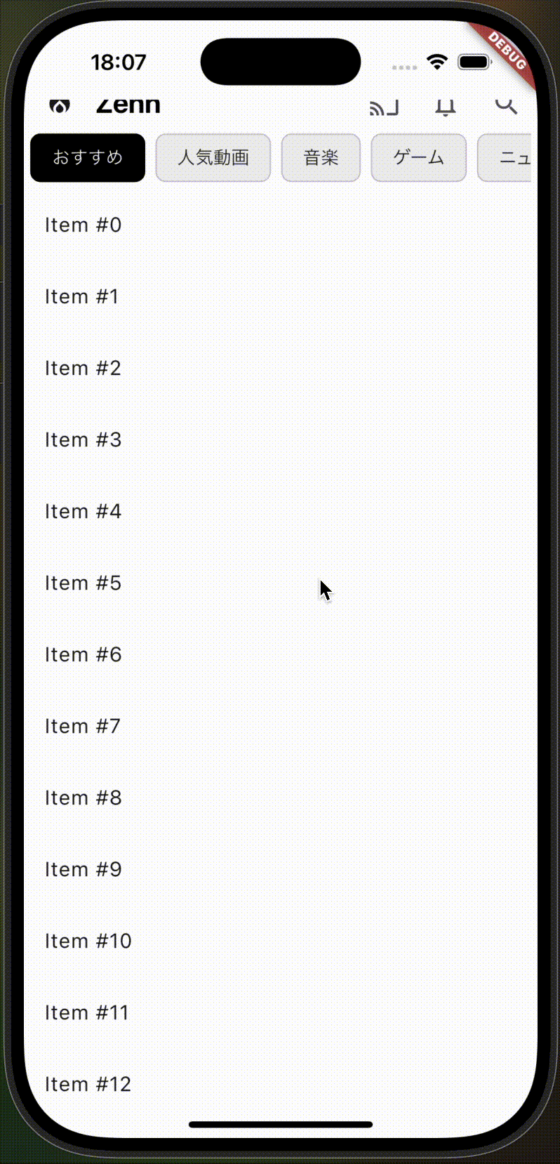
4.YouTubeのようなAppBarを作成してみよう
要件:
1 SliverAppBarでスクロールに応じた、AppBarの表示/非表示の切り替え
2 ChoiceChipを使おう(おすすめ、人気動画等の表示)
*AppBarに組み込みます。
3 AppBarにアイコンを表示(検索アイコン、通知のアイコン、キャストアイコン)
YouTube
//ChoiceChipの内容について
  final List<String> _categories = ['おすすめ', '人気動画', '音楽', 'ゲーム', 'ニュース'];
  // 選択中インデックス
  int _selectedIndex = 0;

Widget build(BuildContext context) {
    return Scaffold(
      backgroundColor: Colors.white,
      body: SafeArea(
        child:CustomScrollView(
        slivers: [
          SliverAppBar(
            backgroundColor: Colors.white,
            centerTitle: false,
            leading: Icon(Icons.local_fire_department, color: Colors.black),
            titleSpacing: 0,
            title: Text(
              'Zenn',
              style: TextStyle(
                color: Colors.black,
                fontSize: 22,
                fontWeight: FontWeight.bold,
              ),
            ),
            //Icons
            actions: [
              IconButton(
                icon: Icon(Icons.cast_outlined),
                onPressed: () {},
              ),
              IconButton(
                icon: Icon(Icons.notifications_outlined),
                onPressed: () {},
              ),
              IconButton(
                icon: Icon(Icons.search),
                onPressed: () {},
              ),
            ],
            bottom: PreferredSize(
              preferredSize: Size.fromHeight(30),
              child: Container(
                color: Colors.white,
                padding: EdgeInsets.symmetric(horizontal: 5),
                alignment: Alignment.centerLeft,
                child: SingleChildScrollView(
                  scrollDirection: Axis.horizontal,
                  child: Row(
                    children: List.generate(_categories.length, (i) {
                      final bool selected = _selectedIndex == i;
                      return Padding(
                        padding: EdgeInsets.only(right: 8),
                        child: ChoiceChip(
                          label: Text(_categories[i]),
                          selected: selected,
                          onSelected: (_) => setState(() => _selectedIndex = i),
                          selectedColor: Colors.black,
                          backgroundColor: Colors.grey.shade200,
                          labelStyle: TextStyle(
                            color: selected ? Colors.white : Colors.black87,
                          ),
                          showCheckmark: false,//trueだとChipの左横にcheckマークが表示される
                        ),
                      );
                    }),
                  ),
                ),
              ),
            ),
            expandedHeight: 80, // AppBarの高さ
            pinned: false, // AppBarを固定
            floating: true, // スクロール中のAppBarの表示
          ),

          SliverList(
            delegate: SliverChildBuilderDelegate(
              (context, index) => ListTile(title: Text('Item #$index')),
              childCount: 30,
            ),
          ),
        ],
      ),
      ),
    );
  }
Discussion