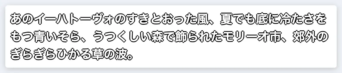
文字の縁取りを実装する場合、 text-stroke や SVG などいろいろな方法があると思います。
今回は text-shadow を使った方法を紹介します。
text-shadow を使うケース
一般的な縁取りは text-stroke と paint-order を組み合わせた方法で対応できると思います。
ただ複数色の縁取りをしたり、縁取りした文字に影をつけたいときにしたいときは、 text-stroke の方法では難しいと思います。
こういったケースの解決策の一つとして、text-shadow を使った方法について紹介していきたいと思います。
text-shadow を使った縁取りの実装
text-shadow を使った縁取りでは複数の text-shadow の値を少しずつずらしていくことで実装します。
たとえば 3px の縁取りを実装する場合で考えてみます。
はじめに 上下左右の4方向に 3px の影をつけます。
text-shadow:
  0 3px 0 #000,
  3px 0 0 #000,
  0 -3px 0 #000,
  -3px 0 0 #000;
4方向だと結構ジャギーが目立つので、次は方向を増やしていこうと思います。
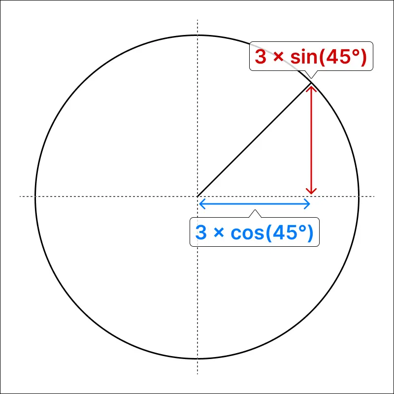
8方向にする場合、先程の値に加えて斜めの方向を追加します。
その値の計算に三角関数を使います。
(今回は小数点第2位で四捨五入します)
右斜上の方向の text-shadow の値は
縦軸の位置 = 3 × sin(45°) ≒ 2.12...
横軸の位置 = 3 × cos(45°) ≒ 2.12...
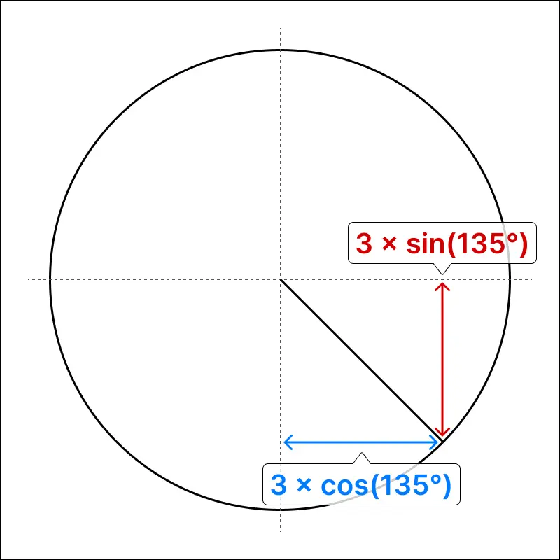
右斜下の方向の text-shadow の値は
縦軸の位置 = 3 × sin(135°) ≒ -2.12...
横軸の影の位置 = 3 × cos(135°) ≒ -2.12...
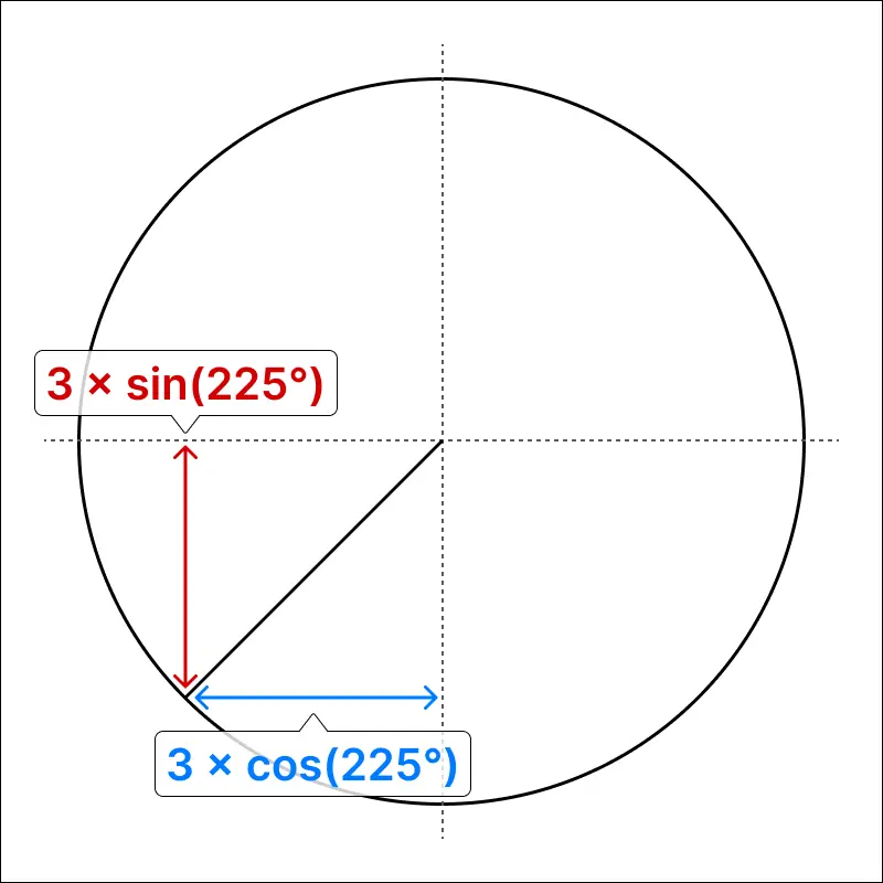
左斜上の方向の text-shadow の値は
縦軸の位置 = 3 × sin(225°) ≒ -2.12...
横軸の位置 = 3 × cos(225°) ≒ 2.12...
左斜下の方向の text-shadow の値は
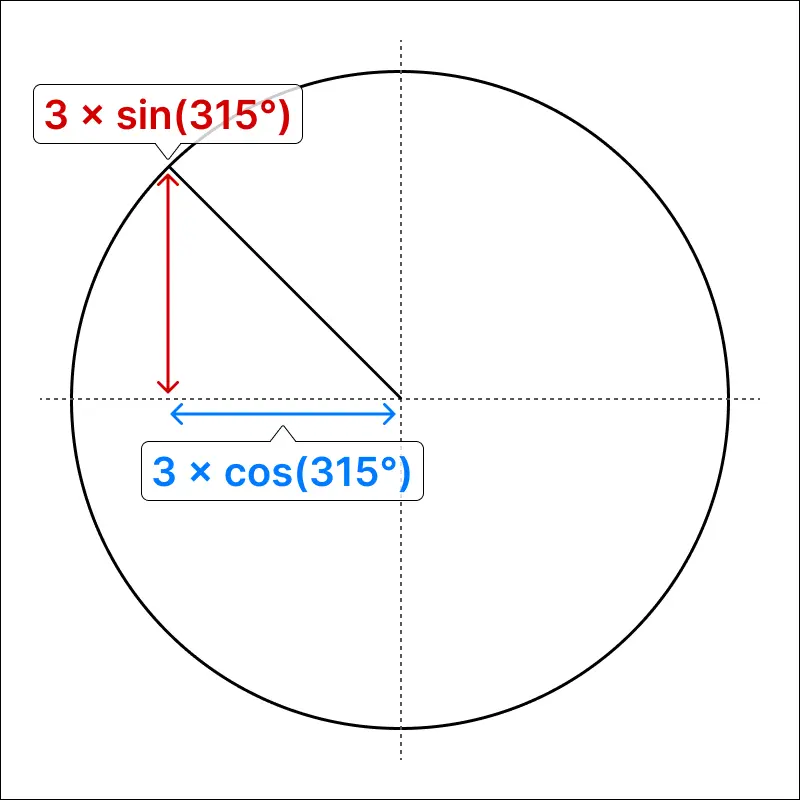
縦軸の影の位置 = 3 × sin(315°) ≒ 2.12...
横軸の影の位置 = 3 × cos(315°) ≒ -2.12...
となり、 text-shadow は以下のようになります。
text-shadow:
  0 3px 0 #000,
+ 2.1px 2.1px 0 #000,
  3px 0 0 #000,
+ 2.1px -2.1px 0 #000,
  0 -3px 0 #000,
+ -2.1px -2.1px 0 #000,
  -3px 0 0 #000,
+ -2.1px 2.1px 0 #000;
必要があれば text-shadow の値を増やしたり、少しぼかすことで曲線部分をきれいにできます。
text-shadowの値を生成するTypeScriptのコード
type Stroke = {
  width: number;
  color: string;
};

type Params = {
  /** text-shadow を生成するために使用されるストロークの配列 */
  strokes: [Stroke, ...Stroke[]];
  /** text-shadow が生成される方向の数 */
  directionCount?: number;
  /** ぼかし */
  blur?: number;
  /** text-shadow の半径のステップ間隔 */
  radiusStep?: number;
  /** 最外周の text-shadow 値の小数点以下の桁数 */
  digits?: number;
  /** 影のオフセット */
  shadowOffset?: number;
  /** 影の色 */
  shadowColor?: string;
};

export function generateTextShadow({
  strokes,
  directionCount = 8,
  blur = 0,
  radiusStep = strokes[0].width,
  digits = 0,
  shadowOffset = 0,
  shadowColor = strokes[0].color,
}: Params): string {
  const factor = 10 ** digits;
  const blurValue = `${blur}px`;
  const shadows: Set<string> = new Set();
  const shadowOffsets: Set<string> = new Set();
  const directions = [...Array(directionCount)].map((_, i) => {
    const angle = (2 * Math.PI * i) / directionCount;
    return [Math.cos(angle), Math.sin(angle)] as const;
  });

  let radius = 0;
  let currentMaxRadius = 0;

  for (const { width, color } of strokes) {
    currentMaxRadius += width;
    while (radius < currentMaxRadius) {
      radius = Math.min(radius + radiusStep, currentMaxRadius);
      for (const [dx, dy] of directions) {
        const x = Math.round(radius * dx * factor) / factor;
        const y = Math.round(radius * dy * factor) / factor;
        const valueX = `${x}px`;
        const valueY = `${y}px`;
        shadows.add(`${valueX} ${valueY} ${blurValue} ${color}`);
        if (shadowOffset) {
          const shadowX = Math.round((x + shadowOffset) * factor) / factor;
          const shadowY = Math.round((y + shadowOffset) * factor) / factor;
          const valueShadowX = `${shadowX}px`;
          const valueShadowY = `${shadowY}px`;
          shadowOffsets.add(
            `${valueShadowX} ${valueShadowY} ${blurValue} ${shadowColor}`,
          );
        }
      }
    }
  }

  const result = [...shadows, ...shadowOffsets].join(", ");
  return result;
}
冒頭の縁取りは以下のパラメータ作成しました。
// 虹色の縁取り
generateTextShadow({
  strokes: [
    { width: 4, color: "#800080" },
    { width: 4, color: "#4B0082" },
    { width: 4, color: "#0000FF" },
    { width: 4, color: "#008000" },
    { width: 4, color: "#FFFF00" },
    { width: 4, color: "#FFA500" },
    { width: 4, color: "#FF0000" },
  ],
  directionCount: 256,
  blur: 1,
  digits: 1,
});

// 影付きの縁取り
generateTextShadow({
  strokes: [{ width: 8, color: "#5A5AFF" }],
  directionCount: 256,
  blur: 1,
  digits: 1,
  shadowOffset: 4,
  shadowColor: "#00009E",
});
まとめ
今回は text-shadow を使った文字の縁取りについて紹介しました。
最近のCSSでは、できることがどんどん増えているので、いずれ text-shadow を使わずとも今回あげたような実装ができるようになるかもしれないですね。

ちょっと株式会社(chot-inc.com)のエンジニアブログです。 フロントエンドエンジニア募集中! カジュアル面接申し込みはこちらから chot-inc.com/recruit/iuj62owig
Discussion