【React】Headless UI ライブラリを比較してみる
 chamo
chamo経緯
- 1から自作でコンポーネントを作成しようと思ったが、Modal や DatePicker などはアクションがあらかじめ設定されているものの方が工数をかけずに作成できる
- デザインは自前のものを使用したいので、スタイルは簡単に変更できるものがよい
→ Headless UI よいのでは???
結論
Radux-ui の primitive を導入することにした。
(ところで「ラディックス」なのか「レイディックス」なのかどっち)
前提条件
- React / TypeScript / Tailwind
- スタイルの変更が安易である
- Modal や DatePickerなど、状態を含むコンポーネントで利用できると嬉しい
開発環境
- Node v20.10.0
- React v18.2.0
- pnpm v8.14.0
- Tailwind v3.4.1
比較したHeadelss UI ライブラリ
npm trends
※ Radix-ui はコンポーネントごとにパッケージ化されているので、Dialog で比較
Headless UI と Radix-ui が2強っぽい。
→AreaKitは少ないので対象外。Reakitは気になってたのでみてみる。

chamo1. Headless UI
特徴
- バンドルサイズは 2.06 MB
実装してみる
インストール
README に沿ってインストールする。
サンプルコードを書く
今回は Dialog で比較。
公式ドキュメントにサンプルコードが書かれているので、そちらを採用。
サンプルコード
import {Dialog, Transition} from '@headlessui/react';
import React, {Fragment, useState} from 'react';

export const HLDialog: React.FC = () => {
  const [isOpen, setIsOpen] = useState(true);

  function closeModal() {
    setIsOpen(false);
  }

  function openModal() {
    setIsOpen(true);
  }

  return (
    <>
      <div className="fixed inset-0 flex items-center justify-center">
        <button
          type="button"
          onClick={openModal}
          className="rounded-md bg-black/20 px-4 py-2 text-sm font-medium text-white hover:bg-black/30 focus:outline-none focus-visible:ring-2 focus-visible:ring-white/75"
        >
          Open dialog
        </button>
      </div>

      <Transition appear show={isOpen} as={Fragment}>
        <Dialog as="div" className="relative z-10" onClose={closeModal}>
          <Transition.Child
            as={Fragment}
            enter="ease-out duration-300"
            enterFrom="opacity-0"
            enterTo="opacity-100"
            leave="ease-in duration-200"
            leaveFrom="opacity-100"
            leaveTo="opacity-0"
          >
            <div className="fixed inset-0 bg-black/25" />
          </Transition.Child>

          <div className="fixed inset-0 overflow-y-auto">
            <div className="flex min-h-full items-center justify-center p-4 text-center">
              <Transition.Child
                as={Fragment}
                enter="ease-out duration-300"
                enterFrom="opacity-0 scale-95"
                enterTo="opacity-100 scale-100"
                leave="ease-in duration-200"
                leaveFrom="opacity-100 scale-100"
                leaveTo="opacity-0 scale-95"
              >
                <Dialog.Panel className="w-full max-w-md overflow-hidden rounded-2xl bg-white p-6 text-left align-middle shadow-xl transition-all">
                  <Dialog.Title as="h3" className="text-lg font-medium leading-6 text-gray-900">
                    Payment successful
                  </Dialog.Title>

                  <div className="mt-2">
                    <p className="text-sm text-gray-500">
                      Your payment has been successfully submitted. We’ve sent you an email with all
                      of the details of your order.
                    </p>
                  </div>

                  <div className="mt-4">
                    <button
                      type="button"
                      className="inline-flex justify-center rounded-md border border-transparent bg-blue-100 px-4 py-2 text-sm font-medium text-blue-900 hover:bg-blue-200 focus:outline-none focus-visible:ring-2 focus-visible:ring-blue-500 focus-visible:ring-offset-2"
                      onClick={closeModal}
                    >
                      Got it, thanks!
                    </button>
                  </div>
                </Dialog.Panel>
              </Transition.Child>
            </div>
          </div>
        </Dialog>
      </Transition>
    </>
  );
};
※公式との差
-
isOpen is never reassigned.(値の変更がない変数をletで宣言している)というエラーが出るのでconstに変更。
- let [isOpen, setIsOpen] = useState(true);
+ const [isOpen, setIsOpen] = useState(true);
感想
- サンプルコードも Tailwind になっており、 参考にできるものがあるのはよい
- モーダルが開いている時に自動的に背景のスクロールが非アクティブになるなど、結構よしなにしてくれる
- その分背景クリックでモーダルを非表示にしない、など細かい調整ができない
- 10コンポーネントと少なめ(2024/2/8 時点)
chamo2. React Area
特徴
- バンドルサイズは 3.02 MB
実装してみる
インストール
ドキュメントを参考にインストール
サンプルコード
スタイルは Headless UI を参考にした
サンプルコード
import React, {useState} from 'react';
import {Button, Dialog, DialogTrigger, Heading, Modal} from 'react-aria-components';
export const RADialog = () => {
const [isOpen, setOpen] = useState(false);
const handleOpen = () => {
setOpen(!isOpen);
};
const handleClose = () => {
setOpen(!isOpen);
};
return (
<DialogTrigger>
<div className="absolute flex size-full items-center justify-center">
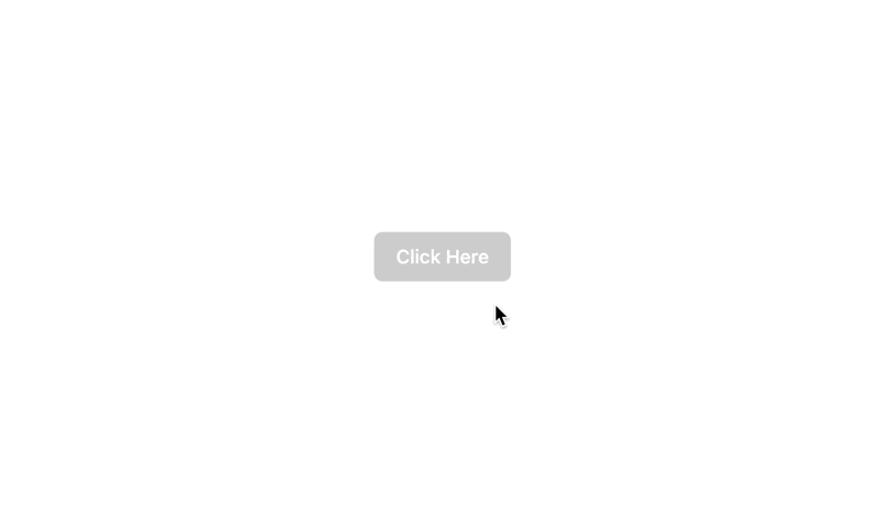
<Button
className="rounded-md bg-black/20 px-4 py-2 text-sm font-medium text-white hover:bg-black/30 focus:outline-none focus-visible:ring-2 focus-visible:ring-white/75"
onPress={handleOpen}
>
Click Here
</Button>
</div>
<Modal
className="fixed z-10 flex h-screen w-full items-center justify-center bg-black/10"
isOpen={isOpen}
isDismissable
>
<Dialog
role="alertdialog"
className="w-full max-w-md overflow-hidden rounded-2xl bg-white p-6 text-left align-middle shadow-xl transition-all"
>
<>
<Heading className="text-lg font-medium leading-6 text-gray-900" slot="title">
Delete file
</Heading>
<p className="text-sm text-gray-500">
This will permanently delete the selected file. Continue?
</p>
<div className="mt-4">
<Button
className=" inline-flex justify-center rounded-md border border-transparent bg-blue-100 px-4 py-2 text-sm font-medium text-blue-900 hover:bg-blue-200 focus:outline-none focus-visible:ring-2 focus-visible:ring-blue-500 focus-visible:ring-offset-2"
onPress={handleClose}
>
Close
</Button>
</div>
</>
</Dialog>
</Modal>
</DialogTrigger>
);
};
感想
- CSS に合わせたスターター用の Storybook があるのでサンプルとしては良さそう。
https://react-spectrum.adobe.com/react-aria-tailwind-starter/?path=/docs/alertdialog--docs - 「背景クリックでモーダルを閉じる」と「ボタンクリックでモーダルを閉じる」の共存ができない(よく調べられてないだけかも)
- input 時に overlay での close を不可にすることなどはできる
- focus が変なところ(モーダル全体)に当たっているのは気になった
- コンポーネント数は40弱とまあまあある(2024/2/13 時点)
chamoこれにした。
3. Radix UI
特徴
- バンドルサイズは 137 kB(Dialog)
- WAI-ARIA design patterns に準拠しており、アクセシビリティを意識した作りになっている
- Vercel や CodeSandbox などが採用
実装してみる
サンプルコード(page)
import React, {FC} from 'react';
import {RUDialog} from '@/sample/radixUi/RUDialog';

const Page: FC = () => {
  return (
    <div className="flex h-screen w-screen items-center justify-center">
      <RUDialog />
    </div>
  );
};

export default Page;
サンプルコード(component)
import React from 'react';
import * as Dialog from '@radix-ui/react-dialog';
export const RUDialog = () => {
return (
<Dialog.Root>
<Dialog.Trigger asChild>
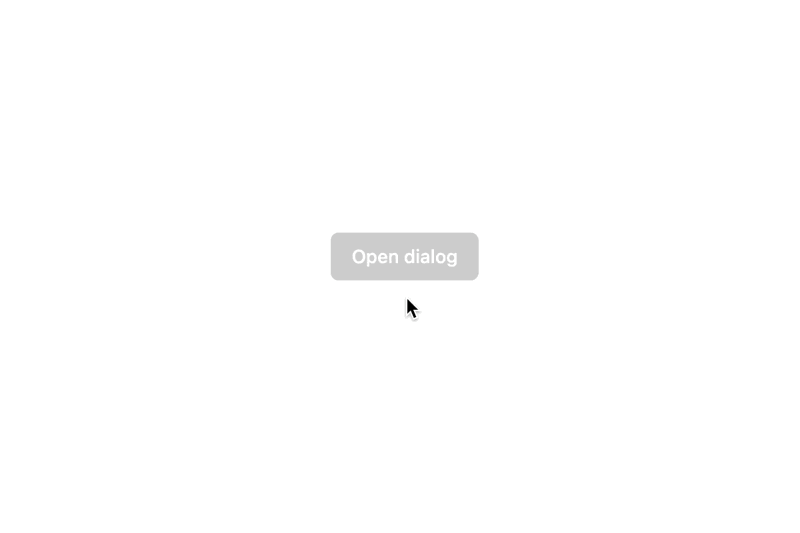
<button className="inline-flex items-center justify-center rounded-md bg-black/20 px-4 py-2 text-sm font-medium text-white hover:bg-black/30 focus:outline-none focus-visible:ring-2 focus-visible:ring-white/75">
Open dialog
</button>
</Dialog.Trigger>
<Dialog.Portal>
<Dialog.Overlay className="fixed inset-0 bg-black/25">
<Dialog.Content className="fixed inset-0 m-auto h-1/5 w-1/4 justify-center overflow-hidden rounded-2xl bg-white p-6 text-left align-middle shadow-xl transition-all">
<Dialog.Title>Payment successful</Dialog.Title>
<Dialog.Description className="mt-2 text-sm text-gray-500">
Your payment has been successfully submitted. We’ve sent you an email with all of the
details of your order.
</Dialog.Description>
<div>
<Dialog.Close asChild>
<button className="mt-4 inline-flex justify-center rounded-md border border-transparent bg-blue-100 px-4 py-2 text-sm font-medium text-blue-900 hover:bg-blue-200 focus:outline-none focus-visible:ring-2 focus-visible:ring-blue-500 focus-visible:ring-offset-2">
Got it, thanks!
</button>
</Dialog.Close>
</div>
</Dialog.Content>
</Dialog.Overlay>
</Dialog.Portal>
</Dialog.Root>
);
};
UIは一緒なので省略
感想
- それなりの人気度もあり、ドキュメントの他にもかなり文献は多い気がする
- デフォルトの動作がかなり固定されているので、慣れるまで若干使いづらいかな〜とは思う。
→ イベントは出せたりするので結構自由度高かった - コンポーネント数は React Area に比べると少ないけど十分
chamo4. Reakit
特徴
- バンドルサイズは 2.54 MB
- Tree shaking が採用されている
-
Reakitの後継がAriakitらしい
Ariakit は、アクセシブルな Web アプリ、デザイン システム、およびその他のコンポーネント ライブラリを構築するための低レベルの React コンポーネントとフックを提供するオープン ソース ライブラリである Reakit の後継です。
感想
Ariakitは、すべての面ですでにReakitよりも優れています。より速く、より多くの機能、改善を提供し、バグが少なくなります。実際、過去1年間に何十ものバグが報告されており、ライブラリに修正が実装される前に、それらのすべてがユーザーランドで解決される可能性があります。クローズされたバグを参照し、それらすべてに「回避策あり」というラベルが付いていることに注目してください。
Ariakit は、最新バージョンの React (17 および 18) と Next.js などのフレームワークを完全にサポートしています。
とあるので、Reakit を使うなら Ariakit の方が良さそう
→比較対象から除外