Enhance Unity's ScrollRect with TableScrollView
Unity’s ScrollRect is convenient, but as the number of items increases, performance can degrade significantly. Additionally, in game development, supporting keyboard (or gamepad) input is often necessary.
This article introduces an additional component, TableScrollView, which extends ScrollRect to address these needs.
GitHub
Features
Based on ScrollRect
While retaining the advantages of ScrollRect, several UX improvements have been made:
- The scrollbar automatically fades out (can be enabled or disabled).
- The selected item is automatically adjusted to the appropriate position when scrolling stops.
No Performance Drop with a Large Number of Items
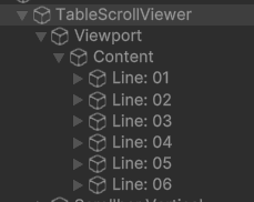
To optimize performance, TableScrollView initially creates a minimal number of required items (referred to as Nodes) in the hierarchy. The scroll area is then managed by updating these Nodes dynamically.
Even if the number of displayed items reaches 1000, the buffer only covers the visible area (at most around 20 items), resulting in a significant performance improvement.
Event Support for Keyboard / Gamepad Input
TableScrollView externalizes input handling as events, allowing developers to integrate their preferred key input systems.

Compatible with Unity 6 and Earlier Versions (Probably)
With minor modifications to account for API changes in Unity versions, it should work in older versions as well.
How to Use
Run SampleScene2.unity to see it in action. There are three main steps to setting it up:
1. Create Nodes
Define a Prefab representing a single item and a corresponding Node class to control it.

using UnityEngine.UI;

public class NodeScene2 : TableNodeElement
{
    [SerializeField] TextMeshProUGUI    No = null;
    [SerializeField] TextMeshProUGUI    Desc = null;
    [SerializeField] Image              Icon = null;
    [SerializeField] Image              Focus = null;
    [SerializeField] Sprite[]           IconSprites = null;

    /// <summary>
    /// Handle focus effect (ON/OFF)
    /// </summary>
    public override void onEffectFocus(bool focus, bool isAnimation)
    {
        Focus.color = new Color(0,0,0, focus ? 0.2f : 0.1f);
    }

    /// <summary>
    /// Update display when item data changes
    /// </summary>
    public override void onEffectChange(int itemIndex)
    {
        var row = (TestScene2.Row)table[itemIndex];

        No.SetText("Line: " + row.No.ToString("00"));
        Desc.SetText(row.PlaceName);
        Icon.sprite = IconSprites[row.No % IconSprites.Length];

        this.name = No.text;
    }
}
Create a Node class that inherits from TableNodeElement and attach it to the Prefab.
2. Attach TableScrollViewer to ScrollRect

Attach TableScrollViewer to the same GameObject as ScrollRect, drag in the created Node Prefab, and select the appropriate scroll direction (Vertical or Horizontal).
3. Register a Data List for the View
Refer to TestScene2.cs:
using System.Collections.Generic;
using UnityEngine;

public class TestScene2 : MonoBehaviour
{
    [SerializeField] TableScrollViewer viewer;

    public class Row
    {
        public int No;
        public string PlaceName;
    }

    List<Row> rows = new List<Row>()
    {
        new Row() { No = 1, PlaceName = "Amsterdam" },
        new Row() { No = 2, PlaceName = "Bangkok" },
        new Row() { No = 3, PlaceName = "Chicago" },
        new Row() { No = 4, PlaceName = "Dubai" },
        new Row() { No = 5, PlaceName = "Edinburgh" },
        new Row() { No = 6, PlaceName = "Frankfurt" },
        new Row() { No = 7, PlaceName = "Geneva" },
        new Row() { No = 8, PlaceName = "Hong Kong" },
        new Row() { No = 9, PlaceName = "Istanbul" },
        new Row() { No = 10, PlaceName = "Washington, D.C." },
    };

    void Start()
    {
        viewer?.Initialize();
        viewer?.SetTable(rows);
        viewer?.OnSelect.AddListener(OnSelectVertical);
        viewer?.OnKeyDown.AddListener(OnKeyDown);
    }
}
The Row class structure is flexible—you can customize it as needed.
Explanation of TableScrollViewer Inspector Options
Settings
-
Source Node:
Drag the created node here. -
Orientation:
Select Vertical for vertical scrolling and Horizontal for horizontal scrolling. -
Alignment:
This option is only functional for non-scrolling views due to its current implementation.
Although TableScrollViewer is designed for scrolling lists, it can also be used for standard button menus, making this option useful in such cases. -
Padding Top / Bottom:
Defines the top (left) and bottom (right) margins of the display area. -
Spacing:
Defines the spacing between nodes. -
Scroll Time:
Controls the scrolling speed. Lower values make scrolling faster. -
Skip Index By Page Scroll:
Specifies the number of items to move when a page scroll request (eKeyMoveFlag.Page???) is triggered via key or gamepad input. -
Scrollbar Auto Fadeout:
Automatically hides the scrollbar when scrolling stops. -
Absorption Target:
Hard to explain... but enabling this improves UX.
(The idea is to adjust the scroll stop position to make it more user-friendly.) -
Select After Focus:
If checked, selection occurs in two steps:
1st step: Focus → 2nd step: Actual item selection. -
Easy Focus For Mouse:
When using a mouse, items are automatically focused without requiring a click. -
Disabled After Select:
After selection, input is disabled. To restore input, you must use InputEnabled(true), which can be inconvenient.
Events
-
OnSelect():
Triggered when an item is selected. The argument provides information about the selected item. -
OnKeyDown():
Defines how the View should respond to key inputs.
You can use either Input or InputSystem, depending on your preferred input handling class. -
OnCursorMove():
Triggered when the focus moves.
While focus movement rendering is handled in the node class, you can define cursor sound effects here if needed. -
OnCheckSelectable():
Determines whether the item being selected is selectable.
For example, if there are selectable items with indices 0-1-2-3-4, but 1 is not selectable, setresult.Enabled = falsefor index 1.
Additional Features
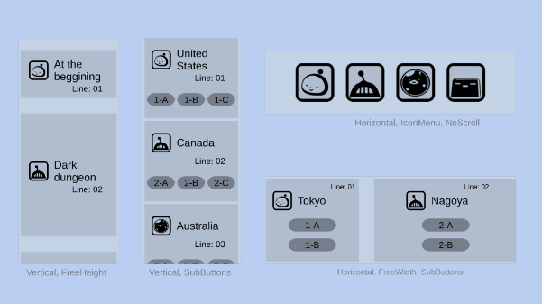
TableScrollView supports sub-nodes, allowing the creation of grid-based menus (m × n layouts).
Discussion