🐈
laravel12 starter kit(react)と使うshadcn/ui Form


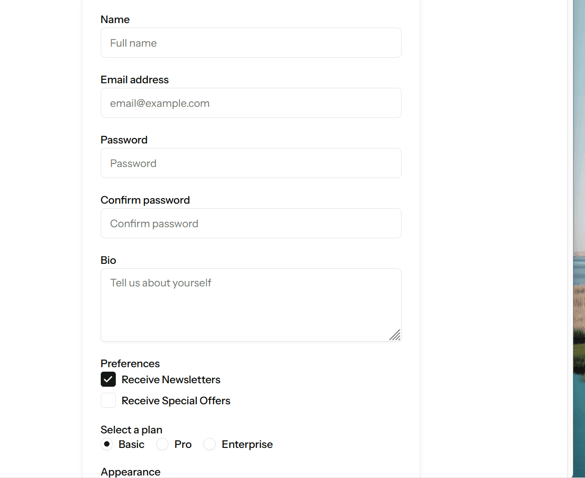
最終目標
基本形
長くなるけど一応全部貼っときます
$ cat resources/js/pages/guide/shadcnui-form.tsx
import { Head, useForm } from '@inertiajs/react';
import { LoaderCircle } from 'lucide-react';
import { FormEventHandler } from 'react';

import InputError from '@/components/input-error';
import { Button } from '@/components/ui/button';
import { Input } from '@/components/ui/input';
import { Label } from '@/components/ui/label';
import { useLaravelReactI18n } from 'laravel-react-i18n';
import AppLayout from '@/layouts/app-layout';

interface ShadcnuiFormProps {
  [key: string]: string;
  name: string;
  email: string;
  password: string;
  password_confirmation: string;
}

export default function ShadcnuiForm() {
  const { t } = useLaravelReactI18n();

  const { data, setData, post, processing, errors, reset } = useForm<ShadcnuiFormProps>({
    name: '',
    email: '',
    password: '',
    password_confirmation: '',
  });

  const submit: FormEventHandler = e => {
    e.preventDefault();
    post(route('shadcn.ui.form.post'), {
      onFinish: () => reset('password', 'password_confirmation'),
    });
  };

  return (
    <AppLayout title={t('Create an account')}>
      <Head title={t('Register')} />
      <div className="flex justify-center p-4">
        <form className="w-full max-w-md space-y-6" onSubmit={submit}>
          <div className="space-y-4">
            <div className="space-y-1">
              <Label htmlFor="name">{t('Name')}</Label>
              <Input
                id="name"
                type="text"
                autoFocus
                tabIndex={1}
                autoComplete="name"
                value={data.name}
                onChange={e => setData('name', e.target.value)}
                disabled={processing}
                placeholder={t('Full name')}
              />
              <InputError message={errors.name} className="mt-1" />
            </div>

            <div className="space-y-1">
              <Label htmlFor="email">{t('Email address')}</Label>
              <Input
                id="email"
                type="email"
                tabIndex={2}
                autoComplete="email"
                value={data.email}
                onChange={e => setData('email', e.target.value)}
                disabled={processing}
                placeholder="email@example.com"
              />
              <InputError message={errors.email} className="mt-1" />
            </div>

            <div className="space-y-1">
              <Label htmlFor="password">{t('Password')}</Label>
              <Input
                id="password"
                type="password"
                tabIndex={3}
                autoComplete="new-password"
                value={data.password}
                onChange={e => setData('password', e.target.value)}
                disabled={processing}
                placeholder={t('Password')}
              />
              <InputError message={errors.password} className="mt-1" />
            </div>

            <div className="space-y-1">
              <Label htmlFor="password_confirmation">{t('Confirm password')}</Label>
              <Input
                id="password_confirmation"
                type="password"
                tabIndex={4}
                autoComplete="new-password"
                value={data.password_confirmation}
                onChange={e => setData('password_confirmation', e.target.value)}
                disabled={processing}
                placeholder={t('Confirm password')}
              />
              <InputError message={errors.password_confirmation} className="mt-1" />
            </div>
          </div>

          <div className="flex justify-center">
            <Button type="submit" tabIndex={5} disabled={processing}>
              {processing && <LoaderCircle className="h-4 w-4 animate-spin mr-2" />}
              {t('Update')}
            </Button>
          </div>
        </form>
      </div>
    </AppLayout>
  );
}

最初から用意されいるパーツ
- resources/js/components/ui/checkbox.tsx
- resources/js/components/ui/input.tsx
- resources/js/components/ui/button.tsx
- resources/js/components/ui/label.tsx*
この辺がshadcn/uiであり
- resources/js/components/input-error.tsx
ここにエラーをつかまえるものが置いてある
validationエラーを出してみる
今requiredを取り除いてあるので、リクエスト先でrequiredバリエーションを書けるとそれを確認できる
routes/web.php
// <snip>
    Route::get('shadcn-ui/form', function (): Response {
        return Inertia::render('guide/shadcnui-form');
    })->name('shadcn.ui.form');
    Route::post('shadcn-ui/form', function (Request $request): RedirectResponse {
        $request->validate([
            'name' => 'required|string|max:255',
            'email' => 'required|string|lowercase|email|max:255|unique:'.User::class,
            'password' => ['required', 'confirmed', Rules\Password::defaults()],
        ]);

        return back();
    })->name('shadcn.ui.form.post');
});

require __DIR__.'/settings.php';
require __DIR__.'/auth.php';

textareaを追加
npx shadcn@latest add textarea
--- a/resources/js/pages/guide/shadcnui-form.tsx
+++ b/resources/js/pages/guide/shadcnui-form.tsx
@@ -6,6 +6,7 @@ import InputError from '@/components/input-error';
 import { Button } from '@/components/ui/button';
 import { Input } from '@/components/ui/input';
 import { Label } from '@/components/ui/label';
+import { Textarea } from '@/components/ui/textarea';
 import { useLaravelReactI18n } from 'laravel-react-i18n';
 import AppLayout from '@/layouts/app-layout';

@@ -15,6 +16,7 @@ interface ShadcnuiFormProps {
   email: string;
   password: string;
   password_confirmation: string;
+  bio: string;
 }

 export default function ShadcnuiForm() {
@@ -25,6 +27,7 @@ export default function ShadcnuiForm() {
     email: '',
     password: '',
     password_confirmation: '',
+    bio: '',
   });
+
+            {/* Bio Textarea */}
+            <div className="space-y-1">
+              <Label htmlFor="bio">{t('Bio')}</Label>
+              <Textarea
+                id="bio"
+                rows={4}
+                value={data.bio}
+                onChange={e => setData('bio', e.target.value)}
+                disabled={processing}
+                placeholder={t('Tell us about yourself')}
+              />
+              <InputError message={errors.bio} className="mt-1" />
+            </div>
           </div>

+          {/* Submit Button */}
           <div className="flex justify-center">
               {processing && <LoaderCircle className="h-4 w-4 animate-spin mr-2" />}
               {t('Update')}
             </Button>
typescriptになったのでtypeを更新しないといけないね。tabIndexの面倒みがあるのでとりはらった。日本語も適時更新しているので日本語になっているが、それは気にしないで...

checkboxのデモ
 import InputError from '@/components/input-error';
 import { Button } from '@/components/ui/button';
+import { Checkbox } from '@/components/ui/checkbox';

 interface ShadcnuiFormProps {
-  [key: string]: string;
+  [key: string]: string | boolean | Record<string, boolean>;
   name: string;
   email: string;
   password: string;
   password_confirmation: string;
   bio: string;
+  agree: boolean;
+  preferences: Record<string, boolean>;
 }

 export default function ShadcnuiForm() {
@@ -28,6 +31,11 @@ export default function ShadcnuiForm() {
     password: '',
     password_confirmation: '',
     bio: '',
+    agree: false,
+    preferences: {
+      news: true,
+      offers: false,
+    }
   });


 export default function ShadcnuiForm() {
@@ -28,6 +31,8 @@ export default function ShadcnuiForm() {
     password: '',
     password_confirmation: '',
     bio: '',
+    agree: false,
+    preferences: [],
   });
+
+            <div className="space-y-1">
+              <Label>{t('Preferences')}</Label>
+              <div className="flex flex-col gap-2">
+                <Label className="flex items-center space-x-2">
+                  <Checkbox
+                    checked={data.preferences.includes('news')}
+                    onCheckedChange={checked =>
+                      setData(
+                        'preferences',
+                        checked
+                          ? [...data.preferences, 'news']
+                          : data.preferences.filter(p => p !== 'news')
+                      )
+                    }
+                    disabled={processing}
+                  />
+                  <span>{t('Receive Newsletters')}</span>
+                </Label>
+
+                <Label className="flex items-center space-x-2">
+                  <Checkbox
+                    checked={data.preferences.includes('offers')}
+                    onCheckedChange={checked =>
+                      setData(
+                        'preferences',
+                        checked
+                          ? [...data.preferences, 'offers']
+                          : data.preferences.filter(p => p !== 'offers')
+                      )
+                    }
+                    disabled={processing}
+                  />
+                  <span>{t('Receive Special Offers')}</span>
+                </Label>
+              </div>
+              <InputError message={errors.preferences} className="mt-1" />
+            </div>
+
+            <div className="space-y-1">
+              <Label className="flex items-center space-x-2">
+                <Checkbox
+                  checked={data.agree}
+                  onCheckedChange={checked => setData('agree', checked)}
+                  disabled={processing}
+                />
+                <span>{t('I agree to the terms and conditions')}</span>
+              </Label>
+              <InputError message={errors.agree} className="mt-1" />
+            </div>


ラジオグループ
 import { Checkbox } from '@/components/ui/checkbox';
 import { Input } from '@/components/ui/input';
 import { Label } from '@/components/ui/label';
+import { RadioGroup, RadioGroupItem } from '@/components/ui/radio-group';
 import { Textarea } from '@/components/ui/textarea';
 import AppLayout from '@/layouts/app-layout';
 import { useLaravelReactI18n } from 'laravel-react-i18n';
@@ -20,6 +21,7 @@ interface ShadcnuiFormProps {
   bio: string;
   agree: boolean;
   preferences: Record<string, boolean>;
+  option: string;
 }
@@ -38,7 +40,8 @@ export default function ShadcnuiForm() {
       news: true,
       offers: false,
     },
+    option: 'basic',


+            <div className="space-y-1">
+              <Label>{t('Select a plan')}</Label>
+              <RadioGroup value={data.option} onValueChange={value => setData('option', value)} disabled={processing} className="flex gap-4">
+                <Label className="flex items-center space-x-2">
+                  <RadioGroupItem value="basic" />
+                  <span>{t('Basic')}</span>
+                </Label>
+                <Label className="flex items-center space-x-2">
+                  <RadioGroupItem value="pro" />
+                  <span>{t('Pro')}</span>
+                </Label>
+                <Label className="flex items-center space-x-2">
+                  <RadioGroupItem value="enterprise" />
+                  <span>{t('Enterprise')}</span>
+                </Label>
+              </RadioGroup>
+              <InputError message={errors.option} className="mt-1" />
+            </div>

npx shadcn@latest add radio-group
セレクト
基本形
+              <Label>{t('Appearance')}</Label>
+              <Select value={data.selectOption} onValueChange={value => setData('appearance', value)} disabled={processing}>
+                <SelectTrigger>
+                  <SelectValue placeholder={t('Choose an Appearance')} />
+                </SelectTrigger>
+                <SelectContent>
+                  <SelectItem value="light">{t('Light')}</SelectItem>
+                  <SelectItem value="dark">{t('Dark')}</SelectItem>
+                  <SelectItem value="system">{t('System')}</SelectItem>
+                </SelectContent>
+              </Select>
+              <InputError message={errors.appearance} className="mt-1" />

スクロール可能なセレクトボックス
"max-h-48 overflow-y-auto"
とか付けてるだけ
+            <div className="space-y-1">
+              <Label>{t('Scrollable Select Box')}</Label>
+              <Select value={data.selectOption} onValueChange={value => setData('selectOption', value)} disabled={processing}>
+                <SelectTrigger>
+                  <SelectValue placeholder={t('Choose an option')} />
+                </SelectTrigger>
+                <SelectContent className="max-h-48 overflow-y-auto">
+                  {Array.from({ length: 20 }).map((_, index) => (
+                    <SelectItem key={index} value={`option${index + 1}`}>
+                      {t('Option') + ` ${index + 1}`}
+                    </SelectItem>
+                  ))}
+                </SelectContent>
+              </Select>
+              <InputError message={errors.selectOption} className="mt-1" />
+            </div>
+
+            <div className="flex justify-center">
+              <Button type="submit" tabIndex={5} disabled={processing}>
+                {processing && <LoaderCircle className="h-4 w-4 animate-spin mr-2" />}
+                {t('Update')}
+              </Button>
             </div>

スイッチ
npx shadcn@latest add switch
+import { Switch } from '@/components/ui/switch';
 import AppLayout from '@/layouts/app-layout';
 import { useLaravelReactI18n } from 'laravel-react-i18n';

@@ -25,6 +26,7 @@ interface ShadcnuiFormProps {
   option: string;
   appearance: string;
   selectOption: string;
+  notifications: boolean;
 }

 export default function ShadcnuiForm() {
@@ -44,6 +46,7 @@ export default function ShadcnuiForm() {
     option: 'basic',
     appearance: '',
     selectOption: '',
+    notifications: false,
   });

   const submit: FormEventHandler = e => {
@@ -162,6 +165,20 @@ export default function ShadcnuiForm() {
               </Select>
               <InputError message={errors.selectOption} className="mt-1" />
             </div>
+
+            <div className="space-y-1">
+              <Label className="flex items-center space-x-2">
+                <Switch
+                  checked={data.notifications}
+                  onCheckedChange={checked => setData('notifications', checked)}
+                  disabled={processing}
+                />
+                <span>{t('Enable Notifications')}</span>
+              </Label>
+              <InputError message={errors.notifications} className="mt-1" />
+            </div>
+
+

スライダー
./vendor/bin/sail npx shadcn@latest add slider
'@/components/ui/select';
 import { Switch } from '@/components/ui/switch';
+import { Slider } from '@/components/ui/slider';
+
 import AppLayout from '@/layouts/app-layout';
 import { useLaravelReactI18n } from 'laravel-react-i18n';

 interface ShadcnuiFormProps {
-  [key: string]: string | boolean | string[] | Record<string, boolean>;
+  [key: string]: string | boolean | string[] | Record<string, boolean | number>;
   name: string;
   email: string;
   password: string;
@@ -27,6 +29,7 @@ interface ShadcnuiFormProps {
   appearance: string;
   selectOption: string;
   notifications: boolean;
+  value: number;
 }

 export default function ShadcnuiForm() {
@@ -47,6 +50,7 @@ export default function ShadcnuiForm() {
     appearance: '',
     selectOption: '',
     notifications: false,
+    value: 50,
   });

   const submit: FormEventHandler = e => {
@@ -178,6 +182,24 @@ export default function ShadcnuiForm() {
               <InputError message={errors.notifications} className="mt-1" />
             </div>

+            <div className="space-y-1">
+              <Label htmlFor="slider">{t('Select a value')}</Label>
+              <div className="flex items-center space-x-4">
+                <Slider
+                  id="slider"
+                  value={[data.value]}
+                  onValueChange={([val]) => setData('value', val)}
+                  min={0}
+                  max={100}
+                  step={1}
+                  disabled={processing}
+                  className="w-full"
+                />
+                <span className="text-sm font-medium">{data.value}</span>
+              </div>
+              <InputError message={errors.value} className="mt-1" />
+            </div>

初期値は50にセットしてある。基本的にはhtmlのmin, max, stepをそのまま使う
他の要素
ファイルとかdatepickerとかあるが、これはshadcn/uiのがいいともいえないのでまたどこかで。
トースト (Sonner)
これもこれで react-toastify などがあるため、選択の余地があるが、laravel-starter-kitでshadcn/uiが全面的に採用されたのであればそちらの流儀に従ってみよう。
なおToastというコンポーネントからSonnerに変わっている
backend
routes/web.php
    Route::post('shadcn-ui/form', function (Request $request): RedirectResponse {
        $request->validate([
            'name' => 'required|string|max:255',
            'email' => 'required|string|lowercase|email|max:255|unique:'.User::class,
            'password' => ['nullable', 'confirmed', Rules\Password::defaults()],
        ]);
        return back()
            ->with('flashMessage', ['success' => __('User updated.')]);
        ;
    })->name('shadcn.ui.form.post');
とした。データー構造はそれぞれ考える事
prop
app/Http/Middleware/HandleInertiaRequests.php
        return [
            ...parent::share($request),
            'name' => config('app.name'),
            'quote' => ['message' => trim($message), 'author' => trim($author)],
            'auth' => [
                'user' => $request->user(),
            ],
            'flashMessage' => session()->get('flashMessage', []),
        ];
レイアウトで受けとる
import { usePage } from '@inertiajs/react';
import AppLayoutTemplate from '@/layouts/app/app-sidebar-layout';
import { type BreadcrumbItem } from '@/types';

interface AppLayoutProps {
  children: React.ReactNode;
  breadcrumbs?: BreadcrumbItem[];
}

export default function AppLayout({ children, breadcrumbs, ...props }: AppLayoutProps) {
  const { flashMessage } = usePage().props;
  console.log(flashMessage);


  return (
    <AppLayoutTemplate breadcrumbs={breadcrumbs} {...props}>
      {children}
    </AppLayoutTemplate>
  );
}
とりあえずtypeが適当だが

これで取れているので、あとは組込む
resources/js/layouts/app-layout.tsx
import { useEffect } from 'react';
import { usePage } from '@inertiajs/react';
import AppLayoutTemplate from '@/layouts/app/app-sidebar-layout';
import { type BreadcrumbItem } from '@/types';
import { Toaster } from "@/components/ui/sonner"
import { toast } from "sonner"

interface AppLayoutProps {
  children: React.ReactNode;
  breadcrumbs?: BreadcrumbItem[];
}

export default function AppLayout({ children, breadcrumbs, ...props }: AppLayoutProps) {
  const { flashMessage } = usePage().props;
  useEffect(() => {
    if (flashMessage) {
      // console.log('Flash Message:', flashMessage); // For debugging
      Object.entries(flashMessage).forEach(([type, message]) => {
        toast[type](message);
      });
    }
  }, [flashMessage]);


  return (
    <AppLayoutTemplate breadcrumbs={breadcrumbs} {...props}>
      {children}
      <Toaster />
    </AppLayoutTemplate>
  );
}
最後に
いい加減まとめたものをgithubに置くのとdeployしときます
Discussion