こんにちは!CastingONEの大沼です。
始めに
Notionにはサイドピークという右側にページを表示するという便利な機能があります。これによって左側でテーブルの一覧を見ながら次々と詳細をサッと見ることができてUXがとても良いです。弊社でもこの機能で業務効率化を図れると思ったため、Notionを参考に実装しました。
この記事では弊社ではどんな感じで実装したのか、簡易アプリを用いて説明したいと思います。
作ったもの
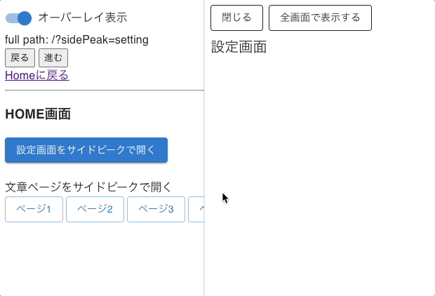
今回検証用で作ったものは以下になります。HOME画面でボタンをクリックしたら該当するページがサイドピークで表示され、サイドピークのヘッダーではこれを閉じたり全画面表示に切り替えることができます。またサイドピークはオーバーレイかエクスパンドのどちらを選択でき、後ろに隠れても良いからサイドピークをより広く使いたい場合も対応しています。
なお、ダミーの文章は Lorem JPsum | 自然な日本語ダミーテキストを自動生成 というサイトから作りました。
サイドピークの実装
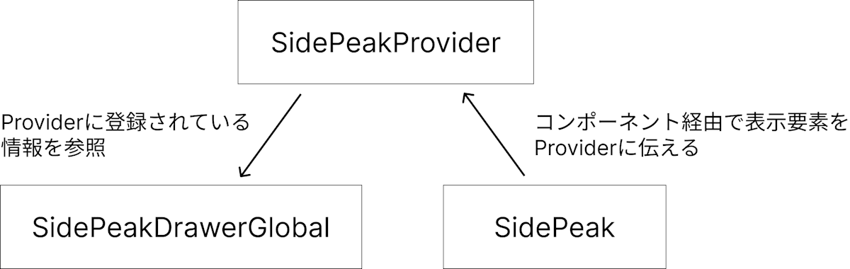
今回実装したサイドピークの大枠の構成は以下のようになっています。SidePeakProviderでサイドピークの情報を管理して、SidePeakコンポーネント経由で表示する内容をProviderに伝え、SidePeakDrawerGlobalコンポーネントで実際の内容を表示します。このような作りにしているのはエクスパンドでサイドピークを開くケースを考慮するとSidePeakDrawerGlobalの配置場所が限定されてしまうため、Portalのように好きな場所でSidePeakを呼び出すとSidePeakDrawerGlobalの場所に表示されるようにしたかったためです。
Providerを用意
まずはサイドピークの情報を管理するProviderを用意します。今回は表示する要素だけあれば十分なのでその値でopen, closeできるようなメソッドもコンテキスト値として追加するだけです。
import type { FC, PropsWithChildren, ReactNode } from 'react';
import { createContext, useCallback, useContext, useState } from 'react';

/** サイドピークに表示するデータ */
export type SidePeakValue = {
  /** コンテンツ */
  content: ReactNode;
};

/** サイドピークのコンテキストデータ(nullの時は非表示) */
export type SidePeakContextValue = {
  /** サイドピークデータ(nullの時は非表示) */
  currentValue: SidePeakValue | null;
  /**
   * サイドピークを開く。既に開いている場合は上書きされる。
   * @param value - サイドピークに表示するデータ
   */
  open: (value: SidePeakValue) => void;
  /**
   * サイドピークを閉じる
   */
  close: () => void;
};

const SidePeakContext = createContext<SidePeakContextValue | undefined>(
  undefined
);

export type SidePeakProviderProps = PropsWithChildren;

export const SidePeakProvider: FC<SidePeakProviderProps> = ({ children }) => {
  const [sidePeakValue, setSidePeakValue] =
    useState<SidePeakContextValue['currentValue']>(null);

  const openSidePeak = useCallback<SidePeakContextValue['open']>((value) => {
    setSidePeakValue(value);
  }, []);

  const closeSidePeak = useCallback<SidePeakContextValue['close']>(() => {
    setSidePeakValue(null);
  }, []);

  return (
    <SidePeakContext
      value={{
        currentValue: sidePeakValue,
        open: openSidePeak,
        close: closeSidePeak,
      }}
    >
      {children}
    </SidePeakContext>
  );
};

/**
 * サイドピークのコンテキストデータを取得する
 */
export const useSidePeakContextValue = () => {
  const context = useContext(SidePeakContext);
  if (context == null) {
    throw new Error('SidePeakProviderが設定されていません。');
  }
  return context;
};
サイドピークの枠を作成
続いてスクショの赤枠で囲った部分のコンポーネントを作ります。

閉じると全画面表示のボタンは共通で、その下の要素は好きなものを出せるようにするため以下のようなpropsにしました。
export type SidePeakProps = {
  /** 全画面表示の際に遷移するURL */
  fullSizeUrl: string;
  /**
   * 閉じる時
   */
  onClose: () => void;
  /** 子要素 */
  children: ReactNode;
};
前セクションで作ったProviderに赤枠で表示する要素を送るように書くと以下のようになります。useEffectで登録することでクリーンアップ時に閉じる処理を書けるため、SidePeakのrenderをやめると自動で閉じてくれます。
import { NavLink } from 'react-router';
import { Box, Stack, Button } from '@mui/material';
import type { FC, ReactNode } from 'react';
import { useEffect } from 'react';

import { useSidePeakContextValue } from './SidePeakProvider';

export const SidePeak: FC<SidePeakProps> = ({
  fullSizeUrl,
  onClose,
  children,
}) => {
  const { open, close } = useSidePeakContextValue();

  useEffect(() => {
    open({
      content: (
        <Box sx={{ height: '100%', display: 'flex', flexDirection: 'column' }}>
          <Stack
            sx={{
              p: 1,
              backgroundColor: '#fff',
            }}
            direction="row"
            spacing={1}
          >
            <Button color="inherit" variant="outlined" onClick={onClose}>
              閉じる
            </Button>
            <Button
              component={NavLink}
              color="inherit"
              variant="outlined"
              to={fullSizeUrl}
            >
              全画面で表示する
            </Button>
          </Stack>
          <Box sx={{ px: 1, pb: 1, flex: '1 1 0', overflowY: 'auto' }}>
            {children}
          </Box>
        </Box>
      ),
    });

    return () => {
      close();
    };
  }, [fullSizeUrl, children, open, close, onClose]);

  return null;
};
サイドピークのドロワー部分を作成
最後にドロワー部分を実装します。全部一気に説明すると長くなるのでまずはリサイズ機能のないシンプルなドロワーについて説明し、その後にリサイズ機能部分について説明したいと思います。
ドロワーの表示
リサイズ機能のないシンプルなドロワーのコードは以下になります。エクスパンド時は実装を簡単にするため指定した幅だけ確保した空のBoxをrenderすることでドロワー領域を占有したかのように見せています。
コンテンツ部分をキャッシュしているのはクローズアニメーション時に要素が消えてしまわないようにする方法で、詳細は以下の記事をご参照ください。ダイアログではアニメーション終了後に勝手にコンポーネントを破棄してくれましたが、ドロワーではそうならなかったのでunmountOnExitをtrueにして明示的に破棄するようにしています。
import { Box, Drawer } from '@mui/material';
import type { FC } from 'react';
import { useRef } from 'react';

import { useSidePeakContextValue } from './SidePeakProvider';

export type SidePeakDrawerGlobalProps = {
  /** 初期の幅 */
  initialWidth?: number;
  /**
   * ドロワーの表示方法
   * - `overlay`: オーバーレイ表示
   * - `expand`: 拡張表示(ドロワー分の幅を確保する)
   */
  variant: 'overlay' | 'expand';
};

export const SidePeakDrawerGlobal: FC<SidePeakDrawerGlobalProps> = ({
  initialWidth = 300,
  variant,
}) => {
  const { currentValue } = useSidePeakContextValue();

  // TODO: リサイズできるようにする
  const sidePeakWidth = initialWidth;

  // 閉じる直前のコンテンツをキャッシュしておく
  const cachedContentRef = useRef<React.ReactNode | null>(null);
  if (currentValue != null) {
    cachedContentRef.current = currentValue.content;
  }

  return (
    <>
      {variant === 'expand' && (
        <Box
          style={{
            width: currentValue != null ? `${sidePeakWidth}px` : 0,
          }}
        />
      )}
      <Drawer
        open={currentValue != null}
        variant="persistent"
        anchor="right"
        slotProps={{
          paper: {
            sx: {
              borderLeft: variant === 'expand' ? `solid 2px #ccc` : undefined,
              overflow: 'visible',
            },
            style: {
              width: `${sidePeakWidth}px`,
            },
            elevation: variant === 'overlay' ? 2 : 0,
          },
          transition: {
            // アニメーション後にコンポーネントを破棄するように設定
            unmountOnExit: true,
          },
        }}
      >
        {cachedContentRef.current}
      </Drawer>
    </>
  );
};
ドロワーのリサイズ
続いてドロワーのリサイズ機能を実装します。リサイズロジックは変数がごちゃごちゃするのでhooksでまとめました。このhooksのインターフェースは以下のようになっています。
import type { MouseEventHandler } from 'react';

type UseSidePeakResizerArgs = {
  /** 初期の幅 */
  initialWidth: number;
  /** 最小幅 */
  minWidth?: number;
  /**
   * リサイズ終了イベント
   * @param newWidth - リサイズ後の幅
   */
  onResizeEnd: (newWidth: number) => void;
}

type UseSidePeakResizerReturn = {
  /** サイドピークの幅を参照するためのref */
  ref: (element: HTMLElement | null) => void
  /** リサイズ中か */
  isResizing: boolean
  /** サイドピークの幅 */
  sidePeakWidth: number
  /** リサイズバーをクリックした時(これをトリガーにリサイズが始まる) */
  handleMouseDown: MouseEventHandler<HTMLElement>
}
これを元に実装すると以下のようになります。ざっくりポイントとしては以下になります。
- マウスダウン時の座標とサイドピーク幅を取得し、ドラッグ時にマウス座標の差分をサイドピーク幅に加算してリサイズする
- リサイズ時は最小幅はargsの
minWidthを下回らないように調整し、最大幅はDOMに対してmaxWidthを設定するので、最終結果は実際に設定しているsidePeakWidthよりDOMに表示されている幅で確定する
- リサイズ時は最小幅はargsの
- ドラッグ中に対象のDOMから離れてもドラッグやマウスアップのイベントを拾えるようにwindowにリスナーを登録
const useSidePeakResizer = ({
  initialWidth,
  minWidth = 300,
  onResizeEnd,
}: UseSidePeakResizerArgs): UseSidePeakResizerReturn => {
  const [sidePeakWidth, setSidePeakWidth] = useState(initialWidth);
  const [isResizing, setIsResizing] = useState(false);

  const elSidePeakRef = useRef<HTMLElement | null>(null);
  const ref = useCallback((element: HTMLElement | null) => {
    elSidePeakRef.current = element;
  }, []);

  const startMousePosXRef = useRef<number | null>(null);
  const startSidePeakWidthRef = useRef<number | null>(null);

  const handleMouseDown: MouseEventHandler<HTMLElement> = useCallback(
    (event) => {
      if (elSidePeakRef.current == null) {
        return;
      }
      startMousePosXRef.current = event.clientX;
      startSidePeakWidthRef.current = Math.max(
        elSidePeakRef.current.offsetWidth,
        minWidth
      );
      setIsResizing(true);
      // ドラッグ中はリサイズカーソルを維持する(セパレートバーを出ると普通のカーソルに戻ることがあるため)
      document.body.style.cursor = 'col-resize';
    },
    [minWidth]
  );

  useEffect(() => {
    const handleMouseMove = (event: MouseEvent) => {
      if (
        startMousePosXRef.current == null ||
        startSidePeakWidthRef.current == null
      ) {
        return;
      }
      const diff = event.clientX - startMousePosXRef.current;
      setSidePeakWidth(
        Math.max(startSidePeakWidthRef.current - diff, minWidth)
      );
    };
    const handleMouseUp = () => {
      if (
        startMousePosXRef.current == null ||
        startSidePeakWidthRef.current == null
      ) {
        return;
      }

      startMousePosXRef.current = null;
      startSidePeakWidthRef.current = null;
      setIsResizing(false);
      // カーソルスタイルを外す
      document.body.style.cursor = '';

      if (elSidePeakRef.current != null) {
        setSidePeakWidth(elSidePeakRef.current.offsetWidth);
        onResizeEnd(elSidePeakRef.current.offsetWidth);
      }
    };
    window.addEventListener('mousemove', handleMouseMove);
    window.addEventListener('mouseup', handleMouseUp);

    return () => {
      window.removeEventListener('mousemove', handleMouseMove);
      window.removeEventListener('mouseup', handleMouseUp);
    };
  }, [minWidth, onResizeEnd]);

  return {
    ref,
    isResizing,
    sidePeakWidth,
    handleMouseDown,
  };
};
続いてリサイズ用のバーを表示するコンポーネントを用意します。バーをクリックしやすくなるように、実際にハイライトが表示される幅よりも広くクリック領域を取れるように工夫しました。具体的にはmanipulationWidthとvisibleWidthの2つのpropsを使って、クリック領域はBoxコンポーネントで、表示領域はbefore擬似要素で表示しました。
import { blue } from '@mui/material/colors';

/** リサイズ用ボーダーのアクティブカラー */
const RESIZER_ACTIVE_BORDER_COLOR = blue[500];

const SidePeakResizer: FC<{
  /** アクティブ状態か */
  isActive: boolean;
  /** 操作可能な幅 */
  manipulationWidth: number;
  /** アクティブ時の表示幅 */
  visibleWidth: number;
  /** マウスクリック時 */
  onMouseDown: MouseEventHandler<HTMLElement>;
}> = ({ isActive, manipulationWidth, visibleWidth, onMouseDown }) => {
  return (
    <Box
      sx={{
        position: 'absolute',
        left: `-${Math.ceil(manipulationWidth / 2)}px`,
        top: 0,
        height: '100%',
        width: `${manipulationWidth}px`,
        cursor: 'col-resize',
        userSelect: 'none',
        '&::before': {
          content: '""',
          position: 'absolute',
          top: 0,
          left: `${Math.floor((manipulationWidth - visibleWidth) / 2)}px`,
          height: '100%',
          width: `${visibleWidth}px`,
          backgroundColor: isActive
            ? RESIZER_ACTIVE_BORDER_COLOR
            : 'transparent',
          transition: 'background-color 0.3s',
        },
        '&:hover::before': {
          backgroundColor: RESIZER_ACTIVE_BORDER_COLOR,
        },
      }}
      onMouseDown={onMouseDown}
    />
  );
};
最後にこれらをSidePeakDrawerGlobalで呼び出したら完成です。
 export type SidePeakDrawerGlobalProps = {
   /** 初期の幅 */
   initialWidth?: number;
   /**
    * ドロワーの表示方法
    * - `overlay`: オーバーレイ表示
    * - `expand`: 拡張表示(ドロワー分の幅を確保する)
    */
   variant: 'overlay' | 'expand';
+  /**
+   * リサイズによって最終的に確定した幅
+   * @param newWidth - 新しい幅
+   */
+  onResizeEnd: (newWidth: number) => void;
 };

 export const SidePeakDrawerGlobal: FC<SidePeakDrawerGlobalProps> = ({
   initialWidth = 300,
   variant,
+  onResizeEnd,
 }) => {
   const { currentValue } = useSidePeakContextValue();

-  // TODO: リサイズできるようにする
-  const sidePeakWidth = initialWidth;
+  const { ref, isResizing, sidePeakWidth, handleMouseDown } =
+    useSidePeakResizer({
+      initialWidth,
+      minWidth: 300,
+      onResizeEnd,
+    });

   // 閉じる直前のコンテンツをキャッシュしておく
   const cachedContentRef = useRef<React.ReactNode | null>(null);
   if (currentValue != null) {
     cachedContentRef.current = currentValue.content;
   }

   return (
     <>
       {variant === 'expand' && (
         <Box
+          sx={{
+            maxWidth: variant === 'expand' ? '50vw' : '80vw',
+            transition: isResizing ? undefined : 'width 0.3s',
+          }}
           style={{
             width: currentValue != null ? `${sidePeakWidth}px` : 0,
           }}
         />
       )}
       <Drawer
         open={currentValue != null}
         variant="persistent"
         anchor="right"
         slotProps={{
           paper: {
             sx: {
               borderLeft: variant === 'expand' ? `solid 2px #ccc` : undefined,
+              maxWidth: variant === 'expand' ? '50vw' : '80vw',
               overflow: 'visible',
             },
             style: {
               width: `${sidePeakWidth}px`,
             },
             elevation: variant === 'overlay' ? 2 : 0,
           },
           transition: {
             unmountOnExit: true,
           },
         }}
       >
+        <SidePeakResizer
+          isActive={isResizing}
+          manipulationWidth={9}
+          visibleWidth={3}
+          onMouseDown={handleMouseDown}
+        />
         {cachedContentRef.current}
       </Drawer>
     </>
   );
 };
使い方
ここからは実装したサイドピークの使用例を書いていきます。
サイドピークの表示場所を指定
まずはサイドピークの表示先を指定します。基本的にはレイアウト部分に配置すると思うので、SidePeakProviderと合わせて配置します。SidePeakDrawerGlobalはエクスパンド方式になると幅を確保するように表示するため、direction=rowのStackコンポーネントでラップするなど横に伸びることを考慮してレイアウトを組みます。またサイドピークの幅や表示方法についてlocalStorageに保存しておくとリロードしても設定が残るのでreact-useのuseLocalStorageを使ってステートを更新しています。
import { FC } from 'react';
import { useLocalStorage } from 'react-use';
import { Box, Stack, FormControlLabel, Switch } from '@mui/material';
import { Outlet } from 'react-router';

import { SidePeakProvider } from '../sidePeak/SidePeakProvider';
import { SidePeakDrawerGlobal } from '../sidePeak/SidePeakDrawerGlobal';

export const Layout: FC = () => {
  const [isOverlay, setIsOverlay] = useLocalStorage('IS_OVERLAY', true);
  const [sidePeakWidth, setSidePeakWidth] = useLocalStorage(
    'SIDE_PEAK_WIDTH',
    300
  );

  return (
    <SidePeakProvider>
      <Stack direction="row">
        <Box
          sx={{ p: 1, flex: '1 1 0', maxHeight: '100vh', overflowY: 'auto' }}
        >
          <FormControlLabel
            control={
              <Switch
                checked={isOverlay}
                onChange={(_, checked) => {
                  setIsOverlay(checked);
                }}
              />
            }
            label="オーバーレイ表示"
          />
          <hr />
          <Outlet />
        </Box>
        <SidePeakDrawerGlobal
          initialWidth={sidePeakWidth}
          variant={isOverlay ? 'overlay' : 'expand'}
          onResizeEnd={setSidePeakWidth}
        />
      </Stack>
    </SidePeakProvider>
  );
};
サイドピーク表示のフラグをクエリに登録
Notionと同じようにクエリでサイドピークを表示するかを管理したいため、今回はsidePeakというキー名に何を表示するか指定します。ページ番号など他にもパラメータを含めたい場合は追加で足しておきます。アクティブ表示があると分かりやすいのでクエリを見てその設定もしています。
import { NavLink, useSearchParams } from 'react-router';

const parsePageNumber = (pageStr?: string | null) => {
  if (typeof pageStr !== 'string') {
    return undefined;
  }
  if (!/^[0-9]+$/.test(pageStr)) {
    return undefined;
  }
  return parseInt(pageStr);
};

export const HomePage: FC = () => {
  const [searchParams] = useSearchParams();

  const sidePeakValue = searchParams.get('sidePeak');
  const paramPage = parsePageNumber(searchParams.get('page'));

  return (
    <div>
      <h3>HOME画面</h3>
      <Stack alignItems="flex-start" spacing={1}>
        <Button
          component={NavLink}
          variant={sidePeakValue === 'setting' ? 'contained' : 'outlined'}
          to="?sidePeak=setting"
        >
          設定画面をサイドピークで開く
        </Button>
        <Box sx={{ pt: 2 }}>
          <Box>文章ページをサイドピークで開く</Box>
          <Stack direction="row" useFlexGap flexWrap="wrap" spacing={0.5}>
            {Array.from({ length: 5 }).map((_, i) => {
              const page = i + 1;
              const isActive =
                sidePeakValue === 'sentence' && page === paramPage;
              return (
                <Button
                  key={i}
                  component={NavLink}
                  variant={isActive ? 'contained' : 'outlined'}
                  to={`/?sidePeak=sentence&page=${page}`}
                >
                  ページ{page}
                </Button>
              );
            })}
          </Stack>
        </Box>
      </Stack>
    </div>
  );
};
クエリを見てサイドピークをrender
設定されたクエリ値を見て対応するサイドピークをrenderするコンポーネントを用意します。該当するものがなければ何もrenderしないでおくと自動で閉じられます。
const SidePeakEntry: FC = () => {
  const [searchParams, setSearchParams] = useSearchParams();

  const closeSidePeak = useCallback(() => {
    setSearchParams((prevSearchParams) => {
      prevSearchParams.delete('sidePeak');
      return prevSearchParams;
    });
  }, []);

  const sidePeakValue = searchParams.get('sidePeak');

  if (sidePeakValue === 'setting') {
    return (
      <SidePeak fullSizeUrl="/setting" onClose={closeSidePeak}>
        <SettingPage />
      </SidePeak>
    );
  }

  if (sidePeakValue === 'sentence') {
    const page = parsePageNumber(searchParams.get('page'));
    return (
      <SidePeak
        fullSizeUrl={`/sentences/${page ?? '1'}`}
        onClose={closeSidePeak}
      >
        <SentencePage page={page} />
      </SidePeak>
    );
  }
};
これを先ほどのページコンポーネントに配置したら完了です。
 export const HomePage: FC = () => {
   return (
     <div>
       <h3>HOME画面</h3>
       {/* 省略 */}
+      <SidePeakEntry />
     </div>
   );
 };
終わりに
以上がReactを使ったサイドピークの実装でした。ReactはReactElementを一度変数で持つことができるためProviderに描画したい要素を送って好きな場所で表示させることができて、好きな場所でサイドピークの中身を設定することができました🎉 サイドピークを実装したい人の参考になれば幸いです。
Discussion