Flutterの新しいほうのボタンウィジェットのスタイルを変える方法
Flutterは変化が速く、少し前の記事だとFlatButtonやRaisedButtonを使ったものが多いです。
ですが、Flutter 1.20.0でボタンウィジェットが新しくなってボタンへのデザイン適用がButtonStyleを使ったものに変わっています。最初、どうやってデザイン変えるのか分からなかったので調べたことを記載しておきます。
環境
- macOS Big Sur Version 11.3.1
- Flutter 2.2.0
- Dart 2.13.0
TextButtonのスタイルを変えてみる
deprecateになったFlatButtonでは、ボタンのデザインを変えるにはFlatButtonが持つcolorやdisabledColorといったプロパティを直接指定すればOKでしたが、新しいTextButtonではそれらのプロパティがなくなり、styleプロパティでButtonStyleを使って指定するという形になっています。
import 'package:flutter/material.dart';
class NewButtonStyle extends StatelessWidget {
const NewButtonStyle({Key? key}) : super(key: key);
Widget build(BuildContext context) {
return Scaffold(
appBar: AppBar(
title: Text('ボタンスタイルサンプル'),
),
body: Center(
child: TextButton(
  style: ButtonStyle(
    backgroundColor: MaterialStateProperty.all<Color>(Colors.teal),
  ),
onPressed: () {
},
child: const Text(
'サンプル',
style: TextStyle(
color: Colors.white
),
),
),
),
);
}
}
styleプロパティでButtonStyleウィジェットを使ってデザインを変更しています。以下の部分ですね。
child: TextButton(
style: ButtonStyle(
backgroundColor: MaterialStateProperty.all<Color>(Colors.teal),
),
さらにMaterialStatePropertyというのがありますが、以下のようにウィジェットの「状態」に依存する値を表現するためのウィジェットとなります。
Material state properties represent values that depend on a widget's material "state"
じゃあ、「状態」ってなんなのかというと
The state is encoded as a set of MaterialState values, like MaterialState.focused, MaterialState.hovered, MaterialState.pressed.
フォーカスしたときやホバーしたとき、ボタンが押されたときといったイベントに対応するもののようです。
この各状態に対応した値が定義されているのがMaterialStateでこれはenumになっています。
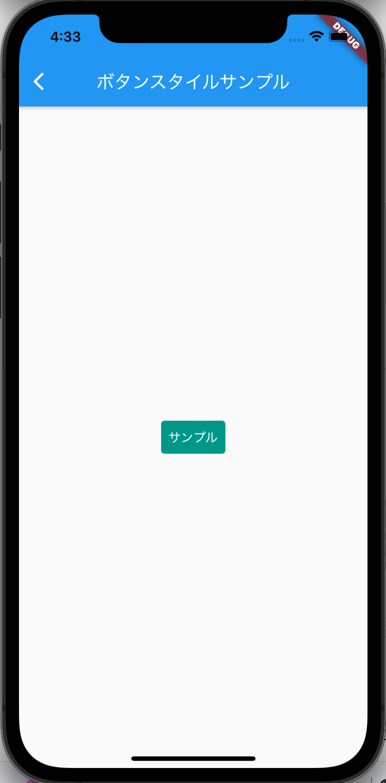
MaterialStateProperty.all<Color>(Colors.teal)と指定することで、MaterialStateで定義されているフォーカス時やホバー時などすべての状態でのボタンの色をまとめて指定することができます。
このMaterialStateProperty.allを使った書き方と公式のドキュメントで MaterialStateProperty.resolveWithを使った書き方を比べると、イメージが掴めるかと思いますでの適宜参考にしてみてください。
現時点のコードを実際に動かす以下のようになります。
styleForm()を使って簡単に書く
MaterialStatePropertyって書くのちょっとめんどくさいですね。あまり直観的でもないように感じます。そのあたりは考慮されていて、公式ドキュメントでstyleForm()というユーティリティーメソッドを紹介していたのでそちらで書き直してみます。
import 'package:flutter/materia///l.dart';
class NewButtonStyle extends StatelessWidget {
const NewButtonStyle({Key? key}) : super(key: key);
Widget build(BuildContext context) {
return Scaffold(
appBar: AppBar(
title: Text('ボタンスタイルサンプル'),
),
body: Center(
child: TextButton(
  style: TextButton.styleFrom(
    backgroundColor: Colors.teal,
  ),
onPressed: () {},
child: const Text(
'サンプル',
style: TextStyle(
color: Colors.white
),
),
),
),
);
}
}
ソースの以下の部分でボタンの色を指定しています。特に追加で説明する必要ないくらいわ
さきほどの MaterialStatePropertyを使った場合と比べてだいぶわかりやすくなりました。
child: TextButton(
style: TextButton.styleFrom(
backgroundColor: Colors.teal,
),
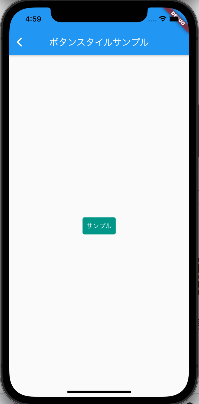
実際に動かすとこんな感じになります。
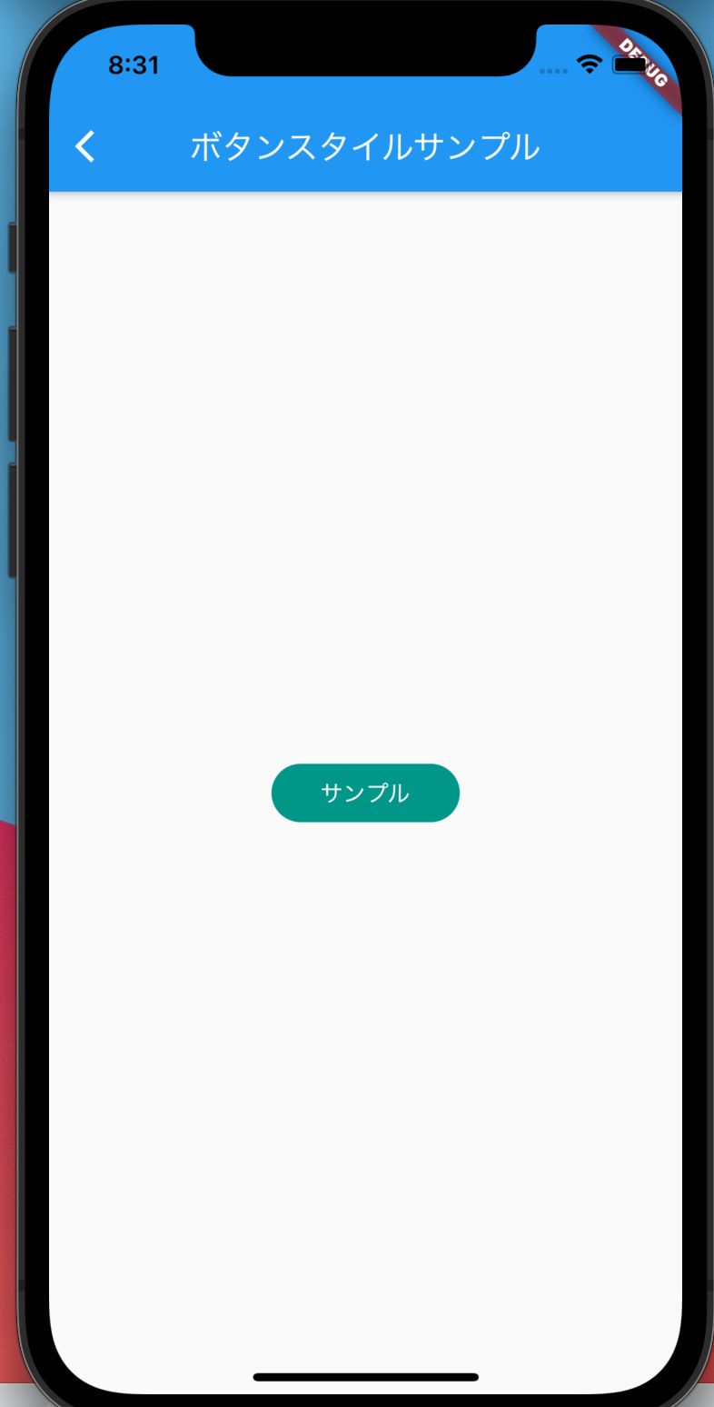
他にも形を変えたければ shape プロパティにこんな指定してあげれば大丈夫です。
child: TextButton(
  style: TextButton.styleFrom(
    backgroundColor: Colors.teal,

    shape: const RoundedRectangleBorder(
      borderRadius: BorderRadius.all(Radius.circular(100)),
    ),
RoundedRectangleBorderを使って角丸にしてみました。
他にもpaddingを設定したり、アウトラインを設定したりもできます。
最後に本記事でのソース全体を載せておきます。
mainは別クラスで書いているので、適宜補完してもらえれば。。。
import 'package:flutter/material.dart';
class NewButtonStyle extends StatelessWidget {
const NewButtonStyle({Key? key}) : super(key: key);
Widget build(BuildContext context) {
return Scaffold(
appBar: AppBar(
title: Text('ボタンスタイルサンプル'),
),
body: Center(
child: TextButton(
style: TextButton.styleFrom(
backgroundColor: Colors.teal,
shape: const RoundedRectangleBorder(
borderRadius: BorderRadius.all(Radius.circular(100)),
),
padding: EdgeInsets.symmetric(horizontal: 30),
),
onPressed: () {},
child: const Text(
'サンプル',
style: TextStyle(
color: Colors.white
),
),
),
),
);
}
}
Discussion