📝
matplotlibの備忘録
毎回ググってるし、必要な情報は一か所にまとまっていて欲しいという、自分のための備忘録です。
plt.plotか、ax.plotか
import matplotlib.pyplot as plt
した後、簡単なグラフを書くには大きく2つの方法があります。一つ目は、
plt.plot(...)
plt.sho()
とする方法です。もう一つは、
fig, ax = plt.subplots()
ax.plot(...)
plt.show()
と書く方法です。
グラフを1つ描画する場合にはどちらでもよいのですが、前者は後者の簡易的な記述方法ですので、後者の書き方で覚えておいたほうが応用が利くと思います。
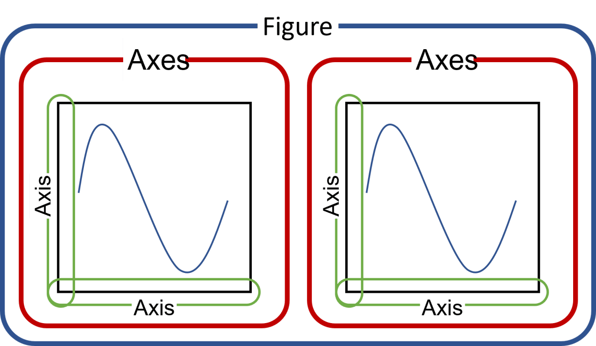
後者の書き方を理解するにあたり、matplotlibの描画領域について理解しておく必要があります。
matplotlibでは、描画領域全体をfigure、その中の一つ一つのグラフの描画領域がaxesになります(下図参照)。
複数プロット
import matplotlib.pyplot as plt

n_row, n_col = 2, 2
fig, ax = plt.subplots(n_row, n_col, figsize=(8, 6))
# 描画領域が1列 or 1行のときaxはベクトルですが、それ以外は行列になるので
# 各要素へのアクセス方法に注意

for i in range(n_row):
    for j in range(n_col):
        ax[i, j].plot([1, 2, 3, 4, 5])
        ax[i, j].set_title(f"ax[{i}, {j}]")
fig.suptitle("Main title")
fig.tight_layout()
plt.savefig("multi_plots.png")

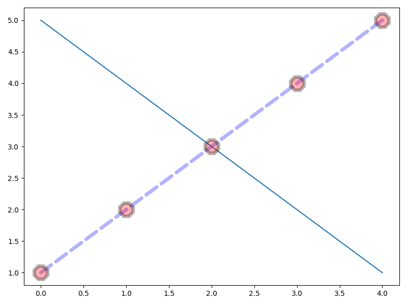
シンプルな一次元配列のプロット(plot)
import matplotlib.pyplot as plt

fig, ax = plt.subplots(1, 1, figsize=(8, 6))
ax.plot(
    # xの値な省略するとrange(len(y))。x=と指定するとエラー
    [1, 2, 3, 4, 5], # yの値。y=と指定するとエラー
    label="ax1",  # 凡例に表示するラベル
    color="blue",  # 線の色、c=も可
    linestyle="--",  # 線のタイプ('-', '--', '-.', ':', '')、ls=も可
    linewidth=5,  # lwも可
    dash_capstyle="round",
    marker="8",  # マーカーの形(None, 'o', 'v', '^', '<', '>', '8', 's', 'p', '*', 'h', 'H', 'D', 'd', 'P', 'X')
    markersize=20,
    markerfacecolor="red",
    markeredgecolor="black",
    markeredgewidth=5,
    alpha=0.3,  # 線とマーカー両方の透過度
    zorder=2,  # 描画順。大きいほうが上(透過していると分かりづらいが。。。)
)
ax.plot([5, 4, 3, 2, 1], zorder=1)
fig.tight_layout()
plt.savefig("simple_plot.png")
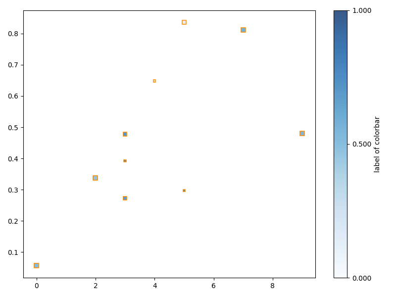
散布図+カラーマップ
import matplotlib as mpl
import matplotlib.pyplot as plt
import numpy as np

np.random.seed(0)

fig, ax = plt.subplots(1, 1, figsize=(8, 6))
sc = ax.scatter(
    np.random.randint(low=0, high=10, size=10),
    np.random.rand(10),
    s=np.random.randint(low=1, high=5, size=10) * 10,  # マーカーサイズ。単一指定も可
    c=np.random.rand(10),  # マーカーの色。単色指定も可
    cmap=mpl.colormaps["Blues"],  # See: https://matplotlib.org/stable/tutorials/colors/colormaps.html
    vmin=0.0,
    vmax=1.0,
    marker="s",  # マーカーの形(None, 'o', 'v', '^', '<', '>', '8', 's', 'p', '*', 'h', 'H', 'D', 'd', 'P', 'X')
    alpha=0.8,
    linewidths=1.5,
    edgecolors="darkorange",
)
plt.colorbar(
    sc,
    ax=ax,  # ax.colorbarは無いので、ax=で指定する。
    location="right",  # right, left, top, bottom
    fraction=0.15,  # カラーバー領域の比率
    aspect=20,  # カラーバーの縦横比
    pad=0.05,  # カラーバーと作図領域の隙間の大きさ
    ticks=[0.0, 0.5, 1.0],
    format="%.3f",
    drawedges=False,  # 色の境界線有無(離散値向け?)
    label="label of colorbar",
)
fig.tight_layout()
plt.savefig("scatter.png")
棒グラフ
グループ化や積み上げなどは、そういう機能があるというより、座標指定でなんとかするイメージです。
import matplotlib.pyplot as plt
import numpy as np

men_means = [20, 34, 30, 35, 27]
women_means = [25, 32, 34, 20, 25]
x = np.arange(len(men_means))
width = 0.4

fig, (ax1, ax2) = plt.subplots(1, 2, figsize=(12, 6))
rects1 = ax1.bar(
    x=x - (width/2),
    height=men_means,
    width=width,
    label="men",
    align="center",  # edge にするとxとバーの左が一致する
    edgecolor="black",
    linewidth=3,
    # tick_label=["M1", "M2", "M3", "M4", "M5"],  # グループが存在しない場合
)
rects2 = ax1.bar(
    x+(width/2), women_means, width, label="women",
)
ax1.bar(
    x=[0.8, 1.8, 2.8],
    height=[5, 3, 1],
    width=width,
    bottom=men_means[1:4],  # 始点(bottom)を指定することで積み上げる
    yerr=[1, 3, 5],  # エラーバーの長さ
    ecolor="pink",  # エラーバーの色
    capsize=5,  # エラーバーのキャップ(横線)の長さ
    color=["tab:red", "tab:purple", "tab:green"],
    label=["foo", "bar", "_hoge"],  # アンダーバーで始めると凡例に描かれなくなる
    log=False,  # Trueにしたら縦軸がログスケールに
    alpha=0.5,
)
ax1.set_xticks(
    np.arange(len(men_means)),
    ["G1", "G2", "G3", "G4", "G5"],
)
ax1.bar_label(
    rects1,
    padding=5,  # バーの端からの距離
    fmt="%.1f",
)
ax1.bar_label(rects2, padding=0)
ax1.legend()

ax2.barh(
    y=[1, 2, 3],
    width=[100, 2000, 30000],
    xerr=[50, 1000, 15000],
    log=True,
)
p2 = ax2.barh(2, 10000, left=2000)
ax2.bar_label(p2, label_type="edge")  # edge(default)だと積み上げた和に
ax2.bar_label(p2, label_type="center")  # centerとすると積み上げ分のみになる
fig.tight_layout()
plt.savefig("bars.png")

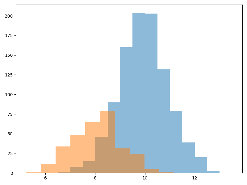
ヒストグラム
確率密度関数を描きたい場合、pandasのplot.kdeか、seabornのdisplotまたはkdeplotを使う必要があると思います。
import matplotlib.pyplot as plt
import numpy as np

np.random.seed(0)
x1 = np.random.normal(loc=10, scale=1, size=1000)
x2 = np.random.normal(loc=8, scale=1, size=300)

fig, ax = plt.subplots(1, 1, figsize=(8, 6))

ax.hist(
    x=x1,
    # binを配列で指定した場合、[i, i+1)が一つのbinになる。
    # 他にbinの総数を指定する方法、"auto"のように文字列で指定し、
    # np.histogram_bin_edgesに計算させる方法がある
    bins=np.arange(6, 14, 0.5),
    density=False,  # Trueだと確率密度として和が1にになるように正規化される
    cumulative=False,  # Trueだと累積和
    log=False,
    stacked=False,  # x=[x1, x2]のようにしてTrueにすると積み上げられる
    color="tab:blue",
    alpha=0.5,
)

ax.hist(x2, color="tab:orange", alpha=0.5)

fig.tight_layout()
plt.savefig("hist.png")
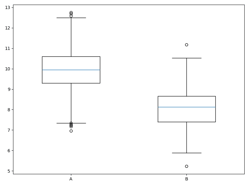
箱ひげ図
import matplotlib.pyplot as plt
import numpy as np

np.random.seed(0)
x1 = np.random.normal(loc=10, scale=1, size=1000)
x2 = np.random.normal(loc=8, scale=1, size=300)

fig, ax = plt.subplots(1, 1, figsize=(8, 6))

ax.boxplot(
    x=[x1, x2],
    sym=None,  # 外れ値のスタイル。None(default)だと白抜き黒線の丸。""とすると描画しない。"b+"みたいな指定も可
    vert=True,  # Falseだと横向き
    widths=0.5,  # 箱の幅
    labels=["A", "B"],
    medianprops=dict(color="tab:blue"),  # 中央値の線のプロパティを指定
    # 他にも、boxprops、flierprops、whiskerpropsを設定可能
)

fig.tight_layout()
plt.savefig("boxplot.png")
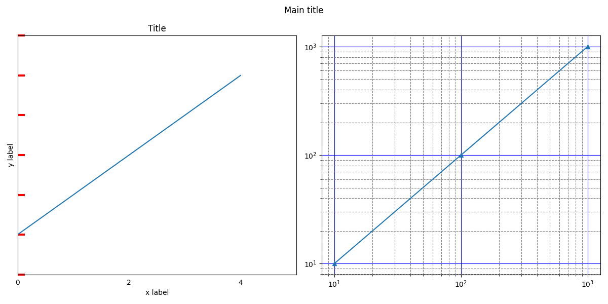
軸周りの修飾
import matplotlib.pyplot as plt
import numpy as np

fig, (ax1, ax2) = plt.subplots(1, 2, figsize=(12, 6))
ax1.plot([1, 2, 3, 4, 5])
ax1.set_xticks(np.arange(0, 8, 2))  # 軸目盛の設定。list渡しでもよい
ax1.set_xlim((0, 5))  # 表示範囲の設定
ax1.set_ylim((0, 6))
ax1.tick_params(
    axis="y",  # 設定対称軸(x, y, both)
    labelleft=False,  # 目盛ラベルを消す(labeltop, labelbottom, labelright, labelleft)
    width=3,  # 目盛線の太さ
    length=10,  # 目盛線の長さ
    direction="in",  # 目盛線の向き(in, out)
    color="red",  # 目盛線の色
)
ax1.tick_params(
    bottom=False,  # 目盛線を消す(top, bottom, right, left)
)
# ax1.set_axis_off()  # 線も目盛も枠も消す場合
ax1.set_xlabel("x label")
ax1.set_ylabel("y label")
ax1.set_title("Title")

ax2.plot([10,100,1000],[10,100,1000],marker='^')
ax2.set_xscale('log')
ax2.set_yscale('log')
ax2.grid(
    which='major',
    color='blue',
    linestyle='-'
)
ax2.grid(which='minor', color='gray', linestyle='--')

plt.suptitle("Main title")
fig.tight_layout()
plt.savefig("edit_axes.png")
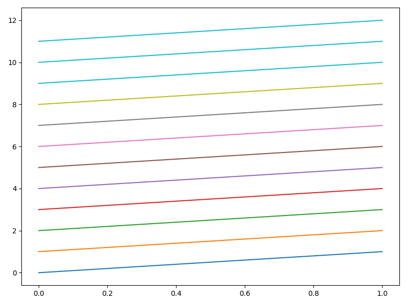
カラーマップ
import matplotlib.pyplot as plt

cmap = plt.get_cmap("tab10")
# tab10(標準), tab20, tab20b, tab20c, Set1, Set2, Set3,
# Pastel1, Pastel2, Paired, Accent, Dark2
# cmapはcmap(i)と丸括弧でアクセスする
# 用意されている色数を超えると最後の色が繰り返される。

fig, ax = plt.subplots(1, 1, figsize=(8, 6))
for i in range(12):
    ax.plot([0 + i, 1 + i], color=cmap(i))
fig.tight_layout()
plt.savefig("color_map.png")
第2軸の利用
import matplotlib.pyplot as plt

fig, ax1 = plt.subplots(1, 1, figsize=(8, 6))
ax1.plot([1, 2, 3, 4, 5], label="ax1")
ax1.set_ylabel("axis 1")
ax2 = ax1.twinx()
ax2.plot([500, 400, 300, 200, 100], label="ax2", c="darkorange")
ax2.tick_params(
    right=False,  # 目盛線を消す(top, bottom, right, left)
)
ax2.set_ylabel("axis 2")
# 2軸を利用する場合、凡例をマージする
h1, l1 = ax1.get_legend_handles_labels()
h2, l2 = ax2.get_legend_handles_labels()
ax1.legend(
    h1 + h2,
    l1 + l2,
    loc="upper center",
    # best, upper right, upper left, lower left, lower right, right,
    # center left, center right, lower center, upper center, center
)
fig.tight_layout()
plt.savefig("twin_axes.png")

テキスト(日本語)
自分の環境で使える日本語フォントは以下から探します。
import matplotlib

fonts = set([f.name for f in matplotlib.font_manager.fontManager.ttflist])
print(fonts)
import matplotlib.pyplot as plt

plt.rcParams["font.family"] = "Yu Gothic"

fig, ax = plt.subplots(1, 1, figsize=(8, 6))

ax.bar([1, 2], [5, 10], 0.25)
ax.set_xticks([1, 2], ["棒1", "棒2"])
ax.set_ylabel("軸ラベル")
ax.set_title("タイトル")
ax.text(
    1.5,
    3,
    "数式も書ける\n$\sum_{i=0}^\infty x_i$",
    fontsize=20,
    color="tab:red",  # None(default)だと黒
    ha="center",  # horizontal alignment (center, left, right)
    ma="left",  # multi line alignment (center, left, right)
    va="bottom",  # vertical alignment (bottom, baseline, center, center_baseline, top)
    rotation=45,
)
ax.annotate(
    "アノテーション",
    xy=(1, 5),
    xytext=(1.3, 8),
    arrowprops=dict(
        facecolor="k",
        width=1,
        shrink=0.05,
    ),
    fontsize=12,
    color="yellow",
    backgroundcolor="gray",
)
ax.legend(["凡例"], fontsize=20)

fig.tight_layout()
plt.savefig("text.png")

Discussion