お試しでReact×tailwindcssでコンポーネントを作れるようにStorybookを準備する


TL;DR
- ふと「xxx みたいなコンポーネントを作るってなるとどうすればいいんだろ?」と思うことがあるかと思います
- そういう時に、ささっとお試しで作れる PlayGround 的なものを用意しておきたい
- 「なら Storybook とかいいんじゃね?」と思ったので、導入にあたってのメモを残します
とりあえず CRA
Storybook を導入する前に、そもそもの基盤となるプロジェクトが必要なので CRA します。
今回は Vite プロジェクトを作成することにします。
npm create vite@latest
React と TypeScript を選択します。
Need to install the following packages:
  create-vite@4.4.0
Ok to proceed? (y) y
✔ Project name: … vitest-react
✔ Select a framework: › React
✔ Select a variant: › TypeScript

Scaffolding project in /Users/yoshidakengo/project/vitest-react...

Done. Now run:

  cd vitest-react
  npm install
  npm run dev
あとは npm install と npm run dev をしろと言われているので、やります。
Storybook の準備
では Storybook をインストールするため以下のコマンドを実行。
npx storybook@latest init
最新版をインストールするか聞かれるので、yとしてインストールが終わるのを待つ。
Need to install the following packages:
  storybook@7.2.2
Ok to proceed? (y) y
インストール後、以下を実行
npm run storybook
この画面が見えれば OK

とりあえず使い方を把握するために、Storybook が雛形で用意してくれているコンポーネントたちをみていきます。
簡単に使い方を確認する
プロパティについて自動で設定値や変更用のスイッチなどを用意してくるようです。

これは*.tsxの Props の内容を自動的に表示してくれているようです。すごい!
//import React from 'react';
import './button.css';

interface ButtonProps {
  /**
   * Is this the principal call to action on the page?
   */
  primary?: boolean;
  /**
   * What background color to use
   */
  backgroundColor?: string;
  /**
   * How large should the button be?
   */
  size?: 'small' | 'medium' | 'large';
  /**
   * Button contents
   */
  label: string;
  /**
   * Optional click handler
   */
  onClick?: () => void;
}

/**
 * Primary UI component for user interaction
 */
export const Button = ({
  primary = false,
  size = 'medium',
  backgroundColor,
  label,
  ...props
}: ButtonProps) => {
  const mode = primary ? 'storybook-button--primary' : 'storybook-button--secondary';
  return (
    <button
      type="button"
      className={['storybook-button', `storybook-button--${size}`, mode].join(' ')}
      style={{ backgroundColor }}
      {...props}
    >
      {label}
    </button>
  );
};
例えば、Is this the principal call to action on the page?という表示を変更しようとするのであれば、コメントを変更後 Storybook を再起動すると反映されていることがわかります。
ただ、再起動しないと変更が反映されてないっぽい(再起動せずに変更する方法があればコメントで教えてください!)
で、*.stories.tsにStoryという型ごとにコンポーネントの引数を定義してあげたりすると、引数ごとのコンポーネントとかを確認できるみたいです。

import type { Meta, StoryObj } from '@storybook/react';

import { Button } from './Button';

// More on how to set up stories at: https://storybook.js.org/docs/react/writing-stories/introduction#default-export
const meta = {
  title: 'Example/Button',
  component: Button,
  parameters: {
    // Optional parameter to center the component in the Canvas. More info: https://storybook.js.org/docs/react/configure/story-layout
    layout: 'centered',
  },
  // This component will have an automatically generated Autodocs entry: https://storybook.js.org/docs/react/writing-docs/autodocs
  tags: ['autodocs'],
  // More on argTypes: https://storybook.js.org/docs/react/api/argtypes
  argTypes: {
    backgroundColor: { control: 'color' },
  },
} satisfies Meta<typeof Button>;

export default meta;
type Story = StoryObj<typeof meta>;

// More on writing stories with args: https://storybook.js.org/docs/react/writing-stories/args
export const Primary: Story = {
  args: {
    primary: true,
    label: 'Button',
  },
};

export const Secondary: Story = {
  args: {
    label: 'Button',
  },
};

export const Large: Story = {
  args: {
    size: 'large',
    label: 'Button',
  },
};

export const Small: Story = {
  args: {
    size: 'small',
    label: 'Button',
  },
};
そして、backgroundColorがカラーピッカーになっているのは、Button.stories.tsで以下のように定義しているかららしい。
  argTypes: {
    backgroundColor: { control: 'color' },
  },
ここを{ control: 'date' }のように指定してあげると、datepicker が表示されるみたいです。

ただ直接指定せずとも引数が正規表現にマッチすれば、colorとdateに関しては推論してくれるみたいですね。
詳しくはドキュメントを参照。
あとはボタンを押した時のイベントハンドラの動きと API,それからテストですが、このあたりは次記事で出す予定のStorybookを使ってGitHubの草コンポーネントを作ってみたで確認してみようと思います。
tailwindcss のインストール
では次に向けて、tailwindcss をインストールしてこの記事は一旦終わっておきます。
Vite プロジェクトそれ自体への適用
まずは Vite それ自体で使えるように設定を行います。
npm install --save-dev tailwindcss postcss autoprefixer
npx tailwindcss init -p
ビルドサイズを縮小するために、purge の設定もしておきます。
module.exports = {
- content: [],
+ content: ['index.html', 'src/**/*.{ts,tsx}'],
 theme: {
   extend: {},
 },
 plugins: [],
}
TailwindCSS のスタイルを読み込みを行うために、import 'tailwindcss/tailwind.css'を追加します。
import React from 'react'
import ReactDOM from 'react-dom/client'
import App from './App.tsx'
import './index.css'
+ import 'tailwindcss/tailwind.css'

ReactDOM.createRoot(document.getElementById('root')!).render(
  <React.StrictMode>
    <App />
  </React.StrictMode>,
)
Tailwind が効いているかを試すために、簡単にクラスを当ててみます。
import { useState } from 'react'
import reactLogo from './assets/react.svg'
import viteLogo from '/vite.svg'
import './App.css'

function App() {
  const [count, setCount] = useState(0)
  return (
    <>
+      <div className="grid grid-cols-2 justify-items-center">
        <div>
          <a href="https://vitejs.dev" target="_blank">
            <img src={viteLogo} className="logo" alt="Vite logo" />
          </a>
+        </div>
+        <div>
          <a href="https://react.dev" target="_blank">
            <img src={reactLogo} className="logo react" alt="React logo" />
          </a>
+        </div>
      </div>
      <h1>Vite + React</h1>
      <div className="card">
-        <button onClick={() => setCount((count) => count + 1)}>
+        <button className="bg-blue-500 hover:bg-blue-700 text-white font-bold py-2 px-4 rounded my-2" onClick={() => setCount((count) => count + 1)}>
          count is {count}
        </button>
        <p>
          Edit <code>src/App.tsx</code> and save to test HMR
        </p>
      </div>
      <p className="read-the-docs">
        Click on the Vite and React logos to learn more
      </p>
    </>
  )
}
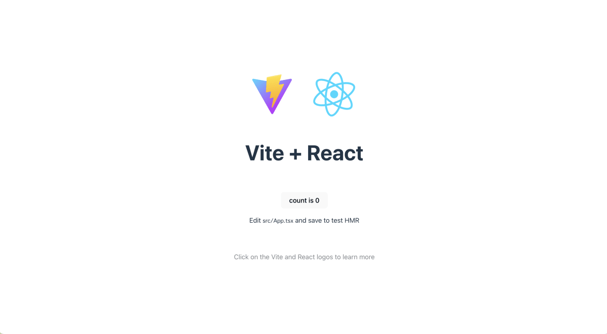
すると以下のように変化します。
適用前
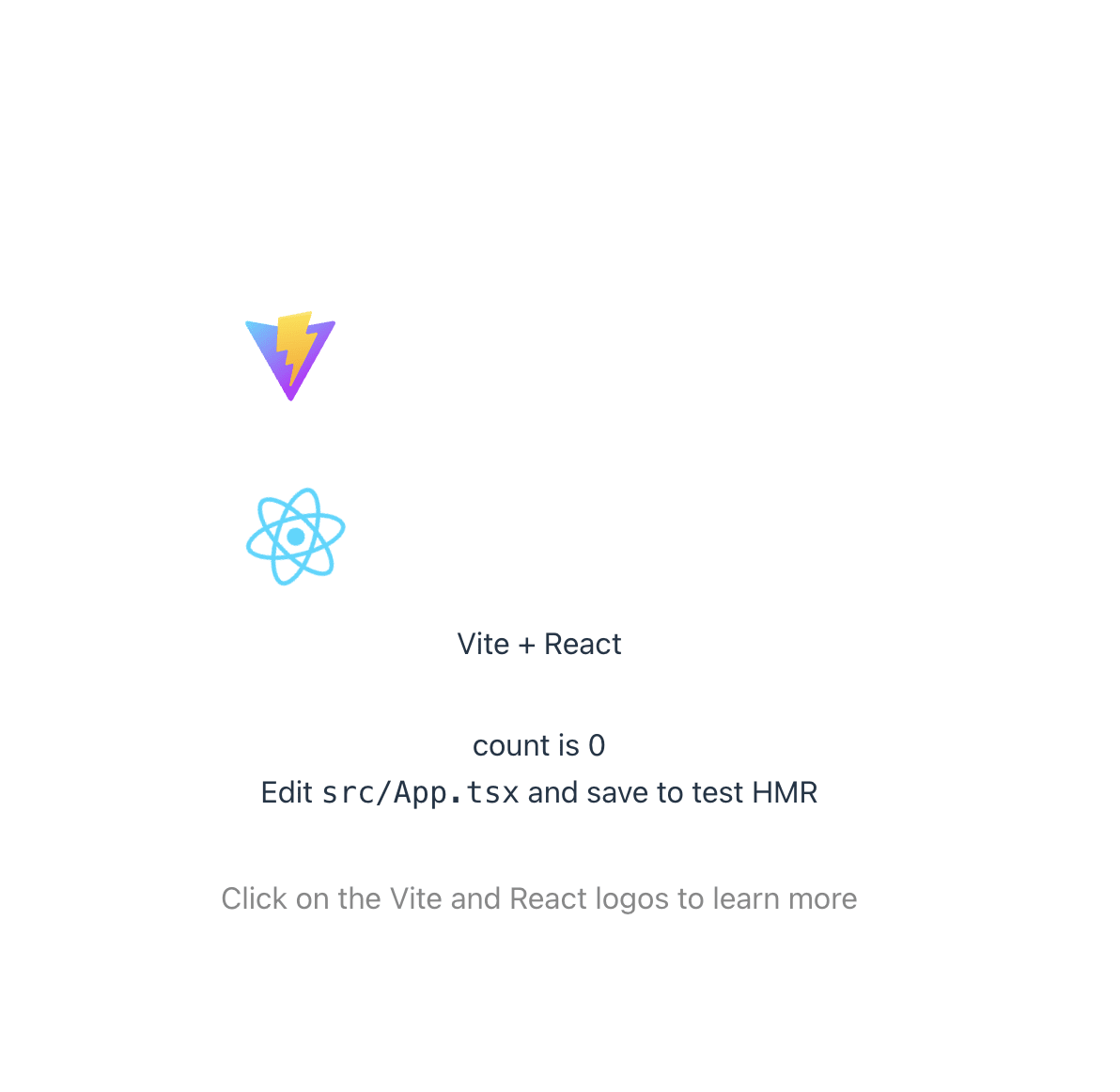
適用後

Storybook への適用
tailwind 本体に加えて、Storybook のアドオンを追加する必要があるのでnpm intallしていきます。
npm install --save-dev @storybook/addon-postcss
アドオンをインストールしたら、.storybook/main.tsと.storybook/preview.tsに以下の内容を追記します。
import type { StorybookConfig } from "@storybook/react-vite";

const config: StorybookConfig = {
  stories: ["../src/**/*.mdx", "../src/**/*.stories.@(js|jsx|mjs|ts|tsx)"],
  addons: [
    "@storybook/addon-links",
    "@storybook/addon-essentials",
    "@storybook/addon-onboarding",
    "@storybook/addon-interactions",
+    {
+      name: '@storybook/addon-postcss',
+      options: {
+        postcssLoaderOptions: {
+          implementation: require('postcss'),
+        },
+      },
+    },
  ],
  framework: {
    name: "@storybook/react-vite",
    options: {},
  },
  docs: {
    autodocs: "tag",
  },
};
export default config;
import type { Preview } from "@storybook/react";
+ import 'tailwindcss/tailwind.css'

const preview: Preview = {
  parameters: {
    actions: { argTypesRegex: "^on[A-Z].*" },
    controls: {
      matchers: {
        color: /(background|color)$/i,
        date: /Date$/,
      },
    },
  },
};

export default preview;
ここまで設定をした時点で、Button.tsxを確認すると以下のように何も表示されていない状態になっているはずです。

ここからは tailwind の class を適用して、tailwind のスタイルが適用されることを確認します。
//import React from 'react';
import './button.css';

interface ButtonProps {
  /**
   * Is this the principal call to action on the page?
   */
  primary?: boolean;
-  /**
-   * What background color to use
-   */
-  backgroundColor?: string;
  /**
   * How large should the button be?
   */
-  size?: 'small' | 'medium' | 'large';
+  size?: 'sm' | 'md' | 'lg';
  /**
   * Button contents
   */
  label: string;
  /**
   * Optional click handler
   */
  onClick?: () => void;
}

/**
 * Primary UI component for user interaction
 */
export const Button = ({
  primary = false,
-  size = 'medium',
+  size = 'md',
-  backgroundColor,
  label,
  ...props
}: ButtonProps) => {
-  const mode = primary ? 'storybook-button--primary' : 'storybook-button--secondary';
+  const mode = primary ? 'bg-blue-500' : 'bg-gray-500';
  return (
    <button
      type="button"
-      className={['storybook-button', `storybook-button--${size}`, mode].join(' ')}
-      style={{ backgroundColor }}
+      className={[
+        'text-white',
+        'rounded',
+        size === "sm" && 'px-2 py-1',
+        size === "md" && 'px-4 py-2',
+        size === "lg" && 'px-8 py-4',
+        mode
+      ].join(' ')}
      {...props}
    >
      {label}
    </button>
  );
};
import type { Meta, StoryObj } from '@storybook/react';

import { Button } from './Button';

// More on how to set up stories at: https://storybook.js.org/docs/react/writing-stories/introduction#default-export
const meta = {
  title: 'Example/Button',
  component: Button,
  parameters: {
    // Optional parameter to center the component in the Canvas. More info: https://storybook.js.org/docs/react/configure/story-layout
    layout: 'centered',
  },
  // This component will have an automatically generated Autodocs entry: https://storybook.js.org/docs/react/writing-docs/autodocs
  tags: ['autodocs'],
  // More on argTypes: https://storybook.js.org/docs/react/api/argtypes
  argTypes: {
-    backgroundColor: { control: 'color' },
  },
} satisfies Meta<typeof Button>;

export default meta;
type Story = StoryObj<typeof meta>;

// More on writing stories with args: https://storybook.js.org/docs/react/writing-stories/args
export const Primary: Story = {
  args: {
    primary: true,
    label: 'Button',
  },
};

export const Secondary: Story = {
  args: {
    label: 'Button',
  },
};

export const Large: Story = {
  args: {
-    size: 'large',
+    size: 'lg',
    label: 'Button',
  },
};

export const Small: Story = {
  args: {
-    size: 'small',
+    size: 'sm',
    label: 'Button',
  },
};
結果、以下のようになれば tailwind が効いている状態です。


おわりに
とりあえず tailwind を使ってコンポーネントを作れるようになりました。
以降の記事では、イベントハンドラの実行(API へのリクエストなど)やテストの実行について確認できればよいかなと思います。
ただテストに関しては Vitest も同梱されているので、そっちでやればいいと思わなくもない。
メンバー募集中!
サーバーサイド Kotlin コミュニティを作りました!
Kotlin ユーザーはぜひご参加ください!!
また関西在住のソフトウェア開発者を中心に、関西エンジニアコミュニティを一緒に盛り上げてくださる方を募集しています。
よろしければ Conpass からメンバー登録よろしくお願いいたします。
Discussion