nextraで究極完全体グレートドキュメントを召喚するヒント


nextraを使って多機能で使い勝手の良い究極感全体グレートドキュメントを作るためのtipsやヒントを微量ながら紹介させていただきます。前半はそもそもnextraとは何かをおさらいして、後半でnextraで実装したドキュメントをより多機能に拡張するためのヒントを実装例やデモを参考に紹介していきます。
1.Nextraとは?

nextraは、Next.js向けの静的サイトジェネレータです。特にドキュメントサイトやブログの生成に特化しています。Nextraを使用すると、マークダウンやMDXを用いてコンテンツを書くだけで、高速に動作する静的なサイトを構築できます。テーマや拡張のサポート、Next.jsのエコシステムを活用できるのも特徴の一つです。
1-1.主な機能
nextraの主な機能や特徴について解説します。
静的サイトジェネレーション
Nextraは、Next.jsの静的サイト生成機能を使用して、速度が速くSEOに優れたウェブページを作成します。Next.jsの機能やエコシステムを活用してアプリケーションを開発することができます。
SSGも使用することが可能で、外部データとの連携も可能です。
下記のようにpages配下にあるページコンポーネント内でgetStaticPropsを使用することでSSGが可能です。
import { useData } from 'nextra/data'

export const getStaticProps = ({ params }) => {
  return fetch(`https://api.github.com/repos/shuding/nextra`)
    .then(res => res.json())
    .then(repo => ({
      props: {
        // We add an `ssg` field to the page props,
        // which will be provided to the Nextra `useData` hook.
        ssg: {
          stars: repo.stargazers_count
        }
      },
      // The page will be considered as stale and regenerated every 60 seconds.
      revalidate: 60
    }))
}

export const Stars = () => {
  // Get the data from SSG, and render it as a component.
  const { stars } = useData()
  return <strong>{stars}</strong>
}

Nextra has <Stars /> stars on GitHub!
MDXベースのドキュメント
NextraのページはMDXで書かれており、通常のMarkdownの文法に加えて、Reactコンポーネントを直接埋め込むことができます。
前述のSSGのソースコードも.mdx拡張子のファイルに記述することでスクリプトを実行することが可能です。
また、Reactコンポーネントを埋め込むことができるため、MantineやChakra UIといったコンポーネントライブラリのUIコンポーネントもnextra上で描画することが可能です。
下記のように通常のNext.jsアプリケーションのようにpages/_app.tsxなどにProviderをラップすることで使用することができます。
import { AppProps } from 'next/app';
import Head from 'next/head';
import { MantineProvider } from '@mantine/core';

export default function App(props: AppProps) {
  const { Component, pageProps } = props;

  return (
    <>
      <Head>
        <title>Page title</title>
        <meta name='viewport' content='minimum-scale=1, initial-scale=1, width=device-width' />
      </Head>

      <MantineProvider
        withGlobalStyles
        withNormalizeCSS
        theme={{
          /** Put your mantine theme override here */
          colorScheme: 'light',
        }}
      >
        <Component {...pageProps} />
      </MantineProvider>
    </>
  );
}
テーマサポート
さまざまなテーマを使用して、サイトの見た目を簡単にカスタマイズすることができます。また、独自のテーマを作成することも可能です。デフォルトではダークモードやライトモードが設定されています。
nextThemeを併用することで、より柔軟なカラースキームを設定してテーマとして使用できます。
また、nextraのパッケージからもさまざまなUIコンポーネントの提供があり、nextra単体でもUIリッチなアプリケーションを実装することが可能です。
1-2.どのような場面で利用されるか?
では実際にnextraを活用するシーンを紹介します。nextraは主にドキュメントサイトやブログ、ガイドといったコンテンツの開発と相性が良いです。
ドキュメントサイトでの活用では、プロジェクトや製品のドキュメンテーションを公開するのに適しています。MDXのサポートにより、例やデモなどのリッチなコンテンツを組み込むことができます。
ブログでは記事をMDXで書き、リッチな内容を持ったブログページを生成するのに利用できます。
更にはチュートリアルや学習ガイドなど、ステップバイステップの内容を公開するのにも適しています。
実際にnextraを使用して作られているサイトをご紹介します。
Nextra
nextra自体のドキュメントとしても使用されています。
シンプルな構成になっており極力外部のパッケージなどは使用せずに作成されているため、ソースコードを見るだけでも分かりやすく、参考になります。
kuma-ui
最近正式にリリースされたゼロランタイムのCSSライブラリのドキュメントとして使用されています。
このドキュメントでは実際にkuma-uiを用いたUIコンポーネントをソースコードと共に掲載しています。
Graphql
Graphqlに関連するドキュメントの多くはnextraを使用しています。
また、ドキュメントのみならずブログやガイドとしても活用しており、nextraを採用しているサイトの中でもかなりのボリュームで使用されています。
2.Get Started
続いてnextraを実際に使うまでのフローを紹介します。
2-1.通常の始め方
2-1-1.必要なパッケージのインストール
Nextra Docsサイトを手動で作成するには、Next.js、React、Nextra、Nextra Docs Themeをインストールする必要があります。プロジェクトディレクトリで、以下のコマンドを実行して、依存関係をインストールしてください。
npm i next react react-dom nextra nextra-theme-docs
2-1-2.Next.jsの設定を編集
プロジェクトのルート・ディレクトリに以下のnext.config.jsファイルを作成してください。
const withNextra = require('nextra')({
  theme: 'nextra-theme-docs',
  themeConfig: './theme.config.jsx'
})

module.exports = withNextra()

// If you have other Next.js configurations, you can pass them as the parameter:
// module.exports = withNextra({ /* other next.js config */ })
以上の設定により、NextraはNext.jsプロジェクトのMarkdownファイルを、指定したテーマで扱うことができます。その他のNextraの設定はガイドにあります。
2-1-3.テーマの設定を編集
最後に、プロジェクトのルートディレクトリに、対応するtheme.config.jsxファイルを作成します。これはNextra Docsテーマの設定に使用されます。
export default {
  logo: <span>My Nextra Documentation</span>,
  project: {
    link: 'https://github.com/shuding/nextra'
  }
  // ... other theme options
}
2-1-4.ページに描画
これで、最初のMDXページをpages/index.mdxとして作成できます。
# Welcome to Nextra

Hello, world!
2-2.テンプレートを使った始め方
nextraは公式でテンプレートリポジトリを用意しています。
これを使用することで必要な設定やプリセットが揃った状態でアプリケーション開発できます。
上記のテンプレートリポジトリから始めることができます。
上記のページで実際にテンプレートリポジトリの挙動をチェックできます。
3.基本的な使い方
nextraを使ってページを実装する際に必要な機能を紹介します。
3-1.MDXファイルの作成と編集
ページコンポーネントはNext.jsのページシステムと同様にpages配下に.mdxファイルを置くことで表示することが可能です。
MDXファイルはマークダウン文法だけでなくReactのコンポーネントの描画も可能です。もちろんコンポーネントだけでなく変数定義や関数実行、外部データのfetchもMDXファイル内で行うことが可能です。
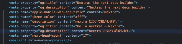
{/* headのmetaタグなどの設定ができます */}
---
title: Hello nextra!
description: nextraについて紹介します。
---

{/* モジュールインポートできます */}
import { Cards, Card } from 'nextra/components';

# nextraとは何か!

hogehogehoge

{/* コンポーネントを描画できます */}
<Cards>
  <Card title='nextraの設定' href='/nextra/setting' />
  <Card title='nextraの始め方' href='/linter/starting' />
  <Card title='nextraでできること' href='/linter/usecase' />
</Cards>
上記のサンプルコードを描画した結果は以下のようになります。
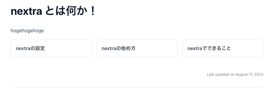
もちろんmetaタグも設定されています。
3-2.ページのルーティング
こちらもNext.jsのルーティングシステムに則ったルーティングを行います。
下記にintroduction.mdxとabout.mdxとcontact.mdxを例に解説します。
3つともにpages配下にあることを前提とします。
# nextraについて

nextraについての概要を説明するページです
# nextraの拡張について

nextraの拡張機能について説明するページです
# お問合せ

nextraについてのお問合せページです
/introductionにアクセスするとintroduction.mdxが描画されます。
/aboutにアクセスするとabout.mdxが描画されます。
/contactにアクセスするとcontact.mdxが描画されます。
といったようにNext.jsのルーティングシステムと同様にpages配下のファイル名をパスとして対象のページにアクセスすることができます。
またnextra特有の設定でpages配下に存在するすべてのディレクトリに_meta.jsonを置くことができます。このファイルを使用すると、ページやドキュメントの構造、ナビゲーション、その他の設定を指定することができます。
{
  "introduction": "nextraについて",
  "about": {
    "title": "nextraの拡張について",
    "type": "page"
  },
  "contact": {
    "title": "お問合せ",
    "type": "page",
    "href": "https://twitter.com/shuding_",
    "newWindow": true
  }
}
上記の設定を行い/aboutにアクセスすると以下のような表示になります。
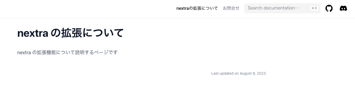
titleを設定することで画面上に表示されるテキストをカスタマイズすることが可能です。今回の設定では"nextraの拡張について"が表示されています。未設定の場合は"about"が入ります。
-
typeを設定することでページを分離して新しいページとして設定できます。 -
hrefを設定することで外部リンクなどを差し込むことができます。 -
newWindowを有効にすることで別ウィンドウで開くことができます。
_meta.jsonの設定内容は下記のファイルで行なっているみたいなので参考にしてみてください。
3.実例/デモ
nextraを使った実際のドキュメンテーションの例を説明していきます。
ここでタイトルの回収になります。
3-1.UIカタログ(storybookの代用)
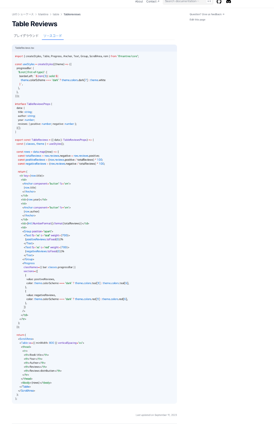
nextraにmantineとreact-liveを導入してmantineのUIコンポーネントを描画して、ライブコーディングできるところまでを想定して解説していきます。
まずは完成形のイメージです。
ライブエディタとmantineのテーブルコンポーネントを描画しつつ、ソースコードも表示するといった内容です。
また、テーブルコンポーネントに表示されているデータのリソースを切り替えられるオプション要素もつけています。
UI描画
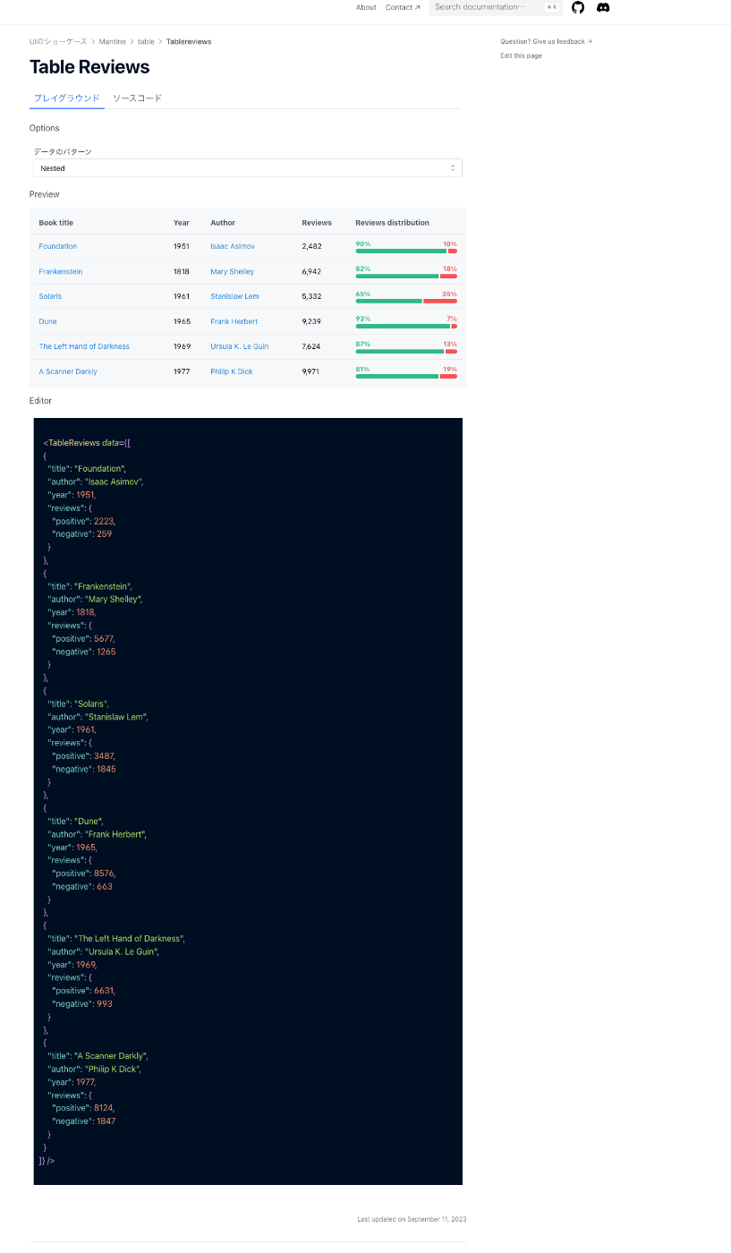
ソースコード描画
3-1-1._app.tsxの設定
まずはアプリケーション内でMantineを有効化するために、Providerで全体をラップします。
_app.tsx
import { AppProps } from 'next/app';
import Head from 'next/head';
import { MantineProvider } from '@mantine/core';

export default function App(props: AppProps) {
  const { Component, pageProps } = props;

  return (
    <>
      <Head>
        <title>Page title</title>
        <meta name='viewport' content='minimum-scale=1, initial-scale=1, width=device-width' />
      </Head>

      <MantineProvider
        withGlobalStyles
        withNormalizeCSS
        theme={{
          /** Put your mantine theme override here */
          colorScheme: 'light',
        }}
      >
        <Component {...pageProps} />
      </MantineProvider>
    </>
  );
}
複数のUIライブラリを使い分けたい場合は_app.tsxではなく各ページにProviderをラップするようにしてください。今回はmantineだけにフォーカスして説明していきます。
3-1-2.テーブルコンポーネントを実装
ひとまず公式のドキュメントにあった適当なテーブルコンポーネントをそのまま実装します。
TableReviews.tsx
import { createStyles, Table, Progress, Anchor, Text, Group, ScrollArea, rem } from '@mantine/core';

const useStyles = createStyles((theme) => ({
  progressBar: {
    '&:not(:first-of-type)': {
      borderLeft: `${rem(3)} solid ${
        theme.colorScheme === 'dark' ? theme.colors.dark[7] : theme.white
      }`,
    },
  },
}));

interface TableReviewsProps {
  data: {
    title: string;
    author: string;
    year: number;
    reviews: { positive: number; negative: number };
  }[];
}

export const TableReviews = ({ data }: TableReviewsProps) => {
  const { classes, theme } = useStyles();

  const rows = data.map((row) => {
    const totalReviews = row.reviews.negative + row.reviews.positive;
    const positiveReviews = (row.reviews.positive / totalReviews) * 100;
    const negativeReviews = (row.reviews.negative / totalReviews) * 100;

    return (
      <tr key={row.title}>
        <td>
          <Anchor component='button' fz='sm'>
            {row.title}
          </Anchor>
        </td>
        <td>{row.year}</td>
        <td>
          <Anchor component='button' fz='sm'>
            {row.author}
          </Anchor>
        </td>
        <td>{Intl.NumberFormat().format(totalReviews)}</td>
        <td>
          <Group position='apart'>
            <Text fz='xs' c='teal' weight={700}>
              {positiveReviews.toFixed(0)}%
            </Text>
            <Text fz='xs' c='red' weight={700}>
              {negativeReviews.toFixed(0)}%
            </Text>
          </Group>
          <Progress
            classNames={{ bar: classes.progressBar }}
            sections={[
              {
                value: positiveReviews,
                color: theme.colorScheme === 'dark' ? theme.colors.teal[9] : theme.colors.teal[6],
              },
              {
                value: negativeReviews,
                color: theme.colorScheme === 'dark' ? theme.colors.red[9] : theme.colors.red[6],
              },
            ]}
          />
        </td>
      </tr>
    );
  });

  return (
    <ScrollArea>
      <Table sx={{ minWidth: 800 }} verticalSpacing='xs'>
        <thead>
          <tr>
            <th>Book title</th>
            <th>Year</th>
            <th>Author</th>
            <th>Reviews</th>
            <th>Reviews distribution</th>
          </tr>
        </thead>
        <tbody>{rows}</tbody>
      </Table>
    </ScrollArea>
  );
};
data.ts
export const tableReviewsData = [
  {
    title: 'Foundation',
    author: 'Isaac Asimov',
    year: 1951,
    reviews: {
      positive: 2223,
      negative: 259,
    },
  },
  {
    title: 'Frankenstein',
    author: 'Mary Shelley',
    year: 1818,
    reviews: {
      positive: 5677,
      negative: 1265,
    },
  },
  {
    title: 'Solaris',
    author: 'Stanislaw Lem',
    year: 1961,
    reviews: {
      positive: 3487,
      negative: 1845,
    },
  },
  {
    title: 'Dune',
    author: 'Frank Herbert',
    year: 1965,
    reviews: {
      positive: 8576,
      negative: 663,
    },
  },
  {
    title: 'The Left Hand of Darkness',
    author: 'Ursula K. Le Guin',
    year: 1969,
    reviews: {
      positive: 6631,
      negative: 993,
    },
  },
  {
    title: 'A Scanner Darkly',
    author: 'Philip K Dick',
    year: 1977,
    reviews: {
      positive: 8124,
      negative: 1847,
    },
  },
];
3-1-3.ライブコンポーネントの実装
次にreact-liveを使用したライブコンポーネントのラッパーを実装していきます。
LiveWrapper.tsx
import { LiveEditor, LiveError, LivePreview, LiveProvider } from 'react-live';
import { PropsWithChildren } from 'react';

type Props = {
  code?: string;
  scope?: Record<string, unknown>;
};

export const LiveWrapper = ({ code, scope, children }: Props & PropsWithChildren) => {
  return (
    <LiveProvider code={code} scope={scope}>
      <div
        style={{
          display: 'grid',
          gap: '12px',
          gridTemplateColumns: '1fr',
        }}
      >
        <h3>Options</h3>
        <div
          style={{
            padding: '8px',
            width: '100%',
          }}
        >
          {children}
        </div>
        <h3>Preview</h3>
        <div
          style={{
            padding: '8px',
            width: '100%',
            backgroundColor: '#f6f8fa',
          }}
        >
          <LivePreview />
          <LiveError />
        </div>
        <h3>Editor</h3>
        <div
          style={{
            padding: '8px',
            width: '100%',
          }}
        >
          <LiveEditor />
        </div>
      </div>
    </LiveProvider>
  );
};
childrenには対象のコンポーネントのプロパティの中身を変更できる要素を入れる想定です。
3-1-4.テーブルコンポーネントをライブコンポーネントでラップする
前述実装したライブコンポーネントをテーブルコンポーネントにラップします。
live.tsx
import { TableReviews } from './TableReviews';
import { tableReviewsData } from './data';
import { useState } from 'react';
import { Select } from '@mantine/core';
import { LiveWrapper } from '../../live/LiveWrapper';

type DataOption = 'empty' | 'nested';

type Props = {
  data: DataOption;
};

const dataOptionsMap: Record<DataOption, string> = {
  empty: '[]',
  nested: `${JSON.stringify(tableReviewsData, null, 2)}`,
};

const scope = { TableReviews, tableReviewsData };

const code = ({ data }: Props) => `
  <TableReviews data={${dataOptionsMap[data]}} />
`;

export const LiveTableReviews = () => {
  const [dataOption, setDataOption] = useState<DataOption>('nested');

  const selectOptions = Object.keys(dataOptionsMap).map((key) => ({
    value: key,
    label: key[0].toUpperCase() + key.slice(1),
  }));

  return (
    <LiveWrapper code={code({ data: dataOption })} scope={scope}>
      <Select
        onChange={(option: DataOption) => setDataOption(option)}
        defaultValue={dataOption}
        data={selectOptions}
        label='データのパターン'
      ></Select>
    </LiveWrapper>
  );
};
ラッパーのchildrenとしてプロパティを動的に操作できる要素を追加します。
3-1-5.ページに描画する
最後にpages配下の.mdxに実装したライブコンポーネントを描画します。
TableReviews.mdx
import { LiveTableReviews } from '@frontend-document/components/mantine/table/live';

# Table Reviews

import { Tabs, Tab } from 'nextra/components';

<Tabs items={['プレイグラウンド', 'ソースコード']}>
  <Tab>
    <LiveTableReviews />
  </Tab>
  <Tab>

```tsx filename="TableReviews.tsx" copy
import { createStyles, Table, Progress, Anchor, Text, Group, ScrollArea, rem } from '@mantine/core';

const useStyles = createStyles((theme) => ({
  progressBar: {
    '&:not(:first-of-type)': {
      borderLeft: `${rem(3)} solid ${
        theme.colorScheme === 'dark' ? theme.colors.dark[7] : theme.white
      }`,
    },
  },
}));

interface TableReviewsProps {
  data: {
    title: string;
    author: string;
    year: number;
    reviews: { positive: number; negative: number };
  }[];
}

export const TableReviews = ({ data }: TableReviewsProps) => {
  const { classes, theme } = useStyles();

  const rows = data.map((row) => {
    const totalReviews = row.reviews.negative + row.reviews.positive;
    const positiveReviews = (row.reviews.positive / totalReviews) * 100;
    const negativeReviews = (row.reviews.negative / totalReviews) * 100;

    return (
      <tr key={row.title}>
        <td>
          <Anchor component='button' fz='sm'>
            {row.title}
          </Anchor>
        </td>
        <td>{row.year}</td>
        <td>
          <Anchor component='button' fz='sm'>
            {row.author}
          </Anchor>
        </td>
        <td>{Intl.NumberFormat().format(totalReviews)}</td>
        <td>
          <Group position='apart'>
            <Text fz='xs' c='teal' weight={700}>
              {positiveReviews.toFixed(0)}%
            </Text>
            <Text fz='xs' c='red' weight={700}>
              {negativeReviews.toFixed(0)}%
            </Text>
          </Group>
          <Progress
            classNames={{ bar: classes.progressBar }}
            sections={[
              {
                value: positiveReviews,
                color: theme.colorScheme === 'dark' ? theme.colors.teal[9] : theme.colors.teal[6],
              },
              {
                value: negativeReviews,
                color: theme.colorScheme === 'dark' ? theme.colors.red[9] : theme.colors.red[6],
              },
            ]}
          />
        </td>
      </tr>
    );
  });

  return (
    <ScrollArea>
      <Table sx={{ minWidth: 800 }} verticalSpacing='xs'>
        <thead>
          <tr>
            <th>Book title</th>
            <th>Year</th>
            <th>Author</th>
            <th>Reviews</th>
            <th>Reviews distribution</th>
          </tr>
        </thead>
        <tbody>{rows}</tbody>
      </Table>
    </ScrollArea>
  );
};

  </Tab>
</Tabs>


"```"
TabやTabsコンポーネントはnextraから提供されているものを使用して表示の切り替えをして完成です。 ▲こちらでTab系のコンポーネントの使い方は説明されています。
必要に応じてコンポーネントにプロパティを追加したり、動的に操作できるようライブコンポーネントのchildrenにインターフェースを追加すれば様々な用途で使用できます。
3-2.ディレクトリ構造の解説
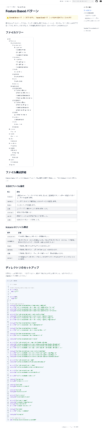
有名どころでいうとatomic designやDDDといった設計・ディレクトリ構造を可視化して解説できるようなドキュメントを実装していきます。基本的なnextraの機能だけで実装できます。
まずは完成のイメージです。
内容はディレクトリ構造をファイルツリーで可視化して、各ディレクトリに何を置くかを簡単に解説し、最後にディレクトリのセットアップコマンドを記載しています。
完成形
ではmdxファイルを以下のように記述してください。
domainDriven.mdx
# Domain Driven パターン

import { Callout } from 'nextra/components';

<Callout type='warning' emoji='⚠️'>
  Featuer Based パターンに似ていますが、ビジネスドメインごとにディレクトリを作成する点が異なります。
</Callout>

ドメイン駆動設計(Domain-driven Design)の原則に基づいて、ビジネスドメインごとにディレクトリを作成するアプローチです。各ドメインディレクトリ内には、そのドメインに関連するコンポーネントやモジュールが配置されます。

## ファイルツリー

import { FileTree } from 'nextra/components';

<FileTree defaultOpen>
  <FileTree.Folder name='src' defaultOpen>
    <FileTree.Folder name='domains' defaultOpen>
      <FileTree.Folder name='users' defaultOpen>
        <FileTree.Folder name='components' defaultOpen>
          <FileTree.Folder name='UserCard' defaultOpen>
            <FileTree.File name='UserCard.tsx' />
            <FileTree.File name='UserCard.css' />
            <FileTree.File name='UserCard.test.tsx' />
          </FileTree.Folder>
        </FileTree.Folder>
        <FileTree.Folder name='containers' defaultOpen>
          <FileTree.Folder name='UserPage' defaultOpen>
            <FileTree.File name='UserPage.tsx' />
            <FileTree.File name='UserPage.css' />
            <FileTree.File name='UserPage.test.tsx' />
          </FileTree.Folder>
        </FileTree.Folder>
        <FileTree.Folder name='hooks' defaultOpen>
          <FileTree.File name='useUser.ts' />
        </FileTree.Folder>
        <FileTree.Folder name='services' defaultOpen>
          <FileTree.File name='userService.ts' />
        </FileTree.Folder>
        <FileTree.Folder name='utils' defaultOpen>
          <FileTree.File name='userUtils.ts' />
        </FileTree.Folder>
        <FileTree.File name='index.ts' />
      </FileTree.Folder>
      <FileTree.Folder name='products' defaultOpen>
        <FileTree.Folder name='components' defaultOpen>
          <FileTree.Folder name='ProductCard' defaultOpen>
            <FileTree.File name='ProductCard.tsx' />
            <FileTree.File name='ProductCard.css' />
            <FileTree.File name='ProductCard.test.tsx' />
          </FileTree.Folder>
        </FileTree.Folder>
        <FileTree.Folder name='containers' defaultOpen>
          <FileTree.Folder name='ProductPage' defaultOpen>
            <FileTree.File name='ProductPage.tsx' />
            <FileTree.File name='ProductPage.css' />
            <FileTree.File name='ProductPage.test.tsx' />
          </FileTree.Folder>
        </FileTree.Folder>
        <FileTree.Folder name='hooks' defaultOpen>
          <FileTree.File name='useProduct.ts' />
        </FileTree.Folder>
        <FileTree.Folder name='services' defaultOpen>
          <FileTree.File name='productService.ts' />
        </FileTree.Folder>
        <FileTree.Folder name='utils' defaultOpen>
          <FileTree.File name='productUtils.ts' />
        </FileTree.Folder>
        <FileTree.File name='index.ts' />
      </FileTree.Folder>
    </FileTree.Folder>
    <FileTree.Folder name='services' defaultOpen>
      <FileTree.File name='user.ts' />
    </FileTree.Folder>
    <FileTree.Folder name='hooks' defaultOpen>
      <FileTree.File name='useUser.ts' />
    </FileTree.Folder>
    <FileTree.Folder name='utils' defaultOpen>
      <FileTree.File name='axios.ts' />
    </FileTree.Folder>
    <FileTree.Folder name='constants' defaultOpen>
      <FileTree.File name='route.ts' />
    </FileTree.Folder>
    <FileTree.Folder name='assets' defaultOpen>
      <FileTree.Folder name='images' defaultOpen>
        <FileTree.File name='logo.svg' />
      </FileTree.Folder>
      <FileTree.Folder name='fonts' defaultOpen>
        <FileTree.File name='font.ttf' />
      </FileTree.Folder>
    </FileTree.Folder>
    <FileTree.Folder name='styles' defaultOpen>
      <FileTree.File name='global.css' />
    </FileTree.Folder>
    <FileTree.File name='App.tsx' />
  </FileTree.Folder>
</FileTree>

## ファイル構成詳細

Feature Based パターンでは featuers ディレクトリに各機能の責務を集約します。全体と featuers で分けて解説します。

### 全体のファイル構成

| 項目        | 詳細                                                                                               |
| :---------- | :------------------------------------------------------------------------------------------------- |
| `domains`   | 各ドメインのルートディレクトリとなります。例えば、ユーザーや製品などの各ディレクトリが含まれます。 |
| `services`  | バックエンド API との通信を行うためのサービスを配置します。                                        |
| `hooks`     | カスタムフックを配置します。                                                                       |
| `utils`     | ユーティリティ関数やヘルパー関数を配置します。                                                     |
| `constants` | 定数の定義を配置します。                                                                           |
| `assets`    | 画像やフォントなどの静的アセットを配置します。                                                     |
| `styles`    | 共通のスタイルシートを配置します。                                                                 |

### domains のファイル構成

| 項目         | 詳細                                                                                                                                         |
| :----------- | :------------------------------------------------------------------------------------------------------------------------------------------- |
| `components` | そのドメインに関連するコンポーネントが配置されます。                                                                                         |
| `containers` | コンテナコンポーネントが配置されます。これらのコンテナコンポーネントは、そのドメインに関連するロジックやデータの取得・更新などを担当します。 |
| `hooks`      | そのドメインに関連するカスタムフックが配置されます。                                                                                         |
| `services`   | そのドメインに関連するサービス(API 通信など)が配置されます。                                                                               |
| `utils`      | そのドメインに関連するユーティリティ関数やヘルパー関数が配置されます。                                                                       |
| `index.ts`   | そのドメイン内のコンポーネントやモジュールをエクスポートするためのエントリーポイントとなります。                                             |

## ディレクトリのセットアップ

以下のシェルを実行すると、上記のディレクトリ構造を自動で作成することができます。
カスタマイズして makefile などで実行してください。

```sh filename="create_structure.sh" copy showLineNumbers
#!/bin/bash

# Define directory and file creation functions
create_dir() {
    mkdir -p "$1"
}

create_file() {
    touch "$1"
}

# Create directory structure for users domain
create_dir "src/domains/users/components/UserCard"
create_file "src/domains/users/components/UserCard/UserCard.tsx"
create_file "src/domains/users/components/UserCard/UserCard.css"
create_file "src/domains/users/components/UserCard/UserCard.test.tsx"

create_dir "src/domains/users/containers/UserPage"
create_file "src/domains/users/containers/UserPage/UserPage.tsx"
create_file "src/domains/users/containers/UserPage/UserPage.css"
create_file "src/domains/users/containers/UserPage/UserPage.test.tsx"

create_dir "src/domains/users/hooks"
create_file "src/domains/users/hooks/useUser.ts"

create_dir "src/domains/users/services"
create_file "src/domains/users/services/userService.ts"

create_dir "src/domains/users/utils"
create_file "src/domains/users/utils/userUtils.ts"

create_file "src/domains/users/index.ts"

# Create directory structure for products domain
create_dir "src/domains/products/components/ProductCard"
create_file "src/domains/products/components/ProductCard/ProductCard.tsx"
create_file "src/domains/products/components/ProductCard/ProductCard.css"
create_file "src/domains/products/components/ProductCard/ProductCard.test.tsx"

create_dir "src/domains/products/containers/ProductPage"
create_file "src/domains/products/containers/ProductPage/ProductPage.tsx"
create_file "src/domains/products/containers/ProductPage/ProductPage.css"
create_file "src/domains/products/containers/ProductPage/ProductPage.test.tsx"

create_dir "src/domains/products/hooks"
create_file "src/domains/products/hooks/useProduct.ts"

create_dir "src/domains/products/services"
create_file "src/domains/products/services/productService.ts"

create_dir "src/domains/products/utils"
create_file "src/domains/products/utils/productUtils.ts"

create_file "src/domains/products/index.ts"

# Create other directories and files
create_dir "src/services"
create_file "src/services/user.ts"

create_dir "src/hooks"
create_file "src/hooks/useUser.ts"

create_dir "src/utils"
create_file "src/utils/axios.ts"

create_dir "src/constants"
create_file "src/constants/route.ts"

create_dir "src/assets/images"
create_file "src/assets/images/logo.svg"
create_dir "src/assets/fonts"
create_file "src/assets/fonts/font.ttf"

create_dir "src/styles"
create_file "src/styles/global.css"

create_file "src/App.tsx"

# Print completion message
echo "Directory structure created successfully!"
"```"
nextraから提供されているFileTreeコンポーネントを使用することで、簡単にリッチなファイルツリーUIを実装することができます。
▲基本的な使い方はこちらに記載されています。
3-3.サンドボックスの埋め込み
nextraにcodesandboxを埋め込む方法を実際に使用しているアプリケーションのソースコードを見ながら紹介していきます。
3-3-1.サンドボックスの描画
サンドボックスを描画するStackBlitzコンポーネントを実装しています。
特にライブラリなどは使用せずにiframeのsrcを動的に変更して意図したものを描画するようにしています。
3-3-2.ページに描画
前述で実装したStackBlitzコンポーネントを使用してページに描画します。
実際にこのページが描画されている箇所は以下になります
また、StackBlitzを埋め込む以外にも、sandpackというCode Sand Boxライクなライブラリもあるのでこれを導入すると手軽に実装できます。
▲実際にsandpackが使用されているサンプルプロジェクトです。他にもReactのドキュメントにも使用されています。
さいごに
nextraはエンジニアリングを助力する便利なツールです。
next.jsを使って開発できるのもフロントエンドエンジニアとして嬉しいものです。
外部APIやDBなどを用いてより拡張性のあるアプリケーションを実装することもできるので今後の発展も楽しみです!
皆さんの周りにもnextraを使ったユニークなアプリケーションのアイデアなどあればコメント欄でご紹介ください!
Discussion