style-dictionary を使ってフロントエンドで利用しやすいデザイントークンを生成する
tl;dr
このレポジトリ から .style-dictionary の中身を持ってきて npm run build を実行してください
yaml で書けて、 JSDoc がついた branded-type なデザイントークンがコード生成されます
デザイントークンとは
デザインシステムを構成する要素のひとつで、 UI における見た目の 各属性値 を共通化するためにトークンとして定義したものです。コンポーネントに適用された カラーコード や 余白 、 フォントサイズ などCSS のスタイルの値などが具体的なデザイントークンです
デザインシステムの中でも、デザイントークンはハードルが低く(値の一覧を棚卸してトークンにするだけ)、また導入した場合の実効性が高いため(実装者、デザイン共に値を少なく管理しやすくしたいという要望がある)、とりあえず導入してみるだけでも効果があります
デザインシステムに取り組みたい、取り組んでいるけどなかなかうまくいかない、という組織は、最初の一歩としてデザイントークンはおすすめです
style-dictionary とは
デザイントークン導入の難しさは、定義するデザインファイルとそれを利用するアプリ側の両方で横断的な管理が必要ということです。ネイティブアプリなどもある場合は、管理する対象も増えていきます
style-dictionary はトークン自体は一元管理するようにし、そこから各プラットフォームに展開できる形で値を出力することができるライブラリです
セットアップ
まずは、ライブラリをインストールして設定ファイルを作成します
style-dictionary init というコマンドもあるのですが、かなりイケていない設定が出力されるので自分で書いていきます。今回は .style-dictionary ディレクトリを作ってそこに設定やトークンを追加していくようにします
npm install --save-dev style-dictionary
mkdir .style-dictionary
touch .style-dictionary/config.js
mkdir .style-dictionary/tokens
touch .style-dictionary/colors.json
module.exports = {
  source: [".style-dictionary/tokens/**/*.json"],
  platforms: {
    scss: {
      transformGroup: "scss",
      buildPath: "dist/",
      files: [
        {
          destination: "_design-tokens.scss",
          format: "scss/variables",
        },
      ],
      options: {
        showFileHeader: false,
      },
    },
  },
};
{
  "color-primary": {
    "value": "red",
    "comment": "color for primary item",
    "attributes": {
      "category": "color"
    }
  },
  "color-text": {
    "value": "black",
    "comment": "color for text",
    "attributes": {
      "category": "color"
    }
  }
}
  ...
  "scripts": {
    "build": "style-dictionary build --config .style-dictionary/config.js",
    "clean": "style-dictionary clean  --config .style-dictionary/config.js",
    ...
  },
  ...
要件を実装する
あとは platforms に必要な出力先を追加していけば使える・・・というのも間違いではないんですが、デフォルトのままだとなかなか不便なので、以下の要件を順に設定に追加していきます
yaml でデザイントークンを記述できるようにする
json で設定ファイル書くのはタイプ数的にも厳しい気持ちになるので yaml で記述できるようにします。信条として yaml を使えない人はこの設定は不要です
const yaml = require("yaml");

module.exports = {
  parsers: [
    {
      pattern: /\.yaml$/,
      parse: ({ contents }) => yaml.parse(contents),
    },
  ],
  source: [".style-dictionary/tokens/**/*.yaml"],
...
yq -P . .style-dictionary/tokens/colors.json > .style-dictionary/tokens/colors.yaml
rm .style-dictionary/tokens/colors.json
color-primary:
  value: red
  comment: color for primary item
  attributes:
    category: color
color-text:
  value: black
  comment: color for text
  attributes:
    category: color
JSDoc 形式でコメントを記述する
style-dictionary には さまざまな出力フォーマット が用意されています
TypeScript で定数としてデザイントークンを出力したい場合は javascript/es6 と typescript/es6-declarations を指定するようにします
    typescript: {
      transformGroup: "js",
      buildPath,
      files: [
        {
          format: "javascript/es6",
          destination: "design-tokens.js",
        },
        {
          format: "typescript/es6-declarations",
          destination: "design-tokens.d.ts",
        },
      ],
      options,
    },
export const ColorPrimary : string; // color for primary item
export const ColorText : string; // color for text
export const ColorPrimary = "#ff0000"; // color for primary item
export const ColorText = "#000000"; // color for text
こんな感じのものが出力されるのですが、コメント部分が気になりませんか? 可能なら JSDoc 形式にして IDE でドキュメントを参照できるようにしたいです
style-dictionary では registerFormat 関数を利用することで、カスタムフォーマッターを追加することができます。 javascript/es6 と typescript/es6-declarations のソースコードを改造して JSDoc 形式でコメントを挿入するように改造しましょう
const StyleDictionary = require("style-dictionary");
const {
  fileHeader,
  getTypeScriptType,
} = require("style-dictionary/lib/common/formatHelpers");
...
/** コメントを jsdoc 形式で挿入する */
function injectComment(content, comment) {
  const jsdoc = comment ? `/** ${comment} */\n` : "";
  return jsdoc + content + "\n";
}

/**
 * `javascript/es6` を拡張してコメントの挿入を jsdoc 形式に変更したフォーマッタ
 * ref: https://github.com/amzn/style-dictionary/blob/v3.7.1/lib/common/formats.js#L331-L371
 */
StyleDictionary.registerFormat({
  name: "javascript/es6-jsdoc",
  formatter: function ({ dictionary, file }) {
    return (
      fileHeader({ file }) +
      dictionary.allTokens
        .map(function (token) {
          return injectComment(
            `export const ${token.name} = ${JSON.stringify(token.value)};`,
            token.comment
          );
        })
        .join("\n")
    );
  },
});

/**
 * `typescript/es6-declarations` を拡張してコメントの挿入を jsdoc 形式に変更したフォーマッタ
 * ref: https://github.com/amzn/style-dictionary/blob/v3.7.1/lib/common/formats.js#L373-L413
 */
StyleDictionary.registerFormat({
  name: "typescript/es6-declarations-jsdoc",
  formatter: function ({ dictionary, file }) {
    return (
      fileHeader({ file }) +
      dictionary.allProperties
        .map(function (prop) {
          return injectComment(
            `export const ${prop.name}: ${getTypeScriptType(prop.value)};`,
            prop.comment
          );
        })
        .join("\n")
    );
  },
});
最後に platforms.typescript.files[] に新しいフォーマッタを指定すれば以下のような出力が得られます 👏 👏 👏
/** color for primary item */
export const ColorPrimary: string;

/** color for text */
export const ColorText: string;
/** color for primary item */
export const ColorPrimary = "#ff0000";

/** color for text */
export const ColorText = "#000000";
Branded-Type として出力する
先ほど出力された型定義ファイルですが、そのままではすべての方が string になっていて辛いです。どう辛いかというと、以下のようなコンポーネントを作った時に backgroundColor にカラーコード以外が入ってくるのを型的に防げないという辺りです
type Props {
  backgroundColor: string;
}

const BoxComponent = ({ backgroundColor }) => {
  return <div style={{ backgroundColor }} />
}
せっかくデザイントークンを定義しているので、 カラートークンを表現する型 みたいなものがあると便利ですよね。ということで Branded-Type です。詳しい説明はリンク先を見てもらうとして、以下のように修正します
const StyleDictionary = require("style-dictionary");
const {
  fileHeader,
  getTypeScriptType: _getTypeScriptType,
} = require("style-dictionary/lib/common/formatHelpers");
...
/** プレフィックスをつけた Branded Type 名を取得する */
function getTypeName(type) {
  const chars = type.split("");
  chars[0] = chars[0].toUpperCase();
  return `DesignToken${chars.join("")}`;
}

/** デフォルトの getTypeScriptType をオーバーライドして、 string 型だった場合は Branded Type を返す */
function getTypeScriptType(value, type) {
  const rawType = _getTypeScriptType(value);
  return rawType === "string" && typeof type !== "undefined"
    ? getTypeName(type)
    : rawType;
}

/** 型定義の先頭に挿入する型定義を生成する */
function generateTypeDefinition(types) {
  let typeDef = [];
  typeDef.push(`type Branded<T, U extends string> = T & { [key in U]: never }`);
  typeDef.push(
    `type TokenType = ${types.map((token) => `'${token}'`).join(" | ")}`
  );
  typeDef.push(
    `type DesignToken<T extends string> = T extends TokenType ? Branded<string, T | 'designToken'> : never`
  );
  typeDef = typeDef.concat(
    types.map(
      (token) => `export type ${getTypeName(token)} = DesignToken<'${token}'>`
    )
  );
  return typeDef.join("\n") + "\n\n";
}
...
StyleDictionary.registerFormat({
  name: "typescript/es6-declarations-jsdoc-with-branded-type",
  formatter: function ({ dictionary, file }) {
    const types = new Set();
    const tokens = dictionary.allProperties.map(function (prop) {
      const category = prop.original.attributes?.category;
      if (typeof category !== "undefined") {
        types.add(category);
      }
      return injectComment(
        `export const ${prop.name}: ${getTypeScriptType(
          prop.value,
          category
        )};`,
        prop.comment
      );
    });
    return (
      fileHeader({ file }) +
      generateTypeDefinition(Array.from(types)) +
      tokens.join("\n")
    );
  },
});
詳しい説明はしませんが、トークンごとにカテゴリを取得してきてカテゴリ名から Branded-Type を生成してトークンの型に指定。最後に登場したカテゴリごとの Branded-Type 自体の型定義をファイルの先頭に出力するようにします
これで以下のような型定義が出力されるようになったので、コンポーネント側では特定のデザイントークンのみをスタイルの値として受け取ることができるようになりました
type Branded<T, U extends string> = T & { [key in U]: never }
type TokenType = 'color'
type DesignToken<T extends string> = T extends TokenType ? Branded<string, T | 'designToken'> : never
export type DesignTokenColor = DesignToken<'color'>

/** color for primary item */
export const ColorPrimary: DesignTokenColor;

/** color for text */
export const ColorText: DesignTokenColor;
type Props {
  backgroundColor: DesignTokenColor;
}

const BoxComponent = ({ backgroundColor }) => {
  return <div style={{ backgroundColor }} />
}
デザイントークンを Storybook などで管理する
せっかく定義したデザイントークンなので、 Storybook などで動的に参照できるようにしたいですね。ですが、 es6 形式で書き出したファイルにはメタ情報が含まれていないため、以下の 2つの定義を platforms.typescript.files[] に追加します
...
{
  format: "javascript/module",
  destination: "design-tokens.module.js",
},
{
  format: "typescript/module-declarations",
  destination: "design-tokens.module.d.ts",
},
...
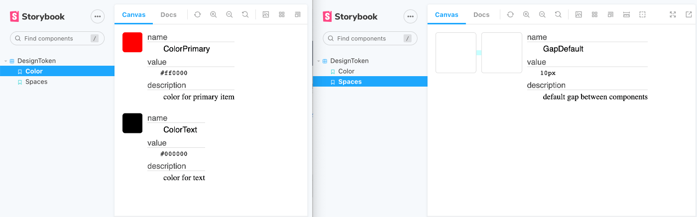
これで、 DesignToken の型を持つオブジェクトとしてデザイントークンが書き出されました。あとは内容を見て Storybook の定義を書いていけば完成です。せっかくなので余白を示す spaces トークンも追加して以下のような Storybook を構成しました
import React from "react";
import DesignTokens from "../dist/design-tokens.module";
import "./Tokens.css";

type Props = {
  token: import("style-dictionary/types/DesignToken").DesignToken;
};

const ColorToken = ({ token }: Props) => (
  <div className="color-token">
    <div className="tip" style={{ backgroundColor: token.value }} />
    <dl className="token-description">
      <dt className="title">name</dt>
      <dd className="text name">{token.name}</dd>
      <dt className="title">value</dt>
      <dd className="text value">{token.value}</dd>
      <dt className="title">description</dt>
      <dd className="text description">{token.comment}</dd>
    </dl>
  </div>
);

const SpacesToken = ({ token }: Props) => (
  <div className="spaces-token">
    <div className="gap">
      <div className="box" />
      <div className="gap" style={{ width: token.value, height: token.value }} />
      <div className="box" />
    </div>
    <dl className="token-description">
      <dt className="title">name</dt>
      <dd className="text name">{token.name}</dd>
      <dt className="title">value</dt>
      <dd className="text value">{token.value}</dd>
      <dt className="title">description</dt>
      <dd className="text description">{token.comment}</dd>
    </dl>
  </div>
);

export default {
  title: "DesignToken",
  component: { ColorToken, SpacesToken },
};

const ColorTemplate = () =>
  Object.values(DesignTokens)
    .filter((token) => token.attributes?.category === "color")
    .map((token) => <ColorToken token={token} />);

export const Color = ColorTemplate.bind({});
Color.args = {
  primary: true,
  label: "Color",
};

const SpacesTemplate = () =>
  Object.values(DesignTokens)
    .filter((token) => token.attributes?.category === "spaces")
    .map((token) => <SpacesToken token={token} />);

export const Spaces = SpacesTemplate.bind({});
Spaces.args = {
  label: "Spaces",
};
完成
ということで完成品はこちらになります
git clone git@github.com:beijaflor/style-dictionary-sample.git
cd style-dictionary-sample
npm install
npm run build
npm run storybook
できなかったこと
style-dictionary はすべての出力をひとつのファイルに書き出してしまうため、トークンが増えてくると import 作業が大変です。以下のようなコードを書こうとしてもカラー以外のトークンが含まれるため、サジェストに大量に表示されてしまうことになります
これに関しては、ライブラリの仕組み上難しかったので、以降のバージョンでの改善を期待したいところです
import { ColorPrimary } from './dist/design-tokens'
また、 style-dictionary はトークンをツリー上に定義することができて 推奨される構造 などもドキュメントにあるのですが、今回のサンプルではそこまで考慮していません
そもそも、カラートークンの管理体系と併せて考えないといけない内容になっているので、ぜひ自分たちのプロダクトのデザインに合わせて拡張してみて下さい
Discussion