🍣
【全スクショ付き】2022年最新版 Flutterウィジェットチートシート
Version
Flutter: 2.8.1-stable
Dart: 2.15.1
Column
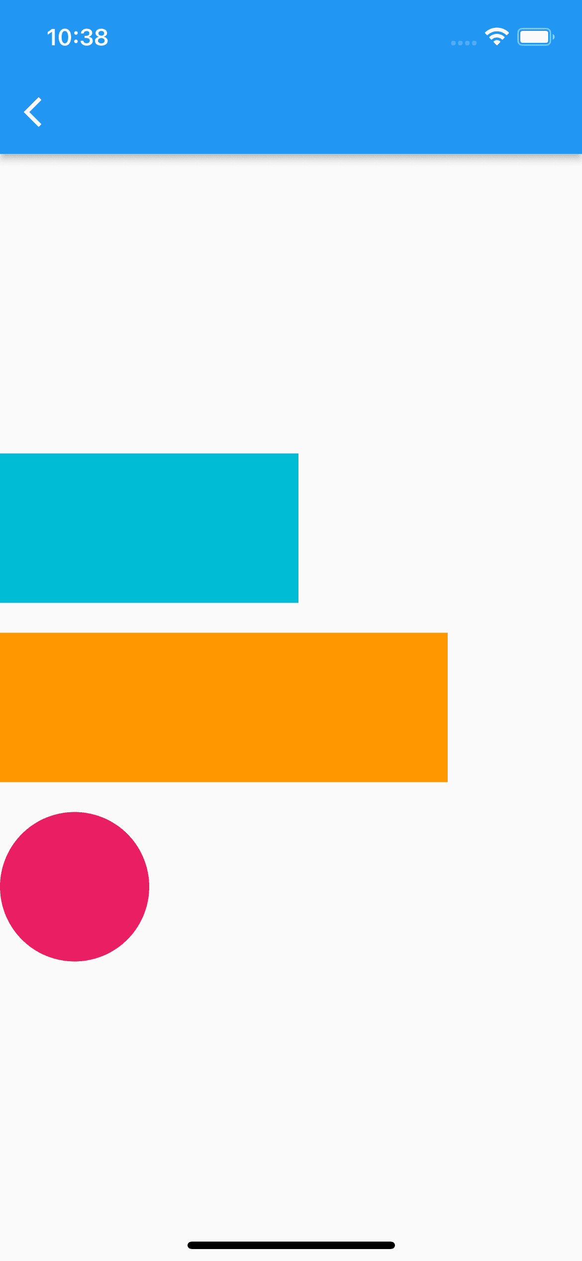
Column(
    mainAxisAlignment: MainAxisAlignment.center, // 縦揃え指定
    crossAxisAlignment: CrossAxisAlignment.start, // 横揃え指定
    children: [
        Container(
            width: 200,
            height: 100,
            color: Colors.cyan,
            margin: const EdgeInsets.only(bottom: 20),
        ),
        Container(
            width: 300,
            height: 100,
            color: Colors.orange,
            margin: const EdgeInsets.only(bottom: 20),
        ),
        Container(
            width: 100,
            height: 100,
            decoration: const BoxDecoration(
                color: Colors.pink,
                shape: BoxShape.circle,
            ),
        ),
    ],
)
Row
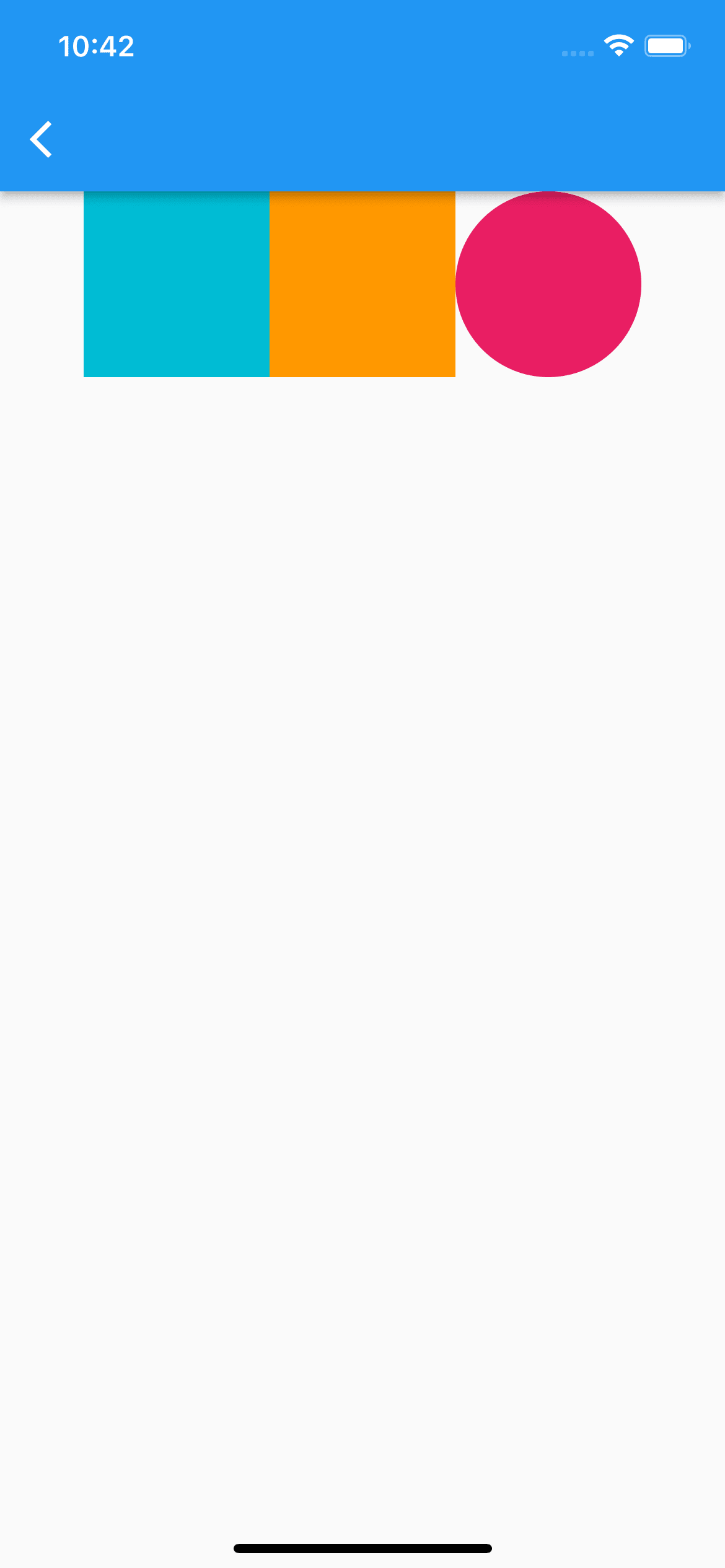
Row(
    mainAxisAlignment: MainAxisAlignment.center, // 横揃え指定
    crossAxisAlignment: CrossAxisAlignment.start, // 縦揃え指定
    children: [
        Container(
            width: 100,
            height: 100,
            color: Colors.cyan,
            margin: const EdgeInsets.only(bottom: 20),
        ),
        Container(
            width: 100,
            height: 100,
            color: Colors.orange,
            margin: const EdgeInsets.only(bottom: 20),
        ),
        Container(
            width: 100,
            height: 100,
            decoration: const BoxDecoration(
                color: Colors.pink,
                shape: BoxShape.circle,
            ),
        ),
    ],
)
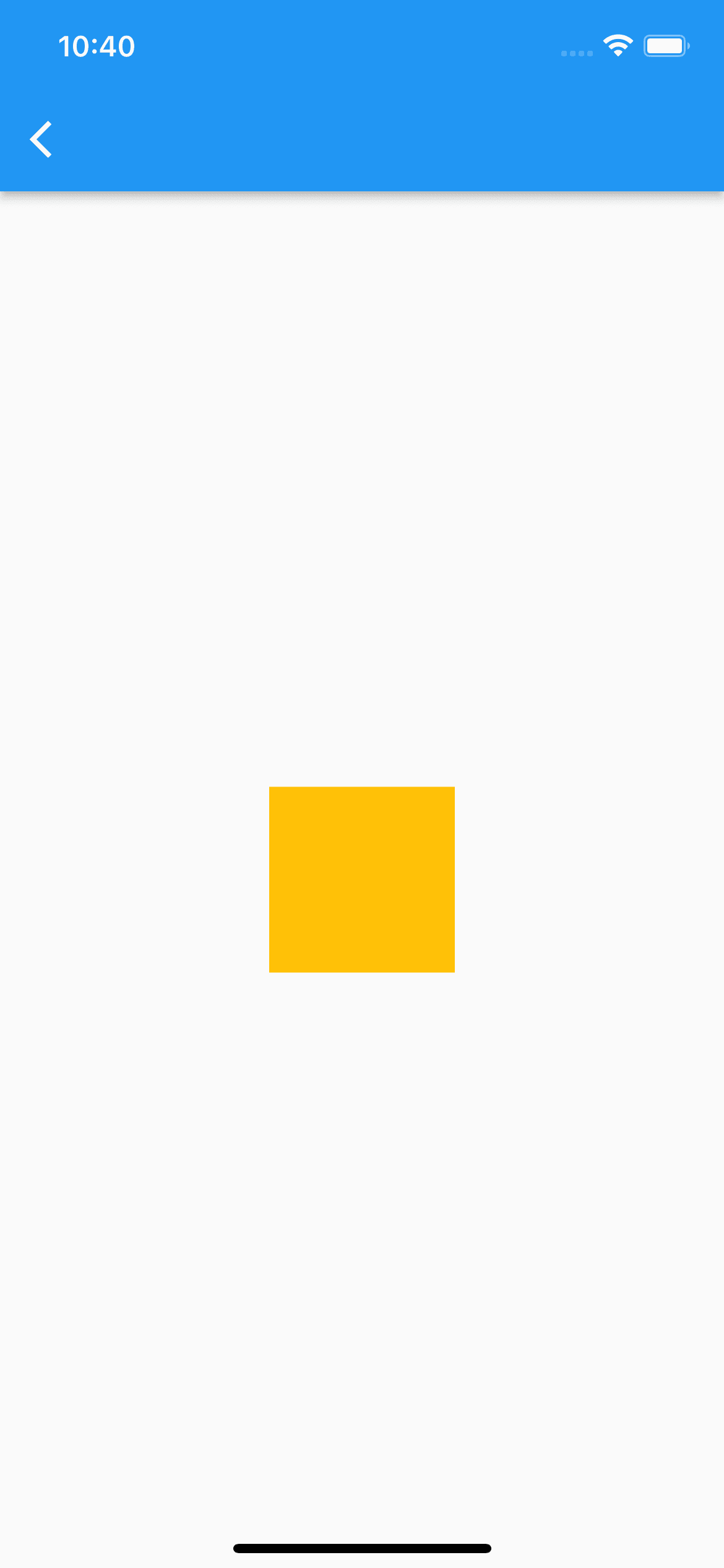
Expanded
ColumnやRowの中で、可能な限り大きい領域を確保してくれる
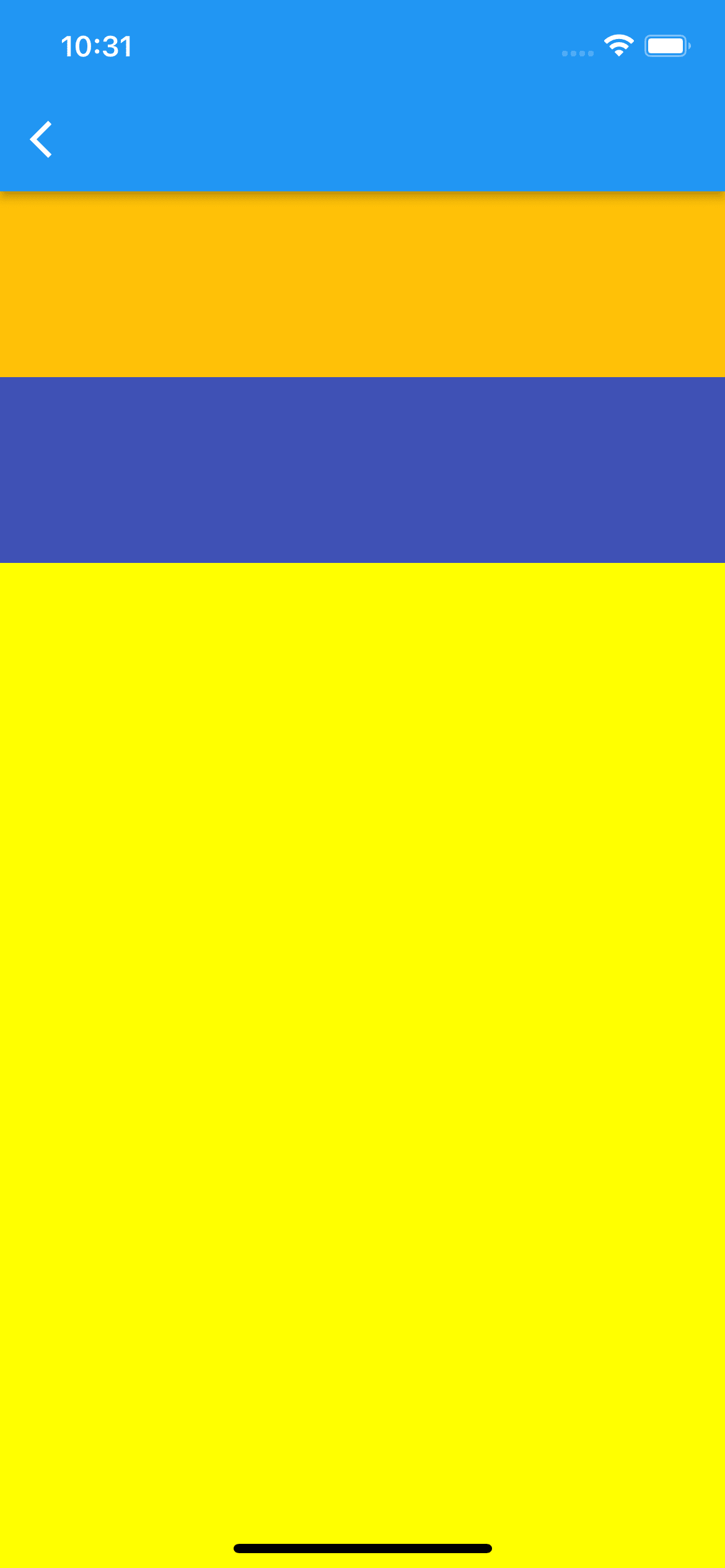
Column(
    children: [
        Container(
            color: Colors.amber,
            height: 100,
        ),
        Container(
            color: Colors.indigo,
            height: 100,
        ),
        Expanded(
            child: Container(
                color: Colors.yellowAccent,
            ),
        ),
    ],
),
GestureDetector
子のウィジェットにジェスチャーイベントを持たせられる
GestureDetector(
    onTap: () {},
    onLongPress: () {},
    onDoubleTap: () {},
    onScaleStart: (scaleDetail) {
        // スケール処理が開始された時の処理
    },
    child: Container(
        color: Colors.amber,
        height: 100,
        width: 100,
    ),
)
Opacity
0.2
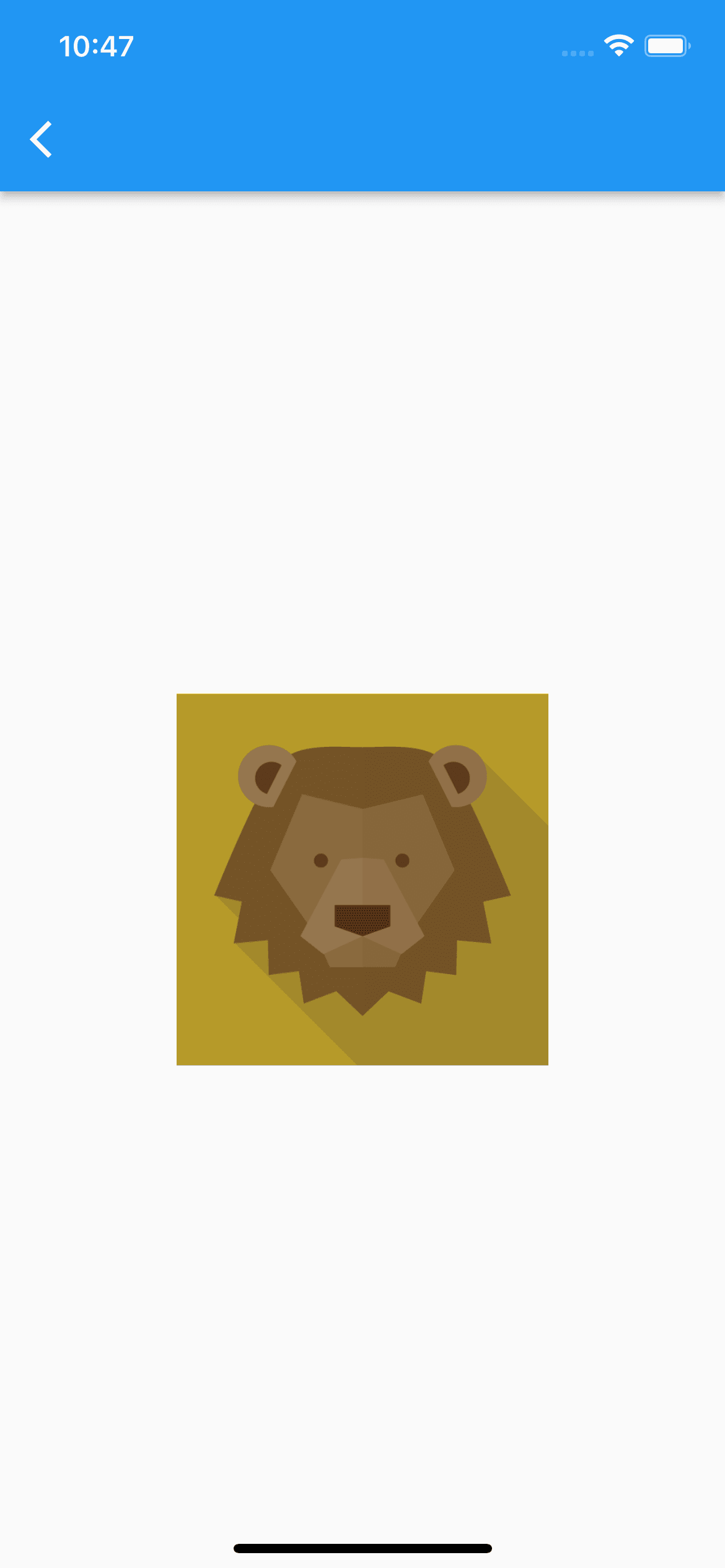
Stack(
    alignment: Alignment.center,
    children: [
        Assets.images.lion.image(
            height: 200,
            width: 200,
        ),
        Opacity(
            opacity: 0.2, // 0から1まで指定可能
            child: Container(
                color: Colors.black,
                height: 200,
                width: 200,
            ),
        ),
    ],
)
0.8
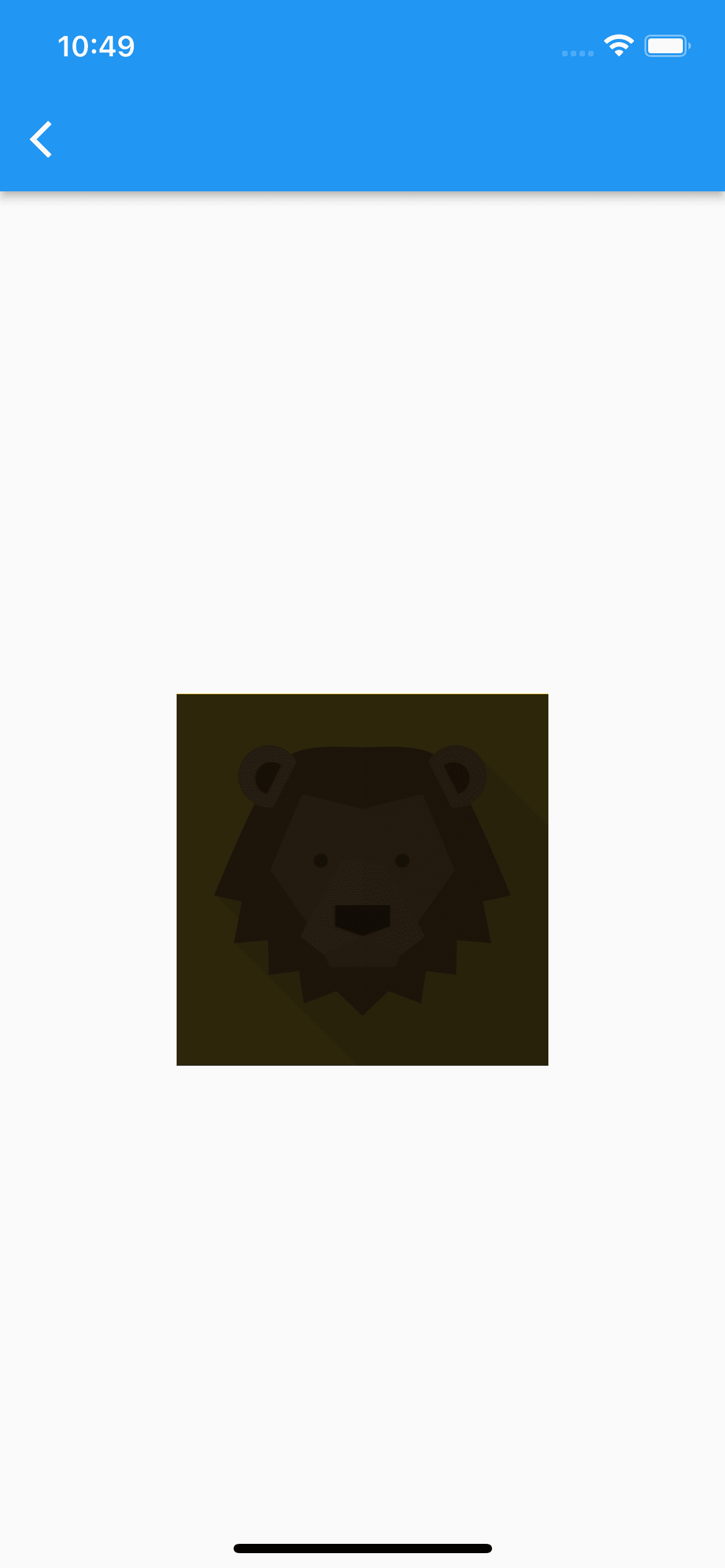
Stack(
    alignment: Alignment.center,
    children: [
        Assets.images.lion.image(
            height: 200,
            width: 200,
        ),
        Opacity(
            opacity: 0.8,
            child: Container(
                color: Colors.black,
                height: 200,
                width: 200,
            ),
        ),
    ],
)
Transform
rotate
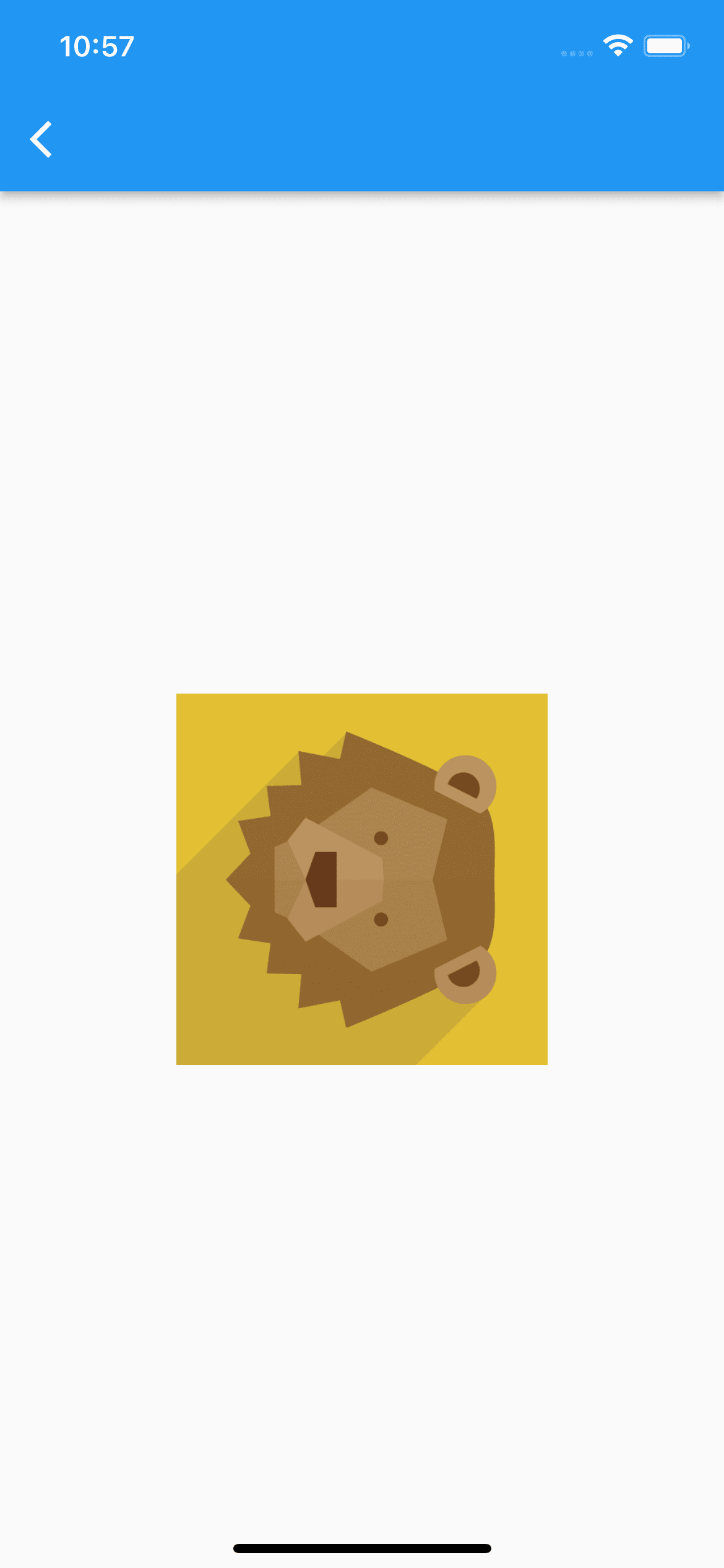
Transform.rotate(
    // pi / 2 => 90deg
    // pi / 4 => 45deg
    // -(pi / 2) => -90deg
    angle: pi / 2,
    child: Assets.images.lion.image(
        height: 200,
        width: 200,
    ),
)
scale
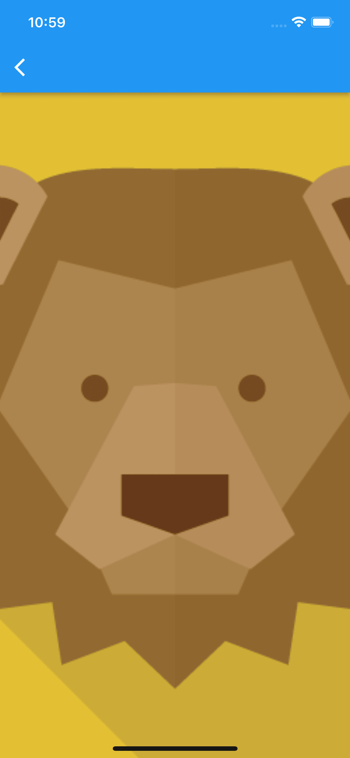
Transform.scale(
    scale: 4,
    child: Assets.images.lion.image(
        height: 200,
        width: 200,
    ),
)
AppBar
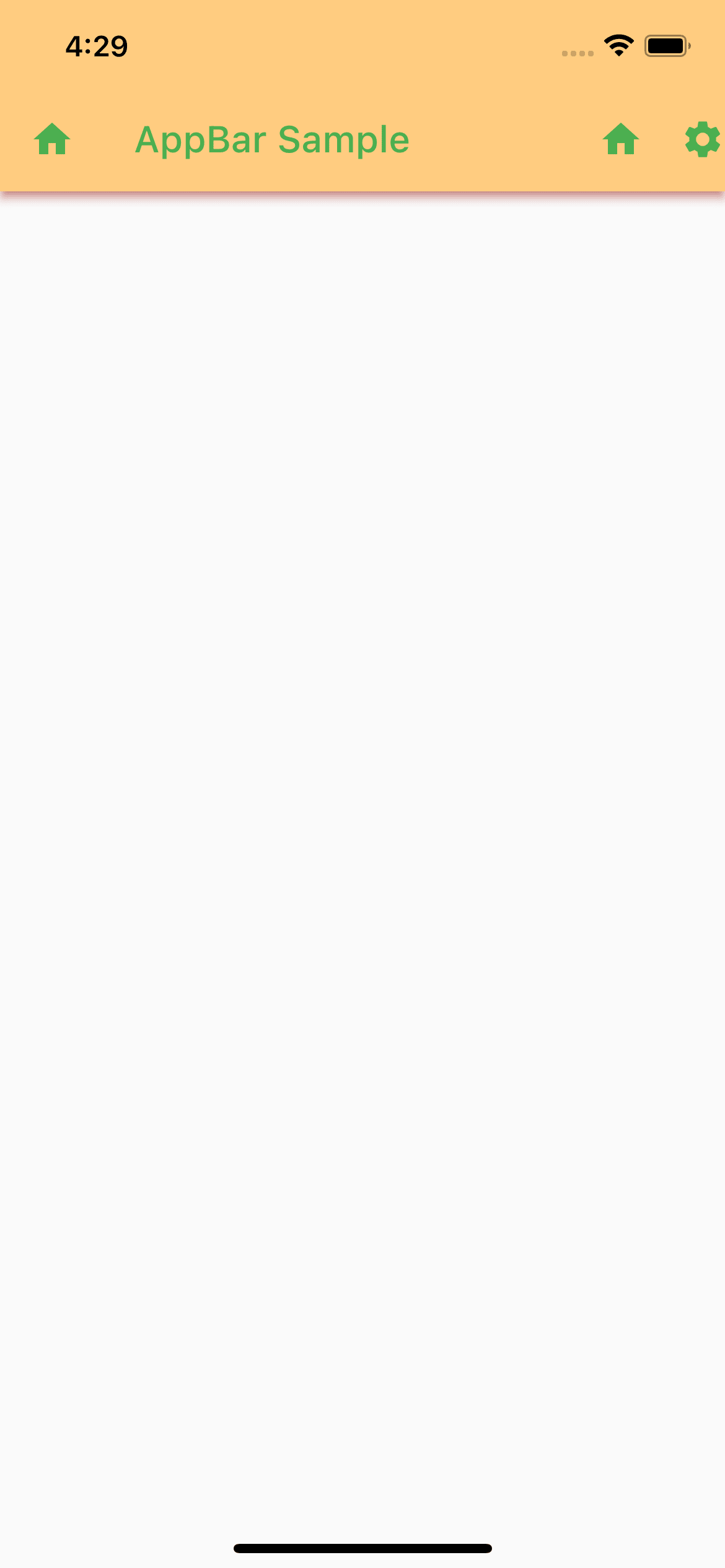
Scaffold(
    appBar: AppBar(
        backgroundColor: Colors.orange[200],
        leading: Icon(Icons.home),
        title: Text('AppBar Sample'),
        actions: [
            Icon(Icons.home),
            SizedBox(
                width: 20,
            ),
            Icon(Icons.settings),
        ],
        foregroundColor: Colors.green,
        shadowColor: Colors.red,
    ),
)
BottomNavigationBar

int _selectedIndex = 0;
// テキストの装飾
static const _style = TextStyle(
fontSize: 50,
color: Colors.blue,
backgroundColor: Colors.amber,
fontWeight: FontWeight.bold,
fontStyle: FontStyle.italic,
letterSpacing: 2,
decoration: TextDecoration.underline,
decorationColor: Colors.green,
);
static const _bodies = [
Text(
'aaa',
style: _style,
),
Text(
'bbb',
style: _style,
),
Text(
'ccc',
style: _style,
),
];
static const _bottomNavItems = [
BottomNavigationBarItem(
icon: Icon(Icons.home),
label: 'ホーム',
),
BottomNavigationBarItem(
icon: Icon(Icons.notifications),
label: '通知',
),
BottomNavigationBarItem(
icon: Icon(Icons.person),
label: 'プロフィール',
),
];
void _onItemTapped(int index) {
setState(() {
_selectedIndex = index;
});
}
Widget build(BuildContext context) {
return Scaffold(
appBar: AppBar(),
body: Center(
child: _bodies[_selectedIndex],
),
bottomNavigationBar: BottomNavigationBar(
items: _bottomNavItems,
onTap: _onItemTapped,
currentIndex: _selectedIndex,
selectedItemColor: Colors.amber,
unselectedItemColor: Colors.grey,
),
);
}
Drawer
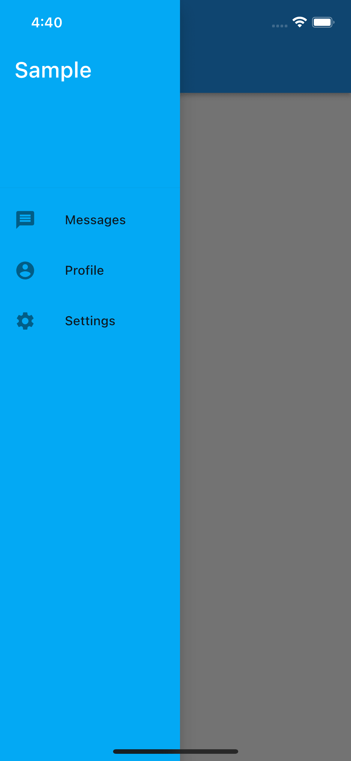
Scaffold(
    appBar: AppBar(),
    drawer: SizedBox(
        width: 200, // ドロワーの幅を指定可能
        child: Drawer(
            backgroundColor: Colors.lightBlue,
            child: ListView(
                padding: EdgeInsets.zero,
                children: const <Widget>[
                    DrawerHeader(
                        decoration: BoxDecoration(
                            color: Colors.lightBlue,
                        ),
                        child: Text(
                            'Sample',
                            style: TextStyle(
                            color: Colors.white,
                            fontSize: 24,
                            ),
                        ),
                    ),
                    ListTile(
                        leading: Icon(Icons.message),
                        title: Text('Messages'),
                    ),
                    ListTile(
                        leading: Icon(Icons.account_circle),
                        title: Text('Profile'),
                    ),
                    ListTile(
                        leading: Icon(Icons.settings),
                        title: Text('Settings'),
                    ),
                ],
            ),
        ),
    ),
)
SliverAppBar

Scaffold(
    body: CustomScrollView(
        slivers: [
            const SliverAppBar(
                pinned: true, // 下スクロールした際に上部固定するか
                floating: true, // 上部スクロール時、すぐにAppBar全体表示させるか
                snap: true, // floatingがtrueの場合のみtrueにできる。スクロール停止時、上部スクロールによって表示されたAppBar全体表示を戻すか
                expandedHeight: 160,
                flexibleSpace: FlexibleSpaceBar(
                    title: Text('SliverAppBar Sample'),
                    background: FlutterLogo(),
                ),
            ),
            SliverList(
                delegate: SliverChildBuilderDelegate(
                    (context, index) {
                        return Container(
                            color: index.isOdd ? Colors.white : Colors.black12,
                            height: 100,
                            child: Center(
                            child: Text(
                                '$index',
                                textScaleFactor: 5,
                            ),
                            ),
                        );
                    },
                    childCount: 20,
                ),
            ),
        ],
    ),
)
TabBar

DefaultTabController(
    initialIndex: 0,
    length: 3,
    child: Column(
        children: [
            hSpace(30),
            const TabBar(
                tabs: [
                    Text('first'),
                    Text('second'),
                    Text('third'),
                ],
                labelColor: Colors.black,
                unselectedLabelColor: Colors.black26,
                labelPadding: EdgeInsets.only(
                    bottom: 10, // bottom指定することで、ラベルとインジケーター間の余白を指定
                ),
                indicatorColor: Colors.amber,
            ),
            const Expanded(
                child: TabBarView(
                    // 通常は横スワイプでviewが切り替わるが、以下のようにすることで横スワイプを無効化できる
                    physics: ScrollPhysics(
                        parent: NeverScrollableScrollPhysics(),
                    ),
                    children: [
                        Center(
                            child: Text('first view'),
                        ),
                        Center(
                            child: Text('second view'),
                        ),
                        Center(
                            child: Text('third view'),
                        ),
                    ],
                ),
            ),
        ],
    ),
)
DropdownButton

String? val = 'first';
Widget build(BuildContext context) {
return Scaffold(
appBar: AppBar(),
body: Center(
child: DropdownButton<String>(
value: val,
style: const TextStyle(
color: Colors.black,
),
icon: const Icon(Icons.arrow_downward),
underline: Container(
height: 2,
color: Colors.indigo,
),
dropdownColor: Colors.indigo[100],
onChanged: (str) {
setState(() {
val = str;
});
},
items: <String>['first', 'second', 'third', 'fourth']
.map<DropdownMenuItem<String>>(
(String value) {
return DropdownMenuItem<String>(
value: value,
child: Text(value),
);
},
).toList(),
),
),
);
}
ElevatedButton
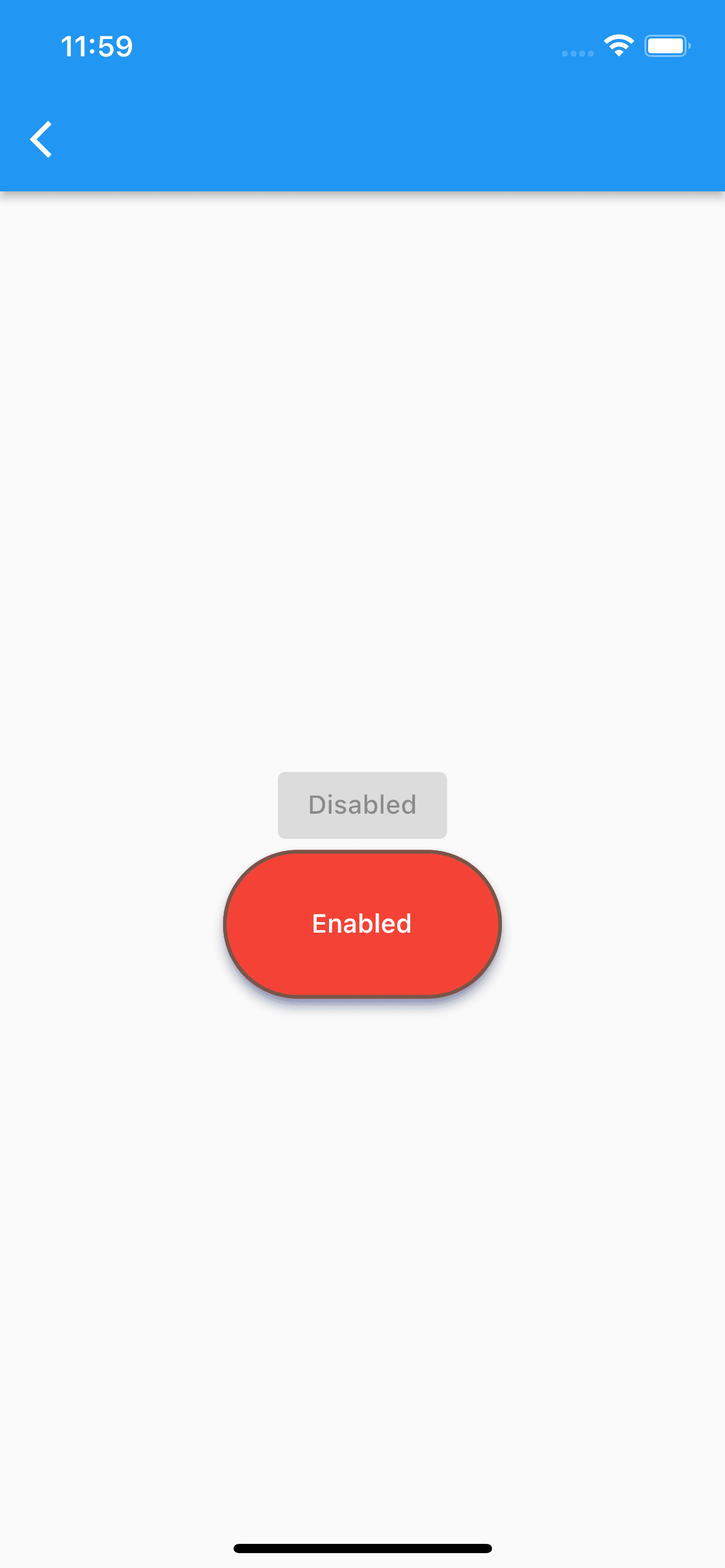
Column(
    mainAxisAlignment: MainAxisAlignment.center,
    children: [
        const ElevatedButton(
            onPressed: null,
            child: Text('Disabled'),
        ),
        SizedBox(
            width: 150,
            height: 80,
            child: ElevatedButton(
            onPressed: () {},
            onLongPress: () {},
            style: ElevatedButton.styleFrom(
                elevation: 5,
                shadowColor: Colors.indigo,
                primary: Colors.red,
                side: const BorderSide(
                color: Colors.brown,
                width: 2,
                ),
                // 角丸化
                shape: RoundedRectangleBorder(
                    borderRadius: BorderRadius.circular(40),
                ),
            ),
            child: const Text('Enabled'),
            ),
        ),
    ],
)
FloatingActionButton
丸形
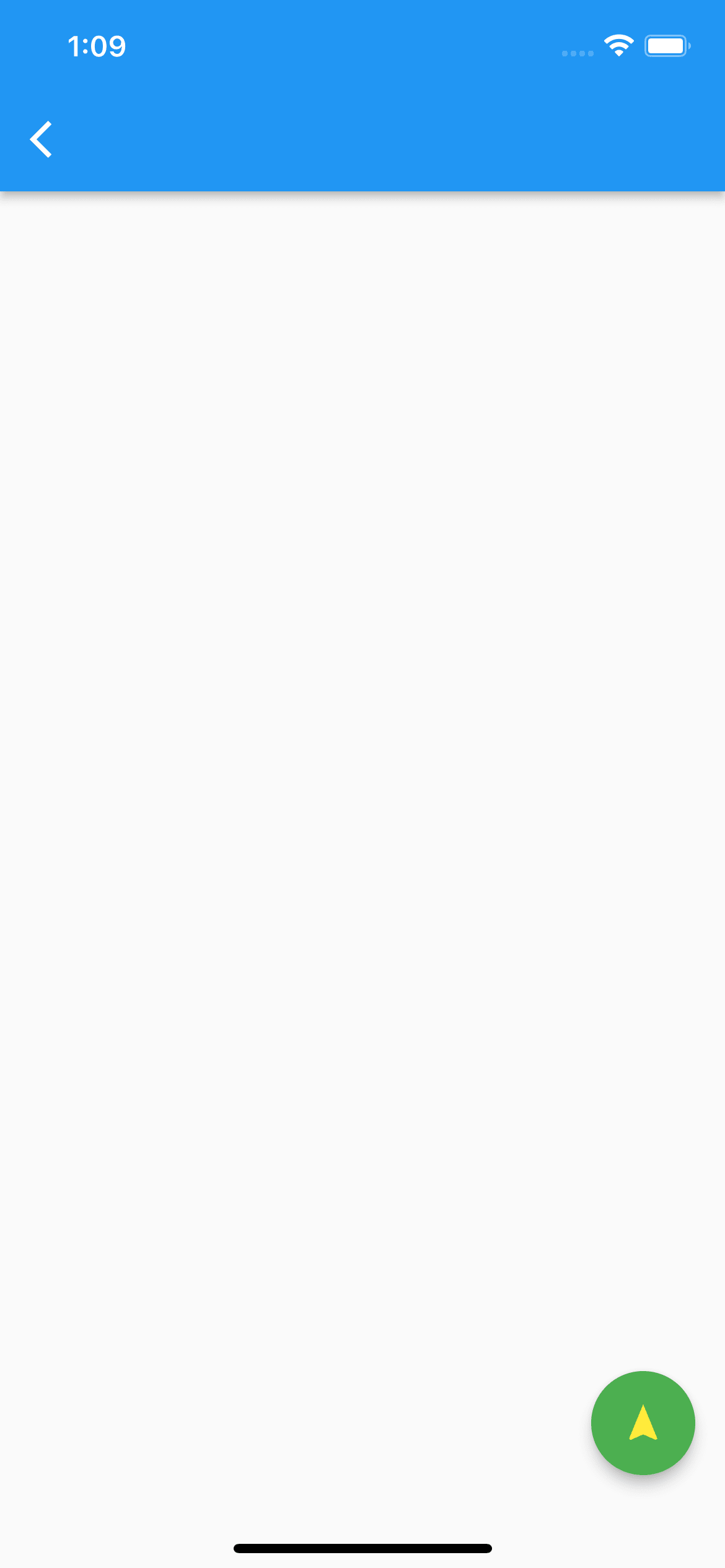
FloatingActionButton(
    onPressed: () {},
    foregroundColor: Colors.yellow,
    backgroundColor: Colors.green,
    mini: false, // trueにすると小さくなる
    isExtended: true,
    child: const Icon(Icons.navigation),
)
角丸型
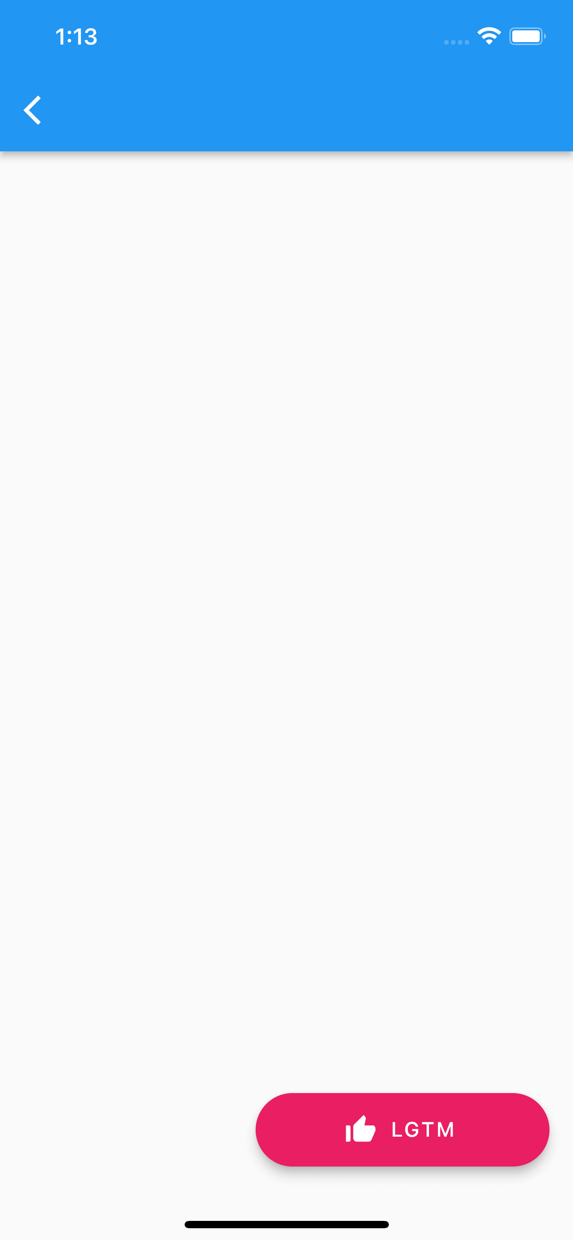
SizedBox(
    width: 200,
    height: 50,
    child: FloatingActionButton.extended(
        onPressed: () {},
        foregroundColor: Colors.white,
        backgroundColor: Colors.pink,
        isExtended: true,
        label: const Text('LGTM'),
        icon: const Icon(Icons.thumb_up_alt),
    ),
)
IconButton
背景なし
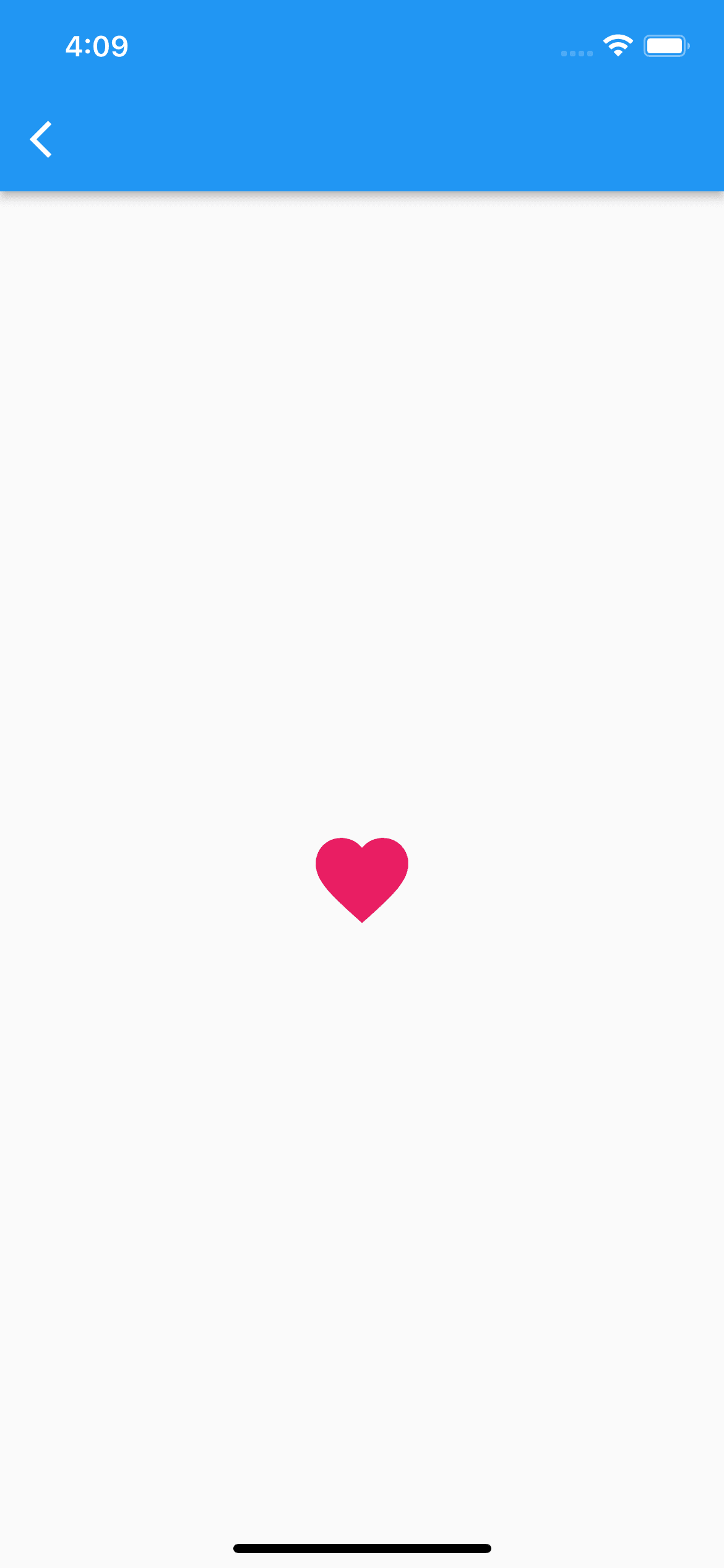
IconButton(
    iconSize: 60,
    color: Colors.pink,
    icon: const Icon(Icons.favorite),
    onPressed: () {},
)
背景あり
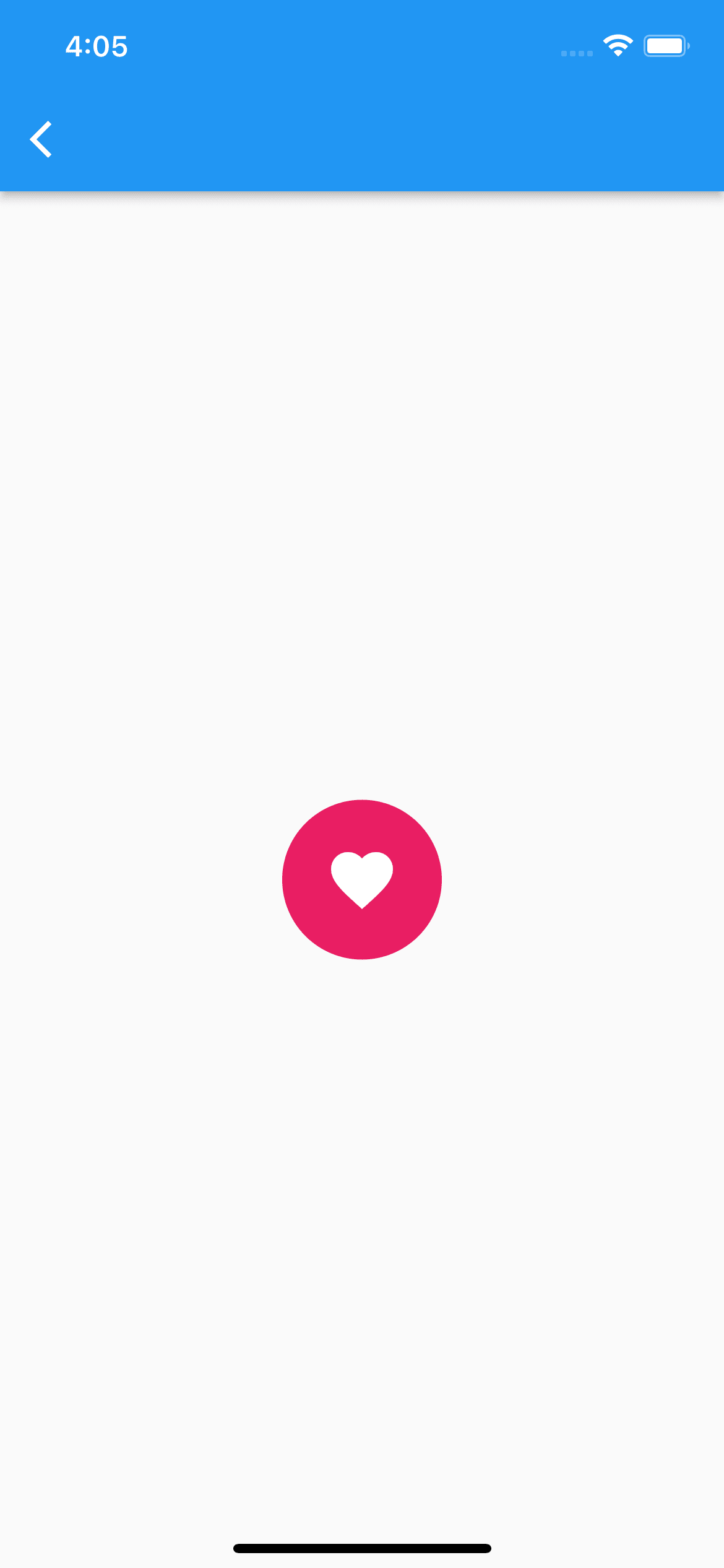
// Inkで囲ってあげるといい感じの背景を表示してくれる
Ink(
    padding: const EdgeInsetsDirectional.all(15),
    decoration: const ShapeDecoration(
        color: Colors.pink,
        shape: CircleBorder(),
    ),
    child: IconButton(
        // splashColorとhithlightColorにtransparentを指定することで、タップ時のリップルエフェクトを無効化できる
        splashColor: Colors.transparent,
        highlightColor: Colors.transparent,
        iconSize: 40,
        color: Colors.white,
        icon: const Icon(Icons.favorite),
        onPressed: () {},
    ),
)
OutlinedButton
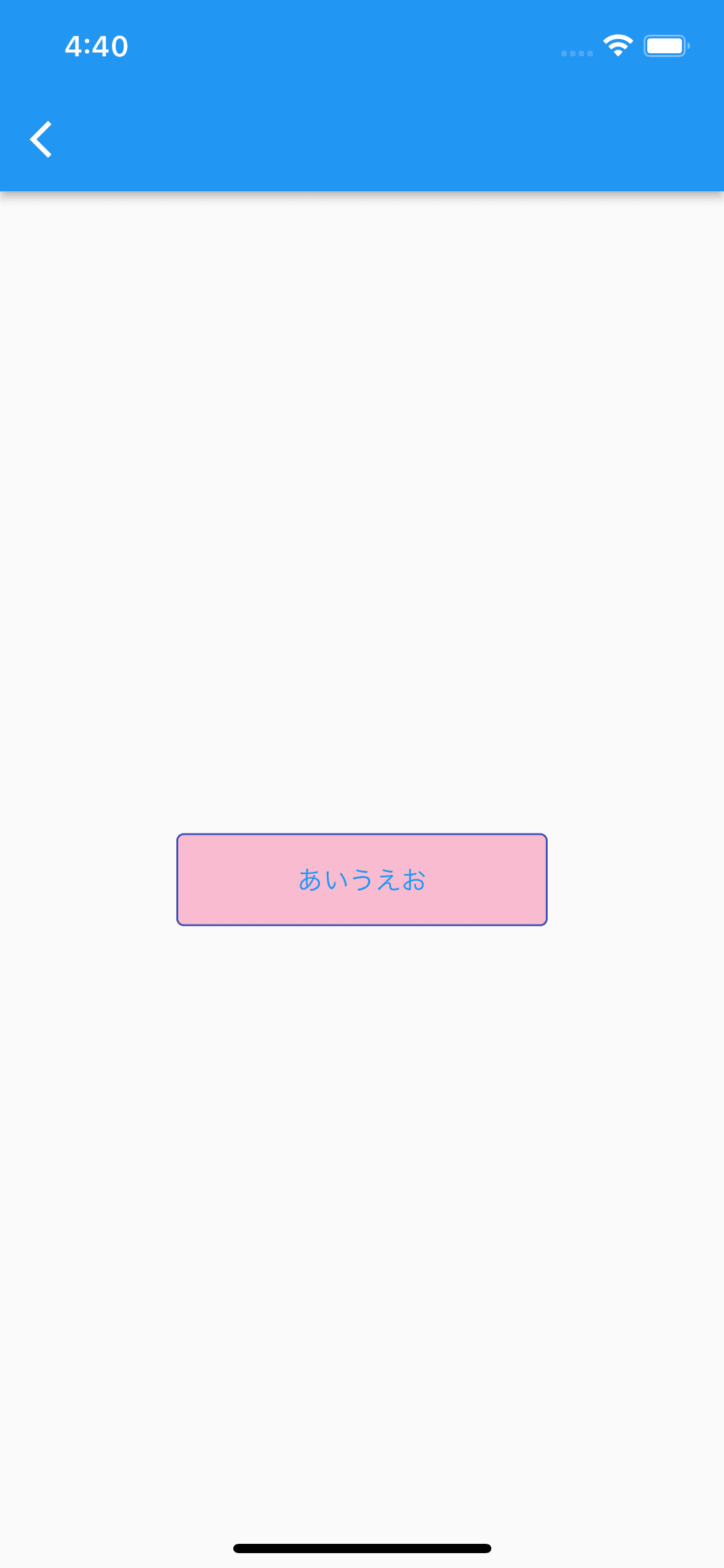
SizedBox(
    width: 200,
    height: 50,
    child: OutlinedButton(
        onPressed: () {},
        onLongPress: () {},
        style: OutlinedButton.styleFrom(
            backgroundColor: Colors.pink[100],
            side: const BorderSide(
                color: Colors.indigo,
            ),
            splashFactory: NoSplash.splashFactory, // タップ時のリップルエフェクト無効化
        ),
        child: const Text('あいうえお'),
    ),
)
PopupMenuButton

enum Sports {
  soccer,
  baseball,
  basketball,
  swimming,
}

PopupMenuButton(
    onSelected: print,
    itemBuilder: (BuildContext context) => <PopupMenuEntry<Sports>>[
        const PopupMenuItem(
            value: Sports.soccer,
            child: Text('soccer'),
        ),
        const PopupMenuItem(
            value: Sports.baseball,
            child: Text('baseball'),
        ),
        const PopupMenuItem(
            value: Sports.basketball,
            child: Text('basketball'),
        ),
        const PopupMenuItem(
            value: Sports.swimming,
            child: Text('swimming'),
        ),
    ],
)
TextButton
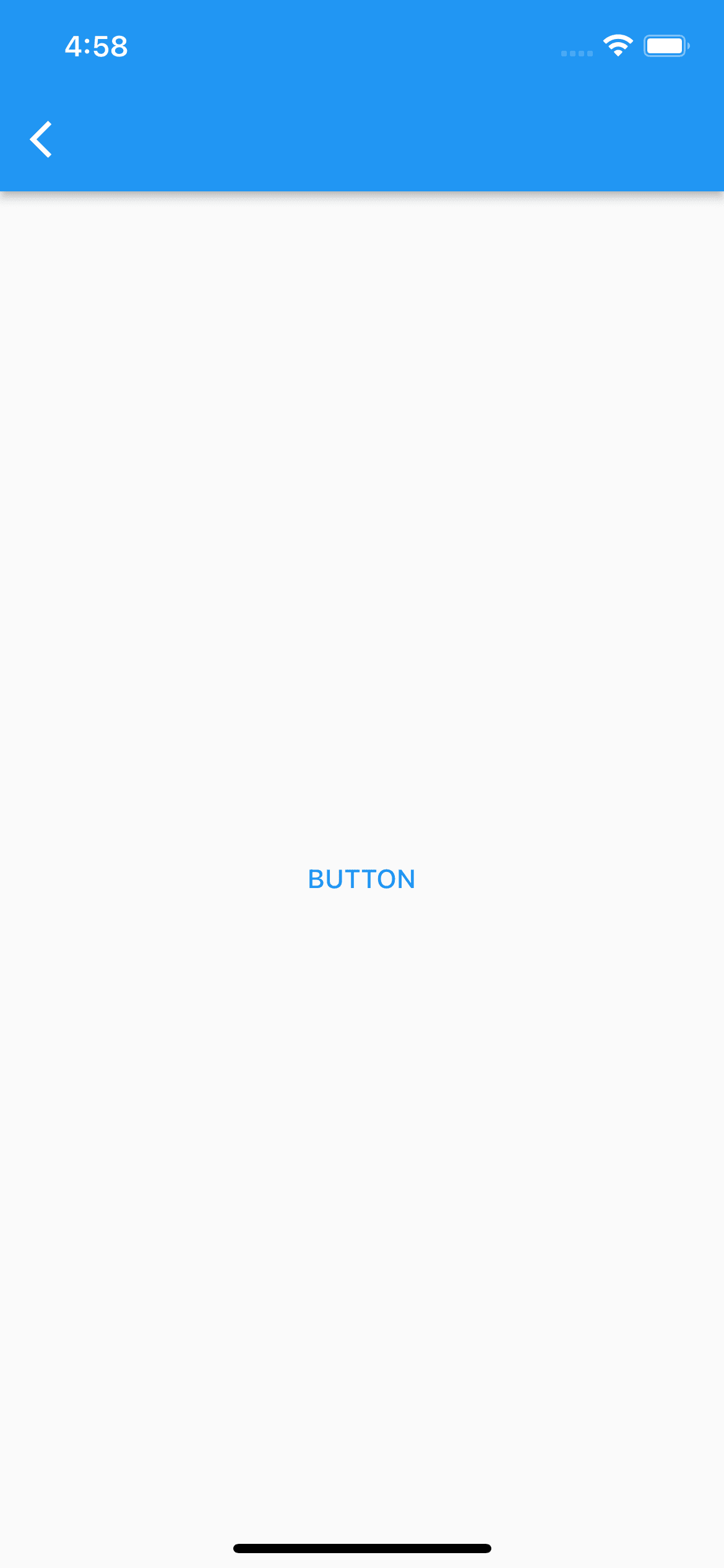
TextButton(
    onPressed: () {},
    style: TextButton.styleFrom(
        splashFactory: NoSplash.splashFactory,
    ),
    child: const Text('BUTTON'),
)
Checkbox
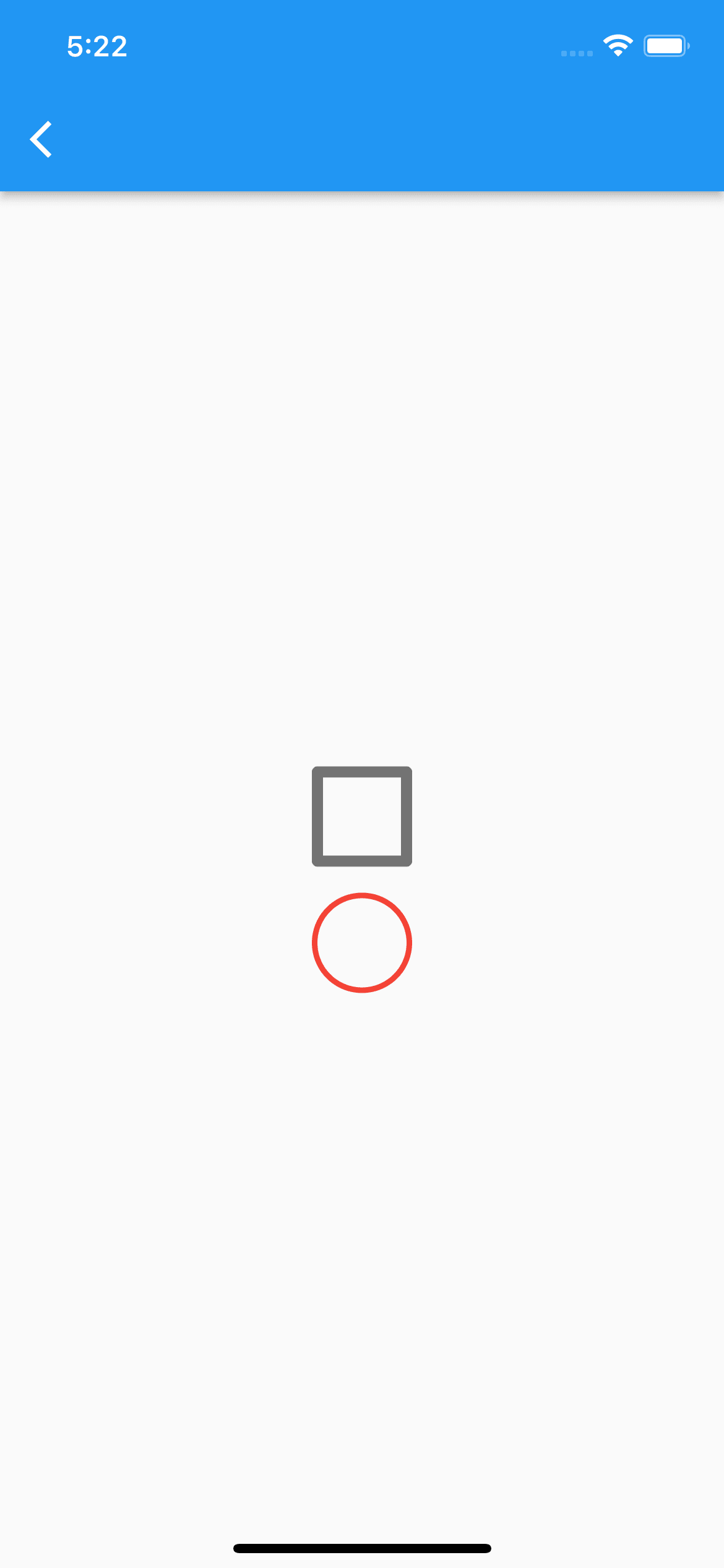
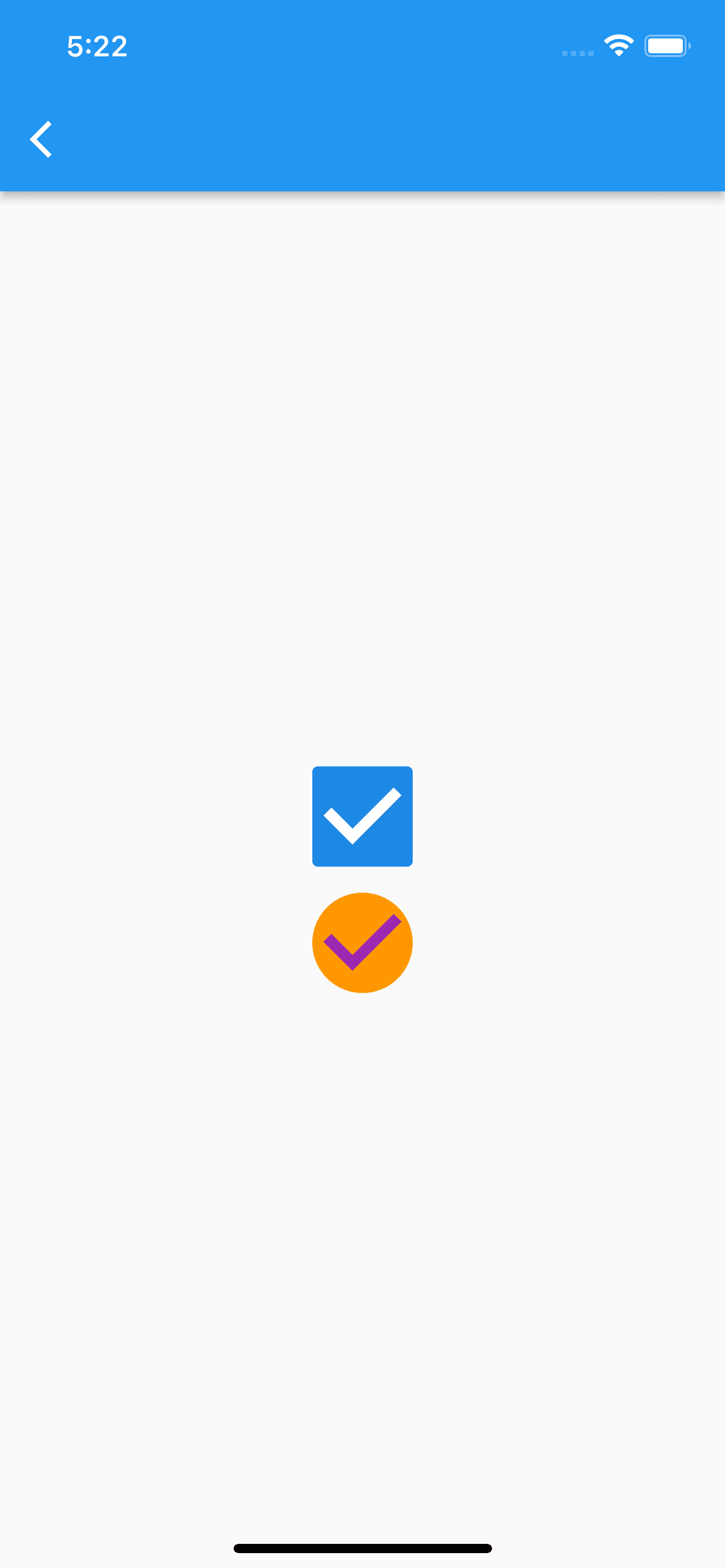
// SizedBoxなどではチェックボックスのサイズを変えられないためTransform.scaleで変更
Transform.scale(
    scale: 3,
    child: Checkbox(
        value: _result,
        onChanged: (result) {
            setState(() {
                _result = !_result;
            });
        },
    ),
),
const SizedBox(
    height: 20,
),
Transform.scale(
    scale: 3,
    child: Checkbox(
        activeColor: Colors.orange,
        shape: const CircleBorder(),
        checkColor: Colors.purple,
        splashRadius: 0, // タップ時のエフェクト無効化
        value: _result,
        onChanged: (result) {
            setState(() {
                _result = !_result;
            });
        },
        // 非チェック(false)時のスタイル
        side: const BorderSide(
            color: Colors.red,
        ),
    ),
)
※Columnの中に記述してます
DatePicker

final _nowYear = DateTime.now().year;
Future<void> _showDatePicker() async {
    final _date = await showDatePicker(
      context: context,
      initialDate: DateTime.now(),
      // 5年前まで選択可能
      firstDate: DateTime(_nowYear - 5),
      // 5年後まで選択可能
      lastDate: DateTime(_nowYear + 5),
      helpText: '選択して下さい',
      cancelText: 'キャンセル',
      confirmText: '確定',
      initialDatePickerMode: DatePickerMode.year,
    );
}

ElevatedButton(
    onPressed: _showDatePicker,
    child: const Text('選択'),
)
TimePicker

Future<void> _showTimePicker() async {
    final _time = await showTimePicker(
      context: context,
      initialTime: TimeOfDay.now(),
      helpText: '選択して下さい',
      cancelText: 'キャンセル',
      confirmText: '確定',
    );
}

ElevatedButton(
    onPressed: _showTimePicker,
    child: const Text('選択'),
)
Radio

enum Gender {
  male,
  female,
  other,
}

Gender? _selectedGender = Gender.male;

return Scaffold(
    appBar: AppBar(),
    // 未選択時の色はテーマのプロパティで指定しなければならず、ちょいめんどい
    body: MaterialApp(
        debugShowCheckedModeBanner: false,
        theme: ThemeData(
          unselectedWidgetColor: Colors.pink,
        ),
        home: Column(
            children: [
                ListTile(
                    title: const Text('男性'),
                    leading: Radio(
                        value: Gender.male,
                        groupValue: _selectedGender,
                        onChanged: (Gender? value) {
                            setState(() {
                                _selectedGender = value;
                            });
                        },
                        activeColor: Colors.indigo,
                    ),
                ),
                ListTile(
                    title: const Text('女性'),
                    leading: Radio(
                        value: Gender.female,
                        groupValue: _selectedGender,
                        onChanged: (Gender? value) {
                            setState(() {
                                _selectedGender = value;
                            });
                        },
                        activeColor: Colors.indigo,
                    ),
                ),
                ListTile(
                    title: const Text('その他'),
                    leading: Radio(
                        value: Gender.other,
                        groupValue: _selectedGender,
                        onChanged: (Gender? value) {
                            setState(() {
                                _selectedGender = value;
                            });
                        },
                        activeColor: Colors.indigo,
                    ),
                ),
            ],
        ),
    ),
);
Slider

double _currentVal = 50;

Row(
    mainAxisAlignment: MainAxisAlignment.center,
    children: [
        const Icon(
            Icons.volume_off,
            color: Colors.indigo,
        ),
        Slider(
            value: _currentVal,
            min: 0,
            max: 100,
            onChanged: (val) {
                setState(() {
                    _currentVal = val;
                });
            },
            activeColor: Colors.indigo,
            inactiveColor: Colors.indigo[100],
        ),
        const Icon(
            Icons.volume_up,
            color: Colors.indigo,
        ),
    ],
)
Switch

bool _enableEmailNotification = false;
bool _enablePushNotification = false;

Row(
    mainAxisAlignment: MainAxisAlignment.center,
    children: [
        const Text('メール通知'),
        Switch(
            value: _enableEmailNotification,
            activeColor: Colors.amber,
            onChanged: (val) {
                setState(() {
                    _enableEmailNotification = val;
                });
            },
        ),
    ],
),
Row(
    mainAxisAlignment: MainAxisAlignment.center,
    children: [
        const Text('プッシュ通知'),
        Switch(
            value: _enablePushNotification,
            activeColor: Colors.deepOrange,
            inactiveThumbColor: Colors.grey[300],
            inactiveTrackColor: Colors.grey[200],
            onChanged: (val) {
                setState(() {
                    _enablePushNotification = val;
                });
            },
        ),
    ],
)
TextField

final _emailController = TextEditingController();
final _passwordController = TextEditingController();
bool _hidePassword = true;

// メールアドレスフィールド
TextField(
    controller: _emailController,
    keyboardType: TextInputType.emailAddress,
    decoration: const InputDecoration(
        labelText: 'メールアドレス',
        labelStyle: TextStyle(
            color: Colors.teal,
        ),
        floatingLabelStyle: TextStyle(
            color: Colors.red,
        ),
        prefixIcon: Icon(Icons.email),
        focusedBorder: UnderlineInputBorder(
            borderSide: BorderSide(
                color: Colors.indigoAccent,
            ),
        ),
    ),
    cursorColor: Colors.indigoAccent,
)

// パスワードフィールド
TextField(
    controller: _passwordController,
    keyboardType: TextInputType.visiblePassword,
    decoration: InputDecoration(
        labelText: 'パスワード',
        enabledBorder: const OutlineInputBorder(),
        focusedBorder: const OutlineInputBorder(
            borderSide: BorderSide(
                color: Colors.indigoAccent,
            ),
        ),
        suffixIcon: GestureDetector(
        onTap: () {
            setState(() {
                _hidePassword = !_hidePassword;
            });
        },
        child: _hidePassword
            ? const Icon(
                Icons.visibility,
                )
            : const Icon(Icons.visibility_off),
        ),
    ),
    obscureText: _hidePassword, // 文字を隠す
    keyboardAppearance: Brightness.light,
)
AlertDialog

Future<void> _showMyDialog() async {
    return showDialog(
        context: context,
        barrierDismissible: true, // falseにすると画面タップでモーダルが閉じなくなる
        barrierColor: Colors.black87, // モーダルの背景色
        builder: (BuildContext context) {
            return AlertDialog(
                title: const Text('削除して宜しいですか?'),
                content: const Text('削除すると元に戻せません'),
                actions: [
                    TextButton(
                        child: const Text(
                            'キャンセル',
                            style: TextStyle(color: Colors.black),
                        ),
                        onPressed: () {
                            Navigator.pop(context);
                        },
                    ),
                    TextButton(
                        child: const Text(
                            '削除',
                            style: TextStyle(color: Colors.red),
                        ),
                        onPressed: () {
                            Navigator.pop(context);
                        },
                    ),
                ],
            );
        },
    );
}

ElevatedButton(
    onPressed: _showMyDialog,
    child: const Text('表示'),
)
SimpleDialog

Future<void> _showMyDialog() async {
    return showDialog(
        context: context,
        builder: (BuildContext context) {
            /*
            一般的な使い方ではないかもしれないが、デフォルトのパディングを無効化してtitleプロパティにColumnでウィジェットを並べる方法をよく使っている。
            こうすることでデフォルトの余白などに邪魔されず、自由にUI作成が出来るため
            insetPaddingとMediaQuery.of(context).size.widthの組み合わせにより、画面両端からダイアログまでの余白を定義できる。
            */
            return SimpleDialog(
                title: SizedBox(
                    width: MediaQuery.of(context).size.width,
                    height: 300,
                    child: Padding(
                        padding: const EdgeInsets.all(10),
                        child: Column(
                            crossAxisAlignment: CrossAxisAlignment.start,
                            children: [
                                const Center(
                                    child: Text('Flutterとは'),
                                ),
                                hSpace(20),
                                const Text(
                                    'Flutter(フラッター)は、Googleによって開発されたフリーかつオープンソースのUIのSDKである。単一のコードベース[4]から、Android、iOS、Linux、macOS、Windows、Google Fuchsia[5][6]向けのクロスプラットフォームアプリケーションを開発するために利用される。',
                                    style: TextStyle(fontSize: 14),
                                ),
                            ],
                        ),
                    ),
                ),
                titlePadding: EdgeInsets.zero,
                contentPadding: EdgeInsets.zero,
                insetPadding: const EdgeInsets.symmetric(horizontal: 20),
            );
        },
    );
}
BottomSheet

Future<void> _showMyDialog() async {
    return showModalBottomSheet(
        context: context,
        builder: (context) {
            return Column(
                mainAxisSize: MainAxisSize.min,
                children: [
                    ListTile(
                        leading: const Icon(Icons.share),
                        title: const Text('Share'),
                        onTap: () => Navigator.pop(context),
                    ),
                    ListTile(
                        leading: const Icon(Icons.link),
                        title: const Text('Link'),
                        onTap: () => Navigator.pop(context),
                    ),
                    ListTile(
                        leading: const Icon(Icons.edit),
                        title: const Text('Edit'),
                        onTap: () => Navigator.pop(context),
                    ),
                    ListTile(
                        leading: const Icon(Icons.delete),
                        title: const Text('Delete'),
                        onTap: () => Navigator.pop(context),
                    ),
                    hSpace(20),
                ],
            );
        },
    );
}

ElevatedButton(
    onPressed: _showMyDialog,
    child: const Text('表示'),
)
ExpansionTile

ExpansionTile(
    onExpansionChanged: (bool changed) {
        // 開閉時の処理
    },
    title: const Text('アコーディオン的なやつ'),
    leading: const Icon(Icons.info),
    children: [
        Row(
            children: const [
                Checkbox(
                    value: false,
                    onChanged: print,
                ),
                Text('aaaaa'),
            ],
        ),
        Row(
            children: const [
                Checkbox(
                    value: true,
                    onChanged: print,
                ),
                Text('bbbbb'),
            ],
        ),
        Row(
            children: const [
                Checkbox(
                    value: false,
                    onChanged: print,
                ),
                Text('ccccc'),
            ],
        ),
    ],
)
SnackBar

void _showSnackBar() {
    ScaffoldMessenger.of(context).showSnackBar(
        SnackBar(
            content: const Text('表示に成功しました'),
            action: SnackBarAction(
                label: 'アクション',
                textColor: Colors.greenAccent,
                onPressed: () {
                    // アクションボタンタップ時の処理
                },
            ),
            backgroundColor: Colors.orange,
            duration: const Duration(seconds: 2), // スナックバーが自動で閉じるまでの時間。デフォルトは4秒
        ),
    );
}

TextButton(
    onPressed: _showSnackBar,
    child: const Text('表示'),
)
Card

Stack(
    alignment: AlignmentDirectional.topEnd,
    children: [
        Card(
            color: Colors.yellow[100],
            child: InkWell(
                splashColor: Colors.greenAccent.withAlpha(50),
                highlightColor: Colors.transparent,
                onTap: () {
                    // タップ時の処理
                },
                child: const SizedBox(
                    width: 300,
                    height: 100,
                    child: Center(
                        child: Text('カードウィジェットサンプル'),
                    ),
                ),
            ),
        ),
        Padding(
            padding: const EdgeInsets.only(right: 10),
            child: GestureDetector(
                onTap: () {
                    setState(() {
                        _isBookmarked = !_isBookmarked;
                    });
                },
                child: Icon(
                    _isBookmarked
                        ? Icons.bookmark_sharp
                        : Icons.bookmark_outline_sharp,
                    color: Colors.green,
                    size: 28,
                ),
            ),
        ),
    ],
)
Chip
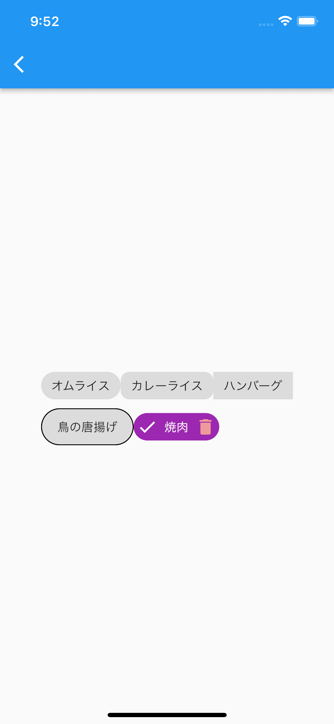
// Wrapで囲むと子要素が親要素の幅を超えた場合に自動改行してくれる
Wrap(
    children: [
        const Chip(
            label: const Text('オムライス'),
        ),
        Chip(
            label: const Text('カレーライス'),
            shape: RoundedRectangleBorder(
                borderRadius: BorderRadius.circular(10),
            ),
        ),
        const Chip(
            label: Text('ハンバーグ'),
            shape: BeveledRectangleBorder(),
        ),
        const Chip(
            label: Text('鳥の唐揚げ'),
            padding: EdgeInsets.all(10),
            side: BorderSide(
                color: Colors.black,
            ),
        ),
        Chip(
            label: const Text(
                '焼肉',
                style: TextStyle(
                color: Colors.white,
                ),
            ),
            avatar: const Icon(
                Icons.check,
                color: Colors.white,
            ),
            deleteIcon: Icon(
                Icons.delete,
                color: Colors.red[200],
            ),
            backgroundColor: Colors.purple,
            onDeleted: () {
                // deleteIconタップ時の処理
            },
        ),
    ],
)
CircularProgressIndicator

SizedBox(
    width: 150,
    height: 150,
    child: CircularProgressIndicator(
        color: Colors.cyan,
        backgroundColor: Colors.pink[50],
        strokeWidth: 5, // 線の太さ
    ),
)
GridView

GridView.count(
    crossAxisCount: 2, // 横に並べる個数
    mainAxisSpacing: 5,
    crossAxisSpacing: 5,
    children: [
        Container(
            color: Colors.cyan,
        ),
        Container(
            color: Colors.indigo,
        ),
        Container(
            color: Colors.red,
        ),
        Container(
            color: Colors.blue,
        ),
        Container(
            color: Colors.pink,
        ),
        Container(
            color: Colors.orange,
        ),
        Container(
            color: Colors.purple,
        ),
        Container(
            color: Colors.green,
        ),
        Container(
            color: Colors.grey,
        ),
        Container(
            color: Colors.amber,
        ),
        Container(
            color: Colors.black45,
        ),
    ],
)
LinearProgressIndicator

SizedBox(
    width: 300,
    height: 5,
    child: LinearProgressIndicator(
        color: Colors.cyan,
        backgroundColor: Colors.pink[50],
    ),
)
Icon
Icon(
    Icons.settings,
    size: 50,
    color: Colors.blue,
)
アイコンを探す際はこちらを参考に
Image
ローカル画像
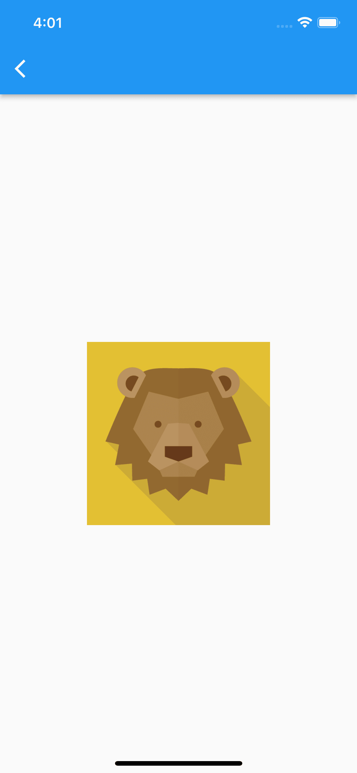
Image.asset(
    'assets/images/lion.png',
    width: 200,
    height: 200,
    fit: BoxFit.cover,
),
※pubspec.yamlに下記のような記述を追加し、事前にassets/imagesディレクトリに画像を配置する必要あり
flutter:
  uses-material-design: true

  # ここを追加
  assets:
    - assets/images/
リソースについて
下記のように書けるようになり、エディタの補完も効きます😊
Assets.images.lion.image(
    width: 200,
    height: 200,
    fit: BoxFit.cover,
)
ネット上の画像
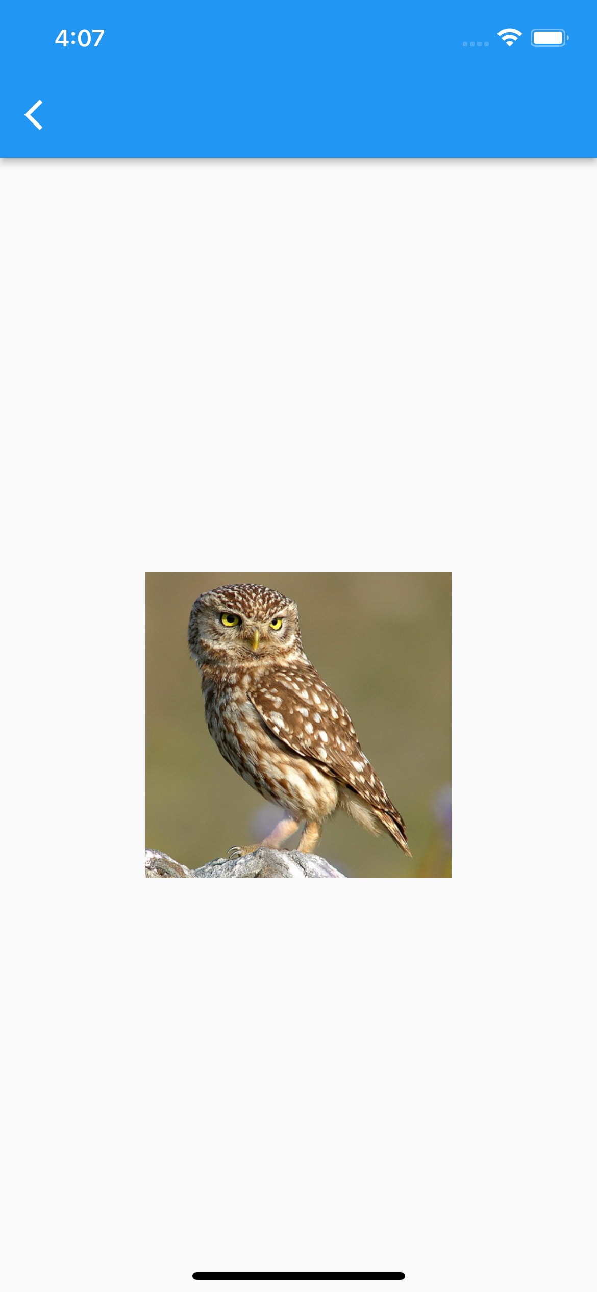
Image(
    image: NetworkImage(
        'https://flutter.github.io/assets-for-api-docs/assets/widgets/owl.jpg',
    ),
    width: 200,
    height: 200,
    fit: BoxFit.fill,
)
Discussion