こんにちは!影山です。
アルダグラムが開発している KANNA アプリは、Next.js / TypeScript を導入して型安全に開発しています。
TypeScript の体験は素晴らしいですが、慣れていないと最初は開発スピードが落ちてしまうこともあります。
そのため、Web 上で type-challenges や サバイバルTypeScript などを通して、TypeScript のイロハを学びますが、 React との兼ね合いによるエラーで詰まってしまうことが第2の試練のように感じます。
そこで、今回は type-challenges の初級問題をベースとした上で、それをどう React(Next.js) に組み込んでいくか、説明していきます。
扱う問題は以下になります。一度解いてから、この記事を読むと理解が深まるかもしれません。
TypeScript の Utility Types をベースとした問題を取り扱っております。
上記、それぞれどういう型情報を持っているかザックリ記述しますが、既に素晴らしい解説があるため、そちらを参照するのがベターです。
セットアップ
KANNAアプリ同様、Next.js と TypeScript を使用していきます。
npx create-next-app@latest --typescript
セットアップが完了すると Next.js のプロジェクトが作成されます。
デフォルトではプロジェクトルート直下に pages が作られますが、今回は src ディレクトリを作ってその中に作成しています。
src/
├──pages
├──components
  ├──pages
├──types
{
  "compilerOptions": {
    "sourceRoot": "src"
  }
}
※CSS の対応を入れると長くなるため、今回は申し訳程度のスタイリングを施すこととします。
Title変更
まずは、Title(h1) 部分を直していきます。Title では Pick を使うため、PickTitle コンポーネントを作ります。
...
import { PickTitle } from '../components/PickTitle'
...
const Home: NextPage = () => {
  const titleContent = {
    title: "Welcome to",
    content: "Next.js!",
  }
...
<main className={styles.main}>
	<PickTitle props={titleContent} />
...
import { FC } from 'react';
import { PickTitle as Pick } from '../types/utils'

export const PickTitle: FC<{props: Pick}> = ({ props }) => {
  return (
    <>
      <h1>
        {props.title}
      </h1>
      <p>{props.content}</p>
    </>
  )
}
export type TitleContent = {
  title: string
  content: string
}
type MyPick <T, K extends keyof T> = {
  [key in K]: T[K]
}
export type PickTitle = MyPick<TitleContent, 'title' | 'content'>
MyPick の解説は、こちらになります。
今回は、 T が TitleContent で、 K が T の key である title , content になります。
PickTitle は、 MyPick の第2引数で 'title' | 'content' と指定したため、その2つの string 型を持ち合わせています。
( MyPick が無くても そのまま TitleContent を PickTitle.tsx へ export しても使えますが、学習のためあえて使用しています)
さて、この MyPick ですが既に TypeScript の Utility Types に入っているため、実は下記のように書き換えられます。
export type PickTitle = Pick<TitleContent, 'title' | 'content'>
Utility Types とはなんでしょうか。
これは、ベースの型(今回なら TitleContent )を変換して、新しく別の型(今回なら PickTitle )に変えてくれる TypeScript 側が用意してくれている型のことです。
【TypeScript】Utility Typesをまとめて理解する
読者の方に知っていただきたいことは、 type-challenges の特に初級では、この Utility Types を自作することが多い、 ということです。
これを知りながら解いていると type-challenges の有用性が分かってくるかと思います。
Description変更
Description 部分を直していきます。Description では Readonly を使うため、ReadonlyDescription コンポーネントを作ります。
...
import { PickTitle } from '../components/PickTitle'
import { ReadonlyDescription } from '../components/ReadonlyDescription'
...
const Home: NextPage = () => {
...
	const description = {
    description: "Get started by editing"
  }
...
<main className={styles.main}>
	<PickTitle props={titleContent} />
	<ReadonlyDescription props={description}/>
...
import { FC } from 'react';
import { ReadOnlyDescription as Readonly } from '../types/utils'

export const ReadonlyDescription: FC<{props: Readonly}> = ({ props }) => {
  // 下記のようなことをするとErrorになるのがReadonlyのチカラ
  // props.description = 'HELLO'
  return (
    <p>
      {props.description}
      <code>{props.code}</code>
    </p>
  )
}
上記のコメントアウト部分のように、書き換えようとするとエラー(Cannot assign to 'description' because it is a read-only property.ts)が出ます。
...
export type PickTitle = MyPick<TitleContent, 'title' | 'content'>

type Description = {
  description: string
}

type MyReadOnly<T> = {
  readonly [key in keyof T]: T[key]
}
export type ReadOnlyDescription = MyReadOnly<Description>
Readonly の解説は、こちらになります。
MyReadonly の [key in keyof T] の T は Description のことを指しており、中身が description: string となります。
なので、 key は、 description となり、 T[key] は、すなわち string となります。
自作した MyReadonly も Utility Types の1つであるため下記のように書き換えられます。
export type ReadOnlyDescription = Readonly<Description>
Grid変更
Grid 部分を直していきます。Grid では親と子で改装を分けてみます。
親Gridの変更
...
import { ReadonlyDescription } from '../components/ReadonlyDescription'
import { Grid } from '../components/Grid'
...
<main className={styles.main}>
	<PickTitle props={titleContent} />
	<ReadonlyDescription props={description}/>
  <Grid>
		...
	</Grid>
...
import { ReactNode } from 'react'
import styles from '../styles/Home.module.css'

export const Grid = ({ children }: {
  children: ReactNode
}) => {
  return (
    <div className={styles.grid}>
      {children}
    </div>
  )
}
children の型要素に ReactNode という TypeScript 側で持っていない型が現れました。 ReactNode とは、React が保持する型情報のことで
type ReactNode = string | number | boolean | ReactElement<any, string | JSXElementConstructor<any>> | ReactFragment | ReactPortal | null | undefined
が中身となります。この内部の説明に関して、こちらの記事が非常に分かりやすかったのでシェアさせていただきます。
TypeScript: ReactNode型とReactElement型とReactChild型
次に、子Gridを見ていきます。
子Gridの変更
Exclude を使うため、ExcludeGridInside コンポーネントを作ります。
4つある子要素のうち、最初の1つに対してのみ、ExcludeGridInside コンポーネントを適用しますが、記事の最後のまとめ部分に map を使った形を載せています。
...
import { Grid } from '../components/Grid'
import { ExcludeGridInside } from '../components/ExcludeGridInside'
...
const Home: NextPage = () => {
...
const gridInsideOne = {
// エスケープ文字が入っているので、UTF-8指定
title: `Documentation ${String.fromCharCode(8594)}`,
href: "https://nextjs.org/docs",
content: "Find in-depth information about Next.js features and API.",
}
...
<main className={styles.main}>
<PickTitle props={titleContent} />
<ReadonlyDescription props={description}/>
<Grid>
{/* 4つある子要素のうち、最初の1つのみに適用 */}
<ExcludeGridInside props={gridInsideOne} />
{/* 2番目以降の要素... */}
<a href="https://nextjs.org/learn" className={styles.card}>
<h2>Learn →</h2>
<p>Learn about Next.js in an interactive course with quizzes!</p>
</a>
...
</Grid>
...
import { FC } from 'react';
import { ExcludeGridChildren as Exclude } from '../types/utils'
import styles from '../styles/Home.module.css'

export const ExcludeGridInside: FC<{props: Exclude}> = ({ props }) => {
  return (
    <a href={props.href} className={styles.card}>
      <h2>{props.title}</h2>
      <p>{props.content}</p>
    </a>
  )
}
export type Info = {
  title: string
  content?: string
  href: string
  description: string
}
type MyPick <T, K extends keyof T> = {
  [key in K]: T[K]
}
export type PickTitle = MyPick<Info, 'title' | 'content'>
...省略
export type ReadOnlyDescription = MyReadonly<Description>

type GridInside = Info
type MyExclude<T, U> = T extends U ? never : T;
export type ExcludeGridChildren = MyExclude<GridInside, 'content'>
- TitleContent を
Infoに改名しました。 - content を
optionalにしました。 -
Infoに新しくhref: stringdescription: stringを追加し、type GridInsideはそれを継承しています。 -
MyExcludeの型ですが、 ジェネリクス型の引数を2つ取ります。
T が U の型情報を持っている場合、 never が返り、そうでない場合 T を返します。つまり、引き算です。
[title, content, href, description] - [content] = [title, href, description]
と考えると分かりやすいかもしれません。
また、元々 TitleContent だったものが、そのまま型エラーを出すことなく、動いていますが、これは Pick を用いて、明示的に型を指定したため、 PickTitle は title と content の2つの型をもつだけなのでエラーが発生しません。
Utility Types を使うことで既存の型への影響も少なくなるのが使う利点となります。
Footer変更
Footer 部分を直していきます。Footer では Awaited を使うため、AwaitedFooter コンポーネントというものを作りました。
Awaited を上手に組み込む方法が見つからなかったので、setTimeout() を使い、アイコン部分は3秒毎に表示する or 表示しないようなテコ入れをしました。
...
import { ExcludeGridInside } from '../components/ExcludeGridInside'
import { AwaitedFooter } from '../components/AwaitedFooter'
...
const Home: NextPage = () => {
...
const footerElement = {
  width: 72,
  height: 16,
  href: 'https://vercel.com?utm_source=create-next-app&utm_medium=default-template&utm_campaign=create-next-app',
  target: '_blank',
  rel: 'noopener noreferrer',
  text: 'Powered by',
  src: '/vercel.svg',
  alt: 'Vercel Logo'
}
...
<main className={styles.main}>
...
	</Grid>
</main>
<AwaitedFooter props={footerElement} />
...
import { FC, useState } from 'react'
import styles from '../styles/Home.module.css'
import Image from 'next/image'
import { FooterProps, MyAwaited as Awaited } from '../types/utils'

type Await = Awaited<Promise<number>>

export const AwaitedFooter: FC<{props: FooterProps}> = ({ props }) => {
  const [isSuccess, setIsSuccess] = useState<boolean>(true)
  const PromiseFunction = () => new Promise<Await>((resolve, reject) => {
    setTimeout(() => {
      const n = Math.random()
      if(n > 0.4) {
        resolve(n)
        console.log('success')
        setIsSuccess(() => true)
      } else {
        reject()
        console.warn('reject')
        setIsSuccess(() => false)
      }
    }, 3000)
  })

  PromiseFunction()

  return (
    <footer className={styles.footer}>
      <a
        href={props.href}
        target={props.target}
        rel={props.rel}
      >
        {props.text}
        <span className={styles.logo}>
          {isSuccess ? (
            <Image src={props.src} alt={props.alt}  width={props.width} height={props.height}/>
          ) : ''}
        </span>
      </a>
    </footer>
  )
}
...
export type ExcludeGridChildren = GridInside

export type FooterProps={
  width: number
  height: number
  src: string
  target: string
  rel: string
  text: string
  alt: string
  href: string
}
export type MyAwaited<T extends Promise<number>> = T extends Promise<infer U> ? U : never
Awaited の解説はこちらになります。
ざっくり解説すると、
-
Tは、Promise<any>(今回はanyではなくnumber)から渡ったくる全てを引き継いでいるよ! -
<infer U>部分で型推論するよ!条件評価のタイミングで渡された引数に対応した型を作るよ! -
Tは<infer U>の型を継承するよ!\ - 分かったタイミングで、
TはUを返すよ! - 分からない間は
neverを返すよ!
となります。
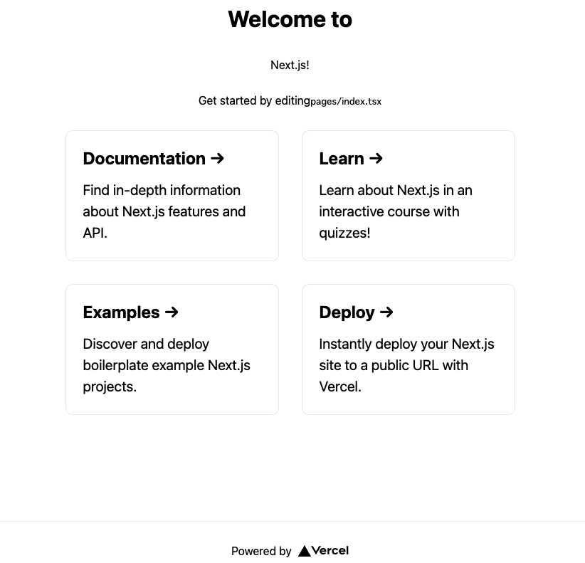
ここまでで、下記のような UI になりました。ほとんど画面側を見ずに TypeScrtipt の型を見て書き換えることができました。
[完成形] まとめ
最後に 4つの子要素部分を map でまとめて終わりにします。
変更点は少ないですが、index.tsx と ExcludeGridInside.tsx の全体を見せて終わりにします。
import type { NextPage } from 'next'
import Head from 'next/head'
import styles from '../styles/Home.module.css'
import { PickTitle } from '../components/PickTitle'
import { ReadonlyDescription } from '../components/ReadonlyDescription'
import { Grid } from '../components/Grid'
import { ExcludeGridInside } from '../components/ExcludeGridInside'
import { AwaitedFooter } from '../components/AwaitedFooter'

const Home: NextPage = () => {
  const titleContent = {
    title: "Welcome to",
    content: "Next.js!",
  }
  const description = {
    description: "Get started by editing",
    code: "pages/index.tsx"
  }
  const gridInside = [
    {
      // エスケープ文字は、UTF-8指定をして、ブラウザで表示
      title: `Documentation ${String.fromCharCode(8594)}`,
      href: "https://nextjs.org/docs",
      description: "Find in-depth information about Next.js features and API.",
    },
    {
      title: `Learn ${String.fromCharCode(8594)}`,
      href: "https://nextjs.org/learn",
      description: "Learn about Next.js in an interactive course with quizzes!",
    },
    {
      title: `Examples ${String.fromCharCode(8594)}`,
      href: "https://github.com/vercel/next.js/tree/canary/examples",
      description: "Discover and deploy boilerplate example Next.js projects.",
    },
    {
      title: `Deploy ${String.fromCharCode(8594)}`,
      href: "https://vercel.com/new?utm_source=create-next-app&utm_medium=default-template&utm_campaign=create-next-app",
      description: "Instantly deploy your Next.js site to a public URL with Vercel.",
    }
  ]
  const footerElement = {
    width: 72,
    height: 16,
    href: 'https://vercel.com?utm_source=create-next-app&utm_medium=default-template&utm_campaign=create-next-app',
    target: '_blank',
    rel: 'noopener noreferrer',
    text: 'Powered by',
    src: '/vercel.svg',
    alt: 'Vercel Logo'
  }
  return (
    <div className={styles.container}>
      <Head>
        <title>Create Next App</title>
        <meta name="description" content="Generated by create next app" />
        <link rel="icon" href="/favicon.ico" />
      </Head>

      <main className={styles.main}>
        <PickTitle props={titleContent} />
        <ReadonlyDescription props={description}/>

        <Grid>
          <ExcludeGridInside props={gridInside} />
        </Grid>
      </main>
      <AwaitedFooter props={footerElement}/>
    </div>
  )
}

export default Home
import { FC } from 'react';
import { ExcludeGridChildren as Excludes } from '../types/utils'
import styles from '../styles/Home.module.css'

export const ExcludeGridInside: FC<{props: Excludes[]}> = ({ props }) => {
  return (
    <>
      {props.map((prop: {href: string, title: string, description: string}, index: number) => (
        <a key={index} href={prop.href} className={styles.card}>
          <h2>{prop.title}</h2>
          <p>{prop.description}</p>
        </a>
      ))}
    </>
  )
}
以上となります。
Next.js, TypeScript を使って開発する際、とても多い頻度では無いですが、 Utility Types やジェネリクスを使うこともあります。
type-challenges を解いた後に、Next.js と併用して使う方がいらっしゃれば、参考になれれば幸いです。

株式会社アルダグラムのTech Blogです。 世界中のノンデスクワーク業界における現場の生産性アップを実現する現場DXサービス「KANNA」を開発しています。 採用情報はこちら: herp.careers/v1/aldagram0508/
Discussion