🎉
Rails|chart.jsを使って過去7日分の投稿数をグラフ化する


要件
・過去7日間分、それぞれの投稿数を一覧表示させる
・chart.js を使って、過去7日分の投稿数グラフ化
開発環境
ruby 3.1.2p20
Rails 6.1.7.4
Cloud9
前提
Booksモデルを作成済み
Bootstrapを導入済み
まず、過去7日間分、それぞれの投稿数を一覧表示させる
まずこの部分を作成します。
Bookモデルに記述
まずは Bookモデルに scopeを記述します。
book.rb
  scope :created_today, -> { where(created_at: Time.zone.now.all_day) }
  scope :created_yesterday, -> { where(created_at: 1.day.ago.all_day) }
  scope :created_2day_ago, -> { where(created_at: 2.day.ago.all_day) }
  scope :created_3day_ago, -> { where(created_at: 3.day.ago.all_day) }
  scope :created_4day_ago, -> { where(created_at: 4.day.ago.all_day) }
  scope :created_5day_ago, -> { where(created_at: 5.day.ago.all_day) }
  scope :created_6day_ago, -> { where(created_at: 6.day.ago.all_day) }
Userコントローラに記述
users_controller.rb
  def show
    @user = User.find(params[:id])
    @books = @user.books
  end
users/show に記述
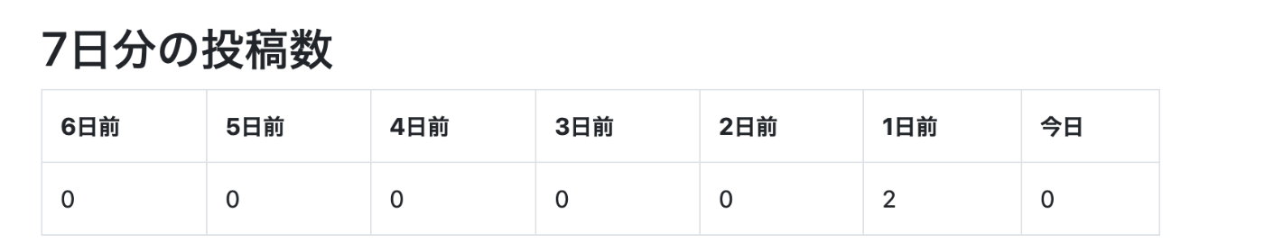
    <h2>7日分の投稿数</h2>
    <table class="table table-bordered ">
      <tr>
        <th>6日前</th>
        <th>5日前</th>
        <th>4日前</th>
        <th>3日前</th>
        <th>2日前</th>
        <th>1日前</th>
        <th>今日</th>
      </tr>
      <tr>
        <td><%= @books.created_today.count %></td>
        <td><%= @books.created_yesterday.count %></td>
        <td><%= @books.created_2day_ago.count %></td>
        <td><%= @books.created_3day_ago.count %></td>
        <td><%= @books.created_4day_ago.count %></td>
        <td><%= @books.created_5day_ago.count %></td>
        <td><%= @books.created_6day_ago.count %></td>
      </tr>
    </table>
次に、グラフ部分を作成します
次に、こちらのグラフ部分を作成します。

chart.jsの導入
chart.jsとは、JavaScriptでグラフを描画するためのライブラリです。
chart.jsの導入方法は色々ありますが、今回は、CDNを用いたインストール方法を使いました。
headタグ内に以下の記述を追加します。
application.html.erb
<script src="https://cdnjs.cloudflare.com/ajax/libs/Chart.js/2.9.3/Chart.min.js"></script>
その他の導入方法
users/show に記述
users/show.html.erb
<canvas id="myLineChart"></canvas>
  <script>
    $(document).on('turbolinks:load', function() {
      var ctx = document.getElementById("myLineChart");
      var myLineChart = new Chart(ctx, {
        type: 'line',
        data: {
          labels: ['6日前', '5日前', '4日前', '3日前', '2日前', '1日前', '今日'],
          datasets: [
            {
              label: '投稿した本の数',
              data: [
                <%= @books.created_6day_ago.count %>,
                <%= @books.created_5day_ago.count %>,
                <%= @books.created_4day_ago.count %>,
                <%= @books.created_3day_ago.count %>,
                <%= @books.created_2day_ago.count %>,
                <%= @books.created_yesterday.count %>,
                <%= @books.created_today.count %>
              ],
              borderColor: "rgba(0,0,255,1)",
              backgroundColor: "rgba(0,0,0,0)",
              tension: 0.4
            }
          ],
        },
        options: {
          title: {
            display: true,
            text: '7日間の投稿数の比較'
          },
          responsive: true,
          scales: {
            y:{
              suggestedMin: 0,
              suggestedMax: 10
            },
            x:{
              stacked: true
            },
          },
        }
      });
    });
  </script>
<canvas id="myLineChart"></canvas>
まず、表を表示するために canvas要素を用意します。
$(document).on('turbolinks:load', function() {
ここで、turbolinksの無効化をします。無効化をしないと、グラフが表示されないことがあります。
var ctx = document.getElementById("myLineChart");
先ほど作成したcanvas要素を取得し、変数ctxへ代入します。
var myLineChart = new Chart(ctx, {
  type: タイプ,
  data: データ,
  options: オプション
}
type: グラフの種類
data: ラベルとデータセット
options: オプション設定を記述します。
type: 'line'
今回は折れ線グラフを使用します。
data: ...
この部分では、先ほど作成したscopeを利用してデータを取得します。
options: ...
この部分ではさまざまなオプション設定を加えています。
これで完成です!!
参照
Discussion