やりたいこと
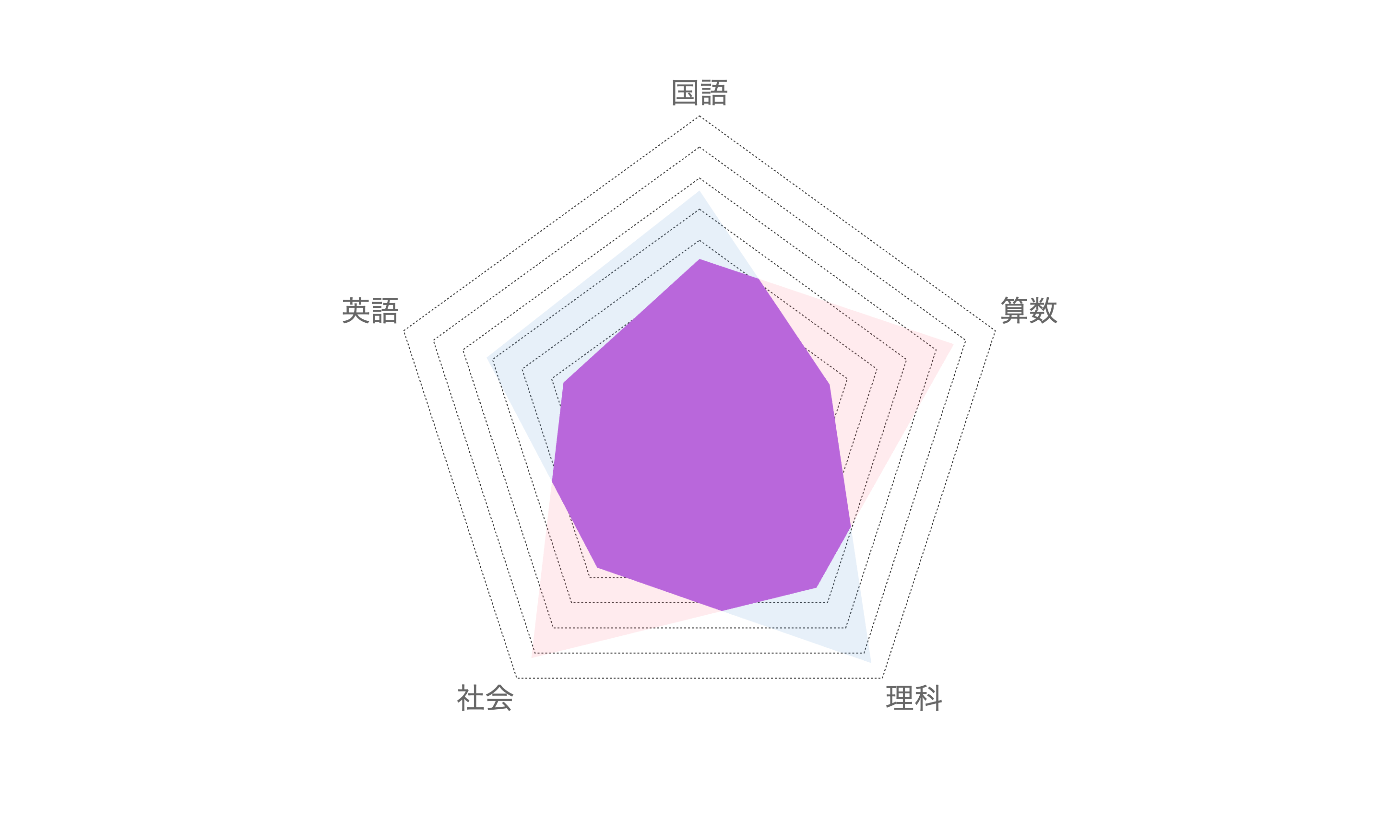
2つのレーダーチャートの重なり部分を別の色で表示させたい要件がありました。Chart.jsでレーダーチャートを実装すること自体は簡単ですが、2つのデータセットの重なり部分だけを別の色で塗りつぶすという実装例はあまり見つからなかったため、まとめました。

完成コード
<!DOCTYPE html>
<html>
<head>
  <meta charset="UTF-8">
  <meta name="viewport" content="width=device-width, initial-scale=1.0">
  <script src="https://cdnjs.cloudflare.com/ajax/libs/Chart.js/3.9.1/chart.min.js"></script>
  <style>
    * { margin: 0; padding: 0; box-sizing: border-box; }
    body { display: grid; place-items: center; height: 100vh; }
    div { display: grid; width: 50vw !important; height: 50vw !important; }
    canvas { grid-area: 1 / 1; }
  </style>
</head>

<body>
  <div>
    <canvas id="backgroundChart"></canvas>
    <canvas id="foregroundChart"></canvas>
  </div>

  <script>
    // サンプルデータ
    const labels = ['国語', '算数', '理科', '社会', '英語']
    const beforeData = [2.7, 4.3, 3.2, 4.6, 2.3]
    const afterData = [3.8, 2.2, 4.7, 2.8, 3.6]

    // 色定義
    const colors = {
      before: '#FF7B8A',
      after: '#5B9BD5',
      overlap: '#B967DB'
    }

    // 線分交差判定
    const findIntersection = (p1, p2, p3, p4, angleA, angleB) => {
      // 極座標 → デカルト座標変換
      const x1 = p1 * Math.cos(angleA), y1 = p1 * Math.sin(angleA)
      const x2 = p2 * Math.cos(angleB), y2 = p2 * Math.sin(angleB)
      const x3 = p3 * Math.cos(angleA), y3 = p3 * Math.sin(angleA)
      const x4 = p4 * Math.cos(angleB), y4 = p4 * Math.sin(angleB)

      // 線分交差の計算
      const denominator = (x1 - x2) * (y3 - y4) - (y1 - y2) * (x3 - x4)
      if (Math.abs(denominator) < 1e-10) return null // 平行線

      // 線分の範囲内に交点があるかチェック
      const t = ((x1 - x3) * (y3 - y4) - (y1 - y3) * (x3 - x4)) / denominator
      const u = -((x1 - x2) * (y1 - y3) - (y1 - y2) * (x1 - x3)) / denominator
      if (t >= 0 && t <= 1 && u >= 0 && u <= 1) {
        return { x: x1 + t * (x2 - x1), y: y1 + t * (y2 - y1) }
      }

      return null
    }

    // 重なり領域描画
    const drawOverlapArea = (chart) => {
      const ctx = chart.ctx
      const scale = chart.scales.r
      const centerX = scale.xCenter
      const centerY = scale.yCenter
      const numPoints = afterData.length
      const angleStep = (2 * Math.PI) / numPoints
      const startAngle = -Math.PI / 2

      // データ値をピクセル値に変換
      const scaleValue = (value) => (value / scale.max) * scale.drawingArea

      ctx.save()
      ctx.fillStyle = colors.overlap
      ctx.beginPath()

      // 最初の点(重なり部分の最小値)
      const firstRadius = scaleValue(Math.min(afterData[0], beforeData[0]))
      ctx.moveTo(
        centerX + firstRadius * Math.cos(startAngle),
        centerY + firstRadius * Math.sin(startAngle)
      )

      // 各軸間を順番に処理
      for (let i = 0; i < numPoints; i++) {
        const nextI = (i + 1) % numPoints
        const angleA = startAngle + (i * angleStep)
        const angleB = startAngle + (nextI * angleStep)

        // 交点計算
        const intersection = findIntersection(
          scaleValue(afterData[i]), scaleValue(afterData[nextI]),
          scaleValue(beforeData[i]), scaleValue(beforeData[nextI]),
          angleA, angleB
        )

        // 次の点の座標
        const nextRadius = scaleValue(Math.min(afterData[nextI], beforeData[nextI]))
        const nextX = centerX + nextRadius * Math.cos(angleB)
        const nextY = centerY + nextRadius * Math.sin(angleB)

        if (intersection) {
          ctx.lineTo(centerX + intersection.x, centerY + intersection.y)
        }
        ctx.lineTo(nextX, nextY)
      }

      ctx.closePath()
      ctx.fill()
      ctx.restore()
    }

    // Chart.js共通設定
    const baseOptions = {
      responsive: true,
      maintainAspectRatio: true,
      plugins: {
        legend: { display: false },
        tooltip: { enabled: false }
      },
      scales: {
        r: {
          min: 0, max: 5,
          ticks: { display: false },
          angleLines: { display: false }
        }
      }
    }

    // 背景チャート(ラベル + グリッド + 塗りつぶし + 重なり部分)
    new Chart(document.getElementById('backgroundChart'), {
      type: 'radar',
      data: {
        labels,
        datasets: [
          {
            data: beforeData,
            backgroundColor: `${colors.before}26`,
            borderWidth: 0,
            pointRadius: 0
          },
          {
            data: afterData,
            backgroundColor: `${colors.after}26`,
            borderWidth: 0,
            pointRadius: 0
          }
        ]
      },
      options: {
        ...baseOptions,
        scales: {
          r: {
            ...baseOptions.scales.r,
            grid: { color: "#333", borderDash: [2, 2], drawTicks: false },
            pointLabels: { font: { size: 30 } }
          }
        }
      },
      plugins: [{ afterDatasetsDraw: drawOverlapArea }] // 重なり部分描画
    })

    // 前景チャート(線と点のみ)
    new Chart(document.getElementById('foregroundChart'), {
      type: 'radar',
      data: {
        labels,
        datasets: [
          {
            data: beforeData,
            borderColor: colors.before,
            borderWidth: 2,
            fill: false,
            pointRadius: 10,
            pointBackgroundColor: colors.before,
            pointBorderColor: '#fff',
            pointBorderWidth: 2
          },
          {
            data: afterData,
            borderColor: colors.after,
            borderWidth: 2,
            fill: false,
            pointRadius: 10,
            pointBackgroundColor: colors.after,
            pointBorderColor: '#fff',
            pointBorderWidth: 2
          }
        ]
      },
      options: {
        ...baseOptions,
        scales: {
          r: {
            ...baseOptions.scales.r,
            grid: { color: 'transparent', borderDash: [2, 2], drawTicks: false },
            pointLabels: { color: 'transparent', font: { size: 30 } }
          }
        }
      }
    })
  </script>
</body>
</html>
解説
Chart.js
以下の要件はChart.jsで十分に満たせるため、ゼロからSVGやCanvasで実装するよりも現実的でした。
- レーダーチャートの基本形状
- グリッドライン表示
- 軸ラベル表示
- データポイントのマーカー
- レスポンシブ対応
問題は重なり部分の可視化のみです。
findIntersectionでの線分交差判定
レーダーチャートの隣接する2点間で、2つのデータセットの線分が交差する点を(AIの力を拝借しながら)計算しました。
レーダーチャートは極座標系ですが、線分の交点計算はデカルト座標系の方が簡単なため、座標変換を行っています。
// 極座標→デカルト座標変換
const x1 = p1 * Math.cos(angleA), y1 = p1 * Math.sin(angleA)
// ...
tとuが0〜1の範囲内にある場合のみ、実際に線分同士が交差していることを意味します。
// 線分の範囲内に交点があるかチェック
const t = ((x1 - x3) * (y3 - y4) - (y1 - y3) * (x3 - x4)) / denominator
const u = -((x1 - x2) * (y1 - y3) - (y1 - y2) * (x1 - x3)) / denominator
if (t >= 0 && t <= 1 && u >= 0 && u <= 1) {
  return { x: x1 + t * (x2 - x1), y: y1 + t * (y2 - y1) }
}
drawOverlapAreaでの重なり部分描画
Chart.jsのカスタムプラグイン(afterDatasetsDraw)として実装し、データセット描画後に重なり部分を追加描画します。
重なり部分は「両方のデータの小さい方」となるため、Math.minを使用しています。
各軸間で交点があれば交点を経由し、なければ直接次の点に向かいます。
if (intersection) {
  ctx.lineTo(centerX + intersection.x, centerY + intersection.y)
}
ctx.lineTo(nextX, nextY)
Canvas重ね合わせで描画を分離
Chart.jsの上に重なり部分を描画すると、線とマーカーが重なり部分に隠れてしまう問題がありました。
そこで、役割を分けた2つのCanvasを重ね合わせることにしました。
背景チャート(ラベル + グリッド + 塗りつぶし + 重なり部分)
前景チャート(線とマーカーのみ)

まとめ
1つのレーダーチャートを表示させるのに2つのCanvasを描画しなければならないため、若干のハック感は否めません。ただ、ライブラリを使ったことによってコストを抑えられたことと、保守のしやすさや拡張性の恩恵は受けられると思います。
多くのレーダーチャートを表示させる必要がある場合は検討する必要があるかもしれませんが、全体的には要件を満たす実装ができたので良しとします。
参考になれば幸いです。

Discussion