Tiny CSS Projects読書メモ
 ta.toshio
1 CSS introduction
1.6.2 Combinators
.list > li { color: crimson; }
このCSSでは、トップ・レベルのリスト・アイテムだけでなく、リスト全体が真紅になります。この色は、<li>要素とそのすべての子孫に適用されます。直下の子要素を選択しても、色は継承されるので、子要素も真紅になります。
子要素の親要素を選択することができますか?
答えはノー
次の例ではうまくいかない
article < p { color: blue; }.
要素の親や祖先を選択したい場合は、has()擬似クラス-article:has(p) { color: blue; }を使う必要があります。
1.6.3 Pseudo-class and pseudo-element selectors
Pseudo-class
link state
link-アンカー・タグ(<a>)は、href属性とユーザーのブラウザ履歴に表示されないURLを含んでいます。
visited-アンカー(<a>)要素には、href属性とブラウザ履歴に表示されるURLが含まれます。
hover-カーソルが要素の上にあるが、クリックしていない。
active-ユーザーが要素をクリックしたまま保持している。
focus-フォーカスされた要素は、デフォルトでキーボードイベントを受け取る要素です。ユーザーがフォーカス可能な要素をクリックすると、その要素は自動的にフォーカスを得ます(JavaScriptがこの動作を変更しない限り)。キーボードを使ってフォームフィールド、リンク、ボタンの間を移動すると、フォーカスが当たっている要素も変わります。
focus-within-focus-withinが親要素に適用され、親の子にフォーカスがある場合、focus-withinスタイルが適用されます。
focus-visible-focus-visibleを使って要素が選択されると、キーボード・ナビゲーションによってフォーカスが得られた時か、ユーザーがキーボードを使って要素とやりとりしている時だけ、スタイルが適用されます。
a:link {
  color: #1D70B8;
}
a:visited {
  color: #4C2C92;
}
a:hover {
  color: #003078;
}
a:focus {
 outline: solid 1px crimson;
}
Pseudo-element
疑似要素はダブルコロン(::)を使う。
header + p::first-letter {
  color: crimson;
  font-style: italic;
}
2 Designing a layout using CSS Grid
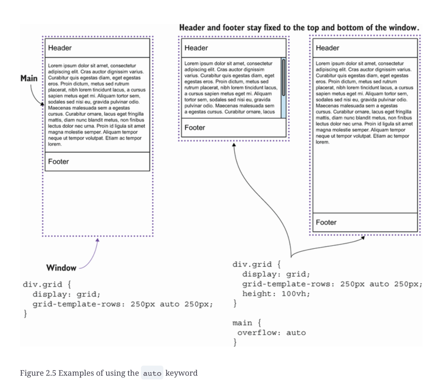
2.3.3 The auto keyword
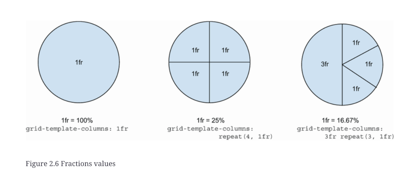
2.3.4 The fractions (fr) unit
2.4 Grid template areas
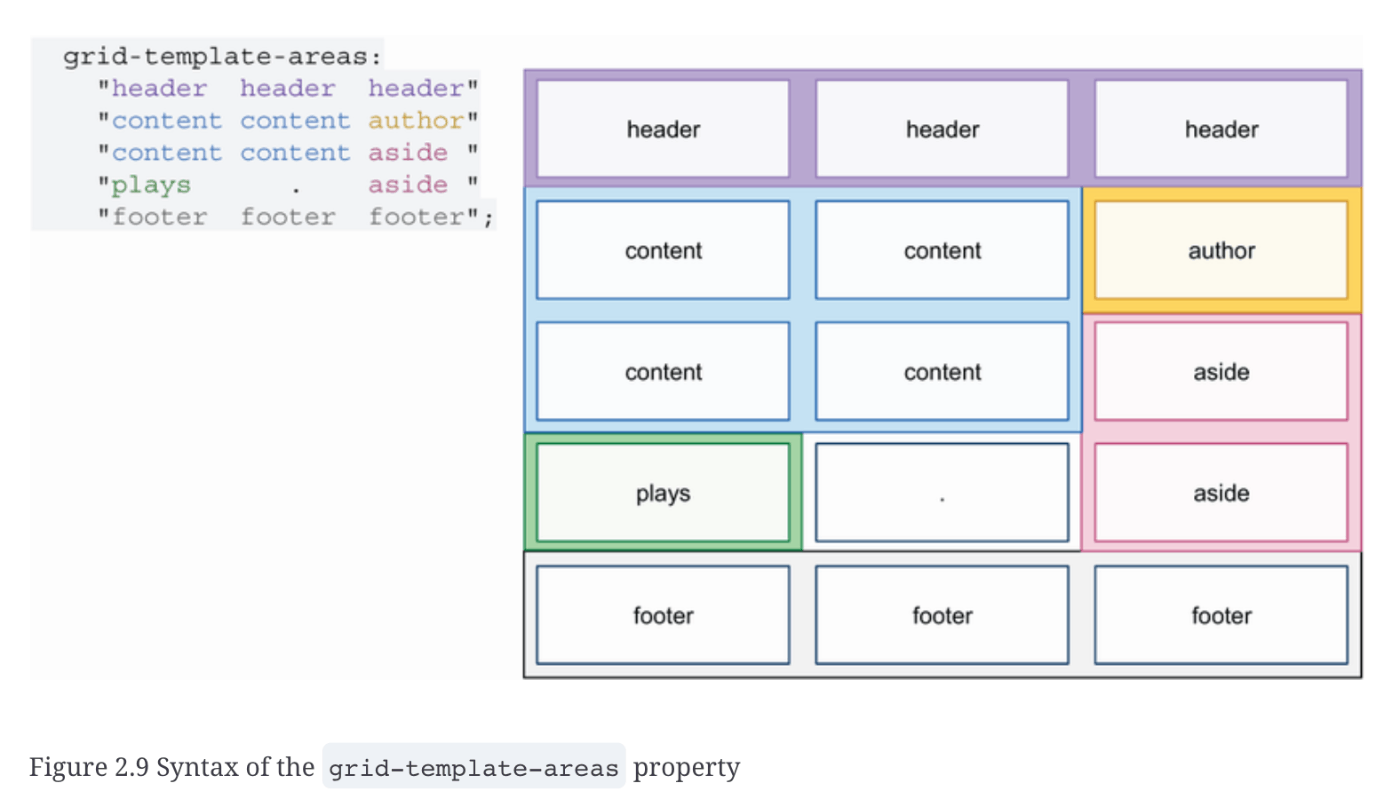
2.4.1 The grid-area property
header { grid-area: header }
article { grid-area: content }
aside { grid-area: aside }
.author-details { grid-area: author }
.plays { grid-area: plays }
footer { grid-area: footer }
2.4.2 The gap property
2.5 Media queries
2.6 Accessibility considerations
ta.toshio3 Creating a responsive animated loading screen
3.2 SVG basics
3.2.1 Positions of SVG elements
全ては SVG 文書の左上隅である (0,0) (原点) から始まる。x や y の値が大きいほど、左上隅から遠くなる。
3.2.2 Viewport

3.2.3 Viewbox
viewBox="min-x min-y width height"
min-xとmin-yで、フレーム内のグラフィックの位置を調整できる。
viewportとviewboxの違い
GPTの回答
SVGのviewBoxとviewportは似ているようで異なる概念です。それぞれの違いを以下に説明します。
viewport
viewportはSVG画像が表示される領域のことを指します。具体的には、SVG要素を囲む枠のサイズを指し、HTML内でSVG要素をどのような大きさで表示するかを定義します。widthとheight属性によって指定されます。たとえば、<svg width="100" height="100">というコードは、100x100ピクセルのviewportをSVGに作成します。
viewBox
一方で、viewBoxはSVG内の描画されるコンテンツの可視領域を定義します。min-x, min-y, width, heightの4つの値で構成され、これらはSVG内のコンテンツがどのようにスケーリングまたは移動されて表示されるかをコントロールします。viewBoxは、SVGのコンテンツがviewport内でどのようにフィットするかを決定するために使用されます。
違い
主な違いは、viewportが実際にブラウザ上でSVGが占める物理的な領域を定義するのに対し、viewBoxはそのviewport内でSVGのコンテンツがどのように表示されるか(スケーリングや位置調整)を決定する点にあります。viewBoxを使用することで、SVGのコンテンツを柔軟に拡大縮小や移動が可能となり、異なるデバイスや画面サイズに対して一貫した表示を実現できます。
簡単に言うと、viewportは「表示領域のサイズ」を、viewBoxは「その表示領域内での描画内容の表示方法」をそれぞれ制御します。
viewboxでできること
GPTの回答
ズーム&パン
viewBoxの値を動的に変更することで、SVG内の特定の部分にズームイン・アウトしたり、パン(スライド移動)したりすることができます。これにより、マップや図面などの大きな画像を効果的に表示し、ユーザーが興味のある部分を詳しく見ることができます。
インタラクティブなグラフィック
viewBoxを使って、ユーザーの操作に応じて形状や文字のサイズを変更するインタラクティブなグラフィックを作成できます。例えば、マウスオーバーで特定のグラフィックが拡大表示されるようにすることができます。
簡易アニメーション
CSSやJavaScriptと組み合わせることで、viewBoxの値を時間経過と共に変更し、SVG内のオブジェクトが動いているように見せるアニメーションを作成できます。例えば、風景の中を飛ぶ鳥や、車が道路を走るアニメーションなどが可能です。
レスポンシブデザイン
viewBoxを使ってSVGコンテンツを柔軟にスケーリングし、異なるデバイスや画面サイズに対応するレスポンシブデザインを実現できます。これにより、画面の大きさに関係なく、グラフィックが常に適切なサイズと比率で表示されます。
クリッピングとマスキング
viewBoxを利用して、SVGの特定部分だけを表示させるクリッピングやマスキング効果を作り出すことができます。これにより、クリエイティブなデザインやアートワークを作成する際に、より多くの表現が可能になります。
viewBoxは、単純な属性のように見えますが、様々なクリエイティブな使い方ができる非常に強力なツールです。これらのテクニックを駆使することで、魅力的でインタラクティブなウェブページやアプリケーションを作成することができます。
3.2.4 Shapes in SVG
- rect (rectangle)
- circle
- ellipse
- line
- polyline
- polygon
- path
3.3 Applying styles to SVGs
SVG Attribute reference
3.4 Animating elements in CSS
animation-delay-アニメーションを開始するまでの待ち時間
animation-direction-アニメーションを順方向に再生するか、逆方向に再生するか。
animation-duration-アニメーションが一回実行されるのにかかる時間
animation-fill-mode- アニメーションが実行されるとき、アニメーションされる要素はどのようにスタイルされるべきか。
animation-iteration-count- アニメーションを何回実行するか
animation-name-適用されるキーフレームの名前
animation-play-state- アニメーションが実行中か一時停止中か。
animation-timing-function- アニメーションが時間の経過とともにスタイルを通してどのように進行するか。
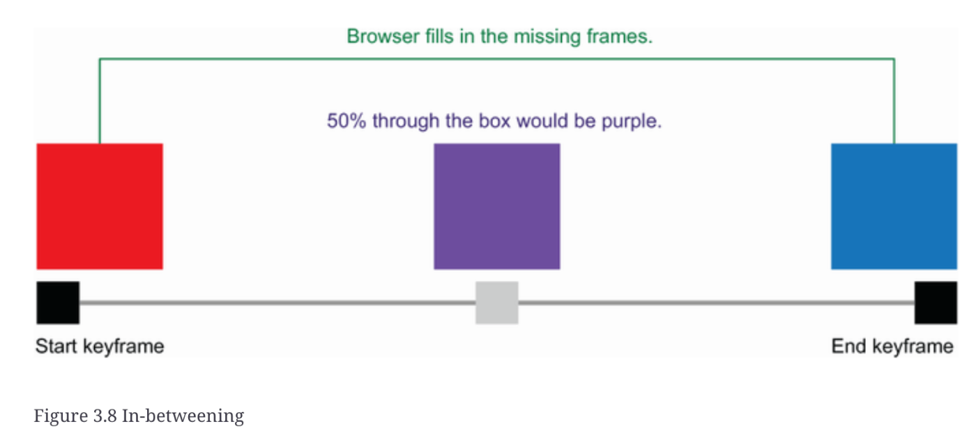
3.4.1 Keyframe and animation-name
キーフレームは、アニメーション(フレーム)の中で最も重要な(キーとなる)変化を表します。次にブラウザは、定義されたフレーム間の時間的な変化を計算します。このプロセスは、in-betweenとして知られる。
sample
transformプロパティはtransform()関数を取れる。関数のリストは以下。そんな多くない
3.4.2 The duration property
3.4.3 The iteration-count property
3.4.4 The animation shorthand property
rect {
-  animation-name: doScale;
-  animation-duration: 2.2s;
-  animation-iteration-count: infinite;
+  animation: doScale 2.2s infinite;
}
3.4.5 The animation-delay property
3.4.6 The transform-origin property
3.5 Accessibility and the prefers-reduced-motion media query
prefers-reduced-motion
- no-preference
- reduce
@media (prefers-reduced-motion: reduce) {
  rect { animation: none; }
}
3.6 Styling an HTML progress bar
3.6.1 Styling the progress bar
accent-color
デフォルトでは、ブラウザはプログレス・バーに独自のスタイルを適用しますが、appearanceプロパティの値をnoneにすることでリセットできます。
appearance:noneが追加されたことで、これまでできなかった方法でコントロールを変更できるようになりました。まず、-webkit-プレフィックスを持つブラウザに焦点を当てます。
3.6.2 Styling the progress bar for -webkit- browsers
::-webkit-progress-inner-element
progress要素の最も外側の部分。
::-webkit-progress-bar
progress 要素のバー全体、進捗インジケータの下の部分、および ::-webkit-progress-inner-element の子要素。
::-webkit-progress-value
進捗インジケータと ::-webkit-progress-bar の子要素。
3.6.3 Styling the progress bar for -moz- browsers
ta.toshio4 Creating a responsive web newspaper layout
4.1.1 Fonts
4.1.2 The font-weight property
font-weightプロパティは、100から900の間の数値か、キーワード値(normal、bold、lighter、bolder)を取ることができます。

出所: https://developer.mozilla.org/en-US/docs/Web/CSS/font-weight
4.1.3 The font shorthand property
font: 700 4rem/1 'Oswald', sans-serif;
syntax: font: font-style font-variant font-weight font-stretch font-size/line-height font-family.
4.2 Using CSS counters
symbols, system, and suffix.
4.2.1 The symbols descriptor
emoji unicode table
4.2.2 The system descriptor
4.2.3 The suffix descriptor
サフィックス記述子は、箇条書き(私たちの絵文字)とリスト項目の内容の間に来るものを定義します(デフォルトではピリオド)。
4.2.4 Putting everything together
@counter-style emoji {
  symbols: "\2615";
  system: cyclic;
  suffix: " ";
}
article ul { list-style: emoji }
4.2.5 @counter versus list-style-image
4.3 Styling images
4.3.1 Using the filter property
filter function
4.3.2 Handling broken images
<img src="..." alt="..." onerror="this.style.display='none'" >
4.3.3 Formatting captions
figure, figcaption
4.4 Using the CSS Multi-column Layout Module
4.4.2 Defining and styling columns
column-count
4.4.3 Using the column-rule property
column-rule: 2px solid #333333;
4.4.4 Adjusting spacing with the column-gap property
column-gap
4.4.5 Making content span multiple columns
blockquote { column-span: all }
4.4.6 Controlling content breaks
break-inside: avoid
4.5 Adding the finishing touches
4.5.1 Justifying and hyphenating text
  p {
    text-align: justify;
    hyphens: auto;
  }
4.5.2 Wrapping the text around the image
4.5.3 Using max-width and a margin value of auto
ta.toshio5 Summary cards with hover interactions
5.2 Laying out the page using grid
5.2.1 Layout using grid
place-itemsはalign-itemsプロパティとjustify-itemsプロパティの値の宣言を組み合わせる省略記法。
5.3 Styling the header using the background-clip property
font: 900 120px "Rubik", sans-serif;
ここでは省略形のフォント・プロパティを使用した。最初の値はウェイトを設定するもので、この場合はheavyである。2番目の値はフォントサイズ(120px)で、その後に使用したいfont-familyが続きます。このフォントが読み込めない場合は、サンセリフフォントにフォールバックします。
syntax: font: font-style font-variant font-weight font-stretch font-size/line-height font-family.
text-transform: uppercase;
大文字をすべて使用すると、アクセシビリティに影響することがあります。スクリーン・リーダーによっては、大文字をすべて頭字語として解釈し、文字を個別に読み取ることがあるからです。
5.3.2 Using background-clip
5.4 Styling the cards
5.5 Using transitions to animate content on hover and focus-within
not()擬似クラスは、セレクタのリストにマッチしない要素を表します。
transitionプロパティを使用すると、ステート間のスタイル変更をアニメーション化できます。
要素の子孫がフォーカスされていることに基づいて条件付きでスタイルを適用するには、focus-within擬似クラスを使います。
ta.toshio6 Creating a profile card
6.3 Creating full-height backgrounds
min-height: 100vh;
6.4 Styling and centering the card using Flexbox
width: 75vw;
max-width: 500px;
display: flex;
justify-content: center;
align-items: center;
6.5 Styling and positioning the profile picture
margin-top: calc(-1 * var(--imageSize) / 3);
6.6 Setting the background size and position
⭐
  margin: calc(var(--imageSize) / 3 + 24px) 24px;
  background-image: radial-gradient(circle at top, var(--primary) 50%, transparent 50%, transparent);
  background-repeat: no-repeat;
  background-size: 1500px 500px;
  background-position: center -300px;
6.7 Styling the content
6.7.3 The flex-basis and flex-shrink properties
6.7.5 Paragraph
line-height: 1.5;
行の高さに単位がないことに注目してください。単位を設定しないことで、行の高さがフォント・サイズに合わせて変化するようになっています。この単位のない値は、line-heightプロパティ固有のものです。例えばline-heightに12pxの値を設定した場合、行の高さはフォントサイズに関係なく12ピクセルのままです。そのため、フォントサイズを極端に大きくすると、文字が縦に重なってしまう。単位は宣言しないほうが無難です。
Summary
align-itemsプロパティは、要素が互いに対して軸上にどのように整列されるかを設定します。
justify-contentプロパティは、要素がどのように配置されるかを設定します。
flex-basisは、フレックスコンテンツをレイアウトする際にブラウザが使用する開始要素サイズを設定します。
flex-shrinkは、要素がフレックスされるときにコンテンツが縮小するかどうか、またどのように縮小するかを指定します。
ta.toshio7 Harnessing the full power of float
7.1 Adding a drop cap
p:first-of-type::first-letter {
  font-size: 6em;
  float: left;
  line-height: .5;
  font-family: 'Passions Conflict', cursive;
}
first-of-type CSS擬似クラスは、兄弟要素のグループの中で、その型の最初の要素を表します。https://developer.mozilla.org/en-US/docs/Web/CSS/:first-of-type
7.3 Curving text around the compass
7.3.1 Adding shape-outside: circle
画像のアスペクト比は、幅を高さで割って算出される画像の高さと幅の比例関係である。
ページに要素が追加されたり、そのサイズが変更されたりすると、要素の後にあるすべてのものが移動して、要素のためのスペースを作ったり、残された空白を埋めたりします。ページ上の要素の移動はレイアウトシフトと呼ばれます。
次の2つは同じことを実現
  shape-outside: circle(50%);
  clip-path: circle(50%);
  border-radius: 50%;
  shape-outside: margin-box;
7.4 Wrapping text around the dog
7.4.1 Using path() . . . or not yet
SVGのアウトラインを模す方法としては以下2つがある
- 円に使った手法と同様に、イメージにほぼ一致する多角形を作成する。
- url()関数を使用し、画像を取り込み、アルファチャンネルを基に形状を作成する。
7.4.2 Floating the image
img.dog {
  aspect-ratio: 126 / 161;
  float: left;
  shape-outside: url("https:/ /raw.githubusercontent.com/michaelgearon/Tiny-CSS-Projects/main/chapter-07/before/img/dog.svg");
}
7.4.3 Adding shape-margin
shape-outsideでのmarginプロパティは効かない。shape-marginを利用する。shape-marginを利用した時点ではmarginは効くようになる。ただしshape-margin以下の値の場合で。
ta.toshio8 Designing a checkout cart
8.2 Theming
8.2.1 Typography
font-variant-numeric
ゼロにスラッシュを入れて表示するかどうか
数字の並び方
分数の表示方法
font-variant-numeric: lining-nums
old style figuresからmodern figuresに変更
8.2.2 Links and buttons
8.2.3 Input fields
buttonのベーススタイルと同じもの使っているの驚き
button,
.button,
input {
  background: none;
  border-radius: 4px;
  padding: 10px;
  border: solid 1px #ddd;
  text-decoration: none;
}
8.2.4 Table
tbody td:nth-of-type(2) {
  font-weight: bold;
}
tbody tr:nth-of-type(even) {
  background: #f2fcfc;
}
table { border-collapse: collapse;
8.2.5 Description list
8.2.6 Cards
8.3 Mobile layout
8.3.1 Table mobile view
@media(max-width: 549px) {
  td, tr { display: block; }
  td {
    text-align: right;
    padding: 5px;
  }
  thead {
    position: absolute;
    left: -9999rem;
  }
  td[data-name]::before {
    content: attr(data-name) ":";
    float: left;
  }

  tfoot tr {
    display: flex;
    justify-content: space-between;
    align-items: baseline;
  }
}
8.3.2 Description list
8.3.3 Call-to-action links
8.4 Medium screen layout
8.4.1 Right-justified numbers
参考: https://www.itti.jp/web-design/css-nth-child/
8.4.2 Left-justifying the first two columns
8.4.3 Right-justifying numbers in the input fields
input[type="number"] { text-align: right }
8.4.4 Cell padding and margin
8.5 Wide screens
flex-basisは、ブラウザが各セクションに割り当てるスペースを計算し始めるときに、セクションの初期サイズを設定します。flexが適用されるコンテンツがセクションの幅250ピクセルに対応できる場合、ブラウザはセクションの寸法を変更しません。
flex-growプロパティは、フレックスがコンテンツに適用された後にスペースが余った場合、この要素をより広くして余ったスペースを使うようにブラウザに指示します。
@media (min-width: 955px) {
  .section-container {
    display: flex;
    gap: 20px;
  }
  section.my-cart { flex-grow: 1; }
  section.summary { flex-basis: 250px }
}
9 Creating a virtual credit card
Using Flexbox and position in layout
Working with background images and sizing
Loading and applying local fonts
Using transitions and the backface-visibility property to create a 3D effect
Working with additional styles such as the text-shadow and border-radius properties
9.2 Creating the layout
9.3 Working with background images
9.3.1 Background property shorthand
background-image: url("bg.jpeg")
background-size: cover
background-color: blue
background-position: left top
background: url("bg.jpeg") left top / cover blue;
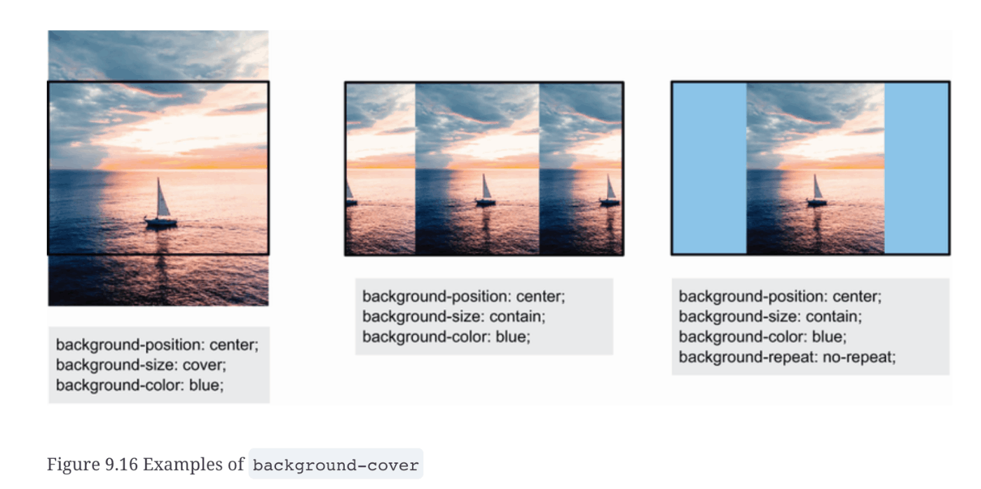
fallbackとしてbackground-colorを設定しておくことをおすすめ。画像が透過していたり、表示領域より小さかったり、読み込み失敗したときのための。
9.3.2 Text color
9.4 Typography
9.5 Creating the flipping-over effect
hoverをサポートしているデバイス時にhoverエフェクトを書く
@media (hover: hover) {
...
}
要素がこちらに背を向けている場合は側面を非表示にし(backface-visibility)、カーソルを合わせたときにカード全体をY軸方向に180度回転させるように指示しています(transform)。transform-styleというプロパティにpreserve-3dという値を与えている。このプロパティがないと、フリップは機能しない。
@media (hover: hover) {
  ...
  .card-item {
    transform-style: preserve-3d;
  }
  .card-item__side {
    backface-visibility: hidden;
  }
  .card-item:hover {
    transform: rotateY(180deg);
  }
}
9.5.3 The transition property
@media (hover: hover) and (prefers-reduced-motion: no-preference) {
  ...
  .card-item {
    transform-style: preserve-3d;
    transition: transform 350ms cubic-bezier(0.71, 0.03, 0.56, 0.85);
  }
  ...
}
350ミリ秒かかるアニメーションは、transformプロパティ(回転)に影響し、デバイスでprefers-reduced-motionをreduceに設定していないユーザーにのみ表示される
9.5.4 The cubic-bezier() function
9.6 Border radius
9.7 Box and text shadows
9.7.1 The drop-shadow function versus the box-shadow property
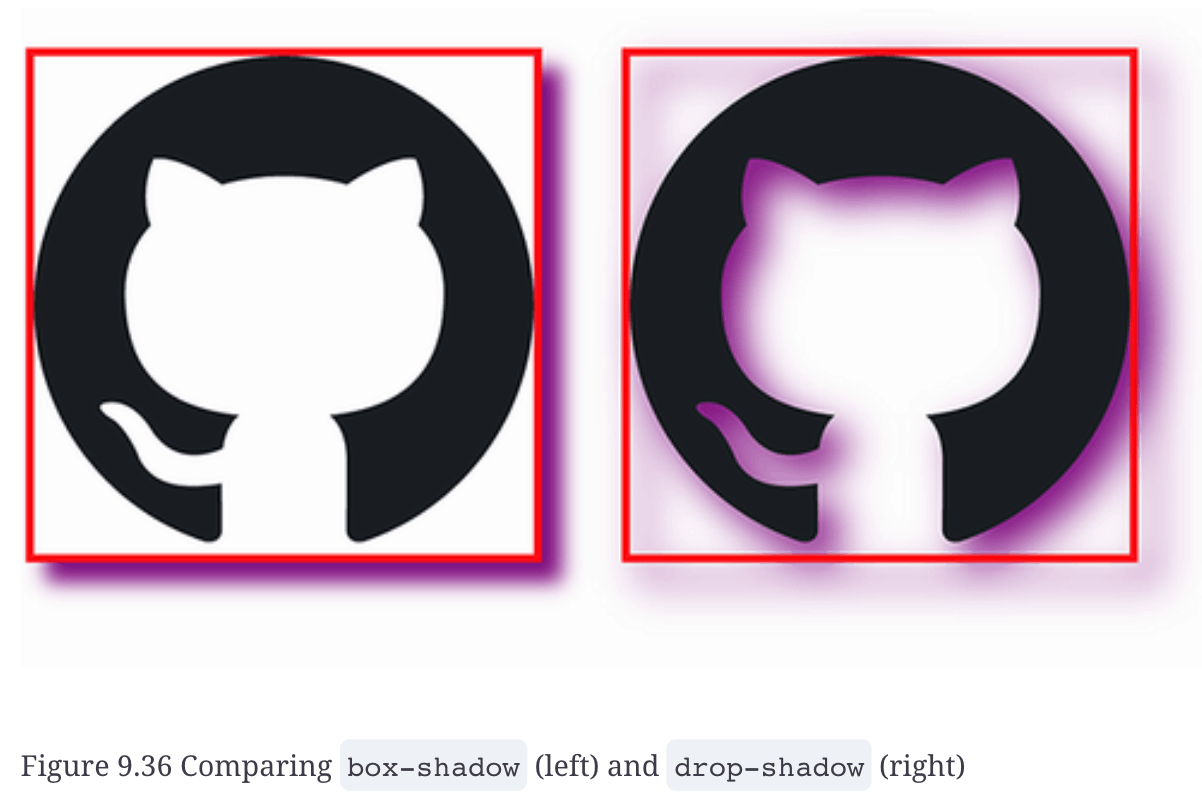
box-shadow: 0 20px 60px 0 rgb(14 42 90 / 0.55);
box-shadow: 水平方向のオフセット 垂直方向のオフセット ぼかしの半径 広がりの半径 色;
水平方向のオフセット: 0px (影は水平方向に移動していない)
垂直方向のオフセット: 20px (影は下方向に20px移動している)
ぼかしの半径: 60px (影がかなりぼやけている)
広がりの半径: 0px (影のサイズは変わっていない)
色: rgba(14, 42, 90, 0.55) (RGBAで指定された色で、透明度は55%)
9.7.2 Text shadows
text-shadow: 7px 6px 10px rgb(14 42 90 / 0.8);
ta.toshio10 Styling forms
10.3 Styling input fields
10.3.2 Making selects and textareas match the input styles
textarea { resize: vertical }
10.3.3 Styling radio inputs and check boxes
appearance: none;
margin: 0;
display: inline-grid;
currentcolor
がポイント
10.3.4 Using the :where() and :is() pseudo-classes
input:focus, textarea:focus, select:focus, button:focus { ... }
の代わりにこう書ける
:where(input, textarea, select, button):focus { ... }
10.3.5 Styling selected radio and checkbox inputs
:where(input[type="radio"], input[type="checkbox"])::before {
  display: block;
  content: '';
  width: 1em;
  height: 1em;
}
10.3.6 Using the :checked pseudo-class
10.3.7 Shaping the selected radio buttons’ inner disk
10.3.8 Using CSS shapes to create the check mark
10.3.9 Calculating specificity with :is() and :where()
:whereと:isの違い
詳細度(Specificity)
:is(): セレクター全体の詳細度にカウントされる。つまり、:is()の中で最も詳細なセレクターの詳細度が適用される。
:where(): 詳細度の値が0になる。つまり、:where()の中のセレクターの詳細度は無視される。
10.4 Styling drop-down menus
10.5 Styling labels and legends
10.6 Styling the placeholder text
::placeholder {
  color: var(--placeholder-color);
  font-size: .75em;
}
10.7 Styling the Send button
10.8 Error handling
直前の要素がdirtyクラスかつinvalid pseudo-classを持っていたらdisplay: inline;
.dirty:invalid + .error span {
display: inline;
}
10.9 Adding hover and focus styles to form elements
10.9.1 Using :focus versus :focus-visible
擬似クラス:focus-visibleは、ユーザーがキーボードで操作しているときにスタイルを追加することを可能にしますが、ユーザーがマウスを使っているときには適用されません。対照的に、:focusは、ユーザが要素と対話する方法に関係なく常に適用されます。
10.10 Handling forced-colors mode
ta.toshio11 Animated social media share links
11.1 Working with CSS architecture
11.1.1 OOCSS
11.1.2 SMACSS
11.1.3 BEM
Block
ブロックの目的を記述する。
例えば、headerのような要素のクラス名です。
Element
要素の目的を記述する。
クラス名は、ブロック名の後にアンダースコア2つと要素(header__textなど)を続けます。
Modifier
appearance, state, and behaviorを記述する。
クラスパターンは block-name_modifier-name (例: header_mobile) または block-name__element-name_modifier-name (例: header__menu_open) です。
11.2
11.3 Sourcing icons
11.4 Styling the block
11.5 Styling the elements
11.5.5 The inherit property value
Inheritanceは親までしか行われない
inheritしたいとこまでリレーする必要がある
.share__menu-item {
  background: inherit;
}

.share__menu {
  background: inherit;
}

.share__link:hover,
.share__link:focus-visible {
  background: inherit;
}
11.6 Animating the component
ta.toshio12 Using preprocessors
12.1 Running the preprocessor
12.2 Sass variables
12.2.1 @extend
.image-base {
  width: 300px;
  height: 300px;
  object-fit: cover;
  margin: 0 2rem;
}

img:first-of-type { @extend .image-base; }
img:nth-of-type(2) { @extend .image-base; }
img:last-of-type { @extend .image-base; }
12.3 @mixin and @include
@mixin handle-img($border-radius, $position, $side) {
  border-radius: $border-radius;
  object-position: $position;
  float: $side;
  margin-#{$side}: 0;
}
12.3.1 object-fit property

12.3.2 Interpolation
margin-#{$side}: 0;
12.3.3 Using mixins
@mixin handle-img($border-radius, $position, $side) {
  border-radius: $border-radius;
  object-position: $position;
  float: $side;
  margin-#{$side}: 0;
}

img:first-of-type {
  @extend .image-base;
  @include handle-img(20px 100px 10px 20px, center, left);
}

img:nth-of-type(2) {
  @extend .image-base;
  @include handle-img(100px 20px 10px 20px, left top, right);
}

img:last-of-type {
  @extend .image-base;
  @include handle-img(50px, center, left);
}
12.3.4 border-radius shorthand
12.4 Nesting
12.5 @each
ハッシュループの実現に@each
12.6 Color functions
background-color: scale-color($color, $lightness: +86%);
12.7 @if and @else
      @if $type == 'error' {
        font-weight: 800
      } @else {
        font-weight: 500;
      }