Python, NiceGUI, Matplotlib, Plotly, Highchartsで価格チャートの描画テスト
コードはこちら
from datetime import datetime, timedelta
import pandas_datareader as web
from matplotlib import pyplot as plt
from nicegui import ui
async def disable_input(selector, value):
s = "true" if value else "false"
await ui.run_javascript(f"document.querySelector('{selector}').disabled={s};")
async def get_data():
await disable_input("button.btn-get-data", True)
df = web.DataReader(
name="BTC-USD",
data_source="yahoo",
start=datetime.now() - timedelta(days=90),
end=datetime.now(),
)
show_table(df)
show_chart(df)
await disable_input("button.btn-get-data", False)
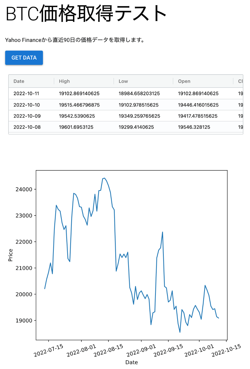
def show_table(df):
df = df.copy().sort_index(ascending=False).reset_index()
df["Date"] = df["Date"].dt.strftime("%Y-%m-%d")
data = df.to_dict(orient="records")
table.options.rowData = data
table.update()
def show_chart(df):
chart_container.clear()
with chart_container:
with ui.plot(figsize=(6.5, 5.8)):
plt.plot(df["Close"])
plt.xlabel("Date")
plt.ylabel("Price")
plt.xticks(rotation=18)
#####################################################################
ui.markdown("# BTC価格取得テスト")
ui.label("Yahoo Financeから直近90日の価格データを取得します。")
button = ui.button("Get Data", on_click=get_data).classes("btn-get-data")
table = ui.table(
{
"columnDefs": [
{"headerName": "Date", "field": "Date"},
{"headerName": "High", "field": "High"},
{"headerName": "Low", "field": "Low"},
{"headerName": "Open", "field": "Open"},
{"headerName": "Close", "field": "Close"},
{"headerName": "Volume", "field": "Volume"},
# {"headerName": "Adj Close", "field": "Adj Close"},
],
"rowData": [],
}
).classes("max-h-40")
chart_container = ui.row()
ui.run()
ボタンを複数回クリックされないように、押された直後に disabled にしたかったのだけど、そこだけひと手間かかった。ui.run_javascript()で任意のJSを実行出来るのでこれを使えばOK。ただしasync/awaitが必要。
async def disable_input(selector, value):
    s = "true" if value else "false"
    await ui.run_javascript(f"document.querySelector('{selector}').disabled={s};")
あと、Matplotlibのチャートはそのままだとボタンを押すたびに前のものが消えずにどんどん増えていったので、Containerに入れておいて描画前にcontainer.clear()を呼ぶことで前のチャートを消すようにする必要があった。(消さずにUpdate出来れば良いのだけどやり方が分からず。)
追記:
Updateは多分 https://justpy.io/tutorial/matplotlib/ を参考にすれば出来そう。
要件によってはラップされている JustPy を直接使った方が良いかも知れないけど、シンプルな画面をサクッと作る用途には非常に良さそう。
内部的に使っている JustPy は Plotly に対応しているので頑張ればなんとかなるはず、と思って試行錯誤の末、なんとか(強引に)Plotlyのチャートも描画出来た。ブラウザ上で範囲指定とかが出来て便利。
変更部分のコード
import justpy as jp
import plotly.graph_objects as go
from nicegui import ui
from nicegui.elements.element import Element
from plotly.subplots import make_subplots

(...省略...)

def show_chart(df):
    chart_container.clear()
    with chart_container:
        fig = make_subplots(
            rows=3,
            cols=1,
            shared_xaxes=True,
            shared_yaxes=False,
            vertical_spacing=0.06,
            subplot_titles=("BTC 90 days", "", ""),
            row_width=[0.3, 0.1, 0.6],
        )
        fig.add_trace(
            go.Candlestick(
                x=df.index,
                open=df["Open"],
                high=df["High"],
                low=df["Low"],
                close=df["Close"],
                showlegend=False,
            ),
            row=1,
            col=1,
        )
        fig.add_trace(
            go.Bar(x=df.index, y=df["Volume"], showlegend=False), row=3, col=1
        )
        fig.update(layout={"width": 700, "height": 500})
        # fig.update(layout_xaxis_rangeslider_visible=False)

        view = jp.PlotlyChart(
            chart=fig,
            classes="border m-1 p-0",
            style="width:100%",
        )
        Element(view)
Plotlyに関して追記。昨日動いたのに今日は動かないな〜と思って、思い出したらPLOTLYという環境変数をセットする必要があった。
PLOTLY=True python plotly_test.py
この環境変数がTrueにセットされていないとどうもブラウザ側の動作に必要なJavaScriptが読み込まれないみたい。
追記:
環境変数ではなく、justpy.envというファイルを作ってそこに
PLOTLY=True
と書いておくのでもOK。
Highchartsでも試してみた。

Highcharts、予想以上に高機能でちょっとびっくり。
変更部分のソースコードはこちら
DAYS = 600

def convert_date2(date_string):
    date = datetime.strptime(date_string, '%Y-%m-%d')
    epoch = datetime(1970, 1, 1)
    return (date - epoch).total_seconds() * 1000


def show_chart(df):
    grouping_units = [['week', [1]], ['month', [1, 2, 3, 4, 6]]]

    df["Date"] = df.index.astype(str)
    x = list(df["Date"].map(convert_date2))

    ohlc_data = list(zip(x, df['Open'], df['High'], df['Low'], df['Close']))
    volume_data = list(zip(x, df['Volume']))

    sma1_data = list(zip(x[50:], df["Close"].rolling(window=50).mean().dropna()))
    sma2_data = list(zip(x[100:], df["Close"].rolling(window=100).mean().dropna()))

    chart_dict = {
        'title': {"text": "BTC Price Chart"},

        "rangeSelector": {
            "buttons": [
                {"type": "month", "count": 1, "text": "1M"},
                {"type": "month", "count": 2, "text": "2M"},
                {"type": "month", "count": 3, "text": "3M"},
                {"type": "month", "count": 6, "text": "6M"},
                {"type": "year", "count": 1, "text": "1Y"},
                {"type": "all", "count": 1, "text": "All"},
            ],
            "selected": 4,
            "inputEnabled": False,
        },

        'yAxis': [
            {'labels': {'align': 'right', 'x': -3}, 'title': {'text': 'Price'}, 'height': '65%',
                'lineWidth': 2, 'resize': {'enabled': True}},
            {'labels': {'align': 'right', 'x': -3}, 'title': {'text': 'Volume'}, 'top': '70%',
                'height': '30%', 'offset': 0, 'lineWidth': 2},
        ],
        'tooltip': {'split': True},
        'plotOptions': {
            'series': {
                'dataGrouping': {'units': grouping_units},  # General options for all series
                'tooltip': {'valueDecimals': 2},
            },
        },
        'series': [
            {
                'name': 'Price',
                'type': 'candlestick',
                'data': ohlc_data
            },
            {
                'name': 'Volume',
                'type': 'column',
                'tooltip': {'valueDecimals': 0},
                'yAxis': 1,
                'data': volume_data
            },
            {
                'name': 'SMA1',
                'type': 'line',
                'data': sma1_data
            },
            {
                'name': 'SMA2',
                'type': 'line',
                'data': sma2_data
            }
        ]
    }

    chart_container.clear()
    with chart_container:
        chart = ui.chart(chart_dict).classes('w-full').style('height: 500px')
        chart.view.stock = True  # type: ignore
ui.chart() のあとで chart.view.stock = True をするとチャートがStockモード(Highstockと同等)になって描画対象の期間を選ぶボタンなどが表示される。
ちなみに、データが変わった時にチャートを更新するのは、 https://justpy.io/charts_tutorial/updating_charts/ を参考にすれば出来そう。