Open1
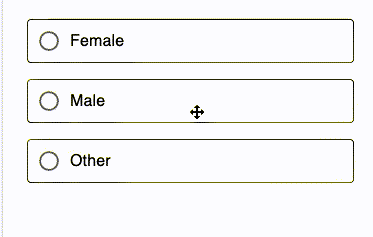
MUIでradio buttonを実装し、ボタン押下によって要素の切り替えをおこなった。
 k_yas
k_yas実装方針
Radio button のcontrolledを使用していく
RadioButton.tsx
import {
  FormControl,
  FormControlLabel,
  Radio,
  RadioGroup,
  Typography,
} from "@mui/material";
import { ChangeEvent, useState } from "react";

function RadioButton() {
  const [value, setValue] = useState("");

  const handleChange = (event: ChangeEvent<HTMLInputElement>) => {
    setValue((event.target as HTMLInputElement).value);
  };

  return (
    <div>
      <FormControl sx={{ width: "100%" }}>
        <RadioGroup
          aria-labelledby="demo-radio-buttons-group-label"
          defaultValue="female"
          name="radio-buttons-group"
          value={value}
          onChange={handleChange}
        >
          <FormControlLabel
            value="female"
            control={<Radio />}
            label="Female"
            sx={{
              border: `${
                value === "female" ? "2px solid blue" : "1px solid black"
              }`,
              m: "8px 0",
              borderRadius: "4px",
            }}
          />
          <FormControlLabel
            value="male"
            control={<Radio />}
            label="Male"
            sx={{
              border: `${
                value === "male" ? "2px solid blue" : "1px solid black"
              }`,
              m: "8px 0",
              borderRadius: "4px",
            }}
          />
          <FormControlLabel
            value="other"
            control={<Radio />}
            label="Other"
            sx={{
              border: `${
                value === "other" ? "2px solid blue" : "1px solid black"
              }`,
              m: "8px 0",
              borderRadius: "4px",
            }}
          />
        </RadioGroup>
      </FormControl>
      {value==='female' && <Typography>Hoge female</Typography>}
      {value==='male' && <Typography>Hoge male</Typography>}
      {value==='other' && <Typography>Hoge other</Typography>}
    </div>
  );
}

export default RadioButton;
コンポーネントでvalue stateを持ってstateによってcssと要素の更新を行なっている