GIS × Python Tutorial Session5 ~ geopandas 実践編 ~


はじめに
この記事は「GIS × Python Tutorial」の関連記事です。
前回はgeopandasの基本的な使い方を解説したので、今回はgeodatasetsのAPIを使用して、シカゴ周辺のデータを取得し、データをこねくり回してみましょう。
実際にデータを分析する際には、いくつかのデータを組み合わせる場合が多いので、この中から今回は以下のデータを取得し組み合わせて見ましょう。全てシカゴのデータです
- 2000年と2010年の地域別にみる人口の変化(Polygon)
- 2011年の放置車両(Point)
geodatasets データセット Chicago Community Area Population Percent Change for 2000 and 2010 2011 abandoned vehicles in Chicago (311 complaints).
実行環境
pythonの実行環境はGoogle Colaboratoryを想定しています。 installが必要なライブラリは以下になります
!pip install geodatasets
!pip install mapclassify
!pip install contextily
!pip install japanize-matplotlib
Import
# 今回使用するライブラリのインポート
from typing import List

import folium
import geodatasets
import geopandas as gpd
import japanize_matplotlib
from matplotlib import pyplot as plt
import numpy as np
import pandas as pd
import rich
import seaborn as sns
import shapely
from shapely.geometry import LineString, Point, Polygon, MultiPoint, MultiPolygon
from shapely.plotting import plot_polygon, plot_points
japanize_matplotlib.japanize()
地域別の人口変化に関するデータ
データの取得
まずはどんなデータかの概要を見てみます。
population_datasets = geodatasets.data.geoda.chicago_commpop
rich.print(population_datasets)
{
    'url': 'https://geodacenter.github.io/data-and-lab//data/chicago_commpop.zip',
    'license': 'NA',
    'attribution': 'Center for Spatial Data Science, University of Chicago',
    'name': 'geoda.chicago_commpop',
    'description': 'Chicago Community Area Population Percent Change for 2000 and 2010',
    'geometry_type': 'Polygon',
    'nrows': 77,
    'ncols': 9,
    'details': 'https://geodacenter.github.io/data-and-lab//commpop/',
    'hash': '1dbebb50c8ea47e2279ea819ef64ba793bdee2b88e4716bd6c6ec0e0d8e0e05b',
    'filename': 'chicago_commpop.zip',
    'members': ['chicago_commpop/chicago_commpop.geojson']
}
データをダウンロードし、中身を見てみましょう。
path = geodatasets.get_path(population_datasets.name)
population = gpd.read_file(path)

# population.iloc[:, :-1].head(5)
| index | community | NID | POP2010 | POP2000 | POPCH | POPPERCH | popplus | popneg |
|---|---|---|---|---|---|---|---|---|
| 0 | DOUGLAS | 35 | 18238 | 26470 | -8232 | -31.099358 | 0 | 1 |
| 1 | OAKLAND | 36 | 5918 | 6110 | -192 | -3.14239 | 0 | 1 |
| 2 | FULLER PARK | 37 | 2876 | 3420 | -544 | -15.906433 | 0 | 1 |
| 3 | GRAND BOULEVARD | 38 | 21929 | 28006 | -6077 | -21.698922 | 0 | 1 |
| 4 | KENWOOD | 39 | 17841 | 18363 | -522 | -2.842673 | 0 | 1 |
UTMに投影変換
今回は対象をシカゴに限定するので、UTMに投影変換しておきましょう。
pop_utm = (
    population
    # UTMのCRSを推定して投影変換
    .to_crs(crs=population.estimate_utm_crs())
)
人口変化の列をまとめる
テーブルを確認すると
- popplus =「人口が増えた、増えていない」
- popneg = 「人口が減った、減っていない」
で2つの要素に分けられていますが、Plotしやすい様に1列に纏めてしまいましょう。
# 人口がプラスかマイナスかを入力しておく
pop_utm['posi_nega'] = pop_utm['POPCH'].apply(np.sign)

# pop_utm.iloc[8: 12, 5: ].drop('geometry', axis=1).head(5)
| index | POPPERCH | popplus | popneg | posi_nega |
|---|---|---|---|---|
| 8 | -4.072214 | 0 | 1 | -1 |
| 9 | -13.378174 | 0 | 1 | -1 |
| 10 | -1.589389 | 0 | 1 | -1 |
| 11 | 1.888247 | 1 | 0 | 1 |
Mapを作成して、特徴量別の分布を見てみよう
- 2000年の地域別人口
- 2010年の地域別人口
- 人口の変化率
- 人口の増減
上記の4つを別々にMapにPlotして大まかな傾向を見ていきます。
# 2行2列でPlotするので、あらかじめ列名とタイトルを2次元のListにしておきましょう
cols = [
    ['POP2000', 'POP2010'],
    ['POPPERCH', 'posi_nega']
]

titles = [
    ['2000年の人口', '2010年の人口'],
    ['人口変化率', '人口の増減']
]

fig, ax = plt.subplots(ncols=2, nrows=2, figsize=(6, 6))
for i in range(2):
    for j in range(2):
        pop_utm.plot(
            ax=ax[i, j],
            column=cols[i][j],
            cmap='viridis',
            legend=True,
            edgecolor='gray'
        )
        ax[i, j].set_title(titles[i][j])
        ax[i, j].set_axis_off()
plt.subplots_adjust(wspace=0.2, hspace=0.2)
増減を見てみると人口が増えた場所よりも減った場所が多いのがよくわかります。しかし変化率を見ると最大下落率が30%程度なのに対して、増加率は多い所だと120%程になっています。実際に集計してみると全体で20万人減っていました。

人口の変化をもっとわかりやすく
上でPlotしたMapでも人口の変化がイメージできますが、誰がみてもわかりやすいとは言えないかもしれません。ダメな部分を洗い出してみます。
- 色が分かりづらい
- 各年の人口は必要ない
- 変化率は120%増加した場所が全体を引っ張り、色のバリエーションが無くなっている
- 増減かの2値だけではイメージしづらい
など色々と考えられます。
次は上記で示した部分を修正したPlotを作成していきます。
- 色が分かりづらい
- 増減をイメージするならば、{増: 青色, 減: 赤色}などはどうでしょうか。個人的に赤は危険なイメージがあるので人口減少に似合っているように思うのですが。
- 各年の人口は必要ない
- 消す
- 変化率は120%増加した場所が全体を引っ張り、色のバリエーションが無くなっている
- 増減を別々に正規化してみる?
- 人口数の差分を使用してヒストグラムか箱ひげ図、あるいはヴァイオリン図にしてみる
- 増か減かの2値だけではイメージしづらい
- 増加した地域数と減少した地域数の割合を見てみたい
という事で最初に増減を正規化してみましょう。
まずは人口の増減を正規化してPlotしてみる
- 人口数の差分を正規化
- 人口変化率を正規化
どちらが見やすいのでしょうか。
def minmax_normalization(series):
    max = series.max()
    min = series.min()
    return (series - min) / (max - min)

#---------- 差分の正規化 ----------#
# まずは差分を正規化してみます
positive_count_normal = (
    minmax_normalization(
        pop_utm[0 < pop_utm['POPCH']]['POPCH']
    )
)
# 減少の方は符号をいったん消してから、元に戻す
negative_count_normal = (
    minmax_normalization(
        pop_utm[pop_utm['POPCH'] <= 0]['POPCH'].abs()
    ) * -1
)
count_normal = (
    pd
    .concat([
        positive_count_normal,
        negative_count_normal
    ])
    # あとから結合するのでIndexで並び替えしておきます
    .sort_index()
)


#---------- 変化率の正規化 ----------#
positive_per_normal = (
    minmax_normalization(
        pop_utm[0 < pop_utm['POPPERCH']]['POPPERCH']
    )
)
negative_per_normal = (
    minmax_normalization(
        pop_utm[pop_utm['POPPERCH'] <= 0]['POPPERCH'].abs()
    ) * -1
)
per_normal = (
    pd
    .concat([
        positive_per_normal,
        negative_per_normal
    ])
    .sort_index()
)

# データフレームにして元のデータに結合します
fig, ax = plt.subplots(ncols=2, figsize=(10, 5))
cols = [
    'normalized_diff',
    'normalized_per'
]
for _ax, col in zip(ax, cols):
    _ax.set_title(col)
    pop_utm.plot(
        ax=_ax,
        column=col,
        cmap='coolwarm_r',
        legend=True,
        edgecolor='black',
        legend_kwds={"shrink": 0.7}
    )
    _ax.set_axis_off()
plt.show()
- 人口の少ない場所に焦点を当てる場合は変化率を採用する
- 人口の多い場所に焦点を当てる場合は差分を採用する
という感じで使い分けたらいいのではないのでしょうか。

次は増加した地域数と減少した地域数の割合をPlotしてみましょう
これは単純に集計して円グラフで表示するだけです。
# 増減別に地域数を集計
# 増減別に地域数を集計
posi_nega_agg = (
    pop_utm
        .groupby('posi_nega')
        .agg({'community': 'count'})
        .sort_index(ascending=False)
        .reset_index()
)
| index | posi_nega | community |
|---|---|---|
| 0 | 1 | 17 |
| 1 | -1 | 60 |
cmap = plt.get_cmap('coolwarm_r')
plt.pie(
    posi_nega_agg['community'],
    labels=['Positive', 'Negative'],
    autopct='%1.1f%%',
    colors=[cmap(220), cmap(30)]
);

人口数の差分の分布を見る
次に人口がどの様に変化しているのかをイメージしやすくする為に、分布を確認できるグラフを作成します。
- ヒストグラム
- 箱ひげ図
- ヴァイオリン図
などを試してみましょう。
diff = pop_utm['POPCH']
fig, ax = plt.subplots(ncols=3, figsize=(9, 3))
ax[0].hist(
    diff,
    ec=cmap(255),
    lw=2,
    histtype='step'
)

sns.stripplot(
    x=diff,
    jitter=True,
    color='blue',
    ax=ax[1]
)
ax[1].boxplot(
    x=diff,
    notch=True,
    vert=False,
    patch_artist=True,
)['boxes'][0].set_facecolor(cmap(255))

sns.violinplot(
    x=diff,
    color=cmap(255),
    ax=ax[2]
)

plt.show()
どれが見やすいでしょうか。個人的には四分位範囲が一目で確認でき、すっきりしている箱ひげ図が好みです。箱ひげ図と散布図的なものを近づけたかったのですが、上手くいかずあきらめました...

試しにヒストグラムと箱ひげ図を組み合わせてPlotしてみましょう。
fig, ax = plt.subplots(figsize=(5, 5))
# ヒストグラムのfacecolorだけ透明度を上げたい
c = list(cmap(255))
c[-1] = 0.1
ax.hist(
    diff,
    fc=c,
    ec=cmap(255),
)
ax.boxplot(
    x=diff,
    vert=False,# 箱ひげ図を横向きに
    notch=True,# 中央値部分をへこませる
    positions=[-3],# y軸の位置
    labels=[''],
    widths=5, # 指定しないとかなり痩せた箱になる
    patch_artist=True,
    # 色も設定しておく
)['boxes'][0].set_facecolor(cmap(255))
あまり見ないグラフになりましたが、個人的には割と好きかもしれない。

3つのグラフを一つのFigureに纏める
- 正規化した人口変化率のマップ
- 増減地域数の割合
- 人口増減の差分の分布
これまで作成してきたグラフを1つのFigureに纏めてPlotしましょう。
Plotを纏めた、ちょっと汚い
fig = plt.figure(figsize=(10, 6))
plt.suptitle('2000年と2010年のシカゴの地域別人口変化', fontsize=20)
ax1 = fig.add_subplot(2, 2, 1)
ax2 = fig.add_subplot(2, 2, 3)
ax3 = fig.add_subplot(1, 2, 2)


ax1.set_title('増減別地域数の割合')
ax1.pie(
    posi_nega_agg['community'],
    labels=['Positive', 'Negative'],
    autopct='%1.1f%%',
    colors=[cmap(220), cmap(30)]
)


ax2.set_title('人口数の増減')
c = list(cmap(255))
c[-1] = 0.1
ax2.hist(
    diff,
    fc=c,
    ec=cmap(255),
    lw=2,
)
ax2.boxplot(
    x=diff,
    vert=False,
    notch=True,
    positions=[-3],
    labels=[''],
    widths=5,
    patch_artist=True,
)['boxes'][0].set_facecolor(cmap(255))
ax2.spines[
    ['right', 'top', 'bottom', 'left']
    ].set_visible(False)
ax2.set_xlabel('人数')

ax3.set_title('正規化した人口変化率')
pop_utm.plot(
    ax=ax3,
    column='normalized_per',
    cmap='coolwarm_r',
    legend=True,
    edgecolor='black',
    legend_kwds={"shrink": 0.7}
)
ax3.set_axis_off()
plt.subplots_adjust(wspace=0)
plt.show()

シカゴにおける2011年の放置車両
データを分析する場合は、求めたい答えに応じて、複数のデータを組み合わせる場合も多いです。GISでは簡単に地理的な要素を使用してデータを組み合わせる事が出来ます。
最も多いパターンはPolygonとPointを組み合わせるパターンだと思いますので、今まで使用してきたシカゴの人口増減のPolygonと合わせて、ここからはシカゴの放置車両のデータも使用していきます。
地理的な情報を使用して、人口減少と放置車両の関係について考えてみましょう。
データの取得
cars_datasets = geodatasets.data.geoda.cars
rich.print(cars_datasets)
{
    'url': 'https://geodacenter.github.io/data-and-lab//data/Abandoned_Vehicles_Map.csv',
    'license': 'NA',
    'attribution': 'Center for Spatial Data Science, University of Chicago',
    'name': 'geoda.cars',
    'description': '2011 abandoned vehicles in Chicago (311 complaints).',
    'geometry_type': 'Point',
    'nrows': 137867,
    'ncols': 21,
    'details': 'https://geodacenter.github.io/data-and-lab//1-source-and-description/',
    'hash': '6a0b23bc7eda2dcf1af02d43ccf506b24ca8d8c6dc2fe86a2a1cc051b03aae9e',
    'filename': 'Abandoned_Vehicles_Map.csv'
}
path = geodatasets.get_path(cars_datasets.name)
cars = gpd.read_file(path)
cars.head(3)
| index | Creation Date | Status | Completion Date | Service Request Number | Type of Service Request | License Plate | Vehicle Make/Model | Vehicle Color | Current Activity | Most Recent Action | How Many Days Has the Vehicle Been Reported as Parked? | Street Address | ZIP Code | X Coordinate | Y Coordinate | Ward | Police District | Community Area | Latitude | Longitude |
|---|---|---|---|---|---|---|---|---|---|---|---|---|---|---|---|---|---|---|---|---|
| 0 | 01/01/2011 | Completed - Dup | 01/07/2011 | 11-00002767 | Abandoned Vehicle Complaint | 0000000000 | Jeep/Cherokee | Red | 20 | 5629 N KEDVALE AVE | 60646 | 1147716.70081754 | 1937054.16743335 | 39 | 17 | 13 | 41.983680361597564 | -87.7319663736746 | ||
| 1 | 01/01/2011 | Completed - Dup | 01/07/2011 | 11-00002779 | Abandoned Vehicle Complaint | REAR PLATE STARTS W/848 AND FRONT PLATE STARTS W/ K | Isuzu | Red | 24 | 5629 N KEDVALE AVE | 60646 | 1147716.70081754 | 1937054.16743335 | 39 | 17 | 13 | 41.983680361597564 | -87.7319663736746 | ||
| 2 | 01/01/2011 | Completed - Dup | 01/20/2011 | 11-00003001 | Abandoned Vehicle Complaint | 9381880 | Toyota | Silver | 2053 N KILBOURN AVE | 60639 | 1146056.03097988 | 1913268.75790263 | 31 | 25 | 20 | 41.91858774162382 | -87.73868431751842 |
前処理
データの中身を確認すると、geometryの列にはNull値しか入力されていない事が分かります。
cars.isnull().sum()
Creation Date                                                  0
Status                                                         0
Completion Date                                                0
Service Request Number                                         0
Type of Service Request                                        0
License Plate                                                  0
Vehicle Make/Model                                             0
Vehicle Color                                                  0
Current Activity                                               0
Most Recent Action                                             0
How Many Days Has the Vehicle Been Reported as Parked?         0
Street Address                                                 0
ZIP Code                                                       0
X Coordinate                                                   0
Y Coordinate                                                   0
Ward                                                           0
Police District                                                0
Community Area                                                 0
Latitude                                                       0
Longitude                                                      0
Location                                                       0
geometry                                                  137867
dtype: int64
データにはLocationという列に(緯度、経度)がタブルで入力されていますがshapely.geometry.Pointには(経度、緯度)で入力する必要があるのでLongitudeとLatitudeの列からgeometryを作成します。
しかしデータ型を確認すると、その2つでさえもobject型となっている事から、なんらかの文字列等が入っている事もわかると思います。
cars.dtypes
Creation Date                                               object
Status                                                      object
Completion Date                                             object
Service Request Number                                      object
Type of Service Request                                     object
License Plate                                               object
Vehicle Make/Model                                          object
Vehicle Color                                               object
Current Activity                                            object
Most Recent Action                                          object
How Many Days Has the Vehicle Been Reported as Parked?      object
Street Address                                              object
ZIP Code                                                    object
X Coordinate                                                object
Y Coordinate                                                object
Ward                                                        object
Police District                                             object
Community Area                                              object
Latitude                                                    object
Longitude                                                   object
Location                                                    object
geometry                                                  geometry
ここは例外処理を使用して、数値が入力されている行のみ処理していきましょう。
def lonlat_to_point(row):
    # 例外処理を挟みPointが作成できない場合はNoneを返す
    try:
        lon = float(row['Longitude'])
        lat = float(row['Latitude'])
        geom = Point(lon, lat)
    except Exception:
        return None
    else:
        return geom


# 行ごとにapplyで関数を適用させます。
cars['geometry'] = cars.apply(lonlat_to_point, axis=1)
# 忘れずにgeometryの列を設定し、CRSをEPSG:4326に
cars = (
    cars
    .set_geometry('geometry')
    .set_crs(crs='EPSG:4326')
)
# UTMにしておく
cars_utm = (
    cars
    .to_crs(cars.estimate_utm_crs())
    .dropna(subset=['geometry'])
)
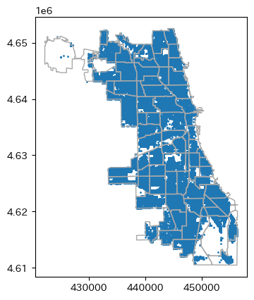
放置車両の位置をPlot
まずは単純に
まずは単純に放置車両の位置と地域Polygonを重ねてPlotしてみます。
basemap = (
    pop_utm
    .boundary
    .plot(
        lw=1,
        color='darkgray'
    )
)
cars_utm.plot(
    ax=basemap,
    markersize=1
);
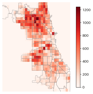
2dヒストグラムで
GIS的な機能を使用しないならば2DヒストグラムとしてPlotする方法もあります。 しかしこれはただ単にPlotするだけなので、PolygonとPointの要素を結合しているわけではありません。
fig, ax = plt.subplots()
pop_utm.boundary.plot(
    ax=ax,
    color='gray',
    lw=0.5,
)
img = ax.hist2d(
    cars_utm.geometry.x,
    cars_utm.geometry.y,
    bins=30,
    cmap='Reds'
)
ax.set_axis_off()
fig.colorbar(img[3], shrink=0.9, ax=ax);
2つのデータを合わせて考える
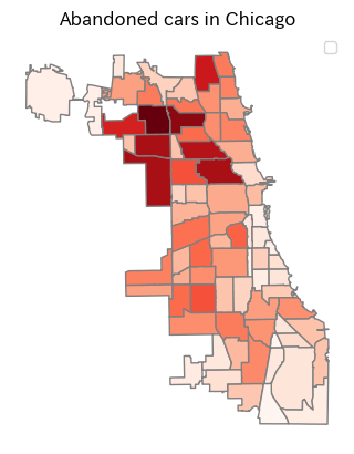
Polygon内に含まれる放置車両を数える
ますは空間検索を使用して、各地域のPolygon内に含まれる放置車両の数を集計していきます。
sjoinを使用しても可能ですが、余計な情報も結合されてしまいます。今回は含まれる数を集計したいだけなので、各地域ごとにintersectsを使用して放置車両を抽出し、行数を数えてみましょう。
def count_points(poly: Polygon, point_gdf: gpd.GeoDataFrame):
    # Community内の放置車両の数を数えます
    count = point_gdf[poly.intersects(point_gdf.geometry)].shape[0]
    return count


pop_utm['abandoned_cars_count'] = (
    pop_utm
    .geometry
    .apply(
        lambda geom:
        count_points(geom, cars_utm))
)
# pop_utm.iloc[:, -3:].head()
| index | normalized_diff | normalized_per | abandoned_cars_count |
|---|---|---|---|
| 0 | -0.43213062944429814 | -0.9166872770454357 | 490 |
| 1 | -0.008638398735844087 | -0.09029258402065879 | 273 |
| 2 | -0.027179352120094813 | -0.46759163149748295 | 176 |
| 3 | -0.3186199631287859 | -0.6388148545953667 | 1086 |
| 4 | -0.02602054253357914 | -0.08143309188226572 | 697 |
放置車両の数をPlot
# シカゴのマップに放置車両をPlotしてみる
ax = pop_utm.plot(
    column='abandoned_cars_count',
    cmap='Reds',
    edgecolor='gray'
)
plt.title('Abandoned cars in Chicago')
ax.set_axis_off()
ax.legend();
データを見てみるとシカゴ北部に放置車両が多い事が分かります。逆に南部は放置車両が少ないですね。
人口の増減と放置車両の関係
人口増減のデータは2000年から2010年へのデータであり、放置車両のデータは2011年のデータです。人口の増減と放置車両には何らかの関係があるのでしょうか。散布図で見てみましょう。
trg = 'abandoned_cars_count'
feats = ['POPCH', 'POPPERCH', 'normalized_diff', 'normalized_per']
fig, ax = plt.subplots(ncols=len(feats), figsize=(12, 3))
for _ax, col in zip(ax, feats):
    _ax.scatter(pop_utm[col], pop_utm[trg], s=3)
    _ax.set_title(f"{col}\n& {trg}")
plt.show()
どうでしょうね、単純な関係はあまりなさそうに見えます。

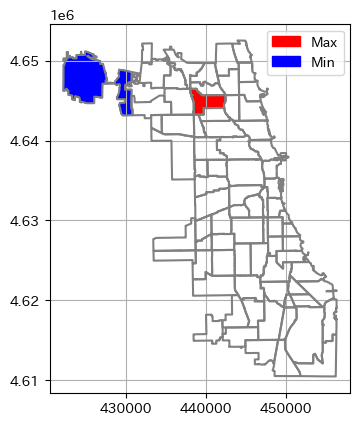
面積比でみる放置車両
上記であまり関係性が見えなかったので、少し方向性を変えて一番放置車両が多い地域と少ない地域を見ていきます。
しかし単純に最も放置車両が多い地域と少ない地域で絞り込むのが正しいとは限りません。GISではPolygonの面積も計算する事が出来るので、面積比で考えてみましょう。UTMに変更しているので単純にGeoDataFrame.areaで面積を計算する事が出来ます。
面積を測る単位に関しては、単純に個人的な好みですが、小さい範囲のデータを見る場合は平方メートル、大きな範囲を見る場合はヘクタールに直す場合が多いです。今回は地域で見ていくのでヘクタールに直します。ヘクタールに直す事で100m四方に放置車両が何台あるのかを測る事が出来ます。
pop_utm['ha'] = pop_utm.area / 10_000
pop_utm['ha_ratio'] = pop_utm['abandoned_cars_count'] / pop_utm['ha']

# pop_utm.iloc[:5, -3: ]
| index | abandoned_cars_count | ha | ha_ratio |
|---|---|---|---|
| 0 | 490 | 427.06885212380865 | 1.147355976824897 |
| 1 | 273 | 157.01412414253952 | 1.738697085315503 |
| 2 | 176 | 184.8913626379784 | 0.9519103406934812 |
| 3 | 1086 | 450.1641174246995 | 2.4124534985435817 |
| 4 | 697 | 269.8752519356357 | 2.5826747543573654 |
単純な放置車両数と面積比の放置車両数とを同時にPlotしてみます。
fig, ax = plt.subplots(ncols=2)
cols = ['abandoned_cars_count', 'ha_ratio']
for _ax, col in zip(ax, cols):
    pop_utm.plot(
        ax=_ax,
        column=col,
        cmap='Reds',
        edgecolor='gray'
    )
    _ax.set_title(col)
    _ax.set_axis_off()
plt.show()

それでは実際にデータを絞り込んでいきます。
max_row = pop_utm[pop_utm['ha_ratio'] == pop_utm['ha_ratio'].max()].copy()

# max_row.drop('geometry', axis=1)
一番放置車両が多い地域はヘクタール当たり(100m × 100m)で6台程度の放置車両があるようです。多いですね...
| index | community | NID | POP2010 | POP2000 | POPCH | POPPERCH | popplus | popneg | posi_nega | normalized_diff | normalized_per | abandoned_cars_count | ha | ha_ratio |
|---|---|---|---|---|---|---|---|---|---|---|---|---|---|---|
| 15 | IRVING PARK | 16 | 53359 | 58643 | -5284 | -9.010453 | 0 | 1 | -1 | -0.2768501448511983 | -0.2637497386568501 | 5021 | 831.9173245365444 | 6.035455509713259 |
min_row = pop_utm[pop_utm['ha_ratio'] == pop_utm['ha_ratio'].min()].copy()
# min_row.drop('geometry', axis=1)
少ない地域は12ヘクタールに1台程度ですね。
| index | community | NID | POP2010 | POP2000 | POPCH | POPPERCH | popplus | popneg | posi_nega | normalized_diff | normalized_per | abandoned_cars_count | ha | ha_ratio |
|---|---|---|---|---|---|---|---|---|---|---|---|---|---|---|
| 74 | OHARE | 76 | 12756 | 11956 | 800 | 6.691201 | 1 | 0 | 1 | 0.04175249564252892 | 0.04771098611427581 | 295 | 3452.2423583922773 | 0.08545170627515927 |
Mapで見てみましょう。
fig, ax = plt.subplots()
pop_utm.boundary.plot(
    ax=ax,
    color='gray'
)
plot_polygon(
    max_row.geometry.iloc[0],
    add_points=False,
    color='red',
    alpha=1,
    label='Max'
)
plot_polygon(
    min_row.geometry.iloc[0],
    add_points=False,
    color='blue',
    alpha=1,
    label='Min'
)
ax.legend();
拡大して見る
放置車両が最も少ない地域と、最も多かった地域をそれぞれを拡大して、どの様に放置車両が分布しているか見てみましょう。
fig, ax = plt.subplots(ncols=2)
for _ax, row in zip(ax, [min_row, max_row]):
    row.boundary.plot(ax=_ax, color='gray')
    pts = cars_utm[row['geometry'].iloc[0].intersects(cars_utm.geometry)]
    plot_points(pts.geometry, markersize=1, color='red', ax=_ax)
    _ax.set_axis_off()
    _ax.set_title(row['community'].iloc[0])

plt.show()

座標値を利用した密度準拠クラスタリング
面積比で最も放置車両の多い IRVING PARK を対象として、放置車両の位置をクラスタリングして、放置車両の多い場所をさらに絞り込んでいきます。
今回の放置車両の様なデータをクラスタリングする場合、クラスター数を事前に決めたくはありません。クラスタリングには DBSCAN(Density-based spatial clustering of applications with noise)を使用します。DBSCANはk-means等と違い、事前にクラスター数を与える必要はありません。今回の様に広い範囲に分布している放置車両をクラスタリングし、放置車両の集中している場所を特定するのに役立ちます。
以下は生成AIに作成してもらったDBSCANの概要を添削したものです。
DBSCANは、1996年にMartin Ester、Hans-Peter Kriegel、Jörg Sander、Xiaowei Xuによって提案された密度ベースのクラスタリングのアルゴリズムです。以下にDBSCANの主な特徴と手順を説明します。
- DBSCANの手順
- まだ訪れていない任意の開始点から処理を始めます。
- その点の半径(ε)の近傍を検索し、ε内に少なくとも閾値(minPts)以上の隣接点があるかを確認します。
- ε内に隣接点がある場合、その点をコア点として分類します。
- コア点から到達可能な点を同じクラスタに追加します。
- どのコア点からも到達不可能な点はノイズとして捉えます。
scikit-learnのclusterにはDBSCANクラスがあるので、それを利用すれば簡単に実装する事が出来ます。主に利用するパラメーターは以下の2つです
-
eps: float
- 近傍を検索する半径
-
min_points: int
- 隣接点を数える閾値
クラスターの計算
今回は半径50m以内に5台以上ある場所を探します。
distance = 50
count = 5
poly = max_row['geometry'].iloc[0]
pts = cars_utm[poly.intersects(cars_utm.geometry)].copy()
data = np.array([[geom.x, geom.y] for geom in pts['geometry']])
dbscan = DBSCAN(eps=distance, min_samples=count, metric='euclidean')
clus = dbscan.fit_predict(data)
pts['cluster'] = clus
とりあえずPlot
fig, ax = plt.subplots()
plot_points(
    pts[pts['cluster'] == -1].geometry,
    markersize=1,
    color='black',
    ax=ax
)
pts[0 <= pts['cluster']].plot(
    column='cluster',
    s=3,
    cmap='Dark2',
    ax=ax
)
plot_polygon(poly, add_points=False, color='black', fill=None)
ax.set_axis_off();

要素の追加
次に
- 各クラスターの中心点を求める
- クラスター内のコアが全て入る
Polygonを作成する
を行っていきます。上記の作業はshapely.geometry.MultiPointを作成する事で簡単に行う事が出来ます。
クラスター内のコアが全て含まれるPolygonを計算する方法は以下の3つが思い浮かびます。
- 各コアからクラスター作成時に使用した、半径の
Bufferを結合したPolygon - 凸包で計算した全てのコアを含む最小の凸集合
Polygon - 凹包で計算した全てのコアを含み、できる限り凹となる
Polygon
今回はDBSCANを使用したので半径を使用したBufferを結合してみましょう。
counts = []
mpts = []
centers = []
buffers = []
# numpy.uniqueでは昇順での並べ替えも行われます。
# 外れ値は-1としてクラスが与えられているので、最初の値を除きます。
for c in np.unique(clus)[1: ]:
    geoms = pts[pts['cluster'] == c].geometry.to_list()
    mpt = MultiPoint(geoms)
    mpts.append(mpt)
    counts.append(len(geoms))
    centers.append(mpt.centroid)
    buffers.append(mpt.buffer(distance))
それでは作成したデータをGeoDataFrameにしていきます。
GeoDataFrame自体は複数のGeoSeriesが入力可能なので、クラスターの中心と範囲の両方が入力可能なのですが、今回は別々なGeoDataFrameにしていきます。
geopandasではexploreというメソッドがあり、foliumを使用した動的なマップを簡単に作成する事が出来ます。細かいデータを拡大して表示し確認する場合などはよく使用するのですが、複数のGeoSeriesを入力しているとこれがエラーになってしまう為、別々に作成します。
# 今までのデータをGeoDataFrameにする。
clus_center_gdf = gpd.GeoDataFrame(
    data={'clus': np.unique(clus)[1: ], 'count': counts},
    geometry=centers,
    crs=pop_utm.crs
)
clus_epsilon_gdf = gpd.GeoDataFrame(
    data={'clus': np.unique(clus)[1: ], 'count': counts},
    geometry=buffers,
    crs=pop_utm.crs
)
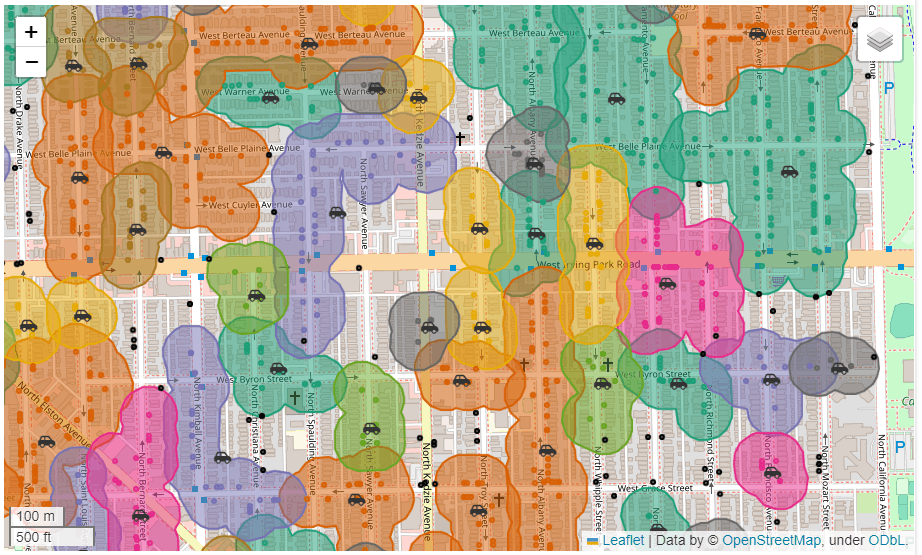
FoliumでPlot
以下の要素を入れたPlotを作成します。
- 各クラスター範囲とその中のコアの色を統一する
- 各クラスター内にあるコアの中心を車のアイコンにする
- クラスター化されなかった外れ値を黒点で表示する
# 動的なMapで表示する
# クラスターの範囲をPlot
_map = clus_epsilon_gdf.explore(
    column="clus",
    cmap='Dark2',
    legend=False,
    name='Center'
)
# クラスターに分類された各コア点をPlot
pts[0 <= pts['cluster']].explore(
    m=_map,
    column='cluster',
    cmap='Dark2',
    legend=False,
    name='Core points'
)
# 分類できなかった外れ値を黒でPlot
pts[pts['cluster'] == -1].explore(
    m=_map,
    color='black',
    legend=False,
    name='Outlier'
)
# 各クラスターの中央をPlot。強調したいので、車のアイコンで表示します。
# iconのクラス名は以下のURLからコピーできます。
# https://glyphsearch.com/?copy=class
clus_center_gdf.explore(
    m=_map,
    color="red",
    style_kwds=dict(
        style_function=lambda x: {
            "html": f"""<span class="fa fa-car-side";</span>"""
        },
    ),
    marker_type="marker",
    marker_kwds=dict(icon=folium.DivIcon()),
    name='Epsilon'
)
folium.LayerControl().add_to(_map)
_map
拡大して初めてわかりましたが、放置車両が家の前の道路に面した場所にあります。これって本当に放置車両なん?

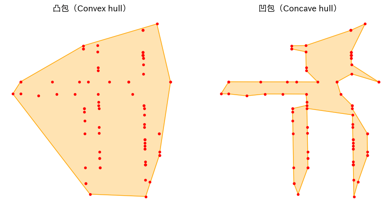
凸包と凹包
ちなみに凸包も凹包もshapelyにはメソッドが用意されており、簡単に計算できます。geopadnas.GeoSeriesにもメソッドがありますが、凹包の方が何故かドキュメントのコピペでもエラーになったので、とりあえずGeoSeriesなしの繰り返し処理で計算した方がいいでしょう。
convex_lst = []
concave_lst = []
for geom in mpts:
    # 凸包で全てのコアを含む最小の凸集合を計算
    convex = shapely.convex_hull(geom)
    convex_lst.append(convex)
    # 凹包で全てのコアを含み、できる限り凹となるPolygonを計算
    concave = shapely.concave_hull(geom)
    concave_lst.append(concave)
fig, ax = plt.subplots(ncols=2, figsize=(10, 5))
plot_polygon(convex_lst[0], add_points=False, color='#ffa500', ax=ax[0])
plot_polygon(concave_lst[0], add_points=False, color='#ffa500', ax=ax[1])

titles = ['凸包(Convex hull)', '凹包(Concave hull)']
for _ax, title in zip(ax, titles):
    plot_points(mpts[0], markersize=3, color='red', ax=_ax)
    _ax.set_title(title)
    _ax.set_axis_off()
plt.show()
凸包は使ったりしますが、凹包の方はパラメーターによって形が変化するので、あまり使わないかもしれません。
おわりに
大分長くなってしまいましたが、なんとなくgeopandasを使用するイメージは出来たかと思います。
次回はh3かosmnxに関して書こうかと思っています。
Discussion