📱
【Flutter】TextButton.iconの扱いに注意
動作確認環境
Flutter 2.2.3 • channel stable • https://github.com/flutter/flutter.git
Framework • revision f4abaa0735 (5 weeks ago) • 2021-07-01 12:46:11 -0700
Engine • revision 241c87ad80
Tools • Dart 2.13.4
TextButton.icon
FlutterでIconとTextを含んだButtonを使いたい時、用意されているTextButton.icon()を使おうと思うかもしれないが、気をつけたい点がある。
通常、以下のようなコードの使いかたをして実装してしまうだろう。
TextButton.iconのsample
TextButton.icon(
  onPressed: () {},
  icon: const Icon(Icons.icecream),
  label: const Text('アイスクリームアイコンのボタン'),
),
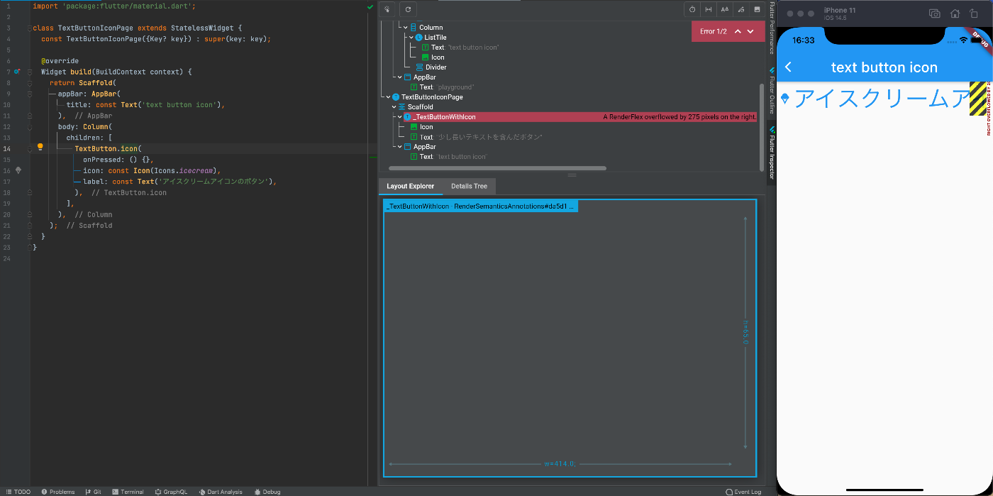
しかし、アクセシビリティでテキストサイズを大きくしていると以下のように画面からはみ出た表示になる問題がある。
回避策
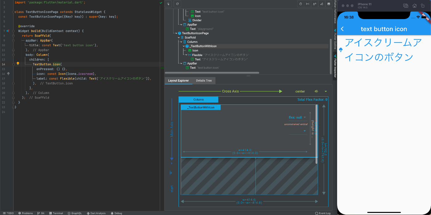
TextをFlexibleで囲ってやることで、画面端で折り返してくれるようになる。
TextButton.iconのsample
TextButton.icon(
  onPressed: () {},
  icon: const Icon(Icons.icecream),
  label: const Flexible(child: Text('アイスクリームアイコンのボタン')),
),
IconTextButton
TextButton.iconを使う際、いちいちTextをFlexibleで囲ってあげるのは手間だし、都度その書き方をしていると、囲み漏れることも起きるかもしれない。
また、TextButton.iconは、楽に扱える分IconとTextのmarginが8pxで固定されており、別の数値を指定した場合に使えなかったりと、融通が効きやすいわけではない。
ならば、いっそ作ってしまった方が良いのではと思う。
WrapIconTextButton
Flexibleで最初からtextを囲うようにしたWrapIconTextButton
WrapIconTextButton.dart
class WrapIconTextButton extends StatelessWidget {
const WrapIconTextButton({
Key? key,
this.onPressed,
required this.icon,
required this.text,
}) : super(key: key);
final VoidCallback? onPressed;
final Icon icon;
final Text text;
Widget build(BuildContext context) {
return TextButton.icon(
onPressed: onPressed,
icon: icon,
label: Flexible(child: text),
);
}
}
IconTextButton
IconとTextのmarginが調整可能なIconTextButton
IconTextButton.dart
class IconTextButton extends StatelessWidget {
const IconTextButton({
Key? key,
this.onPressed,
required this.icon,
required this.text,
this.margin = 8,
}) : super(key: key);
final VoidCallback? onPressed;
final Icon icon;
final Text text;
final double margin;
Widget build(BuildContext context) {
return TextButton(
onPressed: onPressed,
child: Row(
mainAxisSize: MainAxisSize.min,
children: [
icon,
SizedBox(width: margin),
Flexible(child: text),
],
),
);
}
}
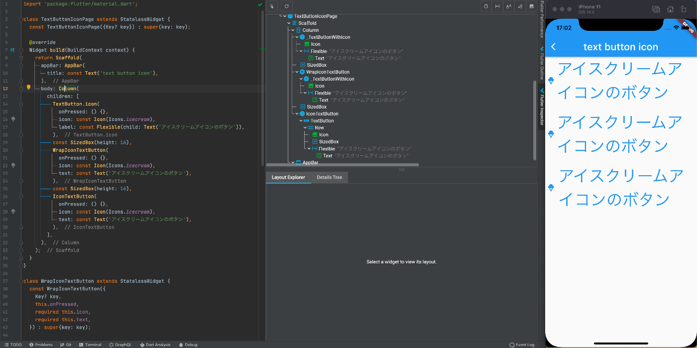
3種3様のButtonの配置比較した図
Discussion