[Flutter入門(4)] 公式チュートリアルのステップ1:Building Layoutsをやってみる

Flutterの公式サイトに チュートリアル として紹介されているコンテンツを順にやってみようと思います。
まずは1つ目の Building Layouts です。
Step 0:アプリの雛形を作る
Write your first Flutter app, part 1 の最初にやったように、アプリの雛形を作ります。
$ flutter create tutorial # 名前は何でもOK
雛形ができたら lib/main.dart を以下の内容にします。
import 'package:flutter/material.dart';
void main() => runApp(MyApp());
class MyApp extends StatelessWidget {
Widget build(BuildContext context) {
return MaterialApp(
title: 'Flutter layout demo',
home: Scaffold(
appBar: AppBar(
title: Text('Flutter layout demo'),
),
body: Center(
child: Text('Hello World'),
),
),
);
}
}
Step 1:レイアウトを分解して理解する
まずは、これから作るレイアウトの内容を確認しましょう。
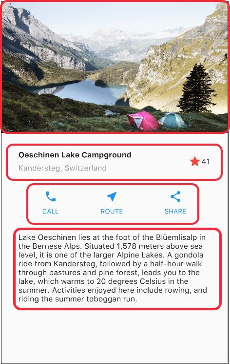
このようなレイアウトを作っていきます。
上から2つ目の赤枠の箇所(タイトルセクション)をさらに細かく分解すると以下のような構造になっています。

また、上から3つ目の赤枠の箇所(ボタンセクション)は以下のような構造になっています。

レイアウトを作成する際には、このようにまず図解をしてみて構造をはっきりさせるとよいです。ここまでの図解ができれば、あとはボトムアップで部品を一つずつ組み上げていけばレイアウトを作るのは難しくありません。
部品を組み上げてレイアウトを作っていく際、階層構造が深くなるとコードが難読になってくるので、適度に変数やメソッドに分割しながら組み立てていくのがおすすめです。
Step 2:タイトルセクションを実装する
では早速、タイトルセクションから実装していきましょう。
MyApp クラスの build() メソッドを以下のように修正します。
  @override
  Widget build(BuildContext context) {
+   Widget titleSection = Container(
+     padding: const EdgeInsets.all(32),
+     child: Row(
+       children: [
+         Expanded(
+           child: Column(
+             crossAxisAlignment: CrossAxisAlignment.start,
+             children: [
+               Container(
+                 padding: const EdgeInsets.only(bottom: 8),
+                 child: Text(
+                   'Oeschinen Lake Campground',
+                   style: TextStyle(
+                     fontWeight: FontWeight.bold,
+                   ),
+                 ),
+               ),
+               Text(
+                 'Kandersteg, Switzerland',
+                 style: TextStyle(
+                   color: Colors.grey[500],
+                 ),
+               ),
+             ],
+           ),
+         ),
+         Icon(
+           Icons.star,
+           color: Colors.red[500],
+         ),
+         Text('41'),
+       ],
+     ),
+   );
+
    return MaterialApp(
      title: 'Flutter layout demo',
      home: Scaffold(
        appBar: AppBar(
          title: Text('Flutter layout demo'),
        ),
-       body: Center(
-         child: Text('Hello World'),
-       ),
+       body: Column(
+         children: [
+           titleSection,
+         ],
+       ),
      ),
    );
  }
titleSection という変数に組み立てたウィジェットを入れておいて、最後に Scaffold の body にそれをセットしています。
titleSection の中はコード量が多いですが、よくよく見ていけば下図の図解のとおりの構造を組み立てているだけだということが分かるはずです。
コードを順に見ていくと、
-
titleSection自体はContainerウィジェットである -
Containerのchildとして1つのRowを持たせている -
RowのchildrenとしてExpandedIconTextの3つを持たせている-
Expandedの中にColumnが1つあり、Expandedで囲うことで余白を埋めるような配置にしている - 結果、
IconとTextが行の右端に寄る形になっている
-
-
Expandedの中のColumnの中には、さらにContainerとTextが入っている- この
Containerの中は1つのTextが入っているだけだけど、paddingで下に余白をつけるためにContainerで囲っている
- この
というような構造になっていることが見てとれます。
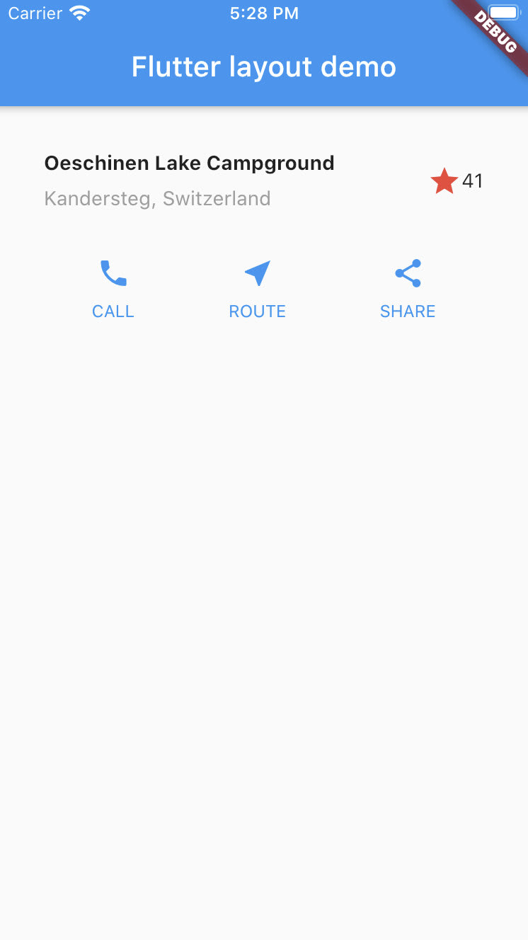
この時点で以下のようにタイトルセクションが実装できました。

Step 3:ボタンセクションを実装する
次はボタンセクションです。
ボタンセクションには1行の中に3列(3つのボタン)があり、それぞれの列が「アイコンとテキストのセット」という同じ構造になっています。
そこで、この1つの列を組み立てる処理をメソッドにしておいて再利用するようにしましょう。
  class MyApp extends StatelessWidget {
    @override
    Widget build(BuildContext context) {
      // 略
    }

+   Column _buildButtonColumn(Color color, IconData icon, String label) {
+     return Column(
+       mainAxisSize: MainAxisSize.min,
+       mainAxisAlignment: MainAxisAlignment.center,
+       children: [
+         Icon(icon, color: color),
+         Container(
+           margin: const EdgeInsets.only(top: 8),
+           child: Text(
+             label,
+             style: TextStyle(
+               fontSize: 12,
+               fontWeight: FontWeight.w400,
+               color: color,
+             ),
+           ),
+         ),
+       ],
+     );
+   }
  }
Column の mainAxisSize や mainAxisAlignment でサイズや位置を調整しているぐらいで、それ以外は構造に注意して読んでいけば理解できる内容ですね。
では続いて、このメソッドを使って実際にボタンセクションを組み立てて、 Scaffold に組み込むところまでやってみましょう。
build メソッドを次のように修正します。
  @override
  Widget build(BuildContext context) {
    Widget titleSection = Container(
      // 略
    );

+   Color color = Theme.of(context).primaryColor;
+
+   Widget buttonSection = Container(
+     child: Row(
+       mainAxisAlignment: MainAxisAlignment.spaceEvenly,
+       children: [
+         _buildButtonColumn(color, Icons.call, 'CALL'),
+         _buildButtonColumn(color, Icons.near_me, 'ROUTE'),
+         _buildButtonColumn(color, Icons.share, 'SHARE'),
+       ],
+     ),
+   );
+
    return MaterialApp(
      title: 'Flutter layout demo',
      home: Scaffold(
        appBar: AppBar(
          title: Text('Flutter layout demo'),
        ),
        body: Column(
          children: [
            titleSection,
+           buttonSection,
          ],
        ),
      ),
    );
  }
titleSection と同様に buttonSection 変数を作って、そこに Container を持たせています。 Container の中身は Row 1つで、 Row の中身は先ほどの _buildButtonColumn() メソッドで作った3つの列となっていますね。
Row の mainAxisAlignment に MainAxisAlignment.spaceEvenly をセットすることで、各列の前後の余白が均等になるように配置しています。
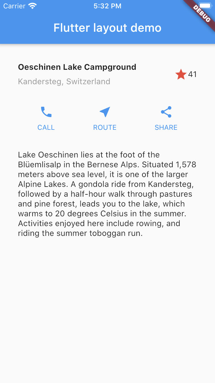
これで、以下のようにボタンセクションが実装できました。
Step 4:テキストセクションを実装する
続いてこのレイアウトの一番下の箇所、テキストセクションを実装します。
以下のようにコードを修正しましょう。
  :
  :

+ Widget textSection = Container(
+   padding: const EdgeInsets.all(32),
+   child: Text(
+     'Lake Oeschinen lies at the foot of the Blüemlisalp in the Bernese '
+         'Alps. Situated 1,578 meters above sea level, it is one of the '
+         'larger Alpine Lakes. A gondola ride from Kandersteg, followed by a '
+         'half-hour walk through pastures and pine forest, leads you to the '
+         'lake, which warms to 20 degrees Celsius in the summer. Activities '
+         'enjoyed here include rowing, and riding the summer toboggan run.',
+     softWrap: true,
+   ),
+ );
+
  return MaterialApp(
    title: 'Flutter layout demo',
    home: Scaffold(
      appBar: AppBar(
        title: Text('Flutter layout demo'),
      ),
      body: Column(
        children: [
          titleSection,
          buttonSection,
+         textSection,
        ],
      ),
    ),
  );
ここまででやってきたこととまったく同じ要領で理解できる内容ですね。
このようにテキストセクションが実装できました。
Step 5: 画像セクションを実装する
最後にこのレイアウトの一番上の箇所、画像セクションを実装します。
まずは画像を用意しましょう。
プロジェクト直下に images というディレクトリを作成して、そこに こちらの画像 を lake.jpg というファイル名で保存してください。
次に、 pubspec.yaml を以下のように修正して、 images/lake.jpg をアセットとして利用できるようにします。
  # The following section is specific to Flutter.
  flutter:

    # The following line ensures that the Material Icons font is
    # included with your application, so that you can use the icons in
    # the material Icons class.
    uses-material-design: true

    # To add assets to your application, add an assets section, like this:
    # assets:
    #   - images/a_dot_burr.jpeg
    #   - images/a_dot_ham.jpeg
+   assets:
+     - images/lake.jpg
pubspec.yamlはケースセンシティブ(大文字小文字を区別する)なので、assetsというキー名や画像ファイルのパスは大文字小文字を正確に書く必要があることを覚えておきましょう。
あとは、 build() メソッドの Scaffold に画像セクションを以下のように足せばOKです。
  return MaterialApp(
    title: 'Flutter layout demo',
    home: Scaffold(
      appBar: AppBar(
        title: Text('Flutter layout demo'),
      ),
      body: Column(
        children: [
+         Image.asset(
+           'images/lake.jpg',
+           width: 600,
+           height: 240,
+           fit: BoxFit.cover,
+         ),
          titleSection,
          buttonSection,
          textSection,
        ],
      ),
    ),
  );
fit: BoxFit.cover はCSSでいう object-fit: cover と同じ効果ですね。
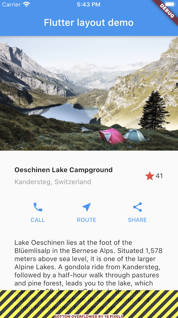
これで、以下のように画像セクションが実装できました。
Step 6:最終調整
さて、実行結果によっては(例えばiOSシミュレータでiPhone SE2を起動している場合)先ほどの実行結果の画面最下部に不穏な警告が表示されていたと思います。
これが表示されている場合、 flutter run しているターミナルに以下のようなエラーが出力されているはずです。
════════ Exception caught by rendering library ═════════════════════════════════
The following assertion was thrown during layout:
A RenderFlex overflowed by 18 pixels on the bottom.

The relevant error-causing widget was
    Column
lib/main.dart:75
The overflowing RenderFlex has an orientation of Axis.vertical.
The edge of the RenderFlex that is overflowing has been marked in the rendering with a yellow and black striped pattern. This is usually caused by the contents being too big for the RenderFlex.

Consider applying a flex factor (e.g. using an Expanded widget) to force the children of the RenderFlex to fit within the available space instead of being sized to their natural size.
This is considered an error condition because it indicates that there is content that cannot be seen. If the content is legitimately bigger than the available space, consider clipping it with a ClipRect widget before putting it in the flex, or using a scrollable container rather than a Flex, like a ListView.

The specific RenderFlex in question is: RenderFlex#9bd17 relayoutBoundary=up1 OVERFLOWING
════════════════════════════════════════════════════════════════════════════════
3行目の A RenderFlex overflowed by 18 pixels on the bottom. だけ読めば分かりますが、画面サイズに対してコンテンツの量が多過ぎて下に18ピクセルはみ出してしまっているよ、というエラーのようです。
最後にこのエラーを解消しておきましょう。
方法はとても簡単で、 Scaffold の body に Column ウィジェットではなく ListView ウィジェットを使うだけで解消できます。
  return MaterialApp(
    title: 'Flutter layout demo',
    home: Scaffold(
      appBar: AppBar(
        title: Text('Flutter layout demo'),
      ),
-     body: Column(
+     body: ListView(
        children: [
          Image.asset(
            'images/lake.jpg',
            width: 600,
            height: 240,
            fit: BoxFit.cover,
          ),
          titleSection,
          buttonSection,
          textSection,
        ],
      ),
    ),
  );
ListView ウィジェットはスクロールの機能を備えているので、画面サイズが小さくてコンテンツがはみ出す場合には自動でスクロール可能な状態で出力されるため、このエラーは出なくなるというわけです。
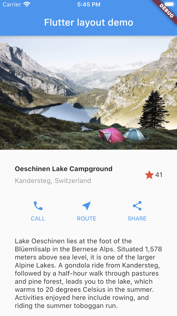
これで、以下のようにすべて実装完了しました。マウスで画面をドラッグしてスクロールができることを確認してみましょう。
Discussion