iTranslated by AI
Creating Perfect React Forms with Minimal JS


Gist
import { ChangeEvent, FormEvent } from "react";

export default function Form() {
  const showError = (message: string) => (e: FormEvent<HTMLInputElement>) => {
    if (e.currentTarget.validity.valueMissing) {
      e.currentTarget.setCustomValidity(message);
    } else if (
      e.currentTarget.validity.patternMismatch &&
      e.currentTarget.name === "postcode"
    ) {
      e.currentTarget.setCustomValidity("Please enter a valid postal code");
    } else if (
      e.currentTarget.validity.tooShort &&
      e.currentTarget.name === "phoneNumber"
    ) {
      e.currentTarget.setCustomValidity("Please enter a valid phone number");
    } else {
      e.currentTarget.setCustomValidity("");
    }
  };
  const handleInputChange = (e: ChangeEvent<HTMLInputElement>) => {
    e.target.setCustomValidity("");
  };
  return (
    <form>
      <section
        style={{
          display: "flex",
          flexDirection: "column",
          gap: "10px",
        }}
      >
        <label htmlFor="firstName">First Name</label>
        <input
          id="firstName"
          name="firstName"
          required
          autoComplete="given-name"
          onInvalid={showError("Please enter your first name")}
          onChange={handleInputChange}
        />
        <label htmlFor="lastName">Last Name</label>
        <input
          id="lastName"
          name="lastName"
          required
          autoComplete="family-name"
          onInvalid={showError("Please enter your last name")}
          onChange={handleInputChange}
        />
        <label htmlFor="phoneNumber">Phone Number</label>
        <input
          id="phoneNumber"
          name="phoneNumber"
          type="text"
          inputMode="numeric"
          pattern="[0-9]*"
          minLength={11}
          autoComplete="tel"
          onInvalid={showError("Please enter your phone number")}
          onChange={handleInputChange}
        />
        <label htmlFor="postcode">Postal Code</label>
        <input
          id="postcode"
          type="text"
          name="postcode"
          inputMode="numeric"
          required
          pattern="[0-9]{7}"
          onInvalid={showError("Please enter your postal code")}
          onChange={handleInputChange}
        />
        <label htmlFor="address">Address</label>
        <input
          id="address"
          type="text"
          name="address"
          required
          autoComplete="address-level1"
          onInvalid={showError("Please enter your address")}
          onChange={handleInputChange}
        />
        <label htmlFor="building">Building Name</label>
        <input
          id="building"
          type="text"
          name="building"
          autoComplete="address-level2"
          required
          onInvalid={showError("Please enter your building name")}
          onChange={handleInputChange}
        />
        <label htmlFor="email">Email</label>
        <input
          id="email"
          type="email"
          name="email"
          required
          inputmode="email"
          autoComplete="email"
          onInvalid={showError("Please enter your email")}
          onChange={handleInputChange}
        />
        <button type="submit">Submit</button>
      </section>
    </form>
  );
}
Attributes to Understand
required
The required attribute is a boolean attribute that, if present, indicates that the user must specify a value for the input before the owning form can be submitted.

This will trigger an error if the input is left empty during submission.
autoComplete
The HTML autocomplete attribute allows web developers to hint to the browser about what type of information is expected in an input field, and it can also specify that the user agent (browser) should provide automated assistance for filling in form fields.
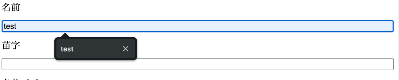
Browsers will autocomplete values based on past entries. This is also essential for accessibility.
type
The <input> element is an HTML element used to create interactive controls for web-based forms in order to accept data from the user.
It is often used to control input values. For example, using type="number" to restrict input to numbers. It can also control values provided through autocomplete—for example, using type="email" allows for email address autocompletion.
inputmode
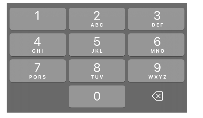
The inputmode global attribute is an enumerated attribute that hints at the type of data that might be entered by the user while editing the element or its contents. This allows a browser to display an appropriate virtual keyboard.
In short, when a user focuses on a data input field, it will display a keyboard optimized for that specific type of data.
e.g., on iOS, if set to numeric, a numeric keypad will be displayed.
pattern
Specifies a regular expression that the form control's value should match.
You can control input values using regular expressions! In the code above, I use it like this:
      <input
          id="postcode"
          type="text"
          name="postcode"
          inputMode="numeric"
          required
          pattern="[0-9]{7}" // Here 👈👈👈
          onInvalid={showError("Please enter your postal code")}
          onChange={handleInputChange}
        />
Since I expect a postal code, I've restricted it to 7 digits.
minLength/maxLength
The maximum/minimum number of characters that the user can enter into an <input> or <textarea> element.
    <input
          id="phoneNumber"
          name="phoneNumber"
          type="text"
          inputMode="numeric"
          pattern="[0-9]*"
          minLength={11} // Here 👈👈👈
          autoComplete="tel"
          onInvalid={showError("Please enter your phone number")}
          onChange={handleInputChange}
        />
For the phone number, I specified minLength. It is not required (no required attribute), so it must either be left empty or contain exactly 11 digits.
Providing User Feedback
This part:
const showError = (message: string) => (e: FormEvent<HTMLInputElement>) => {
    if (e.currentTarget.validity.valueMissing) {
      e.currentTarget.setCustomValidity(message);
    } else if (
      e.currentTarget.validity.patternMismatch &&
      e.currentTarget.name === "postcode"
    ) {
      e.currentTarget.setCustomValidity("Please enter a valid postal code");
    } else if (
      e.currentTarget.validity.tooShort &&
      e.currentTarget.name === "phoneNumber"
    ) {
      e.currentTarget.setCustomValidity("Please enter a valid phone number");
    } else {
      e.currentTarget.setCustomValidity("");
    }
  };
  const handleInputChange = (e: ChangeEvent<HTMLInputElement>) => {
    e.target.setCustomValidity("");
  };
validity
A property that returns the state of the form validation event.
These are the criteria for validating input values in elements like input or textarea. You can use these properties to provide form validation feedback.
setCustomValidity
The setCustomValidity() method of the HTMLObjectElement interface sets a custom validation message for the element.
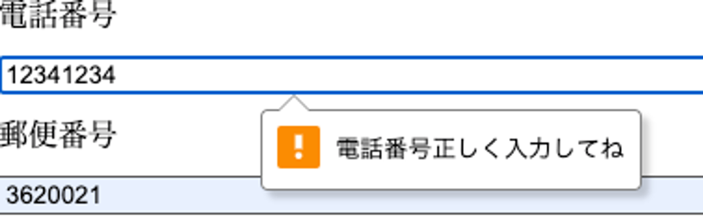
It allows you to set any arbitrary error message.
References
Discussion