Open8
My Flutter Cookbook
 miyaken12
こういうレイアウト作りたいって時に思い出すのがめんどくさいのでなるべく備忘録として残していくもの
miyaken12文字入り横線のレイアウト
スクロール画面とかで下のスクショみたいな文字入り横線で区切りたい時
class _Separator extends StatelessWidget {
Widget build(BuildContext context) {
return Row(
mainAxisAlignment: MainAxisAlignment.center,
children: <Widget>[
Expanded(
child: Divider(
height: 75.0,
indent: 12.0,
endIndent: 12.0,
),
),
Text(
'または他でサインアップ',
),
Expanded(
child: Divider(
height: 75.0,
indent: 12.0,
endIndent: 12.0,
),
),
],
);
}
}
return Center(
child: SingleChildScrollView(
child: Column(
children: <Widget>[
// 省略
_Separator(), // ← こいつ
// 省略
],
線は Dividerで、画面幅めいいっぱいまで広げてあげればいいので線の部分を Expandedで囲って広げてあげる
細かい線の高さとか長さはここで調節
Divider(
            height: 75.0,
            indent: 12.0,
            endIndent: 12.0,
          ),
静的なリストビュー&リストごとに特定への画面遷移処理
import 'package:flutter/material.dart';
class MyCookbook extends StatelessWidget {
Widget build(BuildContext context) {
return Scaffold(
appBar: AppBar(
title: Text(
'My Cookbook',
style: TextStyle(
color: Colors.white,
),
),
centerTitle: true,
),
body: SafeArea(
child: ListView(
children: const <Widget>[
CookBookListTile(title: '画面タイトル', page: (なんかスクリーンクラス)),
CookBookListTile(title: '画面タイトル', page: (なんかスクリーンクラス)),
],
),
),
);
}
}
class CookBookListTile extends StatelessWidget {
final String title;
final Widget page;
const CookBookListTile({required this.title, required this.page});
Widget build(BuildContext context) {
return ListTile(
title: Text(
title,
),
trailing: const Icon(
Icons.keyboard_arrow_right,
),
onTap: () => Navigator.of(context).push(
MaterialPageRoute<void>(builder: (_) => page),
),
);
}
}
画面いっぱいにボタンの幅を広げたい
ElevatedButtonはあくまで例なので他のボタンでもいい
  Widget build(BuildContext context) {
    return Container(
      constraints: BoxConstraints.expand(
        height: 45.0,
      ),
      child: ElevatedButton(
        onPressed: () {},
        style: ElevatedButton.styleFrom(
          primary: AppColor.buttonBackgroundColor,
        ),
        child: Text(
          '新規会員登録',
          style: TextStyle(color: Colors.white),
        ),
      ),
    );
  }
Containerで囲ってあげて
引数のconstraintsに BoxConstraints.expand() というNamedコンストラクタを使ってあげる
高さ(height)のみ値を指定してあげて、widthは指定なしだと幅が広げれるところまで広げてくれる
miyaken12中央配置統一のColumn(Row)に特定のウィジットのみ左 or 右端に配置したい
Columnなら子ウィジットにRow, Rowなら子ウィジットにColumnを配置する
例は縦方向(Column)での中央配置、一部のウィジットのみ右端におく
Widget build(BuildContext context) {
    return Column(
      crossAxisAlignment: CrossAxisAlignment.center,
      children: <Widget>[
        // なんかウィジット
        // なんかウィジット
        // なんかウィジット
        Row(
          children: <Widget>[
            Spacer(),
            // 右端に配置したいウィジット
          ],
        )
      ],
    );
}
子ウィジットの一部にSpacerを配置する
そうすると目当てのウィジットが一番右端に配置される

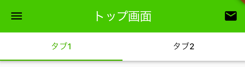
miyaken12アプリバーとタブバーの色を分ける方法
この人の記事を参考にした
Tabbarウィジットに色をつけれるように以下のカスタムウィジットを作成
class ColoredTabBar extends StatelessWidget implements PreferredSizeWidget {
final PreferredSizeWidget tabBar;
final Color color;
ColoredTabBar({required this.tabBar, required this.color});
Widget build(BuildContext context) {
return Ink(
color: color,
child: tabBar,
);
}
Size get preferredSize => tabBar.preferredSize;
}
実際に色を付けたいTabbarウィジットをこのカスタムウィジットで囲む
class Sample extends StatelessWidget {
final _tabs = <Tab>[
Tab(text: 'タブ1'),
Tab(text: 'タブ2'),
];
Widget build(BuildContext context) {
return DefaultTabController(
length: _tabs.length,
child: Scaffold(
appBar: AppBar(
backgroundColor: Colors.green,
bottom: ColoredTabBar(
color: Colors.white,
tabBar: TabBar(
tabs: _tabs,
labelColor: Colors.green,
indicatorColor: Colors.green,
unselectedLabelColor: Colors.black,
),
),
title: Text(
'トップ画面',
style: TextStyle(
color: Colors.white,
),
),
centerTitle: true,
actions: <Widget>[
IconButton(
icon: Icon(Icons.mail),
onPressed: () {},
),
],
),
body: SafeArea(
child: TabBarView(
children: <Widget>[
SingleChildScrollView(
child: Padding(
padding: const EdgeInsets.all(12.0),
child: _TopContent(), // 中身適当なカスタムウィジット
),
),
Center(), // 仮で入れてる
],
),
),
drawer: Drawer(),
),
);
}
}
こんな感じで表示される
miyaken12RichText
    return RichText(
      text: const TextSpan(
        style: TextStyle(
          color: Colors.black,
        ),
        children: <TextSpan>[
          TextSpan(
            text: '999',
            style: TextStyle(
              fontWeight: FontWeight.bold,
            ),
          ),
          TextSpan(
            text: '日',
          ),
        ],
      ),
    );
スクロールできるUIかつ中央配置したい
Center(
        child: SingleChildScrollView(
           // 子Widget
        ),
      );