🚨
【Flutter】押すと拡大/色変更が行われるボタンの試作品
※自分用メモ:Notionで過去に書いたもの
こんにちは、laughtaoneです。
Flutter学習中に備忘録として書いていますので、正確な情報でない可能性もありますのでご了承ください。
前提
ゲーム画面にあるボタンを作っていた際、押した状態がわかりやすいようにしたいと思って作ったものです。
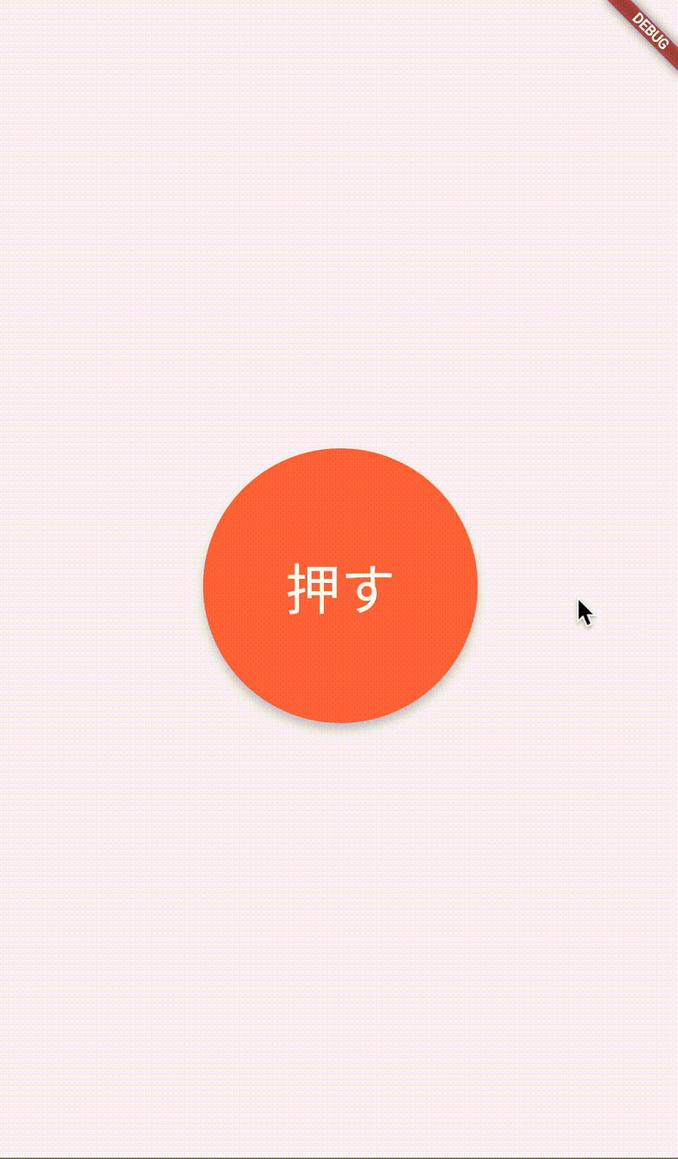
完成イメージ
コード
import 'package:flutter/material.dart';
void main() {
runApp(MyApp());
}
class MyApp extends StatelessWidget {
Widget build(BuildContext context) {
return MaterialApp(
home: Scaffold(
body: Center(
child: AnimatedButton(),
),
),
);
}
}
class AnimatedButton extends StatefulWidget {
_AnimatedButtonState createState() => _AnimatedButtonState();
}
class _AnimatedButtonState extends State<AnimatedButton> {
double shadowBlur = 5;
final Color defaultColor = const Color(0xffFF7049);
final Color pressedColor = const Color(0xffFFDF5E);
Color nowColor = const Color(0xffFF7049);
final double defalutSize = 200;
final double pressedSize = 250;
double nowButtonSize = 200;
void _animateButton() {
setState(() {
nowButtonSize = (nowButtonSize == defalutSize) ? pressedSize :defalutSize;
shadowBlur = (shadowBlur) == 5 ? 15 : 5; // シャドウの強さを変更
nowColor = (nowColor == defaultColor) ? pressedColor : defaultColor; // 色を変更
});
}
Widget build(BuildContext context) {
return GestureDetector(
onTap: _animateButton,
child: AnimatedContainer(
duration: Duration(milliseconds: 150), // 変化にかける時間
width: nowButtonSize,
height: nowButtonSize,
decoration: BoxDecoration(
color: nowColor,
borderRadius: BorderRadius.circular(1000),
boxShadow: [
BoxShadow(
color: Colors.black.withOpacity(0.2),
blurRadius: shadowBlur,
offset: Offset(0, 5),
),
],
),
child: Center(
child: Text(
'押す',
style: TextStyle(color: Colors.white, fontSize: 40),
),
),
),
);
}
}
クラス _AnimatedButtonState で使用している変数について、
-
shadowBlur:シャドウの強さ(押していない時:5, 押している時:15) -
defaultColor:ボタンを押していない時のボタンの色 -
pressedColor:ボタンを押している時のボタンの色 -
nowColor:現在のボタンの色 -
defalutSize:ボタンを押していない時のボタンのサイズ -
pressedSize:ボタンを押している時のボタンのサイズ -
nowButtonSize:現在のボタンのサイズ
となっています。
まとめ
これが、押すと拡大/色変更が行われるボタンの試作品です。
Discussion