🎃
[React] 初心者講座04 <30秒でフレキシブルレイアウト>


Webアプリケーションを作成する際は、最初に想定画面サイズ(対応デバイス)が決められるものだと思っている。
画面幅が「〇〇px固定!」というのもメリットはあるが、PCにおいて、最近はフレキシブルレイアウトが流行っているような気がする。
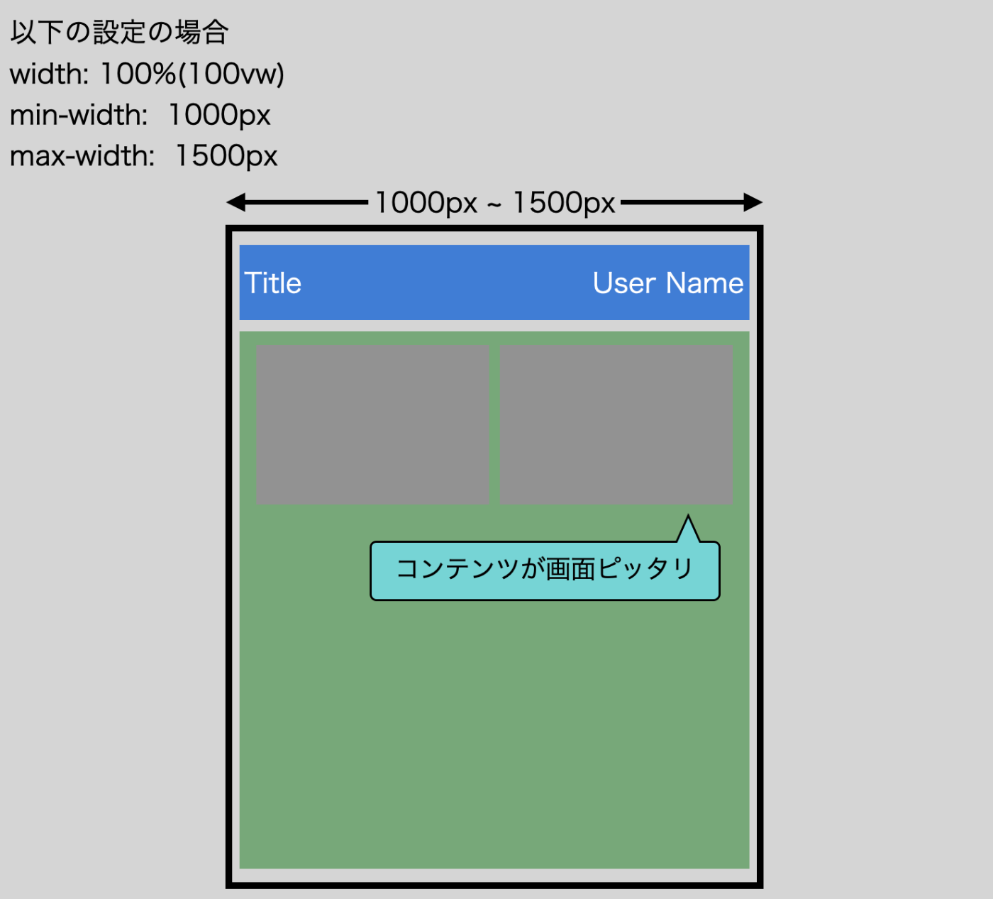
フレキシブルレイアウトとは
2021/12/5時点で、AmazonのPC版サイトを見ると手っ取り早い。
以下2点が特徴
- 基本的に、画面幅に合わせてコンテンツの幅も追従
- コンテンツには最小幅と最大幅がある


スクロール表示させないために、タブレット用、スマホ用に切り替えたりもする。
実装
このヘッダしかないサンプルに適用する。

widthに100%か100vwを設定しつつ、min-widthとmax-widthも設定するだけ。
min-widthとmax-widthはtheme.tsに定義してしまう。
theme.ts
import { createTheme } from '@mui/material/styles';
import { blueGrey, blue, deepOrange } from '@mui/material/colors';

{/* 最小幅と最大幅を定義 */}
export const FLEXIBLE_MIN_WIDTH = 1000;
export const FLEXIBLE_MAX_WIDTH = 1200;

const theme = createTheme({
  ...
MainContainer.tsx
const MainContainer: React.VFC<MainContainerProps> = (props) => {
  return (
    <Box flexGrow={1} sx={{ overflowY: 'auto' }}>
      <Box
        {/* widthは100vw(または100%) */}
        {/* minWidth, maxWidthを設定 */}
        width="100vw"
        minWidth={`${FLEXIBLE_MIN_WIDTH}px`}
        maxWidth={`${FLEXIBLE_MAX_WIDTH}px`}
        margin="auto"
        px="32px"
        py="16px"
      >
        {props.children}
      </Box>
    </Box>
  );
};
AppHeader.tsx
const StyledAppbar = styled(AppBar)({
  backgroundColor: blue[900],
});

const StyledToolbar = styled(Toolbar)({
  {/* widthは100vw(または100%) */}
  {/* minWidth, maxWidthを設定 */}
  width: '100vw',
  minWidth: `${FLEXIBLE_MIN_WIDTH}px`,
  maxWidth: `${FLEXIBLE_MAX_WIDTH}px`,
  margin: 'auto',
});

export type AppHeaderProps = {
  appTitle: string;
  userName: string;
  leftItems: { id: number; node: React.ReactNode }[];
};

const AppHeader: React.VFC<AppHeaderProps> = (props) => {
  return (
    <StyledAppbar position="static">
      <StyledToolbar>
        <AppTitleLabel label={props.appTitle} />
おわり。
続き
前
Discussion