🐷
【Angular】Trimming Icon by Image Cropper with Mateirl Design

Introduction
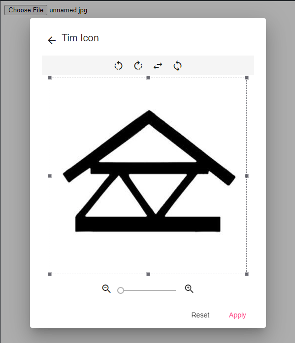
In this article, create the trimming icon dialog like here.
Install packages
Install @angular/material
$ ng add @angular/material
Install ngx-image-cropper
$ npm i ngx-image-cropper
Add index.html to effect material icon
<link
  href="https://fonts.googleapis.com/icon?family=Material+Icons"
  rel="stylesheet"
/>
Add style.scss to effect material theme
@import '~@angular/material/prebuilt-themes/indigo-pink.css';
Coding
image-cropper-dialog
image-cropper-dialog.ts
import { ChangeDetectorRef, Component, Inject } from '@angular/core';
import { MatDialogRef, MAT_DIALOG_DATA } from '@angular/material';
import {
  base64ToFile,
  ImageCroppedEvent,
  ImageTransform,
} from 'ngx-image-cropper';

@Component({
  selector: 'image-cropper-dialog',
  templateUrl: './image-cropper-dialog.html',
  styleUrls: ['./image-cropper-dialog.scss'],
})
export class ImageCropperDialog {
  imageChangedEvent: any = '';
  croppedImage: any = '';
  rotation: number = 0;
  scale: number = 1;
  showCropper: boolean = false;
  containWithinAspectRatio: boolean = true;
  transform: ImageTransform = {};
  defaultWidth: number;
  defaultHeight: number;

  constructor(
    @Inject(MAT_DIALOG_DATA) public data: any,
    private readonly dialogRef: MatDialogRef<ImageCropperDialog>,
    private readonly cd: ChangeDetectorRef
  ) {
    this.fileChangeEvent(data.event);
  }

  fileChangeEvent(event: any): void {
    this.imageChangedEvent = event;
  }

  applyIcon(): void {
    console.log('Cropped Image!', this.croppedImage);
  }

  resetImage() {
    this.scale = 1;
    this.rotation = 0;
    this.transform = {};
    this._resetCropperPosition();
  }

  imageCropped(event: ImageCroppedEvent) {
    this.croppedImage = base64ToFile(event.base64);
    // or if you want to save as base64
    // this.croppedImage = base64ToFile(event.base64);
  }

  imageLoaded() {
    this.showCropper = true;
  }

  rotateLeft() {
    this.rotation--;
    this._flipAfterRotate();
  }

  rotateRight() {
    this.rotation++;
    this._flipAfterRotate();
  }

  flipHorizontal() {
    this.transform = {
      ...this.transform,
      flipH: !this.transform.flipH,
    };
  }

  flipVertical() {
    this.transform = {
      ...this.transform,
      flipV: !this.transform.flipV,
    };
  }

  changeScale(e) {
    this.scale = e.value;
    this.transform = {
      ...this.transform,
      scale: this.scale,
    };
  }

  zoomOut() {
    this.scale -= 0.1;
    this.transform = {
      ...this.transform,
      scale: this.scale,
    };
  }

  zoomIn() {
    this.scale += 0.1;
    this.transform = {
      ...this.transform,
      scale: this.scale,
    };
  }

  toggleContainWithinAspectRatio() {
    this.containWithinAspectRatio = !this.containWithinAspectRatio;
  }

  closeEditIconDialog(): void {
    this.dialogRef.close();
  }

  private _flipAfterRotate() {
    const flippedH = this.transform.flipH;
    const flippedV = this.transform.flipV;
    this.transform = {
      ...this.transform,
      flipH: flippedV,
      flipV: flippedH,
    };
  }

  private _resetCropperPosition(): void {
    this.containWithinAspectRatio = false;
    this.cd.detectChanges();
    this.containWithinAspectRatio = true;
  }
}
image-cropper-dialog.html
<ng-container>
  <div class="mat-dialog-header">
    <div class="flex-start">
      <button mat-icon-button (click)="closeEditIconDialog()">
        <mat-icon>arrow_back</mat-icon>
      </button>
      <h1 mat-dialog-title class="mb-0">Tim Icon</h1>
    </div>

    <div class="my-8 action-header flex-center">
      <button mat-icon-button (click)="rotateLeft()">
        <mat-icon>rotate_left</mat-icon>
      </button>
      <button mat-icon-button (click)="rotateRight()">
        <mat-icon>rotate_right</mat-icon>
      </button>
      <button mat-icon-button (click)="flipHorizontal()">
        <mat-icon>swap_horiz</mat-icon>
      </button>
      <button mat-icon-button (click)="flipVertical()">
        <mat-icon>sync</mat-icon>
      </button>
    </div>
  </div>

  <mat-dialog-content>
    <image-cropper
      [imageChangedEvent]="imageChangedEvent"
      [maintainAspectRatio]="true"
      [containWithinAspectRatio]="containWithinAspectRatio"
      [aspectRatio]="1"
      [resizeToWidth]="256"
      [cropperMinWidth]="128"
      [onlyScaleDown]="true"
      [roundCropper]="false"
      [canvasRotation]="rotation"
      [transform]="transform"
      [alignImage]="'center'"
      [style.display]="showCropper ? null : 'none'"
      format="png"
      (imageCropped)="imageCropped($event)"
      (imageLoaded)="imageLoaded()"
    ></image-cropper>
  </mat-dialog-content>

  <div class="flex-center">
    <button mat-icon-button (click)="zoomOut()">
      <mat-icon>zoom_out</mat-icon>
    </button>
    <mat-slider
      step="0.1"
      min="1"
      max="2"
      [value]="scale"
      (change)="changeScale($event)"
    ></mat-slider>
    <button mat-icon-button (click)="zoomIn()">
      <mat-icon>zoom_in</mat-icon>
    </button>
  </div>

  <mat-dialog-actions class="flex-end">
    <button mat-button (click)="resetImage()">Reset</button>
    <button mat-button color="accent" (click)="applyIcon()">Apply</button>
  </mat-dialog-actions>
</ng-container>
image-cropper-dialog.scss
:host {
  .flex-start {
    display: flex;
    justify-content: start;
    text-align: center;
  }

  .flex-center {
    display: flex;
    justify-content: center;
    text-align: center;
  }

  .flex-end {
    display: flex;
    justify-content: end;
    text-align: center;
  }

  .action-header {
    background-color: #f5f5f5;
  }

  .mat-dialog-content {
    .cropper-container {
      width: 100%;
      margin: 0 auto;
    }
  }

  img {
    width: 600px;
  }
}

::ng-deep .ngx-ic-move {
  border-radius: 50%;
  outline: 1px solid #888;
}
Using cropper component (example: app.component)
app.component.ts
import { Component } from '@angular/core';
import { MatDialog } from '@angular/material/dialog';
import { ImageCropperDialog } from './image-cropper-dialog/image-cropper-dialog';

@Component({
  selector: 'my-app',
  templateUrl: './app.component.html',
  styleUrls: ['./app.component.css'],
})
export class AppComponent {
  constructor(private readonly dialog: MatDialog) {}

  fileChangeEvent(event: any): void {
    this.dialog.open(ImageCropperDialog, {
      width: '600px',
      data: event,
    });
  }
}
app.component.html
<input type="file" (change)="fileChangeEvent($event)" />
app.module.ts
Import modules
import { NgModule } from '@angular/core';
import { BrowserModule } from '@angular/platform-browser';
import { FormsModule } from '@angular/forms';
import { AppComponent } from './app.component';
+ import { ImageCropperModule } from 'ngx-image-cropper';
+ import { ImageCropperDialog } from './image-cropper-dialog/image-cropper-dialog';
+ import { MatButtonModule } from '@angular/material/button';
+ import { MatIconModule } from '@angular/material/icon';
+ import { MatDialogModule } from '@angular/material/dialog';
+ import { MatSliderModule } from '@angular/material/slider';
+ import { BrowserAnimationsModule } from '@angular/platform-browser/animations';

@NgModule({
  imports: [
    BrowserModule,
    FormsModule,

+   MatButtonModule,
+   MatIconModule,
+   MatDialogModule,
+   MatSliderModule,
+   ImageCropperModule,

+   BrowserAnimationsModule,
  ],
  declarations: [
    AppComponent,
+   ImageCropperDialog
  ],
  bootstrap: [AppComponent],
+ entryComponents: [ImageCropperDialog],
})
export class AppModule {}
Discussion